Typography, though being an indispensable element of today’s digital landscape, is often neglected. Almost the entire globe uses different types of fonts such as canaro font on a daily basis, but still don’t take notice of its effectiveness. The style and appearance of a font have a tremendous impact on the visual outlook of a website. Despite such a proliferation of web fonts which are capable of leveraging the functionality of any website, choosing a right one is still a daunting task, if not impossible.
Many web developers find themselves in a bewildered state when it comes to deciding on an elegant font. Through this article, we are trying to offer an insight into various types of fonts that can boost the quality of content. So, let’s set the ball rolling.
The boldness of Lobster makes it a smart choice for the headings. It is a beautiful typeface with heavy strokes, which helps in emphasizing the content. One of the strong points of Lobster is the legibility it offers. The text becomes highly attractive, much to the delight of the viewers. It works great with Droid Sans, resulting in an excellent layout.

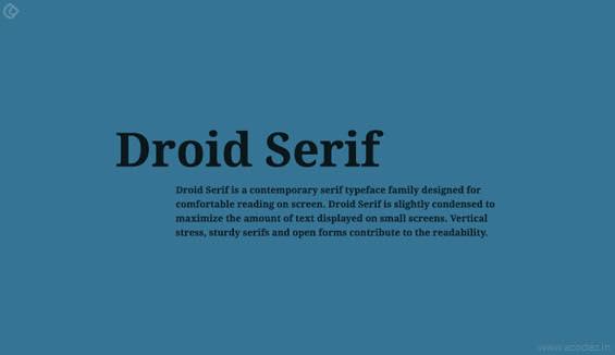
Seeking a substitute for Arial, Verdana and Georgia? Look no further than the Droid Trio – Sans, Mono and Serif. Designed in 2006, the droid fonts were launched with a motive of providing a wonderful resource for the developers which could help them in increasing the readability of web content when accessed from mobile phones or other devices. It is a friendly font whose popularity hasn’t shrunk a bit despite the rise of the rivals. Its universality makes it a preferred choice.
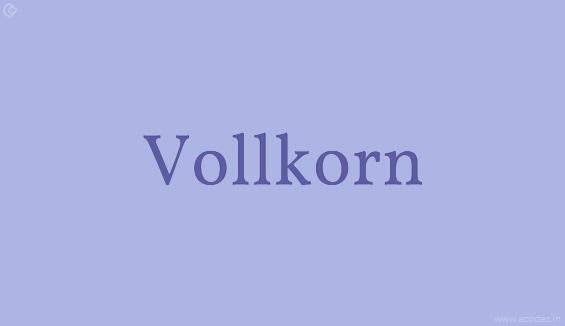
Vollkorn has its roots in German culture. Simple yet subtle, the font is a perfect fit for everyday content. Its efficacy and utility for various purposes makes it an ‘all and sundry’ font. Vollkorn is utilized for presenting the headlines and body text in an eye-pleasing way. The dark and robust serifs looks gorgeous even at a small size.
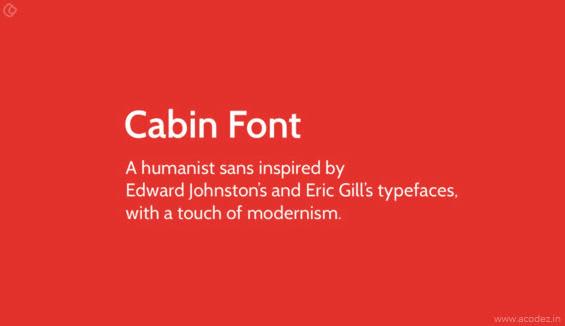
Cabin is an ideal font for both headers and body text. Its sophisticated looks make it grab all the eyes. The font has eight styles to complement its attractiveness, namely Regular, Medium, Semibold and Bold. Every font has its own corresponding features, adjustments and proportions, well-suited for myriad uses. It is clean and modish.
Lora is graceful and spectacular in all regards, available in four typefaces. The font is the web developers’ first choice for body text to suit the contemporary web trend. It is a well-balanced font with terrific styling, which works wonders for the overall aesthetics of a website. The brushed curves, light contrast and serifs blows a spark into the web content. It is optimized for the screen viewing.

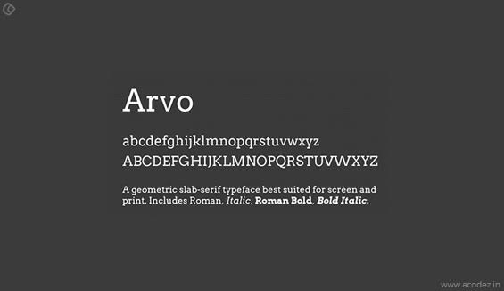
Arvo means ‘Number’ or ‘Value’ in Finnish language. It is a geometrically built slab-serif font, greatly used for headlines, titles and body text. It is an open source that can be easily accessed from the Google Font Directory. The typeface is a mix of flavors, unique and extraordinary in its own way.
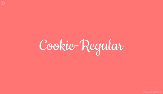
Cookie evokes the fond memories of pin-up posters and advertisements of 1950s as it is constructed on brush calligraphy. It is used widely for presenting the headlines. The hook of the font is its vintage appearance that makes the content more engrossing.
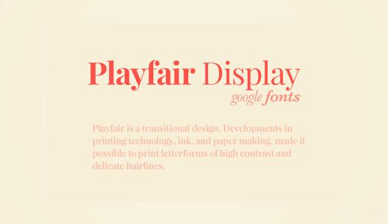
The transitional period of late 18th century in the domain of the writing / printing becomes the inspiration for Playfair display. It is the time when quill pens disappeared in the cloud of modernization, and pointed steel pens became the new rage. Moreover, the Playfair display is greatly influenced by the typefaces of William Martin and John Baskerville, which they designed for ‘Boydell Shakespeare’. The font is a best fit for body text and headlines. The capitals are slightly larger than the lowercase letters. Playfair display is a perfect companion to Georgia.
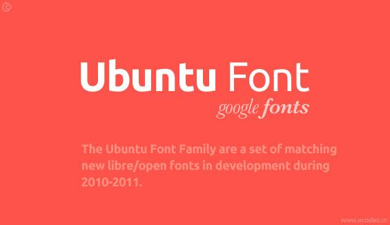
Ubuntu is an everyday font, good for headlines, titles and body text. Ubuntu Font is a family of sans serif fonts that marvelously impacts the legibility of the content on mobile phones and other tech devices. The best part is its multilingual nature.
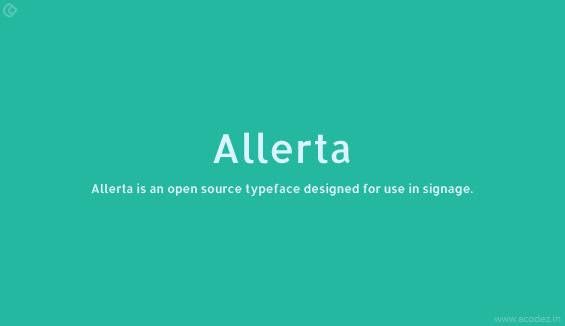
Allerta is an elegant font, a creation of Matt Mclnerney. It is a somewhat a bold sans-serif font, designed to distinguish one character from the other, so as to enhance the perceptibility of the content. It is for both print and web, used widely for the headings and the copy.
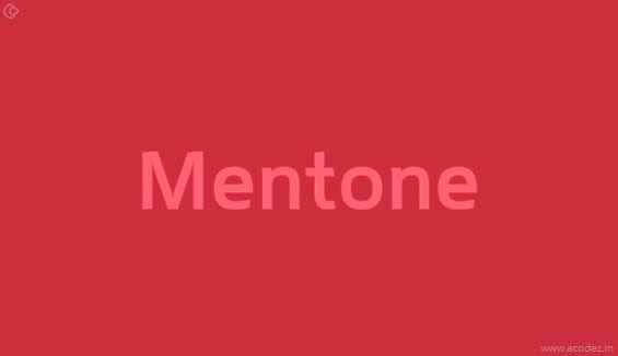
Mentone is an extensively used font, a new and reformed entrant into the big line of the sans-serif fonts. The font has much allure, given the rounded edges and rich chamfers, which become invisible at text sizes, but remains distinctively visible at display sizes.
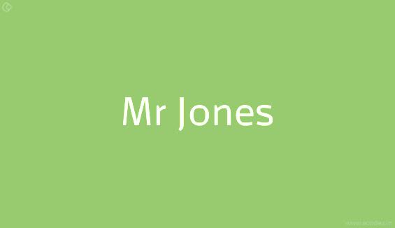
Originated typically for printing purposes, Mr Jones is an old favorite for its wide lowercase and narrow capitals, which are advantageous in terms of legibility and spacing. The font maintains a terrific equilibrium between the positive and negative spaces without creating a bizarre view. The width of the characters is intelligently devised for the most authentic juxtaposition of various spaces. The typeface is suitable for the body text, but the user has to bring a number of tracking adjustment for larger settings. The font comes with small caps, proportional and vintage styling and discretionary ligatures.
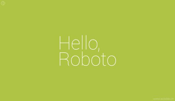
Used in Google’s Ice Cream Sandwich version for Android, Roboto is the font appropriate for body text. What makes it the most special is its availability in 12 weights. The Roboto Condensed version is launched in six weights, giving a lot of scope for experimentation to the web savvies. The font is great for personal blogging and magazine styling.
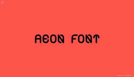
Aeon is a powerful font available in six weights and used highly for graphical presentations. The web developers use the font for minimal designing, posters and magazines.
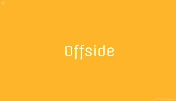
Created by Eduardo Tunni, Offside font is a riveting one with simple structure and monoline strokes. The way it suits the contemporary styling is completely remarkable. The large counters make it excellent for web headlines.
Are you looking forward to hire a Web Designing Company in India? Call us at +91 9544668844 & get in touch with our team right away!
Looking for a good team
for your next project?
Contact us and we'll give you a preliminary free consultation
on the web & mobile strategy that'd suit your needs best.