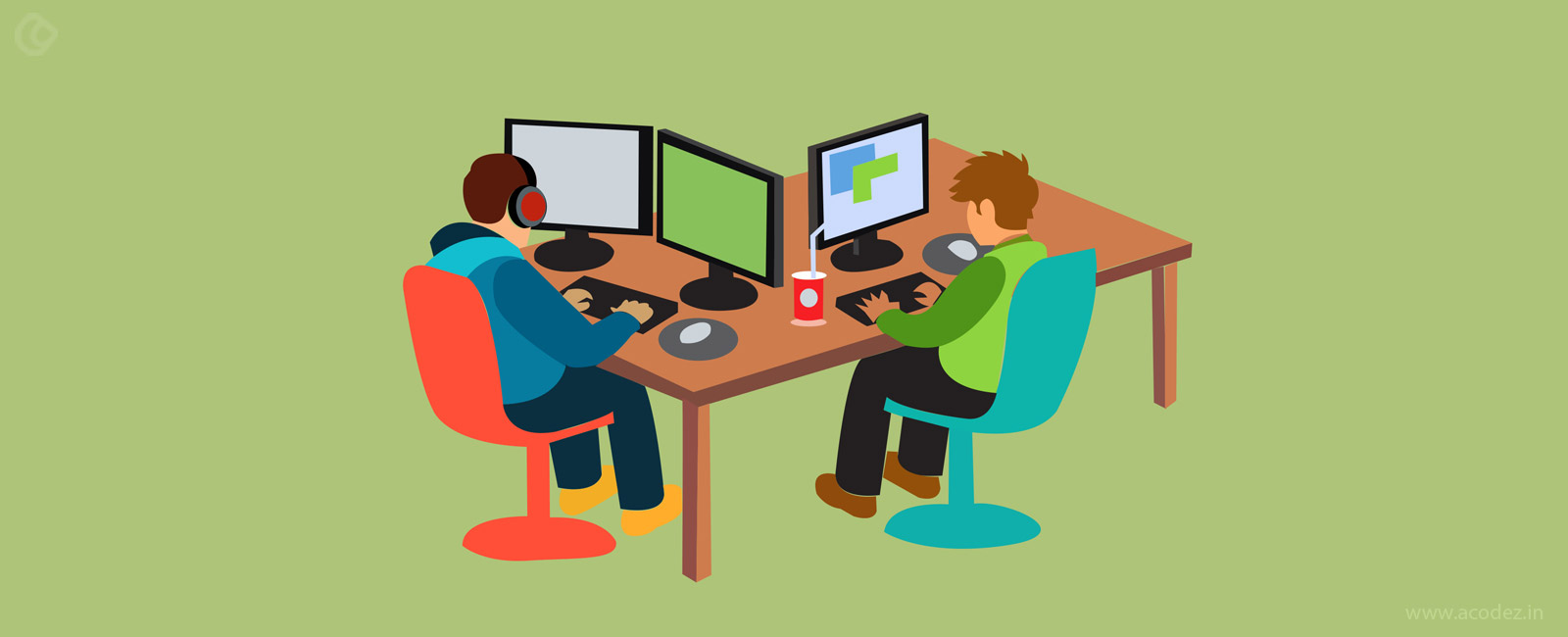
The best thing that evolved with technology was mobile and the brilliant part of mobile is that it is evolving every other day. The focus of the tech experts is to create an interface that offers a great user experience by improvising the overall performance.
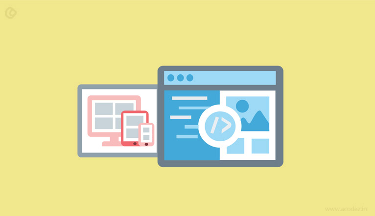
Seventeen percent of smartphone users in the US utilize mobile phones for browsing the internet. App and website developers are putting in their best effort to customize these to fit well into the screen of the mobile devices. It is not an easy task to optimize these apps or websites to fit into the distinctive screen size of the mobile devices as they are made up of intricate internal details, which need to be analyzed well before weaving it into the mobile device. This is where responsive website design (RWD) comes into the picture, making it the most effective and affordable option.
Before, we dive deeper into bootstrap or materialize front-end frameworks, you need to realize the importance of RWD.
How does RWD work?
RWD helps in designing and developing websites that are flexible enough to adapt or fit into the screen sizes of any devices, including mobile phones without failing the customer experience. Almost all designers are implementing this design technology in their designs to ensure that the app experiences are fluid in nature and are ready to fit into any devices.
What are the main ingredients of RWD?
- Flexibility in images: There is a 100% max-width rule in CSS for placing images inside a grid. The size of the image should fit into the grid frame.
- Media attributes is the CSS3 module that is capable of controlling the styles, including orientation, height and weight.
- Fluidity of grids: It is a platform, which allows you to manage or organize the content that does not have a preset width. With these grids, you can organize your content in an intuitive manner that matches the mood of your device.
Awesome, isn’t it? So, how do we attain the goals of RWD?
What is a solution?
Implementing frameworks that support the materialization of intuitive designs is the best possible outcome. This can be accomplished by using frameworks, such as Skeleton, Bootstrap, Materialize, etc.
There is no shortage of frameworks that offer RWD, but Bootstrap and Materialize are the designer’s preferred choice of frameworks. You could write some code to make your design responsive rather than using these frameworks, but these frameworks works best for helping people implement RWD.
Some of the advantages of RWD, which will make you love it:
- It helps to add consistency to the projects
- Fluidity flow in between the people involved in these projects
- Helps to develop prototype of designs instantly
- No redundancy in actions
- Grid is always available to adjust the flow of the process across any kind of devices.
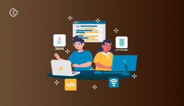
Here, we will discuss the beauty of Bootstrap:
What exactly is Bootstrap?
It is one of the most preferred development frameworks offering the best of features in front-end, which triggered its popularity.
Evolution:
It is a long story shortened: Two of the Twitter employees (a designer and developer), one fine morning decided to create a framework that will power RWDs. And, thus, Bootstrap was born. Initially, named as Twitter Blueprint, it was later transformed into the commonly used open-source framework.
This front-end framework supports the idea of mobile first and is developed on the technologies, such as CSS, JavaScript and HTML.
Bootstrap comprises of three major components or files, as they call it and these are:
Along with these components, Bootstrap also contains jQuery, which helps in simplification and also, provides cross-browser compatibility, which is why it is the most popular JavaScript library.
What makes Bootstrap a favorite among designers?
It is composed of enormous number of resources that are accessible by all and among these there are a few other reasons why you will want to consider Bootstrap for your next design:
1. Ease of use:
Accompanied with JavaScript library that is the developer’s love, this RWD framework can be combined with CSS or SASS or even LESS as it has the property of adaptability. Also, this user-friendly framework is easy to learn.
2. Responsiveness:
This is one of those traits that we are searching for in RWDs. The widely increasing network of mobile devices and their varieties and the kind of features that they offer make it imperative that a designer keeps handy distinctive set of impressive attributes to incorporate while designing responsive websites. This comes with grid layouts that helps in offering mobile friendly designs. Thanks to the in-built classes that carves out the spots in any grid, thus, creating responsive designs that can flow across any device or screen space.
3. Pre-designed elements that offer simplified integration:
Not all frameworks are ready to collaborate and when no one else is ready to integrate, bootstrap is. It provides integration property, thus allowing it to combine with any kinds of frameworks or platforms. You can get integration done anywhere: either start it from the scratch or include it in the existing sites. All the pre-designed elements provide incorporating drop downs, navigation bars, alerts, etc. in your app or design with ease.
If you are looking for an intuitive framework that is powerful, cheap and works faster then, Bootstrap is the best choice as it is a combination of great features that powers fully functional websites in responsive mode.
You might be aware of the fact that web design languages can power mobile-first, metro, flat and material, etc. kinds of websites. And, of these, Bootstrap specializes in mobile-first design language as we have already discussed, while materialize uses Material. All of these designs offers a large number of benefits and application features and you can choose the one that will fit well into your software design.
Google ensured that material design provides a platform, for creating flat designs, which comes with emotion and realistic aspects that people can relate to it with ease. This design brings in the realistic face of real-time things, connecting this to the users, helping to reduce overload.
Introduction to Materialize.
That slick material design, comes from the materialize front-end framework, offers responsiveness in the website designs that you create.
This user experience (UX) element is what Google implements components that will function on the web page as you want it to. Thanks to Google’s Material Design Language that comes with design principles and concepts powering physics elements, such as light, space and motion into the designs that you create. This means that each and every other element has depth apart from the width and height that it comes with.
The composition of Materialize:
It is a combination of CSS written in Sass and JavaScript framework, comprising of distinctive sets of icons and components. Again, just like bootstrap this comes with a 12-column grid layout that supports responsive website designing. It provides a variety of components such as toasts and parallaxes, which you cannot find in Bootstrap. Also, this finds compatibility in cross-browsers, including Internet Explorer 10+, which is the latest one.
Materialize powers all kinds of materialistic designing across a variety of platforms and devices along with customized components, animations, basic styling and transitions. The user experience and interface should be smooth, which is the overall aim of materialize.
Materialize is built upon the design principles of material design language from Google. It depends on principles of user interface design (UI) that are fresh and simple unlike others. It provides a clear picture on the interaction between UX elements and the interface they offer to people to enjoy the experience. The visual impact is also guarded by this design language. The major goal of this design language is to provided a discipline to UI elements owned by Google across the web and mobile platforms.
Again this is also powered in collaboration with the various elements of physics including space, light and momentum.
The materials or elements designed using Materialize, which comes in collaboration with Google’s Material design contain 3D space and offer heavy motion. The elements are accompanied with depth along with the height and width aspects, allowing them to move in any intended manner.
Some of the similarities between Bootstrap and Materialize are listed below:
1. The 12-column grid approach is common to both and you can create one of the best design processes.
2. The class and structure names are similar in both the front-end framework though both support different functionalities, such as mobile-first and materialism.
3. Helps you to design templates that are responsive in nature
4. The set of components and icons that you can find in both the frameworks are same.
Advantages of using Bootstrap:
Bootstrap offers classes that flaunt a number of elements, which it can process or hide depending upon the scenario.
There is a comprehensive documentation process involved, providing flashy examples.
It offers an extensive browser compatibility, with IE8 and IE9+ and many of the latest browsers.
You can enjoy accessibility compliance via helper classes, which comprises of keyboard navigation and screen readers.
Provides base styling for the basic HTML elements such as:
1) Icons
2) Images
3) Tables
4) Forms
5) Buttons
6) Code
7) Typography
Apart from all these features, it also offers brilliant documentation features, along with demos and examples to help the user interpret and understand it better.
Why choose Materialize?
1) For the ease of writing columns, e.g., 12*6
2) The built-in features that includes flow texts, cards, hoverable items and objects
3) Parallax elements
4) Avatar content
Deciding which is the best is not an easy task, because both the front-end frameworks offer ample of options for designers and developers to carve out an enriched design.
It is up to you to decide which will be the best depending on how it will fit into your needs, who your target audience is and how it will benefit them.
On the basis of these options, as well as what your needs are and the time and cost you are planning to spend on this will help you to carve out the perfect framework that will meet your needs.
Both these frameworks are widely used by people these days for the ample of features that they offer.
Which one would you choose for your needs?
We can help you choose the one that fits into your business requirements. Yes, we have done this before.
Acodez IT Solutions is a web development and web design company offering a wide variety of web design services in India and abroad. We have won multiple international awards for our services across the various arenas of web designing. We also offer inbound marketing services that are best in the industry, making us the most popular SEO agency in India.
For further details on our products and services, please contact us today.
Looking for a good team
for your next project?
Contact us and we'll give you a preliminary free consultation
on the web & mobile strategy that'd suit your needs best.