Pause a moment and gaze at the world around you! It looks so bright and beautiful. Nature has its own palette of colors to add in the grace and elegance that makes everything a delightful charm. Imagine how dull it would have been if there were no colors. Gosh! Black and white? We don’t even like to watch those old movies that were shot in black & white before the visual revolutionization was evoked. We all love colors as these contain life in them.
When it comes to designing a website, colors have an important role at creating a humanization impact. The first and foremost thing that you need to keep in mind while designing websites is that you are designing these websites for humans and not for robots. It is not a new knowledge that colors are linked to human psychology and this is one of the key aspects that designers have been exploring since the day the web was formed.
The fundamental myth which is more of a fact behind using colors is that they have the power to communicate with people. Kissmetrics revealed the scientific association of colors with human psychology which states that whenever a color is picked up by the eyes, instantly a message is sent to the brain’s hypothalamus which will forward it further to the pituitary glands and finally it reaches the thyroid glands. This triggers the release of a set of hormones which affects your mood, emotions, and even behavior.
This tells us something- the actual reason why sometimes we experience a flow of negative or positive vibes while we are on certain websites. Do you remember those moments when you experienced a strong adrenaline rush while you were on a travel website which took you across skydiving and tandem jumps? It is all the magic of colors. Also, Kissmetrics states that a site visitor takes only 90 seconds to judge a website. And around 62-90% of this interaction is subject to the color of a product.
The color is one among the most important aspects of a website design that creates a strong first impression for the human eye as revealed in the e-book Web Design for the Human Eye.
How to choose colors that strike the human eyes?
Actually speaking there is no perfect answer to this question. Psychologists have been on research regarding the same and could not find anything that can relate to how people relate to colors as it is majorly a matter of personal preference.
For instance, when you think of red, two things can cross your mind: one is it relates to danger and the other is love (hearts and roses). So which do you fix? Again this is a contradiction. There might be people who think of red as beautiful while another category that relates red to a bad omen. Once I had one of my colleagues quit the job just because he could not adjust to his new cabin that was painted in deep blue, as it strongly reminded him of snakes.
This is how personal perception works, the next thing is cultural considerations. For instance, the color green is related to money and envy though there are certain nations that even have green flags as they consider this color to bring them good luck and fortune while there are those nations that consider green to bring them ill-luck and refrain from using it anywhere.
Also Read: How to Choose the Perfect Color Scheme for Your Web Design Projects
Let us brush all this apart and focus on choosing a bundle of colors from the color palette for your website design rather than working on how do you choose colors individually. What I could realize from my researches and through discussions with my web development team is that designers need to shift their attention more on choosing multiple colors rather than thinking over how people respond to individual colors.
So, there are certain factors that you need to take into consideration before choosing the colors for designing your website:
- Audience (male/female & kids/adults & different demographics)
- Cultural considerations
- Relevance to the brand/product guidelines
- Ease of accessibility/ usability
The impact of audience and brand:
Audiences and brands are the two important factors that can help to narrow your search further.
As we have already discussed, color is one of those factors that plays an important role at creating an excellent first impression for the users on your website. So, ensure that you do not choose colors that fail to create an impression but rather this poor choice of colors take a negative turn leading the users away from the website as it annoys them or causes a kind of strain to their eyes.
Also, the contrast is another factor that helps to determine how the user views a website. A proper implementation of contrast boosts the legibility and this makes it necessary to keep the background color different from that of the text color.
So, I have summed up a few usability tips that will help designers to fill in their websites with appealing and attractive colors:
#1. White spaces: How can you attract the visitor’s eye? Just by adding some space between the content units and the blocks of colors. For instance, my personal choice would be a landing page that is not too dark with a “download now” button that is not too light in color because this will help in better conversion than a page that has a poor choice of colors. You need a button that attracts the visitor’s eye and they automatically go on and perform the specified action.
Also Read: How to Create Perfect White Space in Web/UI Design
#2. Web Smart Colors: As is the case with browsers the same applies to Mac and PCs, which simply states that you need to use ‘web smart’ colors because these devices render colors differently.
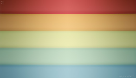
#3. Don’t come up with too many color choices: If you take into account the majority opinion when it comes to the relation between colors and web design you will find it that people prefer to have it as simple as possible. It is not a vibgyor that you are planning to create on your website though we discussed colors prompt visitors to take actions, so be kind to your choice of colors.
#4. A little opacity cannot hurt: As we have already discussed there are no rules and you can experiment. If you have positioned text in front of images or if you are using patterns, you can possibly reduce the opacity across the background pattern and also along the image where the text has been placed to give a lighter feel to the colors and this will bring about a greater contrast across the text in the background.

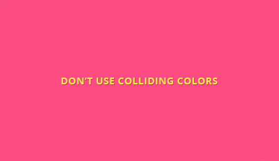
#5. Don’t use colliding colors: Would you like to read across a website that has yellow text on a pink background? That would be too weird!
#6. Clicked Links: There is a huge confusion to whether you need to change the color of a visited link? A large number of websites implement this to help users navigate with ease. Also, the commonly used color is maroon when it comes to changing the color of clicked links. Try not to apply these to your primary navigation. It gives an awkward feel.
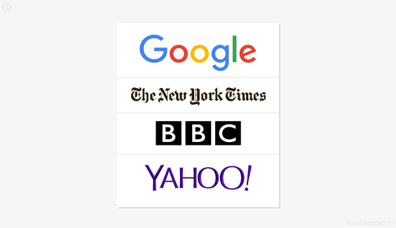
#7. Links: When it comes to links some of the most popular websites including Google, New York Times, BBC, Yahoo, etc. are using blue color for the links and when there is an existing standard why change it?
#8. Color coding: There is no particular set of rules when it comes to colors. You can have a look at the navigation of the new Guardian website, the awesomeness of colors and why we just discussed there are no rules for coding and if there exists any, nobody’s going to stop you from breaking these. Also, if you check out how Techcrunch’s authors reply to their reader comments that are color-coded, which again shows there are no rules.
#9. Shades: A fusion of neutralized color choices is a great preference for many web designers and also these are combined with a variety of shades from their main color choices. This kind of a color combination is of less strain to the eyes than you have while working with a number of primary colors.
#10. Contrast: Let us begin our discussion with Contrast, that we have already discussed which has been found to be one of the decisive factors in retaining visitors. When it comes to the background color, it is ideal to keep it in the same color throughout while you can experiment a varying contrast with the text. For instance, when your background is white in color, text colors in black or gray is the most recommended option. Sweet & simple!

#11. Use color according to the prominence of the item: When it comes to coloring a “Buy now” button I would prefer a red color on a white background.
#12. Shadows and gradients: This reminds of Web 2.0, but is a formula that has been experimented quite often here and there and works out well. Sometimes websites are revamped using the same existing entities with maybe a few changes in those gradients or maybe these will have a drop shadow below the logo. Actually, this makes the site a lot more attractive and does not give the usual 2D feel.
#13. Light text and dark backgrounds: Though it has been found working for some websites it does not go well with certain publishers. It would be great if you can decrease the font weight. Don’t you think it looks quite odd when you use white on the black background as compared to vice-versa? And when you use this across blogs or news sites my dear friend, you are inviting a disaster.
#14. Fluorescence is another disaster: Don’t commit that mistake of giving a headache to your visitors so that they regret having visited your website.
#15. Globalizing: Cultural considerations is another important factor as we have already discussed when it comes to choosing the colors. Decide the target audience and then conduct a research on their demographics and also explore the location where they live.
#16. Brand: Any website has a particular set of brand guidelines and chooses a color theme that either matches or complements with your website.
#17. Demographics The audience demographics is one of the most important factors that you need to take into consideration before choosing the colors. If you are targeting kids, use lighter shades whereas if it is for elderly people brighter shades would be the best. If it is for females, then use girlish shades such as purple and when it comes to men a combination of a white background with black text would be great.
#18. Images: Images also contribute a lot to the color of a website. So be wise when you make a color choice as everything matters.
#19. Consider the theme of your product: Red has nothing to do with the environment which would look a lot better when colored in green.
Here are a few tools that will help you to make the right choice of colors:
Read-made color palettes provide designers with a great choice. But when it comes to web UI design, you can choose from the following:
- Adobe Color CC: for Adobe users
- Mudcube Color Sphere: a wide selection of themes
- Color: You can choose a color by moving your mouse across the screen
- Flat UI Color Picker: helps to create flat designs in beautiful colors
- Check my Colors: it helps to check the foreground and background color combinations and also it is helpful when it comes to people with colorblindness.
- Paletton: the best choice of colors for beginners.
Don’t use brown and orange too much:
It is generally found that brown is one of the colors that men dislike and orange is the color disliked by women.
Choosing a color scheme:
It is very rare that you will create a website with only one color in it. There would be a choice of multiple colors but making it look the best with the given choice of colors is where you can apply some of your smartness.
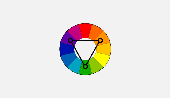
Here are 3 basic methods to help you choose the best scheme of colors:
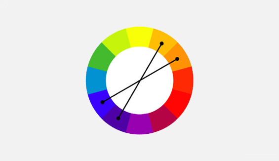
Triadic: The name says it all. From a 12-step color wheel, you can choose 3 colors that are located at a distance of 120 degrees from one another when it comes to content, background, and navigation, just like in the image given below:
Compound: This will need some experimentation before you actually implement it. In this method, you can choose 4 colors consisting of two contrasting pairs (which lie near to each other on the color wheel) and another two you can choose at random, that make as complementary pair (lying across on the color wheel)
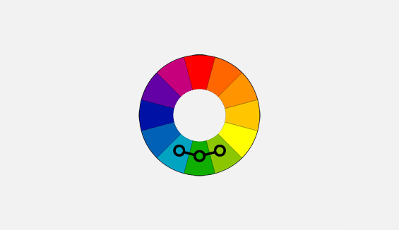
Analogous: This is based on a choice of complementary colors and the choice depends on what you wish to convey to the user.
Conclusion:
The color is always an important aspect of website design that cannot be compromised at any cost because it also reflects the brand image. Each of the colors that you choose has a story to tell which is related to your brand and product. So make wiser decisions which are not at all difficult with the available ready-made color palettes.
How do you design your website? What are the factors that you take into consideration while choosing colors for your website? Share your recommendations and thoughts with us.
Acodez IT Solutions is a Web Development Company based in India providing all kinds of web design and development services to a large number of clients across the globe. Start utilizing the advantages of UX designs for your website today from a ux agency india. We also provide excellent digital marketing solutions that help businesses to reach out their target audiences with ease. Contact us for a free consultation!
Looking for a good team
for your next project?
Contact us and we'll give you a preliminary free consultation
on the web & mobile strategy that'd suit your needs best.


Choosing colors in website designing and development is one of the most important tasks. Often the developers get confused in choosing the best colors which suits their websites or which is suitable to the customers eye. Always remember that don’t make your website a rainbow. Try to use the minimum colors as much as you can. As per rule, 2-3 colors are recommend at a glance.