Traditionally, emotions have been considered to be something that design evoked, rather than something that drove the design experience. But times are changing, and today emotion is a crucial element of UI. Take a look at the emails or texts you have sent and received; how many times have emojis been used? Pretty frequently, I’d say!
Today, the way people share news has changed: we announce to perfect strangers about the most personal things: breakups, birth of a baby, death of a pet, and so on, thanks to social networking. Nobody is worried about over-sharing these days! People want to express their emotions, want others to know how they feel, and empathize with them.
Initially websites were formal and stuffy, but now, being casual is in. Websites are more light hearted, and companies often use humor to connect with their audiences.
However, this is not as easy as it sounds when it comes to incorporating it into design. Human beings are a tangle of innumerable emotions, and they are very subjective. Every individual may have a different reaction, and therefore, emotion, to a given situation, image, event etc. Emotions are complex; emotions are often messy too. But there’s no doubt that much of the global economy is driven by human emotion. For example: why would anyone want to spend huge $$$ on say, a designer bag, a suit, or watch, when you can get perfectly functional and reliable stuff at a small fraction of that price? The human emotions of excitement, joy, snobbishness and pride, at owning a high-end product is definitely responsible for this!
Similarly, whether it’s a website, a web app or mobile app, it has become imperative for designers to address the emotional needs of the end user.
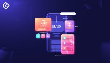
What is Emotional/Emotive UI?
An emotive UI is the most sought after element of website design. An emotive UI combines a user friendly interface with one that really connects with the user emotionally – regardless of whether that emotion is happiness, excitement, fear or sadness. When you interact with a great design, you may go through several emotions, not just one.
Sherine Kazim, MD of Experience Design at Huge Ideas, is an expert on the subject, and mentions Robert Plutchik, the academic psychologist who wrote the textbook about emotions in 1980. He mentioned 8 base emotions: –joy, trust, fear, surprise, sadness, disgust, anger, and anticipation, and also wrote that these have various levels of intensity, and tend to dissipate and even change into other emotions.
(A good idea to include the diagram below in the article)
Ms. Kazim says that designers want users to experience certain feelings when they use their products (sites, apps); after all, don’t business organizations often say, “We want to surprise and delight our users.”? However, surprise and delight are just a very small part of the whole emotional spectrum, and designers will have to learn to interact with all of them.
Ms. Kazim modified the emotional wheel to make it more relevant for out times. Take a look:
Whichever image you look at, you can see that the intensity of each emotion changes as you go further outwards from the wheel center – and this is what is missing in today’s design. The designs of today induce the basic emotions in viewers, but there is no adjustment of the UI correlating to the change in the intensity of the user’s emotions.
Sherine feels that the products today aim only for the center wheel emotions, simply because it’s less complicated to do. Considering the entire spectrum, and the dissipation of emotional intensity is just too much work, and in some cases, designers are not truly aware of this facto
The Law of diminishing returns in Economics, says that the more you keep getting of something, the less returns/satisfaction you will derive from it over time (to put it in very simple terms!). Similarly, the excitement of happiness a user derives from a design may diminish as he continues to interact with it for some time. The same goes for anger and sadness. Think about it: are you as angry at the guy who bullied you in high school now, as you were at that time? Certainly not! In fact, you may even feel some amusement at the memory of some of the pranks played on you. This is just human nature at work. According to Ms.Kazim, designers have to ‘intentionally design for every single emotion’ that a user will go through when interacting with a certain product. So basically, you have to fine-tune communication between your products and their end users; design for a basic emotion, as well as its diminishing intensity. Only then will you be able to establish deeper and more meaningful connections with the user.
It is possible to design for emotions other than delight – like fear and grief especially, though it is quite subjective; Sherine also says that surprise is one of the most difficult elements to incorporate, however it can be effective used in games.
She is also of the opinion that at the present, it is almost impossible to capture the other 4 emotions, and that it is something that needs to be worked on. She opines that when that happens, products will become ‘more multidimensional’ with their own personalities, just like their users!
While in the past, designers focused on ‘user friendly’ design (usable, easy), now they need to focus on design that excites, stimulates and delights, and connects with them deeply.
Why Emotional UI?
Well, why not? If you go to a fancy restaurant, don’t you expect the food presentation to be wonderful, to be pampered by the staff, the taste to be exquisite? If all you wanted was something to fill your stomach, you would have gone to a fast food place for a quick bite! Similarly, people today are looking for something beyond just functional, when it comes to all things digital, be it websites, apps, games or anything else.
Aarron Walter, VP of Design Education at InVision, founder of UX practice at MailChimp and the author of Designing for Emotion, says: “Why do we settle for usable when we can have usable and pleasurable?” An example he gives is that of Basecamp and Wufoo. Both are project management tools but Wufoo (as the name suggests) is way more fun to use. Naturally, given a choice, most people would choose the latter.
Based on Abraham Maslow’s theory of the hierarchy of human needs, proposed in 1943:
He said that the top tier needs of humans must be met before other advanced needs could be fulfilled.
Walter created one for interface design, which allows a better understanding of the way audience’s minds work:
The UI we design, says Walter, need to functional, first and foremost; they must be able to resolve a problem. Next, they must be reliable. They need to be easy to use; and lastly and importantly, they need to be pleasurable to interact with.
He gives the following examples:
- Feathers, a Twitter iPhone app by Aral Balkan is an app that combines usability and emotional design to create a pleasurable user experience. A little bird gets filled up with blue color as you type (to remind you of the character limit of 140); if you overshoot, the bird turns red. This is a fun way to give the user feedback, rather than “Warning! You have exceeded the word limit!”
- TapBots is a weight management app from Mark Jardine that tracks weights and performs simple unit conversion. It is designed in a way that establishes an emotional connection with the users through personification. An almost-human robot does the tracking and converting, which makes it fun for the user.
- Photojojo: this website for wannabe photographers offers ‘treats’ throughout the shopping cart process. The most visible is a ‘Learn More’ balloon that, when clicked, displays more detailed information about the product. It floats down to the product description and solves a potential usability problem, while also entertaining the user! This discover of a treat is akin to say, coming back to your hotel room and finding a chocolate on your pillow. Not that you can’t buy a chocolate, but it gives you a warm feeling that someone bothered to do it for you. Emotions at work!
- MailChimp, the email automation app, has Freddie, the chimp with a sense of humor that keeps users coming back. It turns an otherwise boring task into a fun activity.
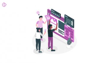
Using Colors, Fonts and Copy to Convey Emotion
Like I said before, emotions are very complex things; for example, if you ask people what word they associate with the color, say red, most may say danger or anger; but some may say love! Which is why you cannot rely simply on color to establish an emotional connect with the user; you need a lot else, like the right imagery, appropriate copy (words) and so on, in addition to colors.
- Color – this is a good place to start, to establish a baseline connection, but just remember that what you associate with a particular color may not be what the user associates.
- Faces – using images of people displaying the emotion you want to convey, is a powerful tool. You’re hardly likely to feel sad when you see an image of say, a laughing child.
- Language – the words you use are as important as the imagery; they are the final cues that help you to convey to the user exactly what you want to. For example, if it’s a fun and festive emotion you want to evoke, “ho ho ho! Merrry Christmas folks!” might work better than “We wish you a merry Christmas”. Again this depends on the audience you’re designing for.
Conclusion
Is emotional UI the future of UX design? Like it or not, emotive UI is here to stay. Though showing emotion in your design has a certain amount of risk, it is still worth it when you get those emotional responses from users coming in. Displaying your personality in your products or brand is a powerful way to connect with your audience, and to get them to empathize with you. Human beings like to connect with other humans; businesses after all, are just collections of people. So what’s the harm in portraying that?
Another reassuring factor is that the spectrum of human emotions, according to Sherine Kazim, will not change; people have a ‘finite set of emotions and there will never be a Sadness 2.0’. This is in a way, great because it means we only have to work within those limits. As designers we need to understand the entire spectrum of emotions and the intensity dissipation of each; only then will we be able to develop products with ‘personality’.
So yes, emotional UI is definitely the way forward as far as user experience is concerned; and it’s not just a single emotion, like happiness or delight, but the entire range of human emotions that the designers will have to account for.
Acodez IT Solutions is a UI web designing company based in India, lending our services abroad as well. We know the amount of competition that businesses today face on the internet. At Acodez, our professional designers create top-notch websites to make your business the next big thing online. Want to know us better? Visit our website and contact us today.
Looking for a good team
for your next project?
Contact us and we'll give you a preliminary free consultation
on the web & mobile strategy that'd suit your needs best.