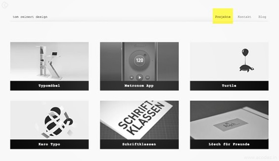
Website UI designs are built on a lot of repeated patterns as well as best practices, but not all are built following the rules of carved in stone. Designing is an art and a good or a bad design depends on the users.
There definitely are guidelines which have been derived from the fundamentals of design which aid the designing professionals in training themselves for building layouts that are good and liked by the users too.
The white space in Web/UI design is a tricky concept as it deals with the larger concepts such as positioning of the content, balance as well as the composition. The value of the White Space in web design depends mainly on the current situation as well as the purpose for which the web page is being developed. That’s why the value of White Space is mostly subjective as they are based on the layout of the website itself.
However, it would be quite exaggerated to say that all the values of White Space are considerable. Appropriate White Space values need to be stated from the eye of the user. The pixels as well as percent matter only relative to other things on the web page. Thus, once you have recognized the poorly crafted White Space, it would become very easy to understand the reason for its poor structure and also the solution for fixing it.
First of all, let’s have a look at the common issues with the use of very little to quite a lot of White Space in web/UI design. These are only the generic idea, but they do relate to almost every website. Then we would discuss a few solutions for helping the designers to improve their skills as well as their process of creatively designing.
Perils of insufficient space

When there is not enough space on the page, the elements look cramped. This is not as good and looks very filthy visually.
The users should be able to comfortably read as well as understand the text. White Space makes this happen. But, you need to keep in mind that just giving White Space between the texts, but even between the paragraphs and full-content sections is important.
It would also not look good to keep the content sections very close to each other. White Space needs to be liberally used in every part of the website.
The visual hierarchy dissolves when you do not allow sufficient White Space in a web design. When things are cramped up together, it becomes very difficult to understand the heads and their paragraphs. It could become even more difficult to understand the ending as well as the beginnings of the paragraphs which would be quite unpleasant for the readers.
A big picture of the hierarchy order creates the sense of easy usability. The users would not know the technical terms for the headings, navigations, sidebars or the carousel widgets. But, they need to at least visually locate the placement of the elements from the layout overall. Even if they do not know the exact meaning of these terms, they should be able to at least visually understand the purpose.
Without sufficient Whit Space, the areas of content would simply break-down and mix together into a shapeless blob.
The perils of extra space

On the contrary, just consider the impractical nature of using extra and unnecessary White Space in web design. Extra White Space creates a low info density of the web page. This means that the layout offers less info as opposed to the expectations of the users. The content is placed too far all throughout the sections and the visitors do not have a choice but to just keep scrolling.
Especially, the mobile users would very annoy since they would be viewing the page on the small screen.
The low density of information also hampers the hierarchy of the page. When the content is spaced out too much, everything looks fragmented. The visitors are not sure about the layout of the page as there is a lot of space between the content. Even with very less content on the page, you need to design your layout with proper sections which are close to each other relatively so that you can communicate a relationship between the interface elements.
By simply looking at some websites, you may train yourself to locate the values of White Space on command. You should start focusing on the bigger agenda, such as full website composition and the White Space found between the content. Most of the website designers develop the layouts of the website focusing on these web page components first. Once the bigger elements look appealing, they move to the small detailing like visual White Space as well as the textual White Space.
It is quite unfortunate the White Space depends mostly on the genre as well as the content of the website. There is no simple way of understanding the right amount to be used. The purpose of White Space needs to be understood. Over time ideas become ingrained in the mind.
Mastering the White Space in website or UI designs

But, since it is a very subjective art, it becomes a little to do it. But, keeping a few important things in mind will help you in this regard.
As it has been rightly said practice makes a man perfect. So, just go through the work of those people who have been in this industry for quite some time now. They would definitely have better knowledge as well as experience than you.
Research on the internet and go through some blogs as well as forums. Study some examples and point out the areas that look visually good as well as the areas which look bad. This will give a better idea of the layout.
If you liked this article you can check out this too Blurred images in web design and how to make them work?
Let us know what you think about this article, If you want us to assist with your design issue let us know. We are one of the leading web development and web designing agency in India. You can Contact us +91 95 44 66 88 44 here. We have a team of best ux designers in India that can cater to all your requirement that you are looking for.
Looking for a good team
for your next project?
Contact us and we'll give you a preliminary free consultation
on the web & mobile strategy that'd suit your needs best.


