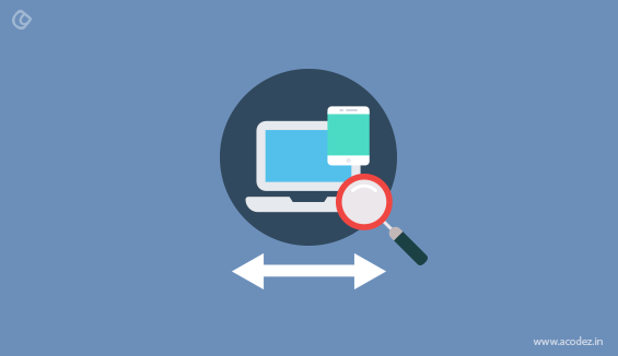
Responsive design is essentially including in elements of design that enable a page to respond to the screen size, and gadget, to see that page. Rather than a mobile site, with its own URL, the URL is simply the same, and the page reworks to fit the screen. This is quite important for various reasons. While one of the important reasons for search engine optimization is responsive design, the positive effect on user experience is the essential advantage. Speed and visual appeal will be of greater benefits for the experience users too.
Originally, responsive design was just about fitting another screen size. It was nothing more, and nothing less. Most cell phones had comparable estimated screens, and the main tablet worth designing for was the iPad, which had only one screen measure. Presently we are seeing distinctive measured screens on cell phones and new tablets that are as much as two inches greater or smaller than their competitors. Design components must incorporate distinctive screen sizes to guarantee a uniform user experience across all devices rather than simply planning for one gadget.
Responsive Design is not About Devices
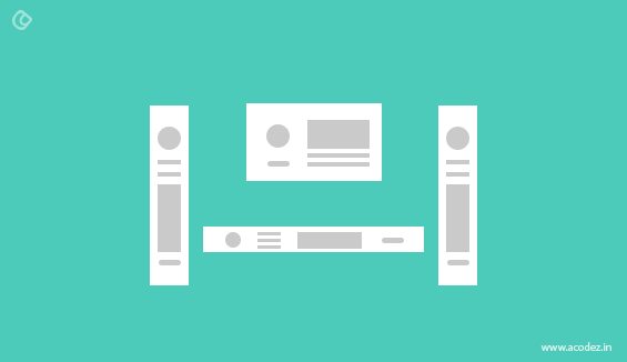
Getting a page to render appropriately on every gadget is vital, yet particular components on a page are likewise important.
Responsive plan has neglected to consider essential components on a page like columns and advertisement placements. Moving sidebars and preserving menu placement to fit content onto screens is essential, yet pages need to keep up remarkable plan components and their capacity to adapt.
Still Responsive Design is the Future
Responsive website architecture surely has some imperative improvements to make. While it has imperfections, it is a ton superior to dedicated mobile websites, plug-ins and different workarounds that are frequently executed with an aim to make a site mobile-friendly.
Responsive web design (RWD) has turned into the standard for anyone who needs to make a good presence on the web. With the progression of time, best practices, guidelines and layout standards have been normally made, executed and acknowledged by most web developers and designers.
How will be a Responsive Design Analyst is Considered?
Each task is not quite the same as all others, and as a rule the main characteristics are unique. In this way, the architecture and design ought to be exceptional as well. This is the primary motivation behind why standard guidelines of responsive design doesn’t work for everyone, and a profound examination of each project is required with an aim to take full benefit of responsive web design. Now, another position may assume an important role: every project needs a person who can investigate the content and structure and help in finding a balance between the treatment of data and responsiveness.
A Step Closer to Awesome UX (User Experience)
One of the key difficulties for any responsive design analyst is the making of accurate structures to reduce or avoid data that could really have the effect. In order to keep your most recent post on first, there is a propensity to expel alternate containers from the primary column of the desktop format when contracting to fit the smaller screens. For the most part, such other containers incorporate data of your main advertisers: no sponsor might want to see their advertisement going out from the main shot of the site — that isn’t what they are paying for, is it? Consequently, a planned content placement is a must in the responsive design process.
It is a fact that that responsive design has been advancing because of the consistent improvement of gadgets with access to the web and the need to show the exact layout of the website on those distinctive gadgets. Without losing that sight, it’s an ideal opportunity to begin giving more significance to content placement and its effect on viewers, but this work can’t be done by a single person — it requests a particular individual or group, in fact, set to break down and consider a lot of factors abridged in target, content type and in addition structure and importance of the information to show.
Moreover, such groups or people must have the capacity to make an exact set of structures for each resolution and have clear and effective communicational skills to express their thoughts and structures to the design and development groups. This will help in giving the project a responsive design plan and a strong content placing which is flexible.
Read more about user experience design here
How responsivity analysis is related to content choreography?
So do you know what content choreography is?
It is nothing but giving more importance to content while designing responsive layouts. This was introduced by Trent Walton in 2011.
One of the initial steps of this idea is to set up content priorities, and once that is done, content may begin moving once again the design. You can see this basic approach which embodies precisely how structure and progressive system is broken and content is revamped on the premise of need.
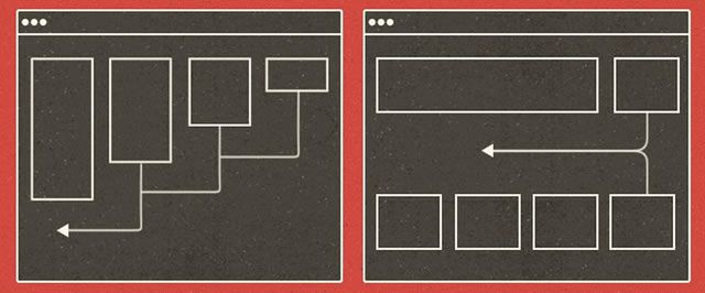
Source: https://speckyboy.com/
Utilizing this technique, it is not important to place content horizontally in a same order when transposed. But it is placed following some rules that are preset according to the each content importance.
Thus in order to resolve the issue of predictable behavior of boxes when resizing to the resolution of mobile, content choreography can be used as well.
Let’s consider two phases: when the horizontally arranged content is transposed to vertical, the Ad will lose its privileged place and hidden on small screens before applying content choreography.
When it is applied and the horizontal arrangement is transposed to vertical according to its importance, as a result Ad has not lost its place and will stay on top irrespective of the resolution of devices.
Content choreography has been more advanced with responsive Ads and it is known as Stretch. Stretch is not just about changing position with relevance but also changing ads must have better appearance in smaller resolutions too to worth any foreground sponsor with their investment.
There is no predefined plan for content and each content must be treated in a different way and this is why special position must be implemented in web design process.
Acodez IT Solutions is a web design and web development company offering all types of web design and web development services to our clients across the world. We have more than 600 clients from around 60 countries. We are also a SEO agency based in India offering all kinds of digital marketing services at affordable prices.
For further queries, please contact us today.
Looking for a good team
for your next project?
Contact us and we'll give you a preliminary free consultation
on the web & mobile strategy that'd suit your needs best.


Hi Krishnan Kutty,
This is the first time I am visiting your site and glad to see the very useful and amazing content you publish here. Looking forward to come back and read more updates in future too.
Thanks for the good share.
Reji Stephenson
Hello,
I am a new visitor of your blog really your blog is very much informative. It will guide to new beginners designers. As SEO Agency point of view creative and attractive design is very much important to company promotion.
Thank you