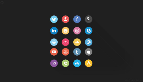
There is no doubt that mobile applications are becoming more and more popular among people of all age groups. The app stores contain some apps for almost anything from helping you find the best restaurants around to make purchases online. People can use these apps from anywhere around the globe. Also, you can use it while on the move to find real-time information.
From these hundreds of thousands of apps available, how to make your app stand out from the rest? Besides features & functionalities, the design of app icons also plays a significant role in compelling a user to download & try the app. This is why we stress a lot on creating stunning icons that capture the attention of users.
Here are some of the best app icon design tips to help you create awe-inspiring icons for your app.
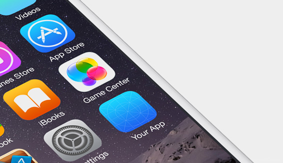
#1. Consider where the icon is going:
It is not that you do not know where the icon goes, but you need to design it with one thing in mind: the scenario under which the icon is required.
Every time you mutate it, ensure that you subject it to testing to analyze the size variations and how it will be displayed.
For instance, if you are designing icons for iPhone apps then the general resolution is 1024 * 1024 pixels, and these size resolutions vary from other devices.
Another thing that you need to consider is where your icon is the background in which your icons will be displayed.
The background color of the design in which the icon will be positioned matters.
Let me slip a icon tip: Take screenshots of the background for which you are designing the icon.
Then, design your icon on the screenshot. It will blend in well with its environment.
#2. What are the functionalities of the icon?
As you are aware two types of icons, exist. Some are functionality oriented to be placed on an interface. Also, you might have designed icons that are appealing and serve aesthetic purposes.
I have seen designers design icons that are neither completely beautiful nor completely serve the functional purpose.
These icons tend to fall in between the two.
One reason experts recommend that you need to understand the functionalities of your icon so that you can align it accordingly as a beautiful one or design it to serve more of a functional purpose.
The appearance of your app needs to convey to the user that it is the one they are looking for with some idea of what it would do.
It should attract the user’s eye. So that means your app icon should be awe-inspiring and also stand out of the crowd.
App icon design tips for you:
1.) Use a minimal color palette.
2.) Also, let the design convey what the app does.
Say no to complexities:
#3. Simplicity should be your policy:
Keep your icons simple and let it be a pleasure to take a look at these. Regardless of whether you are designing it for a functional or aesthetic purpose, never make these complicated.
Bridge the gap between the message it conveys and also the design being used to showcase it.
If it is not able to manage the balance between being functional while striving hard to be realistic, don’t make it something that people will think is a kind of illustration.
#4. Stick on to design limitations:
There are sometimes design limitations that you need to consider before you design your app icon.
Many a times you will be asked to design your icon aligning it with specific color scheme or design formats.
Here are some of the general recommendations:
You can either include same corner radiuses, a global light source for reflections/shadows, and specific stroke widths for outlined icons.
#5. Consistency:
If you are designing multiple icons at a time, ensure that all are consistent. If you use different designs, color palettes, and format to design each of them, it will appear out of different boxes.
You do not want these to look indifferent.
#6. Readable Icon:
An icon should be readable, i.e., it should be able to convey to a user what it stands for in a matter of seconds. It should be visually legible & help people recognize the brand even if it is quite small. A good icon should be easy for people to remember & connect with the brand. It should not be complicated & confuse the users.
#7. Icon, Not Just Another Image

Many icons have images and texts on them. Some of them are very popular among the people too. But the key here is know how to blend the text and images in the icon; that reflects your branding. A good idea is always to go for graphical representation as they look good and go with the flow.
#8. Try to Avoid Words
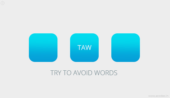
Try to avoid words when you design icons as it might not be legible to a user due to the small size of the icon. Use of a letter or 2 can be a better idea if it can relate to your brand without confusion. A word or a text can be time-consuming for readers.
#9. Use Simple Logo

While designing icons, one of the most important keys to success is simplicity. Consider making use of symbols that aptly represents your brand. Simple icons are more effective & easy to identify.
#10. The Scale

Whenever the concept of icon comes, most of us tend to think of it as a small representation. Sometimes icons are used for advertisement and in that case you need to provide icons that look brilliant even when scaled up to size. The best solution is to build it big & then scale down to whichever size required.
#11. Use Vector Format
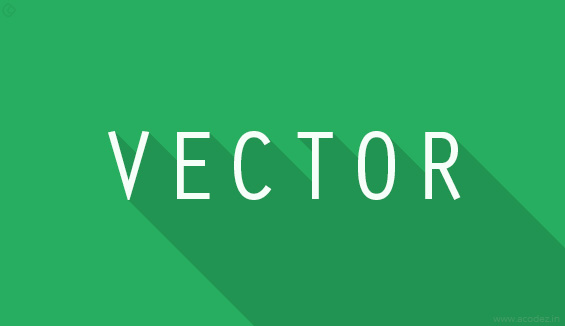
Vector format provides you an extra arm for editing. When you work on an icon design, it is very much advisable to create the icon in vector format. Vector format enables you to create icons that fit multiple devices without the need to create a lot of individual images.
#12. Think Out of The Box

Always think out of the box to make your icon design different and recognizable among thousands of other apps. Come up with a great idea that matches your branding requirements & execute it following the tips we discussed. Fresh ideas always have takers.
#13. Start With Monochrome
While designing icons, it is best that you start with monochrome. If your design looks good & conveys the message without color, it means it works. Now consider adding some colors to make it even better.
#14. Design Square
Make sure you design fits well into a square shape. It doesn’t mean that your design should be the exact square, but more or less having equal height & width, which is the most commonly accepted aspect ratio for icons.
#15. Colors:
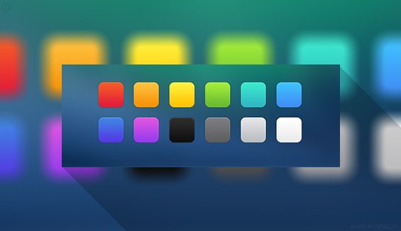
Colors provide life to icons, and that is why colors are important while designing icons. For some brands, colors alone represent the brand. Vibrant colors attract user attention. It makes the icon shine in any background. So the key here is to select that vibrant color that matches & complement your branding.
Now you know what makes a perfect icon design.
How do you design icons? Do you implement any special icon design tips? Share your thoughts, comment and feedback with us.
Acodez IT Solutions is a web development company based in India providing web design and development services across the globe. We also provide the best digital marketing solutions in the industry.Trust us for we have done this before and know the importance of a good IA for your website. Among many other companies, our design works are noted for being able to deliver best user experience designs in India.
For more details, contact us today. We will provide you with a free quote upon request and trust us for we provide the best of web development and SEO strategies in the industry.
Looking for a good team
for your next project?
Contact us and we'll give you a preliminary free consultation
on the web & mobile strategy that'd suit your needs best.