Gone are the days of static websites and even the rest like the carousels, and the ones with hamburger menus. Though, all these seemed to impress and weave magic in the minds of people in the early days of web or maybe until a decade or so back, it was not until recently that people actually started realizing and differentiating between things that they need and need not.
Landing pages are the soul of any website design. Poorly designed landing pages are equal to grossing zero business. So, when you land up yourself on a landing page through an impressive ad, just to find yourself in an annoying place, how would you react? To be honest, you would never return. You would leave the page as soon as you can and then, find business elsewhere.
Are there any parameters on which you can align your landing page? Of course, there are:
- It should be in synch with the ad that directs to the landing page.
- Provide the promises you made. (Since, this is the reason why they are here. Why annoy them?)
- Let it be impressive.
What happens when you don’t provide what you promise?
- People lose interest in you. They vow to never return.
- Increased bounce rates, which will spoil your reputation in Google’s eyes.
- Reduced sales, which will lead to loss in sales.
- Negative opinions start spreading like wildfire ruining your reputation amongst all the audience.
How could you solve this? Remember, when Math taught us all problems come with a solution, so does your landing page.
An appealing user experience with an excellent platform to directing your users to fulfilling their user goals is the door to conversion that starts at your landing page.
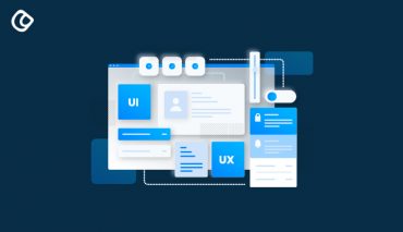
Why should you care about user experience?
Weird question! You are doing business for your people, so if you do not provide them with a great user experience, how do you expect them to convert them into sales.
So, designing must be always intended and aimed at your people.
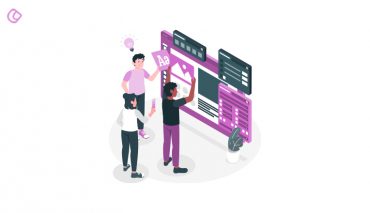
As a designer, everything starts at you and ends at you. It’s in your hands to take your people to the product. And, the experience that you provide them with while on their journey is something that matters. Their level of comfort, the interaction level, the ease of communication, problem solving efficiency and above all whether the product satisfies their needs, marks your success.
And, the exciting part is that all this has happen within a short span of time of just 50 milliseconds that you have. This is where you can utilize your skills and talent and design a great landing page that people can relate to.
What kind of a landing page are your people expecting? No one knows exactly, but in a generic sense you could incorporate some of the above listed items to design an interesting landing page:
- Leads capture form that is clean, clear, and precise, and above all is secure.
- Eliminate distraction (e.g., navigation elements, etc.)
- Include enticing offers and compelling promises that actually are true.(A CTA that would not fail their hopes.)
- Finally, timely response and completion of tasks without no time or effort wasted on waiting.
This is just an excerpt. Here, we will examine all the UX factors that you need to be focusing upon to experience an increased conversion rate:
1. Videos can be leading and misleading too, but you need to find a balance
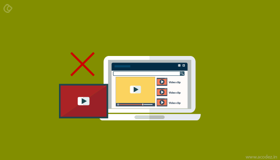
There are two kinds of videos here. One is the persuader video and the other is the explainer video. Most people do it wrong often. So, which one should you be using on your landing page?
How about a persuader video? What’s your opinion?
Now, some logic!
Persuader videos have real time impressions on people. They love to hang over when they could see some real life activity. These videos take them on a tour of how your product is designed to work and even you could include existing customer testimonials and how they found your product to be life changing. Explainer videos can be misleading; since these animations do most of the product promotion, which you could even include on your social media page.
We want real time human interactions to take place and this cannot happen unless you have real humans online. If you could get an existing customer to speak up for you and your product then, it could work wonders as this helps in generating trust. And, people trust it when others say!
2. Navigation: Is it good or bad?
Would you like to navigate or scroll?
One-hundred and one percent of people want to scroll over navigation, which is out of trend today. So, when there is no navigation, you do not have to be insecure about where you would include all the landing page elements and end up crowding the space above the fold with a lot of garbage. This happens because all those elements seem to be too important to be missed out. And, you really do not want to miss out on your customers just because you didn’t include one or two of them.
An excerpt from an observation from Click Tale’s user scrolling research history parameters reports that:
- Pages with scroll bar attracted more than 90% of page views, which is really impressive
- And, this accounted to more than 70% of scrolling activity
- The rest 20% accounts to scrolling from top to bottom, which is of course a positive sign.
People love scrolling. So, now again the ball is in your court. It all starts from how well you manage to convince your people and ensure that they stay there and while they are here they get some time to view the benefits and finally, they decide to click-through making your CTA a great success.
3. Visual cues
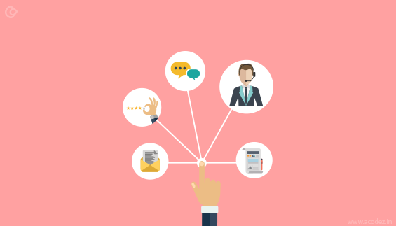
Otherwise, also referred to as the anchor tags, are the guide that directs visitors across your website to that location on your landing page, where you want them to be. These visual cues that could be anything including human sight or arrows all need to point to the CTA button, which is your door to conversion.
Try including anchor tags at the bottom of your page which will coax your people to scroll across and come down toward the end of the page.
This is how you could get your users jump from one point to another on your page through the links that you have. Make it easier and navigable for your users helping them find the treasure on your landing page.
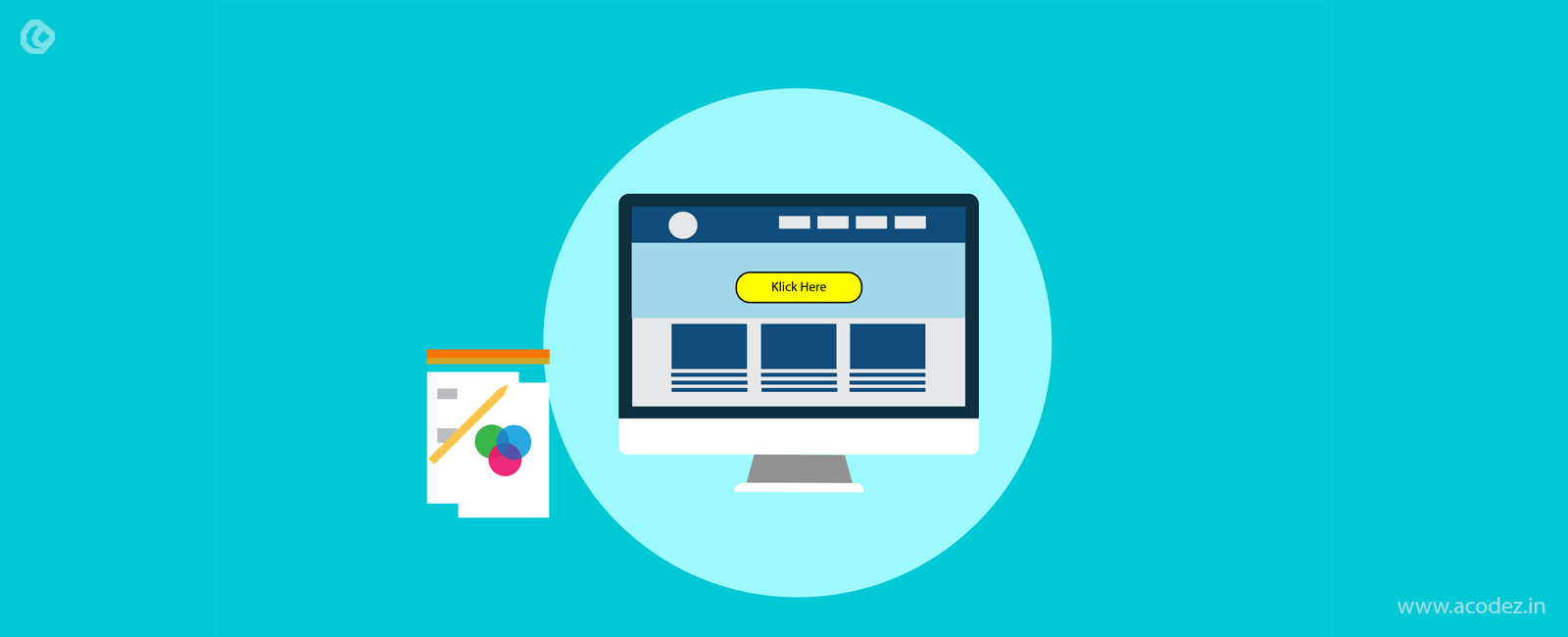
4. CTA buttons
The most important of all on a landing page is the CTA button. This should be something that people can relate to and easier for them to follow and stick. So, how could you ensure that it stays in their heart forever?
Color it in contrast to the landing page’s color. This way it will be noticeable and strike the eye and also, make it sticky so that it sticks to the mind of the visitor as and when they scroll.
A great viewing experience and excellent user experience is what matters the most when someone is at your website on your landing page. Give them what they need and they will return the favor as a courtesy for what you have done for them.
These are some of the simple things that you could jot down in your UX design diary which will help you with designing the next time you are designing a landing page.
Also Read: The Ultimate UX Design of the Perfect CTA Button
Do you need help with designing a great landing page?
We can help you.
Acodez is a web development company in India offering all kinds of web design and development solutions to our clients in India and abroad. We can also help you with SEO services which are mainly related to digital marketing and inbound solutions for a business that takes it to the wider crowd online. We are also considered as one of the best ui ux design companies in India by many rating agencies and we have also won several awards for our UX, UI designing works.
Looking for a good team
for your next project?
Contact us and we'll give you a preliminary free consultation
on the web & mobile strategy that'd suit your needs best.


Its right the landing page must be very interesting which can hold the visitor, otherwise the bounce rate will be very high. And thanks for sharing the importance of persuader video, I need to focus on it. I will insert a video on my landing page. The whole information shared by you is very helpful and important for good landing page.
Thanks a lot Rajeesh
User experience is the most important thing. If a visitor find your landing page boring he will definitely leave your page quickly. The content you shared in this article is very unique and applying this strategy on a landing page can decrease the bounce rate.
Thanks and please keep sharing these kind of articles.
nice website and content
Landing page is the most important factor in designing. yours tips are very helpful