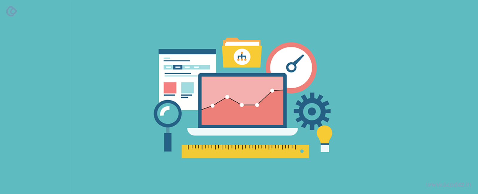
Visual perception and its implementation in website design
When it comes to designing websites, the knowledge of visual perception about how a user interacts with the website, how they feel about a website, and various other knowledge of such user behavior is quite essential. This helps ensure that the information that you wish to convey is properly communicated. The brain is quite a complex part of the body, and the process of how a human brain perceives visually is even more complex as various complex interactions take place based on prior knowledge, expectations, and goal.
In the numerous researches carried out in the learning process several of these favors the visual method of learning process with the help of certain deductions like:
- Visual information is processed 60,000x times faster than the textual information.
- 65% of the people are visual learners.
- 90% of the information that the brain transmit is visual.
It is due to this reason that various websites have shifted their focus to visual content like GIFs, infographics, and video-based content. The rising popularity of the same can also be contributed to the increase in the speed of internet and its wide reach to almost all the people.
Some of the tech giants like Facebook, Twitter, etc. have now shifted their focus to the image and video-based content to attract more and more users.
It doesn’t matter if you are using the theme or template, using a PSD file or are starting from scratch, the proper idea of the visual perception is quite essential. This helps you to design a visually aesthetic website without any hassles. The proper idea of the same can also help you in selecting the PSD designers, web developers, web developing companies, templates, and themes.
Benefits of a visually aesthetic website
A visually aesthetic website helps you in a lot of ways. It helps you gain more and more visitors and results in better conversions. It also helps in creating the brand awareness and also helps in SEO, impact bounce rate, and session duration thereby aiding into your website SEO.
A poorly designed website acts as the turnoffs for the users and contributes to being a major factor to tarnish the reputation of the company. Hence it becomes necessary that you design a visually pleasant website that caters to your visitor’s needs.
What makes a visually aesthetic website?
A beautiful website is comprised of a proper combination of the best images, videos, and text properly laid out in a beautiful format. However, the proper combination of the same cannot be pulled out successfully by the developers. To do so, the users must have a proper idea of the same. The proper choice of colors, images, videos, text, font, font layout, background image, etc. collectively contribute to a beautiful website. These must be properly chosen to make sure that you get the best-designed website. The images, text, videos, and colors that you choose for your website must be compliant with your website and must please the customers. To do so, you must have an idea of the customer base and their demographics. Based on the same, you can design your website to attract more and more customers.
Some advanced concepts for designing a visually aesthetic website
The website design is not just restricted to the proper combination of text, images, and videos. There are some other factors that need to be kept in mind to make a website look beautiful and appealing. A proper idea of how the humans view and are impacted is also necessary. Some of the most important ones based on the science of visual perception are mentioned below. If you take into consideration the factors mentioned below, you can rest assured that your website will appear pleasant to the users and further attract a large number of users.
Follow the Golden Ratio principle
The Golden ratio is the most popular mathematical number and is used by mathematician, artist, painters, alike. The impact of the golden ratio can be found in plants, flowers, and galaxies as well. The same rule has been applied to the construction of famous buildings, paintings, and several other such masterpieces as well. Some of the well-known painters like Leonardo Da Vinci and Michelangelo have implemented this in their well-known paintings like Mona Lisa, The Last Supper, The Creation of Adam and much more such artistic masterpieces. The same golden principle can be applied to the website design and apps thereby making it visually appealing. The use of images that follow this golden ratio in the websites also turns out to be quite appealing.
Proper white spacing
White spaces also play a major role in making the website look visually appealing. Both the lack and overuse of the white spaces may turn out to be problematic and act as turn-offs for the users. Hence it is necessary that proper spacing is used into the website to separate paragraphs, graphics, and other components of the website. This, in turn, makes the website look less crowded and facilitates the users to find out the content that interests them. This helps the users to visit the website again and again. It is also necessary that the white spaces are available in the images and the infographics that you use. This will help them to find out the necessary information quite easily.
Design websites based on the eye movement
The eyes follow the F shaped pattern while viewing as has been found out in various researches carried out. This same principle works while viewing the websites as has been confirmed by the heat maps of various websites irrespective of the industry they belong to. Hence it becomes necessary that you implement the call to action button in these areas as it gets the most attention of the visitors. It is also necessary that you lay out your paragraph, text, and images in the same way. This helps in the better interaction with the users and helps you to convey the information in a better and easier way.
Proximity
The idea of proximity turns out to be quite helpful in the web development process. It helps the users know about the related items as the related items are grouped. This helps to convey the information properly and avoid the clutter. The items that are unrelated to each other must be laid apart from the related ones.
A majority of the web developers use this knowingly or unknowingly. It helps enhance the performance of the website and achieve your goals.
Let’s imagine a clothing e-commerce website where the products are grouped where you can find out the dresses grouped into different categories based on the type of clothes, age, and various other such parameters. Imagine a similar e-commerce website that has the products listed haphazardly with no groupings. In case the number of products is same, the users will prefer to buy the products from the former as in the latter case they will have to scroll for a longer period and click on numerous products to select the product of their choice. In the former cases, the narrowing down helps to choose the best products with very few clicks.
Repetition
Repetition is one of the major standards of website design. The website must follow the repetitive components like color, shape, texture, font, typography, graphics, images, video, header, footer, sidebar, widgets, and much more such elements. These when laid out in a consistent manner, promote the brand. It also helps in better user experience as the users can find the elements in the same places. The same colors, font, and other such elements let the users focus on the information you wish to convey and not on the other secondary things like colors, font, logo, etc. However, it is also necessary to implement repetition with variation, as then it would become repetitive. A proper balance of the repetition and variation helps to produce outstanding effects. It also enhances the curiosity of the visitors and attracts their attention. This makes the user visit your website again and again. Let’s consider a website where the header, footer, menu, logo, etc. change places all over from time to time. As a visitor, you may become annoyed as the major portion the time; you will spend looking for these. You will not be able to focus on the website, and there are chances that you will never visit it again.
Alignment
A proper alignment is an integral part of the website. This introduces order and conveys harmony into the website. Different web page elements when brought together to form a balanced blueprint conveys the information in the best possible way. It is necessary to keep in mind the F shaped eye movement to lay out the most relevant information first. This will help the users to get an idea of the relevant information quite easily and fastly. Thus the user can be able to take the decision and carry out the work that you intend them to do. While deciding the alignment of the website, it is necessary that you emphasize the design, structure, and organization of the website as well.
Summary
The knowledge of visual perception in website design is quite essential. This knowledge will help you to design a website that is visually aesthetic and yields better conversions. This helps you in various aspects of web design whether you are choosing a theme or template, or are planning to design a website from scratch. One of the best parts of using this method is that this scientifically proven method has been used by many websites all over the world and you can implement the best performing techniques in your website to get the best conversions.
Acodez is the best web design company in India. The latest web development methodologies are implemented to provide the best user experience on the website. Over the span of 6+ years, we have worked on more than 600 projects out of which some are the well known prestigious companies. Complete web solution is provided to help them achieve their desired goals.
Looking for a good team
for your next project?
Contact us and we'll give you a preliminary free consultation
on the web & mobile strategy that'd suit your needs best.