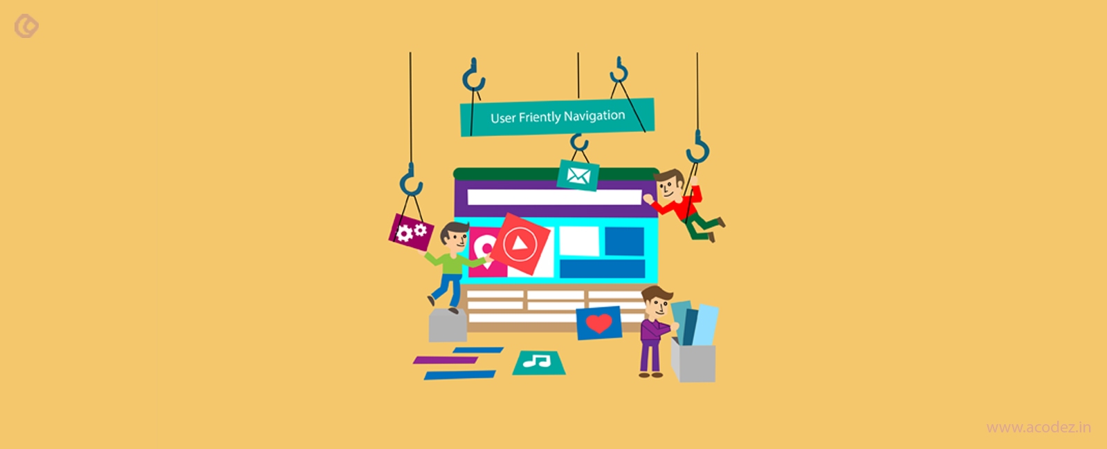
A website is the treasure trove of information for the users and provides them with an idea of your organization and your business. Apart from that, it can also help them to facilitate the sale and purchase of the item, get information, and get entertained. No matter what the intended output of the website, it is necessary that during web interface design you provide the best user experience to your visitors. Many factors contribute to the user experience of the visitors like site layout, speed, images used, the color used, the functionality of your website, navigation, and various other factors. Out of these factors, navigation also holds a critical position that contributes to the user experience of the website. It is quite essential that a primary focus must be laid on the website navigation. It is because the site navigation allows the access to the users.
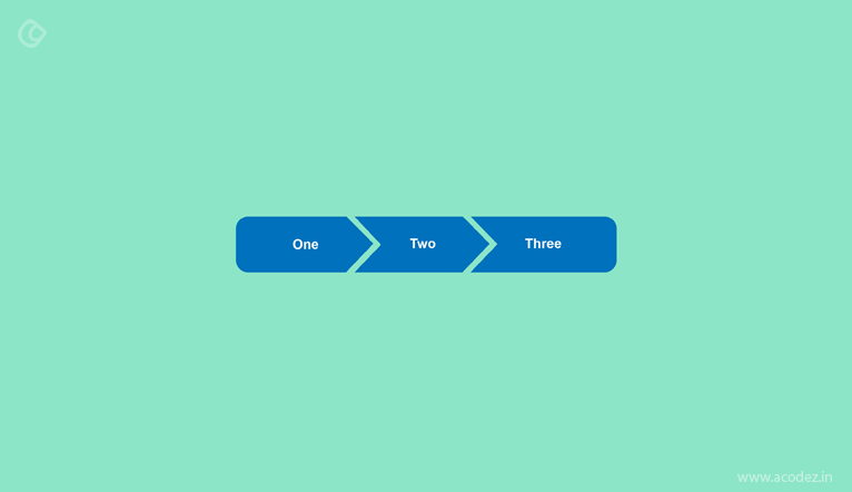
These are the links which help you easily navigate from one page to the next. With the advancement in various web technology, the navigation too has undergone some changes. Here are some of the best modern website navigation practices that you can implement and make sure that you can get the best results for your website.
Why is navigation important?
There are many ways in which a user can visit a particular page of a website. These are:
- Visit the web page directly by typing the link in the browser window.
- Visit the website by search engines.
- Clicking the links.
With millions of websites available it is quite difficult that you remember all the site that may turn out to be helpful. Many websites compete on search engines to get to the top for a keyword. Even for a reputed website, it is not necessary that it ranks at the top in the search engines that they intend to target. By clicking on the links, a user can quite easily navigate between different websites. In a recent research carried out, it has been deduced that 70 percent of the users start the task by clicking on the link while 30 percent make use of search.
A proper navigation of the website is quite helpful as it helps a great deal in the search engine rankings. The best part of this is that, it enhances the number of clicks per views, daily time on the site, page views per visitor, and various other such websites. This also enhances the domain authority and page authority of the website. Apart from that, it also increases the ranking of the website.
In the case of the e-commerce website, these help in the increase of sales as the users can get the products that interest them. It is because the products can be easily be browsed and a proper decision can be taken on which product is to be bought. Hence it becomes necessary that you implement a proper navigation on your website.
Proper menu implementation:
Menus are quite essential as it helps you to navigate to the different pages of the website. These can be located in different locations like in the header, footer, sidebar and various other locations. There are different types of website menu like the interactive menu, static menu, hamburger menu, drop down menu and many more such styles. The menu with big text and images can be used in situations where you have the smaller number of menu items. In case if you have a long list of menu items, choosing the small menu items turns out to be quite helpful.
One can choose any type of menu as per their requirement that will fit into the website. Which menu to select and how to choose is entirely dependent on you. However, it is necessary that you choose the menu that works the best for your website. This includes the choice of proper color combination, font, and design that is easily visible to the users and must not look absurd. The menus must be properly used to introduce the navigation on your website to the users.
In the header menu, the key sections of the website must be added to the navigation menu. This can help the users to get the information of the website and your business. The header menu can be either fixed or floating. Various websites have subheaders as well. In such cases, having an aesthetically drop-down menu turns out to be quite helpful.
In many cases, the footer menu is the repetition of the header menu. In the footer menu, such links must be provided that the users must want to visit. Apart from the relevant links of the website, you need to add the contact information, about the website, and other relevant information.
Mobile-oriented navigation:
About 50% of the web visits comes from the website. The display of the website on mobile differs from that when you are on a PC. In such a case, it becomes necessary that you also lay important focus on the navigation of the mobile layout of the website. A proper focus must also be laid on the mobile layout. However, you must also keep in mind that the mobile version must be similar to that of the web version. It is also necessary to keep other factors in mind like visual interface, site speed, and must be able to make use of the interaction capabilities of the different devices.
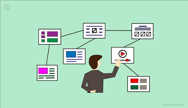
Breadcrumbs, categories, and tags:
Breadcrumbs, categories, and tags is another navigation technique that is applied to the websites. In many websites, the pages are arranged in different categories, sections, tags, subsections, parent pages, child pages, etc. In many cases, these help the users to browse to the different sections of the website. These help the users to understand the structure of the website and can also help you to browse to the different sections of the website with ease. Various categories and tags help you to browse content as per your interests. These can improve the navigation on your website. As a visitor is interested in your content, these can help them to find out some other related content.
Related content/related products:
Various websites display the related content and related products at the bottom of the page or on any other location. Apart from these, blogs use various content like latest post, featured post, most read post, most popular post, author bio, editor’s picks and various other such links. This too helps enhance the navigation of the website as the users can find out the content and products that intrigue them. Different users may have interest in different content that you have to offer. It is important to identify the content that interests your users and bring those links into the forefront.
Make necessary links visible:
A website may consist of a number of pages. It is necessary that the relevant links must be placed at appropriate locations. If your pages are not available in the form of links, these may not be able to reach your visitors that you intend to. Hence, the links must be provided in the relevant locations.
Links must be appropriately highlighted:
A majority of websites use links in their content. In such a case, it is necessary that these must be clearly outlined with the help of proper colors. This helps the users differentiate between the links and the content. The color for the links must be consistent with the color of the website.
Clear interactions:
In a website, many of the items are interactive while most of them are not. A new user has no idea of which of the items are interactive and what is to be expected of them. This can be easily tackled by making the menus with clear interactions.
Hover interactions:
In a number of websites, hover effects are applied. The mobile version of the website does not support the hover in a majority of cases. Hence it is necessary that such hover effects must be applied that works both on the mobile version and the web version.
Maintain consistency:
Maintaining navigational consistency is quite necessary as it makes easier for the users to navigate on the website. In this case, the links that belong to a similar category must be categorized properly. This helps users to navigate easily as the similar sections are arranged in properly. In this way, the users can decide where to look for for a particular element and they do not need to waste time researching for the location of the content on the website. If some elements do not fall into the category already mentioned, it is wise to create a new group for the same. You can also rethink the site hierarchy and then fit the content.
Reduce broken links:
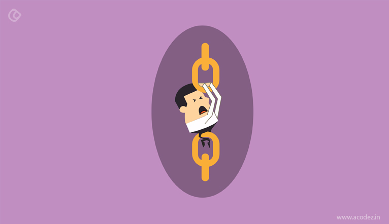
While browsing, you must have come across certain links that do not work. When a user clicks on such links, and nothing happens they feel confused and frustrated. These in turn act as major turn offs for the users. Hence it is necessary that only those links must be included in the menu that redirects you to different pages and sections of the website. Each of the links must be appropriately redirected to their respective pages and sections. This helps to prevent confusion and helps in the navigation. Any broken links if available must be immediately fixed.
Implement heat map:
Heatmaps of the website can provide you a better idea of how the users interact with your website. After getting the response from the users, you can then decide where you need to place the menu to get the best results. Apart from these, you can also test the different navigation layout and then decide which one works the best for you.
Summary:
By making use of the tips mentioned above you can rest assured that a proper navigation system is provided to your users and provide a better user experience to the users. Apart from the above-mentioned steps, it is necessary that you remain updated with the latest technological trends and innovations taking place. This will help you to ensure that your website remains updated with the latest trends. Apart from that, it is also necessary that you have an idea about your users and their familiarity with your navigation.
Acodez is a leading web design company in India, who has bagged many pretigious awards and also recognition for best web designing work. We create unmatched design to and deliver website that are beyond the expectations of the newly emerging or existing online entrepreneurs. Be it a site revamping or creating a new one, we offer exceptionally good looking and funtionally advanced websites.
Looking for a good team
for your next project?
Contact us and we'll give you a preliminary free consultation
on the web & mobile strategy that'd suit your needs best.