When you are creating a particular website, you mainly focus upon those aspects that help in highlighting your designs, which will indirectly attract your people. For instance, images, colors, fonts and pictures get the major attention in any web designing task. However, most of the times there are certain invisible parts that play an equally important role while the aforementioned aspects still share a major weightage.
The negative spaces as some people refer to it – these “whitespaces” are the space left in between the elements – and are overlooked as a spectrum of relief by the web designers. They think that the whitespaces that originate from the left over empty space are a useless part of the designed website.
Nonetheless, that is not true. Whitespace can be filled with certain contents – the logic behind this is to get your people spend more time on your website. Wondering, how – whitespace is magical as it has the power to set a tone for the affects and designs that directly influences the usability of the site powered by you.
What is whitespace?

If you ask me, what whitespace, as a non-technical person, is I would say that it is the blank space you see on a webpage. But, experts have a better definition for the same.
Logically, whitespace is the space that has no print over it, while the entire website has been taken over with contents that include design and text, and all the other components. Such a space does not have the ability to print anything when you try typing anything on it. For instance, carriage returns and tab space.
These are the two kinds of whitespace characters that are commonly implemented by most of the web designers.
Whitespace also refers to the space between the elements that helps them to separate from one another. This consists of the space included on the edges of fixed-width layouts, margin spaces, padding around pictures and text blocks that comprise padding and margins.
Whitespace also includes spaces present in between the lines of texts and letters in words.
What color do you think whitespace could be in? It could be black or white or maybe some other color?
You must always remember that whitespace need not be necessarily white in color. If the color of background is black, then the whitespace will also be black in color. A more simple definition for whitespace is that it is the area of your design, where no elements are placed by the designers.
Why do people disapprove the use of whitespace? Have you wondered ever?
I have been keen on finding out why people disapprove whitespace and here, is what my research says:
The fold concept
There are people who say that users do not scroll below the fold. This topic is controversial and the internet community is still doubtful about whether people scroll above or below the fold.
So, what happens at the fold
Most designers ensure that the design is crafted such that all the important content along with the other components are positioned above the fold.
But, as we know people do not like it when a lot of things are crowded in together in a single place. They do not read what you have got for them when their eyes have to take a lot of strain that comes with overcrowding. Ultimately, they leave your website.
So, how do we sort this out?
Let us believe that people are only interested in the components above the fold. What do you do now?
Let us add the most important elements, including our content and the call-to-action (CTA) above the fold, and insert some whitespace to highlight these.
Push down the remaining non-important elements below the fold.
Undoubtedly, people will notice the elements that are present above the fold and they will take the necessary action. This means that the whitespace above the fold is not a disaster, but a blessing.
Now, you know why whitespace needs to be included above the fold.
Simplicity
When it comes to simplicity, this forms yet another topic of debate on the web.
A lot of people say that keeping your site simple is good for its health. But, there is another section of people who do not mind whether your site is simple or complicated because all they want is information. A good example could be the comparison between the Google and Yahoo sites.
Google is simple, there is no crowding of data or images; but Yahoo brings to you all the information that it can manage to find over the web and is very much crowded.
If I ask you which one would you prefer – my audience would be divided into two sections. One would go with Google and the remaining lesser population would prefer Yahoo. However, let us say the whitespace has some charm around it that cannot be ignored. Don’t you agree with me? Undoubtedly, your answer is an yes.
Most of us prefer Google for the same reason and one of the reasons maybe many among us do not check out Yahoo pages when in doubt.
While we are discussing the use of whitespace across website designs, there have been a lot of controversies in the world of web designing that support their implementation and there is also another group of experts who do not approve of whitespace.
I will share the details of what I have found out from my research of whitespace across the web:
Effects of whitespace on web designing
1. Legibility
At micro level, whitespace can greatly assist one to enhance or destroy the legibility of a specific web page. If you have some web content over your website, then you must ensure that it has miniature font that consumes minimal whitespaces. You can conveniently increase the tracking or leading for making the text readable.
If you have a look at the print version of some Wall Street journal’s, then you would notice that the paper has multiple columns of texts with minimal amount of margin spaces in between them. However, the margins and spaces that are used in between the columns make the texts readable enough.
2. Tone
At macro level, whitespaces help in conveying a sense of down the market quality and elegance for the created design. The greater the whitespace the better and sophisticated will the design appear.
If you ever had a look at the advertisements in any of the popular magazines, then you would have noticed that most of the ads comprise of minimal volume of negative spaces. The texts are small enough to leave maximum space for the images and other components of reader interest. Apart from a magazine design, you might have had spotted blocks in direct mail ads. They have multiple images and very petty negative spaces.
3. Comprehension
What kind of a page do you like to read? Honestly, speaking our attention is grabbed by a page that has a fair amount of whitespace between the paragraphs and sentences.
Now, think about this – would you like to read a page that has no spacing left between the sentences and paragraphs.
Even, if we try to read such pages for the subject interest that coaxes us to go through it, after sometime we feel annoyed for no reason as it creates a lot of strain to the eyes and head.
Whitespace between texts and paragraphs gives the reader a better understanding of what they are trying to read and understand.
4. Grabs attention
It automatically helps to grab the attention of the people who visit your website. If there is any specific component, such as an image or a text that needs the reader’s attention, then, choose to put some whitespace around it.
You will have you reader’s attention.
It is very useful, when you are trying to sell something on your site. For instance, if you have a product image or maybe if you are selling a discount coupon, add some whitespace around it and you will easily attract the people’s attention.
5. Interaction
There is evidence that whitespace helps in speeding up interaction.
How –
It actually helps the user to know where they should be going and what action to take next as we discussed in #4.
Whitespace leads the users to their destination, while giving them a reason to act.
When you have a lot of things stuffed into your website remember you are knowingly or unknowingly annoying your visitors.
This will frustrate your people to the core and they will end up deciding to leave your website and hang on with the site of your competitor.
Try including lesser elements and also, highlight what is important. This you can do by including whitespace around the important elements.
This is one of the recommended ways to ensure that your website design will not distract people and attract their attention toward things that are important.
6. CTA’s and whitespaces are closely related
As we have already discussed in #4 and #5, whitespace plays a major role in grabbing attention.
So, when it is implemented around a CTA that needs user or visitor attention, don’t you think they will be tempted to take an action?
A designer who is experienced at designing great links and tabs that grab user attention by implementing graphics and flashes is great at work, but to add some cream to the cake, you can ensure that your user will have his attention by allowing whitespace around these important objects.
7. Color of your whitespace
Whitespace was once called as negative space and still people refer to it as the same.
It is the space where there is no content.
And, when there is lesser content, how do you ensure that people stay on your website.
The colorfulness of your whitespace will attract attention. Trust me it works, and this is one of the tried-and-proven techniques that people have been implementing so far.
8. Lesser distraction
When you do not have many elements to include on your website, what do you do?
Include whitespace on your website.
Rather than annoying your people by including a lot of components on your website, it would be good if you can reduce these extraterrestrial elements and add some whitespace around the elements that you are including on your website.
9. It looks clean
When you add a lot of elements on your website, it is fine, but unappealing and also, doesn’t look trustworthy.
It looks like you have been adding up many things to ensure people will like your site and whatever you are trying to do.
Also, your site takes a lot of time to load when there are a lot of components added to it.
Why make it overloaded under stress when you can have it done with ease?
Keep it clean and add a few elements to your site and the remaining space will be taken up by the whitespace that will attract attention.
This means that whitespace is an integral part of website UX.
Let us see how whitespace inclusion can help with website UI.
Website UI designs are built on a lot of repeated patterns as well as best practices, but not all are built following the rules of carved in stone. Designing is an art and a good or a bad design depends on the users.
There definitely are guidelines, which have been derived from the fundamentals of design, which aid the designing professionals in training themselves for building layouts that are good and liked by the users too.
The whitespace in Web/UI design is a tricky concept as it deals with the larger concepts such as positioning of the content, balance as well as the composition. The value of the whitespace in web design depends mainly on the current situation as well as the purpose for which the web page is being developed. That is why the value of whitespace is mostly subjective as they are based on the layout of the website itself.
However, it would be quite exaggerated to say that all the values of whitespace are considerable. Appropriate whitespace values need to be stated from the eye of the user. The pixels as well as percent matter only relative to other things on the web page. Thus, once you have recognized the poorly crafted whitespace, it would become very easy to understand the reason for its poor structure and also the solution for fixing it.
Firstly, let’s have a look at the common issues with the use of very little to quite a lot of whitespace in web/UI design. These are only the generic idea, but they do relate to almost every website. Then, we would discuss a few solutions for helping the designers to improve their skills as well as their process of creatively designing.
Perils of insufficient space

When there is not enough space on the page, the elements look cramped. This is not as good and looks very filthy visually.
The users should be able to comfortably read as well as understand the text. Whitespace makes this happen. But, you need to keep in mind that just giving Whitespace between the texts, but even between the paragraphs and full-content sections is important.
It would also not look good to keep the content sections very close to each other. Whitespace needs to be liberally used in every part of the website.
The visual hierarchy dissolves when you do not allow sufficient whitespace in a web design. When things are cramped up together, it becomes very difficult to understand the heads and their paragraphs. It could become even more difficult to understand the ending as well as the beginnings of the paragraphs, which would be quite unpleasant for the readers.
A big picture of the hierarchy order creates the sense of easy usability. The users would not know the technical terms for the headings, navigations, sidebars or the carousel widgets. But, they need to at least visually locate the placement of the elements from the layout overall. Even if they do not know the exact meaning of these terms, they should be able to at least visually understand the purpose.
Without sufficient Whitespace, the areas of content would simply break down and mix together into a shapeless blob.
The perils of extra space
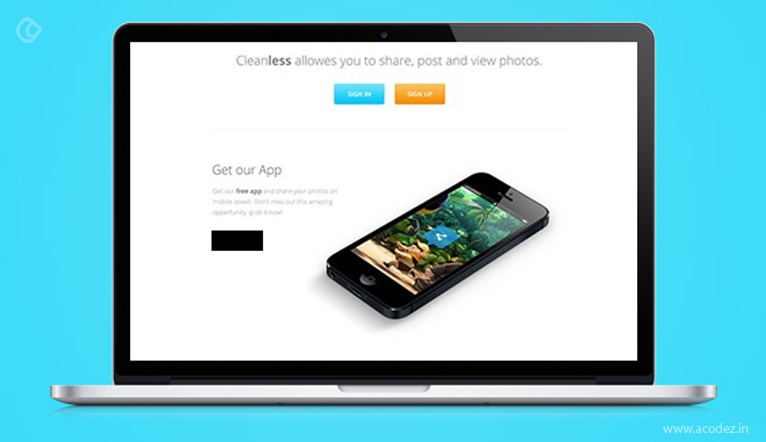
On the contrary, just consider the impractical nature of using extra and unnecessary whitespace in web design. Extra whitespace creates a low information density of the web page. This means that the layout offers less info as opposed to the expectations of the users. The content is placed too far all throughout the sections and the visitors do not have a choice but to just keep scrolling.
Especially, the mobile users would find this annoying since they would be viewing the page on the small screen.
The low density of information also hampers the hierarchy of the page. When the content is spaced out too much, everything looks fragmented. The visitors are not sure about the layout of the page as there is a lot of space between the content. Even with very less content on the page, you need to design your layout with proper sections, which are close to each other relatively so that you can communicate a relationship between the interface elements.
By simply looking at some websites, you may train yourself to locate the values of Whitespace on command. You should start focusing on the bigger agenda, such as full website composition and the Whitespace found between the content. Most of the website designers develop the layouts of the website focusing on these web page components first. Once the bigger elements look appealing, they move to the small detailing like visual whitespace as well as the textual whitespace.
It is quite unfortunate that the whitespace depends mostly on the genre as well as the content of the website. There is no simple way of understanding the right amount to be used. The purpose of Whitespace needs to be understood. Over time, ideas become ingrained in the mind.
Mastering the whitespace in website or UI designs
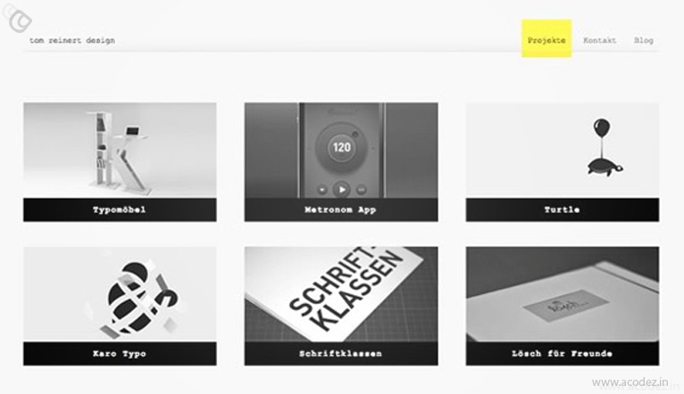
But, since it is a very subjective art, it becomes a little to do it. Keeping a few important things in mind will help you in this regard.
As it has been rightly said practice makes a man perfect. So, just go through the work of those people who have been in this industry for quite some time now. They would definitely have better knowledge as well as experience than you.
Research on the internet and go through some blogs as well as forums. Study some examples and point out the areas that look visually good as well as the areas, which look bad. This will give a better idea of the layout.
Summarizing the benefits of white space to your web design:
- Acts as a balance between the location, movement and relation between different components on your site
- Grabs the user’s attention
- Helps in improvising readability
- Enhances the beauty of your layout
- Signifies creativity, which attracts attention
- Creates a balance between focus and impact of an object
- Takes up the role of a separator between the lines and other components
Do you need help with designing a great website?
Acodez is a web design and development company offering all kinds of web design and development services in India and across the globe. For the past six years, we’ve been serving the world with the best web design and development services, which has made us one of the industry leaders.
Looking for a good team
for your next project?
Contact us and we'll give you a preliminary free consultation
on the web & mobile strategy that'd suit your needs best.


Makes a lot of sense.
very very good article. This is such a nice one keep up the work
This is really great one article. Thanks for sharing,keep up the work.
Nice Blog.