A landing page is a page a visitor arrives at upon clicking a referral link to the website. The success of a landing page lies in achieving its visitors to perform the desired action. The desired action is often tied to the business objective and is technically called the ‘Goal’.
Where do we start?
Creating a landing page is not so easy-go thing. It takes years of digital meditation to finally fix a page that converts. The design components, the psychology of your visitors without failing to recognize what your customer wants are some of the major factors that matter when you create a landing page.
Landing page often presents challenges to online marketers. Skillful optimization is one of the critical parameters of online marketing campaigns, especially when it comes to paid ads.
The truth is there is no perfect paradigm shifter for designing a landing page. But, there are several tried-and-proven techniques of designing landing pages as per expert recommendations.
The first and foremost thing that you need to keep in mind when designing a landing page is that you cannot use the same parameters for designing different landing pages.
There is a lot of difference between these pages based on the product, niche, value proposition, shipping method, audience, purpose, intent and others. The same approach does not work for all kinds of landing pages. But, the truth is you can find a lot of things in common when you compare landing pages that enjoy a high-level of conversion.
Here are some tips to keep in mind to building a successful landing page that converts visits into business:
#1. Headline:

As you know landing pages do not usually showcase a lot of content. It is constructed to be precise and understanding. The whole purpose of the site and why people are here is to be conveyed in a few words through your landing page and if you ask me what are the ingredients to the success of a landing page. The first thing I would recommend is a headline.
What do you think is the first thing that someone notices when they arrive at a landing page or for that matter any page on your website?
Of course, it is the headline. The headline conveys a lot. It is capable of generating interest, grabbing the attention and also helping people understand what you have got for them.
So, now you know where it all begins.
Yes, the design of your landing page starts from its headline. How do you design a perfect headline?
It should be impressive, check whether it is capable of grabbing the reader’s attention.
It should be capable of conveying to the user what the product or service is about. When it comes to images, headlines can work wonders if it describes the product or service very well.
No one is interested in reading headlines that are volumes longer. Keep it precise. It should not exceed a maximum of 20 words, if you can keep it to 10, then great.
#2. Sub-headlines that grab eyeballs:
Your headline should be strong enough to grab the user attention. Once you manage to grab their attention, then, you need to develop a sub-headline that will make them think and take an action.
And, where do you position this sub-headline?
It should come right after the headline that forces your visitor to stay on the page.
Also, ensure that you mix in a certain element of persuasiveness in your sub-headline. This is the point where you can force your people to stay on the page. All that you can do is take the concept of your headline and develop it further.
Add some in-depth content to your sub-headline and let it convey a higher level of information than the headlines.
#3. Important elements include bullets, whitespace & more:
As we know and we practice, not even one of them amongst has got the patience or the time to read everything that is written on a page. It is boring!
And, also, sometimes there is a lot of cram fitted in so that the page appears full. But, the readers have no interest in reading all that. Only, the main points impress them. So, don’t mistake that they are going to read through all the content that your content writer has worked upon.
Most of the people love to scan and skim through the bullet points.
When you have bulleted the main points your people’s eyes will scan through these and they will read out only the points that matters to them the most. In other cases, they will leave your site when they reach the fold.
Everyone loves empty spaces. So, it is one of the best practices to have empty spaces across your design.
Let your design be clean such that it will divert your reader’s attention to the main aspects such as the offers, benefits and call-to-action that you have got there.
Colors are another important factor that needs to be taken into consideration when designing a landing page. It is always best to implement call-to-actions in contrasting colors that is sure to hit the reader’s eye.
#4. Adding Images:
Are you aware of the fact that the human brain is capable of processing images 60,000 times faster than ordinary text? So, when you have got more text on your landing page.
What kind of images do you choose?
These pictures should be large in size. And, also don’t forget about the relevance. It should be in relevance to the product or service that you are specializing in. When you are selling physical products, it is a good idea to include the image of this particular product in your landing page.
While selling a product, ensure that your image is capable of grabbing the user attention and also, showcase the relevance of your product. Use high-quality images and this is not somewhere you can flaunt your skills in Photoshop.
#5. Explanation:
You have a great headline and sub-headline that is capable of attracting your customer’s eye, but they should be able to understand what kind of product or service you have got. Unless, you provide an interesting explanation to your product or service, you will lose your customers.
Be straightforward when you are describing your product or service. You do not need to stuff in a lot of impressive factors.
So, where do you fit in an explanation?
You can incubate it with your headlines or provide an entirely separate explanation.
The following elements need to be incorporated in your explanation:
- Headlines
- Sub-headlines
- Images
- And, a separate paragraph on what your intention is.
The explanation should be beneficial to the readers.
#6. Content:
Another point that matters is the content that you include in the landing page. Remember, this is your landing page and you do not need to use a lot of content to explain to your users what you have got there.
A little information that conveys about your product and service can work wonders.
A small paragraph or just 2-3 sentences could convey what you are doing here.
#7. Follow the 5 second rule:
Now you know very well the importance of having content above the fold.
The fold is one of the components of a web design that is much debated about amongst the web design committee.
Before the reader reaches the “above the fold” section there is something that will draw them to this portion of your webpage.
Yes, you guessed it right! I am driving you to the 5 second rule.
The first impression is always the best.
Researches and studies say that a website needs to work out the magic of impressing a visitor within 3 to 5 seconds or they will leave and will never again return to the site that annoyed them.
My dear friend, this rule is meant for your landing pages too because no prospect will stay on a page that looks unappealing from the start.
#8. Objective:
Ask this yourself – what is your objective? What do you want your website to do for your business? What do you want the visitors to do post landing on your website? Categorize your objectives into primary, secondary, tertiary etc. Brainstorm. Come to the point. Build your landing page keeping the very same objectives in mind.
#9. Respond to the search query:

Remember that your landing page plays the role of a sales executive in retail stores. The ‘search query’ is by what a visitor discovers your website. The landing page is the ‘responder’ to the search query. Keeping this in mind, build a landing page that precisely addresses and highlights what the visitors are looking for.
#10. Do not overwhelm:
Do not clutter up your landing page with loads of information. Use a minimal number of words. Avoid unnecessary navigational links. In some cases, it’s okay to not have any links at all. Throwing up a lot of information will overwhelm the visitors and stray them from reaching the desired objective. Present just what is relevant and might be useful to the visitor. This makes it easy to convert.
#11. Above the fold:
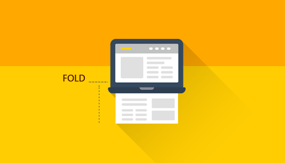
Make sure you get to the point and grab visitors’ attention as soon as they land on your page. Keep all the necessary information and the conversion point above the fold.
#12. Show them what to do:
Include effective call-to-actions on your landing page. Tell your visitors what you want them to do. Sign up for a newsletter? Drop an enquiry? Download a brochure? Add to cart? Illustrate clearly how they could complete the desired action. Churn your visitors into whatever goal you have set for the page.
#13. Directional Cues:
Directional cues are like roadmaps for the eyes. For instance, a landing page that has image elements, videos etc. could interfere with the visual focus and get visitors distracted from the conversion point. In such cases, a directional cue (usually in the form of arrows, or finger pointing etc.) that shows the lead form, sign up button, download link etc. can get the visitors’ attention and direct them to the goal you’ve set.
#14. Do not ask a lot:
If you have a lead form on your landing page which is your conversion point, make sure you do not deter the visitor from completing the action by asking a lot of information. Make sure your form only contains the information fields that are absolutely necessary. Remember that you could always contact the lead generated via their contact number or email id.
#15. Creating a sense of urgency is important:

You have got a call-to-action that is designed in contrasting and appealing colors and also the content on these buttons is highly attractive that will ensure that the customer clicks through.
You are indeed smart if you have managed to bring your customers this far.
But there is another thing called Unique Selling Point which should be unique and unless and until the customer finds it to be unique what is the point of having one?
The main aspect of designing a unique selling point is that your customer wants to find out the advantage of choosing you over your competitors.
You can use your company’s tagline or any other unique selling point that would make it clear to your people on why they should choose you.
The next is a need to make an immediate purchase. For instance, have your noticed something like “limited seats left!”, “limited period offer” etc.?
It is easy to drive attention when you create a sense of urgency. They feel that they need to make a purchase today or it is never going to happen again.
#16. Answer the question “Why should I buy from you?”
Good question!
I have myself thought along the same lines while visiting certain websites or if someone coaxes me to make a purchase from them. Of course, we all have thought of it at some point or the other. Why do we buy from someone?
What is it that you have got that your competitors don’t have?
It needs to be handled smartly and wisely.
Give a convincing answer to their question by displaying the irresistible benefits that you offer.
They should realize that the coupons, contest, services, products or whatever you have got is the best and something they are really in need of.
Use attractive words and images to highlight your value proposition on the landing page.
#17. Know what, why and for whom you are designing:
The most important factor that you need to consider when designing a landing page is that you are designing it for real people living in the real world. Not all the people out there are your customers but there is a specific category that belongs to your customer list.
Study them. Find out their likes and dislikes. Chart out their demographics. Identify their online behavior before you design the landing pages.
Once you have done a thorough research of your buyer persona you have a clear idea on who they are and you can use common traits to design your page.
You are not alone in the competition. There are others doing the same business and they will do their best to make it your customer’s heart.
Your smartness lies in ousting them. It is important that you conduct a research and analysis of your competitor’s landing page. This will help you to develop a landing page that is different from theirs but is impressive.
Last but not the least comes the offer that you are providing.
You are offering something to your customers. So, when you are designing the landing page firstly, you need to analyze what these offers are and also, answer a simple question like “why they should care about what you have got”.
It should be designed for:
- Solving a problem
- Design a unique campaign
- The benefits of your campaign and how it will help your customers.
#18. Include your Contact information:
You are here to close customers and make profit. But, unless you do not exhibit genuineness no customers will make a purchase from you.
Show them that you have an address, a contact number and it would be a great idea if you could include details such as the map of your location which shows that you are accessible and the very fact that you exist.
Customer testimonials are a great way to show that people trust you and they make purchase from you.
You could exhibit some of the good quotes from your customers on your page. It gives evidence on your genuineness. Also, include social networking links that will take your visitors to the social endorsements that your existing customers have gifted you.
It would be great if you could also include an image of your customers on your page who have contributed to those good words about you. It adds credibility to what people say.
Behind the scenes scenario is something that people love. We all like to have a sneak-peek into what is happening behind the scenes in any company.
Give your people a glimpse of the team that is working and communication with them. The simple formula of humanization works out here.
#19. Credibility:

It has been proven that people tend to believe testimonials from even those whom they do not know. It also helps to put up reviews, social media ratings, awards etc. on the landing page as it helps to build your credibility.
#20. Landing page needs SEO:
Surprised? You don’t need to feel surprised! Just like you optimize any other pages of your website it is important that you need to optimize your landing page for the search engines because people are searching for you.
Here are some of the important tips that you need to follow when optimizing your landing page for the search engines:
- Page title: It is important to include keywords in the URL path of your landing page. All that you need to do is to assign a title to your landing page. And, ensure that this title is included when you are creating the page for your website.
- The content: Google plays it hard when it comes to understanding what kind of content is there on a page. It is your responsibility to ensure that your page can convince what you are doing here to Google. The best way to convince is by adding the keyword text phrases of what you do in your landing page’s content. It will help Google to understand whom you are targeting just like your people.
- Meta tags: Not heard of it before or unsure of how to create a meta tag? Don’t worry! I am here to help you. Meta tags could be considered as one among those components that are found in a site’s backend. Google reads through all this backend stuff. So, now what do you think Meta tags are doing here? They are important. You need to include these in your title, keywords, descriptions and similar attributes. You can use alt tags for image descriptions.
- Social share buttons: Any page looks incomplete without these social share buttons. In the early days of the web, it was ok if there were no social share buttons included in your page because back then, people were less socializing in the virtual world. 20 years later the scenario has changed. Today people are more active in the virtual world rather than the real world.
So, if you are designing a landing page without social share buttons, you are driving yourself into great loss. From Google’s perspective, a landing page without these buttons is useless. Think it for yourself what use is a page that does not have these buttons?
Include these social share buttons at the top of your webpage and ensure that these are visible.
#21. Test:
Only testing your landing pages can tell you what’s working best with your target audience. You could implement split test (A/B test) with variations of your web pages in terms of text, image elements, colors, layouts, CTAs etc. Be bold, think out of the box and let your creativity out. You will be amazed at how even granular changes can create big impact on the conversion rates.
How has your experience been with landing page optimization? Share your ideas and experience with us.
Are you looking for methods or tips to improve the conversion rate?
Try out the tips that we have listed out here. We have found it to be helpful for our projects and we bet it will be helpful for you too.
Acodez IT Solutions is a web design company offering a wide range of services that includes web development and web design in India. We also offer mobile application development and big data analytics services to our clients in India and abroad. We are also a digital marketing service provider offering all kinds of inbound marketing services to our clients to help them take their business to the next level.
For further information, contact us today.
Looking for a good team
for your next project?
Contact us and we'll give you a preliminary free consultation
on the web & mobile strategy that'd suit your needs best.




Very informative article . Thanks for sharing. Keep posting 🙂
hi,this post gives a ideas about how to design a landing page vary interactively this is very usefull for me to design my site more popular thanks for sharing your ideas
Great tips ! i love it and use it for my lading page.