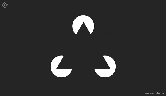
Can you pay attention to everything in your environment? No, it is impossible. Even though we have access to millions of TV shows, movies and new videos, we are not able to see everything as we have to spend more than 15 hours in a day. Keeping this in mind It is been said that the web designers apply psychological approach to attract the users while designing. The designers are well aware of the visual perception of the viewers and with respect to that they design in the way which they want to convey the message. The human brain is equipped to see the patterns, logic and structures to make sense of the world. Lets take an example of below picture

What do you see first? A triangle? This is what the sense made by our brain which is something familiar, symmetrical and what we can understand through our years of experience. But this is actually 3 white pac men. Good designers understand the important and powerful role that is played by psychology in perceiving the visuals like what happens when images meet the viewers’ eye and how they react to that image.
In this busy world, we don’t have time to pay attention to everything and anything around us as said earlier, isn’t it? Numerous websites, advertisements, apps, new products and many more things are being launched each day and our human brain cant look for all. For example if you are trying to catch a train in a railway station and someone asks for a help, you will be ready to answer it and just imagine same question has been asked by 50 members and you get late to catch the train. You will automatically consider this as noisy environment. And next time you will never pay attention to such things to an extent even. Thus we have more things to be noticed but limited amount of time and energy. If we are considering everything like this, what do we pay attention to in this environment?
Do you know why web designers apply psychological principles while designing?
- Applying psychological principles in designing will make their design more effective in a particular situation like when using visual hierarchy, gradients, grouping similar items, background shading and to distinguish different ones.
- Applying those principles influence the viewers visual perception that directs our attention to focus on specific points and to thereby take specific actions for a behavioral change.
Just like the example of triangle and railway station given above, there is inattentional blindness that world in the digital world too.
It will more clear if we explain it with an example.

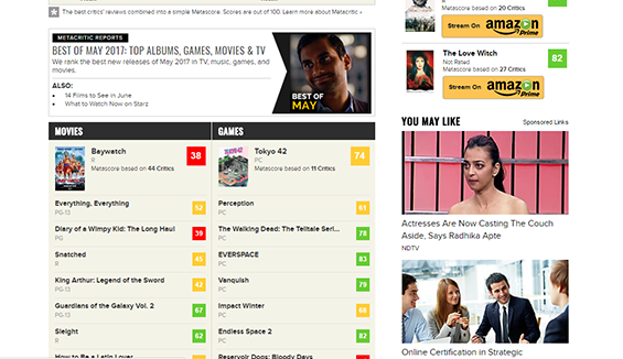
Here we have searched for top best albums, videos for May 2017 and we got a list for what we have asked for. Right? How many of you have paid attention to the right side section of “You may also like”?
This is called digital world’s inattentional blindness. You already know the right side will be of either similar things of our query or other advertisements and you consider these as noisy environments. If you are not satisfied with the list of your query, you will start searching for the right side for any similar items.
How can you apply the Principle of Limited Attention to UX design?
So, now you are well aware of what is happening when a person visits your website or app or any other product. How can you give them a remarkable experience?
To implement this, understand your customer requirement first, for example, if you are advertising your product, your customer needs to buy your product or if you are running ecommerce site, your customer just wants to buy a dress or a pair of shoes.
So you must know what your customer wants to accomplish and how they get the job done. Once you get to know them, your objective is simply to make them buy or product.
1. Your pages must be easily scannable
You will know how a visitor visits a page. A visitor just look at the page, read some text and click mostly the first link they get attracted that is similar to what they are searching for.
Also Read: 14 Ways to Make Visitors Fall in Love with your Website
So while you design the page, try to design for scanning rather than designing for reading. Here are some basic tips to design for scanning.
- Predict on each page what they are supposed to do
- Add most important elements where they are likely to scan it
- If anything is not contributing as expected, cut it off
- Strategize the elements that require more importance and give a visual hierarchy that guides them
- Always keep your information as bulleted with short paragraphs, more headings
If the page is stuffed with unwanted elements, people will definitely lose interest and they won’t get into the details. So provide the element with highest priority and let them decide afterwards.
2. Provide only what they require
So you tried understanding your customer requirement. Thus, provide only what they require exactly. To make a strong decision, your opinion of understanding your customers will not be enough. After making some assumptions, you need to test those before confirming the requirements and focus group. You need to take information from different sources to get the right picture. Combine you gained from your experience, your knowledge, qualitative sources like session replays, surveys, remote usability test etc and quantitative web analytics .
3. Exploratory user research fixes every issue
Anyone who gathers information for feedback will be affected by the inattentional blindness along with UX designers, researchers, product folks etc. this is because, when you are concentrated in improving a specific part, you will be blind on improving the other parts even though it will be obvious right in front of you. In order to fix those issues, use exploratory user research by using open-ended tasks to test and perform participant minimal explanation
Next we can see some principles to apply directly to modern design to be useful in UI design.
4. Figure-ground
It states that viewers see only the objects in foreground or background as they stand obvious either in front or back. It let the designers to give any action regarding the promptness of the product whether to accept it or ignore it. And when people use any app on mobile or desktop, they figure out the figure and ground.
Here is the example and people see a white apple on black background. This is a case of emphasizing.

Image Source
5. Similarity
Similarity principle states that we group each similar type of elements tending to think they have similar function. For example if a group has same shapes with different colors, we obviously group them according to the colors with same colors in a same row or column. Just like this if you take a website page that serves differently with different colors on same page.

This is an example of Cloudzon Infoconnect website. You can see similar groups are given in same color. Ie, services are in blue and about the company is given in white.
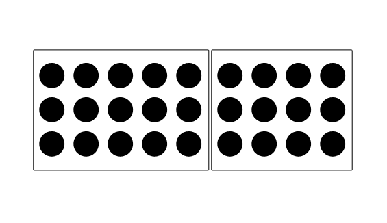
6. Common region
This is similar to proximity principle where objects are placed within similar closed space and we see them as grouped together.

Source: Smashing Magazine

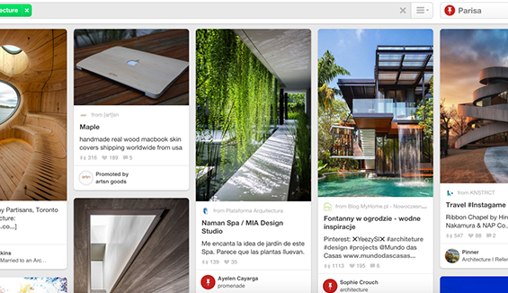
7. Proximity
This principle states that if there is a group, closely related items will be grouped together and a space will be given in between two groups. This is quite powerful as it overrides similarity of colors, shapes and other factors to differentiate each group of objects.
Best example you can see in ecommerce site with same type of products will be grouped in a section and others in different section.
8. Continuity

Source: Smashing Magazine
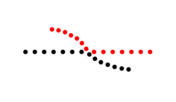
This example clearly states the principle of continuity where the elements in a line or curve will be related than those which are not in a curve or line. Here our natural eye perceives a line that is crossed eachother but it is just a curved line which has been placed together.
9.Focal point
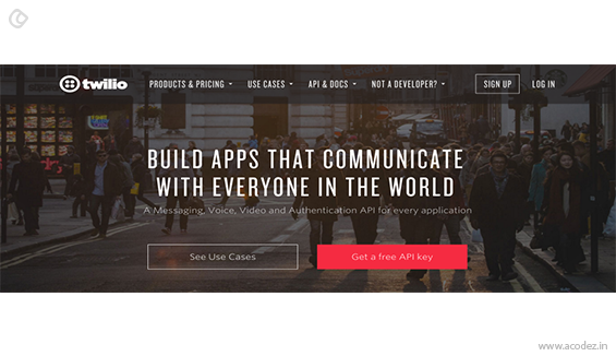
This principle states that whatever stands out in a group, viewers will see that first.

This example gives a focus on their call to action button with a different color.
10. Closure
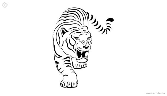
Closure principle states that even if the image is provided with some stacks of elements, we make a picture of recognized pattern where we had an experience.
For example if a tiger’s picture is given with only black lines, our mind make a recognition of image as tiger by imagining the closure of the outline. This is because our mind is registered with the body shape of tiger before itself.

Conclusion
People are running out of time to pay attention to every detail they see in a day. Thus, the human brain itself filters many things which occur to be irrelevant even if they occur in front of their eyes and focus only one thing they need to get accomplished. So while designing your product doesn’t forget to check what your focus group intended to get their job done. Instead of going with the inattentional blindness, design your product by focusing customer’s attention towards the product.
Do you need any help with UX design?
We have a team of best ux designers in India that can cater to all your requirement that you are looking for.
Acodez IT Solutions is a web design and web development company in India offering all kinds of web design solutions ranging from carousel sites to the ultra modern sites that only a few of the multi giants have got. We are also a SEO agency based in India offering all kinds of SEO and inbound marketing solutions to our clients. For more details, you can visit our website or contact us.
Looking for a good team
for your next project?
Contact us and we'll give you a preliminary free consultation
on the web & mobile strategy that'd suit your needs best.


