Every business needs to get a specific response from the users like buying a product, get the users to sign up for the newsletters or to call on a particular number. This is mainly achieved by a call to action which is designed to provoke a specific immediate response from the users. These help to create a pattern of behavior and makes it easy for the users to follow through. These provide compelling reasons to either purchase a product or carry out a certain task. These help users to make quick decisions rather than deferring the purchase decisions. These instant decisions help in getting more interested customers. This, in turn, provides instant and measurable results.
Even in the website interface design, the call to action button is the most important aspect and must be tackled quite properly. It is quite important that an important focus must be laid on its design. Some businesses believe that if you get your CTA right, your conversions are bound to go up.
Here are some of the characteristics of the call to action buttons that can help you to get the best results no matter where you use them. It is necessary that you design the call to action button and make sure that you get what you wish for. To do so, it is necessary to know why a certain call to action button compel you to click while others are ignored.
Good call to action buttons are compelling
A good call to action button needs to be compelling enough and must not be easy to ignore. It must be able to provide information about what the users are going to get after they click on the button. To make sure what type of call to action button works the best for different websites. This can be done by having a look at some of the best performing website worldwide. You can also have a look at your competitors that perform better in your niche.
Compelling button shapes
Button shapes also may help increase your responses on a button. It is advised to choose a good shape for your button. There are chances that an interesting CTA button shape will help you to get a better response to your call to action button.
Must be of the right size
It is necessary for the call to action buttons to be of the right size and must go with the flow of the rest of the website. It must neither be too big that it does not go with the look and feel of the website and also must not be such small as the users would have to strain their eyes to have an idea of what your call to action button conveys. It depends on the amount of information you wish to display to your users, page length, design layout of the website and many more such features. It can either be located in the top of the page, in the bottom of the page, or either can be spread throughout the page.
Make use of fancy graphics
Fancy graphics in some cases too may turn out to be outstanding and interesting. This may help make the call to action buttons compelling and help the web owners as it will help get better responses from the users.
Must be action-oriented
It is necessary for the call to action button must be action oriented and must tell the users what they need to do with the information provided. The use of trigger words helps to enhance the efficiency of the call to action buttons. These are verified by several sales representatives to provide desirable results from the users and result in better sales.
It is also necessary to make a perfect balance between the order and request. Answering the questions of the users that they have in mind in the call to action turns out to be quite helpful.
Must be located at the right place
The location of the call to action button is also quite necessary and helpful and helps you to decide where you should place the call to action button to get the user’s attention. It is also necessary that you choose a location that is easily distinguishable from the rest of the website. It must be easy to find and must not be located in such locations where it is difficult to access. The best place where the call to action button can be placed is in the path of the user so that it can draw their attention. It must be placed logically by getting an idea of where the user is bound to look next.
Choose a proper color combination for your call to action button
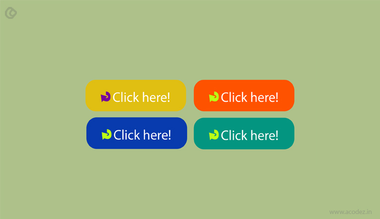
A proper color selection turns out to be quite essential while designing the call to action button. It is necessary that the call to action button must be easily identifiable and must stand out from the rest of the part of the website. In most of the cases, the contrasting colors are used that helps them stand out from the rest of the part of the website. It is also necessary that it must go with the color palette of the website and must not look alien to these.
Must be clear and concise
It is necessary that the call to action button is clear and concise. The long and ambiguous call to action button worries the user and makes them ignore it. As per HubSpot, it is necessary that the call to action button must not contain more than five words. In this case, the theory less is better works the best.
It is necessary that the call to action button must not contain more than five words. In this case, the theory less is better works the best.
Make use of heatmaps
Heatmaps are a fairly new technology that can help you to decide on which parts a user clicks the most on your website. This can help you to get an idea of which parts of your website gets most visits and clicks. Then you can choose a particular location to set your call to action button and make sure that they get noticed by your users.
Do not use too many calls to action button
It is necessary that you do not use too many calls to action buttons on your website to get user attention. In such a case, they tend to ignore all these calls to action button or either get lost in the same. Hence it becomes necessary that you ask yourself this question, What is the most important thing that I want my customers to do. After getting the answer to this question, now you can choose the option to set that call to action button on your website and make sure that the following call to action button stands out from the rest. Even if you feel the need to add multiple calls to action button, you can then it is necessary that you provide a guide for the most important event of your page. It must also be the most visually aesthetic and attention-grabbing than the others.
Must arouse a sense of urgency in the users
It is the human tendency that they want to have the things that are going to be unavailable to us later. This is used in marketing as well where the demand increases with the decrease in availability. Any such information like sales, limited period offer, discounts, etc. if available must also be mentioned along with the call to action buttons. This will help ensure that the users have a sense of low availability which may help them to make decisions faster and make decisions in your favor. This principle can help you to get better returns on your investment.
Must contain any other information
Apart from providing the button to carry out a task, it is also necessary that any other information about your product must be clearly mentioned. It must be such that it should answer the question of the user and also arouse their interest in the product. This can help the users to decide if they need to respond to the call to action button or not.
Must be spoken by the user
In a recent study it has been found out that people connect better when spoken in the first person rather than when spoken in the second person. This same rule applies in the call to action buttons as well. The call to action buttons in the first person perform better and receive more clicks as compared to the ones in the second person.
Must be in proximity to the previous action
The CTA buttons that are in the path of the eyes and action get more attention. It is quite useful in the today’s web design trends of parallax scrolling as when the user scrolls down, they immediately get a call to action button and carry out their tasks.
Summary:
The above tips can help you to design better call to action button and get better responses from the users. However, it is necessary to keep experimenting with the different call to action buttons. This will help you to decide which call to action button works best for you and which call to action buttons do not. This will help you to make appropriate changes in your call to action button so that you can get the one that works the best for you.
Acodez is one of the best UX design company in India that helps you to develop visually stunning websites. We’re a full-fledged web development company India that adhere to the latest web development trends, the website is such designed to make sure that you can get the results that surpass your expectations. Many innovative and unconventional ideas are implemented to make sure that your users are provided with the best web experience.
Looking for a good team
for your next project?
Contact us and we'll give you a preliminary free consultation
on the web & mobile strategy that'd suit your needs best.





Nice article sharing .Give updated technique .
Good Post.!
Thanks for sharing,
Cheers