Design is considered as the most important aspect of a website that helps you create a lasting impression on users. But the question is how to make your website design, better than the rest. Worry not!
The following tips will help you in making sure that your website design stands out in the competition.
Highlighting the Fundamentals

- Before you start to make your website look better, make sure you have all the fundamentals in pace. Get the layout & other basic design works done properly. Now you need to “polish” them, but how are you going to do that?
- You need to ensure that those fundamental design helps a user with what they want. He/she should not feel that there a disconnect between the design and the content on the website.
A check on Alignment and Spacing

- Alignment and spacing plays a major role in website design. These two elements are going to tell your users, how much serious you are regarding your work.
- The text, whether on the home page or inner pages, which contains text and graphics, should be aligned properly.
- The spacing should be proper between the words, ie. neither too much, nor too less. It should be appropriate.
Applying Anti-Aliasing to the Text

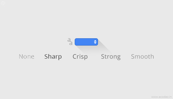
- Anti-Aliasing is a technique, which is used to remove or minimize the distortion artefacts. Experiment with different fonts & sizes & choose one that works best for you. Sharp, Crisp, Smooth etc. looks great depending on the design being used.
Adding 1 Pixel Stroke
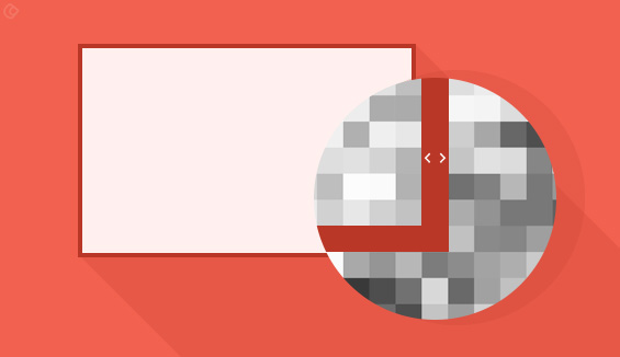
- Borders & lines should be 1 pixel stroked. This would give crispness to your website. This is often ignored in many websites.
- It also gives more depth to the design of the website as the text would gain attention on its own.
Add Gradient Effects

- Gradients are now seen in almost any webste. The subtle variation in gradient can produce wonderful results if done right.
- They make the design come alive in web designs, unlike in print designs, where they are mostly flat.
Adding Drop Shadows

- Adding the subtle drop shadows are also important in website design. This makes sure that various elements “pop out” at a user making it a good choice.
- Each of the pictures, text and borders should be distinguishable & drop shadow would help you in achieving this.
Hierarchy and Action

- You need to think from a user’s point of view, only then you will understand that what should be the hierarchy in your website. It is really very important to do so.
- If there is no hierarchy in your website, a user would be confused as to where to start searching from? Users would keep on searching the website for required information and get frustrated.
- You should also take good care of the color and contrast on the website. The color should be appealing to the eyes & not irritable.
Final Judgment
- After finishing everything, come back to the website with a fresh user perspective, to see if there are any final changes to be made. Is there any text which needs to be removed or to be added or highlighted?
- Is there any element gaining too much attention? Is the color and contrast good enough? Is there a consistency between the text, pictures and the borders?
- You should also see if you can use more of the white space on the website to see if it would make the website any better.
Conclusion
Take care of these tips & you have a website that not only works better, but looks even better & more appealing to users! Choose the best ux and ui design company in India for the best results.
Get your website designed from the best website designing company in India! Call +91 95 44 66 88 44 now!
Looking for a good team
for your next project?
Contact us and we'll give you a preliminary free consultation
on the web & mobile strategy that'd suit your needs best.


