As always I say designers are the big time players and the task we undertake is not a simple or easy one.
After contemplating and brain-storming over an extended period of time, we come up with ideas that the client finds interesting and in sync with their business plans. Moreover, they approve a design when it almost starts to represent their business closely.
Then comes wireframes and moodboards that almost represents the final outcome.
Now you have the design completed. SEO process furbished, and content curated for your website and the online promotion activities are on.
But, the visitors to your website don’t seem to be very much interested in your website.
Neither any sales nor any enquiries are being generated from your website?
Precisely, no activities are happening on your site. Isn’t that depressing?
If your site has visitors who are not willing to stay there for even 52 seconds, you automatically find a place in Google’s blacklist.
What could be the possible reason?
Here, I will take you through those reasons that might be warding off potential visitors from your website:
#1. Outdated Plugins:
What kind of plugins do you have on your website?
Just answer this:
Do you make your visitors wait till the sales content gets dug out from the Flash Files, which is more or less considered to be a graveyard and not recommended anymore?
Folks, for heaven’s sake, don’t underestimate your visitors. They neither have the interest nor the time to wait till the updated version of the plugin gets installed.
If you are still stuck with the outdated version of these plugins why not take a page from YouTube’s book, they have already dropped the Flash object embeds and replaced these with HTML5 video player.
HTML5 video players are a great replacement option for your outdated plugins.
#2. Obtrusive registration requirements that bulge out:
It is indeed a fantastic idea if you are using gated content to drive leads into your sales funnel.
But before you use gating for anything and everything just think twice. Gating a content is good unless the complex registration requirements do not take a sour turn and people start yawning when the thought of the process comes to their mind.
When you are generating the registration requirements, try to cut the crap and put in only those fields that are needed.
I am so confident about eliminating unnecessary fields because there have been instances where several businesses found success and a sudden flow of customers into their sales funnel with simple tweaks.
#3. No exit intent technology:
What’s the bounce rate of your website?
How many of your visitors hit the back button and leave the site?
Don’t fret! You can grab their attention by including the exit intent technology programs.
Using these tools you can identify or track user’s mouse movements.
Before they hit the back button, why not present them with an offer or message that will stop them from ditching the action and move ahead.
#4. Loading Speed Issue:
Considered as the biggest trouble in managing the functioning of a website, slower uploading and downloading of images on the website or the content will not let the visitors stay. In this fast pace world, no one has enough time to wait long enough to load a page for accessing required information. The users may shift to some other website with the speedy loading system.
#5. Outdated Website’s Layout or Design:
Technology is changing quickly and so do the demands of the users. Previously, heavily imaged website was a fashion; while, it is not completely outdated. A website’s design based on old principles will not attract the users; rather, it will make them run away for a safer spot. As all know, website design is meant to cast an impression and an outdated style will surely not do so.
#6. Did someone just hack your website?
I know the idea sounds a bit crazy someone has hacked your site, and you are unaware of what is happening.
Why does it happen?
Sometimes even the most expert webmasters fail to notice the signs of hacking as the hackers leave no trace or clue of the mess they have been inflicting upon the site.
It is not necessary that you can detect the signs of hacking though you keep an eye out and monitor the activities regularly.
You can have monitoring program such as the Sucuri installed to help track any unauthorized activities on your site.
#7. Content is too complicated:

Being crispy in content is a way to impress users; but, making it too much crispy makes the content monotonous. And no one will be able to understand the content; if it is excessively creative. In this manner, the content becomes difficult to understand and the users opt for the website with easier content.
#8. Autoplay Problem:
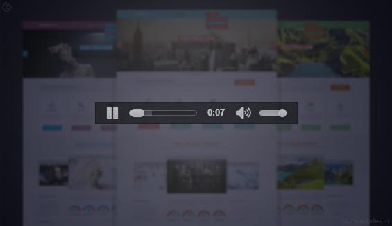
One of the most irritating thing in opening a website is the audio or video playing automatically. This distracts the users from searching the necessary information. And, at the first go, they tend to find the button to switch off the audio. At times, it can keep away prospective visitors from the website because it becomes annoying.
#9. Inactive blog:
As known, a blog is the most important way of informing visitors about the products or services available on the website in an informal manner. But, the blogs being inactive for a long time will not update the visitors on required information and this will surely not allow them to return.
#10. Product Benefits are Unclear:
Generally, the users tend to get attracted to a product or service by reading its benefits. And if they are not clear to them; then, the users will not act in favor of that website and go for other options with clear information.
#11. Advertisements that pop up everywhere:

The websites with too much of advertisements meant to attract users and lesser of crystal clear information are surely going to keep the users far away from accessing it further. Today, the scenario is such that people look for information with highlighted points and not too much of ads without any attractiveness.
#12. Navigation Structure is Ambiguous:
The proper navigation structure leads the users to the right information. But, a poor structure will leave the user hunting for suitable buttons or tabs to access the needed information. This will lead to the wastage of time and keep the users away from the website.
#13. Website is non responsive:

Today, it is the fashion of responsive websites that reacts on the command of the users and provide them with an essential piece of information. If the websites are not responsive and do not give suitable information or interact with them through blogs or other means or even relate to them; the users will definitely stay away from such websites.
#14. No Call to Action:
The websites without having any kind of content that provokes the users to take immediate action in favor of the online business will not allow the users to stay. The plain content is will not add to the sales value of the business and allow users to make purchases. So, these conditions keep the prospective users or buyers away from the website.
#15. Do you think your landing page fulfills your intentions?
Imagine you are planning to buy a car and you in your attempt to buy the best one you reach a website where they are promoting the best cars of the year.
Immediately you are pleased and try to find your way towards the landing page.
But what awaits you here is depressing.
You find that you have been deceived.
You have reached a different site that sells automobile parts such as tires and others.
You are not deceiving your people but yourself.
Certainly, a website is an ideal way that allows the users and buyers to find a company on the web world. And as the changing technical trends, people are making transactions online only. Be it shopping, money transfer or any commercial activity, websites helps a business to flourish and help the prospective clients to get connected with the suitable business choices. So, it is important to have a website that may provide essential information in conjunction with the suitable images to make the picture clear.
Besides this, following the web trends is imperative because the present fashion demands for responsive websites. These dynamic websites less of scrolling and more of information. Any organization or a website designer not keeping all these factors in mind can put an adverse effect on the online business. As said, walking in line with the changes will always reap productivity benefits and avoiding such conditions will not fetch the desirable amount of web traffic.
Do you think your website is failing to attract customers?
Did someone hack your website?
Do you want help?
Acodez IT Solutions offers web development in India and all over the globe. We are also a web design company providing the best of web related services. If you are looking for some stunning digital marketing services, then our expert team of inbound professionals will help you.
For further inquiries, contact us today and we will provide you with a free quote.
Looking for a good team
for your next project?
Contact us and we'll give you a preliminary free consultation
on the web & mobile strategy that'd suit your needs best.




What a surprise, I came through IndiBlogger, and while reading the blog I analyzed it is not the thing for which I came over here. The heading there on the IB is saying about 16 Reasons for Website Running Slow, while the article is on 10 Reasons That Visitors Shun Away from Your Website. So it surprised me badly.
Hi Alok, sorry for the inconvenience caused. We’ve fixed it. And, thank you for the heads up!
Yep, This is a valid points or reason for visitors persistently avoid your website or online business. Thanks for sharing the valuable one.
Page loading time and the poor content strategy are the worst things in this compilation but yes, other mentions also compiles for the same. Thanks for putting these all together. Keep sharing. 🙂
Wow! At last I got a web site from where I be able to really
take helpful information regarding my study and knowledge.
you’re actually a good webmaster. The site loading pace is incredible.
It sort of feels that you are doing any unique trick.
Also, The contents are masterwork. you’ve done a great
task in this subject!