As we know, one of the major ingredients that contribute to the success of a business website is the kind of user experience (UX) that it provides, which makes this a vital component of any website design. Now, you know why your team of consultants (including designers, developers, digital marketing experts, webmasters and creative analysts) is brainstorming and contemplating on ideas to ensure that your website renders a great UX.
No user will want to return to a site that offers a poor UX. We do not need any research to tell us that around 88% of users should never be expected to return to a site that offers a bad experience. Forty-eight percent is contributed by those users, who never return because the site’s appearance failed to impress them.
This statistics can be easily tracked from the analytics data, which will help in further repair and maintenance of your website. But, according to report only 55% or lesser companies try to track the analytics data to analyse the UX performance of their websites.
There are several metrics that you can implement to analyse your website’s UX performance and one of them is heat maps. While they provide you with analytics data, they also provide you with further information on how users behave and interact when they are on your site. Once you get to know further details on how the user interacts while they are on your site, you can work on improvising whatever needs to be enhanced to satisfy them.
Here, we will discuss further heat map and how it helps websites.

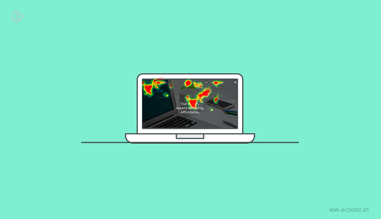
A heat map, as you know is colorful. This visual analytic tool utilizes color to provide insight into the information on how users interact with your website. The colors take you across the spots where your users are browsing and clicking through, which provides you with an idea of where they are not interested in clicking and scanning.
Of course, the conventional methods of website analytics provide you an idea on how far or how well your page or site is successful, but there are certain things that it cannot help you with. Like it fails to provide you with information on why some areas of your page fail to attract people like the other portions.
But, with website heat maps, you can gain insight into the areas of your website that attracts users and those that distracts users. Along with these, it also provides you with an idea on why certain areas are preferred and why not others.
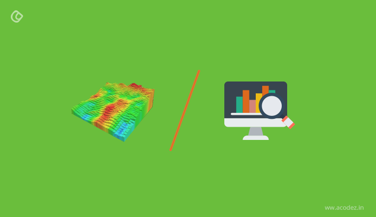
Heat map vs. conventional analytics

Unlike the conventional analytics which provides only the data of the percentage of areas on your website or web page that attracts people, website heat maps are successful at showing these areas as well as why some portions perform better than the others and the reason why some pages fail.
What kind of insights does a heat map provide you with? There are two kinds of these insights that a heat map provides and these include:
This will tell you what are the areas of your website that your visitors are most interested in. In certain instances, you might find that some users are more inclined toward clicking the call-to-action (CTA) buttons on a page or they might be interested in adding certain items to the cart.
Apart from the clicks that your website receives, heat maps also showcase the part of your website that brings in the greatest of mouse activity. There could be a situation where your user doesn’t want to scroll below the fold, which indicates that there is something wrong with the UX of your site that is warding off your visitors away from the site. And, as you know once the UX displeases the people, it is less likely that they would return.
The heat map analytics’ data provide the following information:
- If the links, lead generating components, and CTAs are successful at attracting users
- If the users click through the afore-mentioned components
- If the blog email subscription form is visible and the users are viewing it. But, if they are just viewing it and not clicking through, then, they are not interested in the content, which gives you sufficient space to work on improvising the content.
- The distractive or annoying elements of your site – sometimes, a video might be the one because of its length. But, if it is distracting your people, then, your heat map would point this out for sure.
The next thing that it will take you to is to the portion till where your people scroll.
With heat map analytics, you can actually monitor the scrolling that takes place on your page. It is not easy to get your people scroll across and through to below the fold area of your website. The data that is acquired from these website heat maps help in understanding the effect of your designs on the visitors that arrive at your page.
For instance, if you find that people are not seeing your CTA and happen to not scroll below, then, it is obvious that they have not seen it. Regardless of whether the CTA went unnoticed because the visitors did not scroll down or whether it should be shifted up a bit so that it gets noticed, then your heat map will definitely point at the weak positions.
Once your heat map provides you with information on where your users click and where they don’t, you will know whether they are moving across the entire page or site. Sometimes, it happens that people do not scroll below the fold because it is irritating. There could be several reasons why people do not scroll below the fold – one it could be the content – two, it could be the design – which doesn’t offer a great UX.
How does heat map help you in the future?
Whatever you do, your major focus is to bring about conversion on your website. This is when you are expecting the elements on your web page to drive conversion. This is what website heat maps are great as – they help in identifying those areas that can be improvised for future – thus, helping in changing your website’s conversion rate. Monitoring and tracking your user’s behaviour is important as it helps in identifying how well your users can be attracted and the measures that can be taken to improve conversion.
How can you use heat maps to enhance conversion on your website?

Heat maps are one of the best ways to identify and track user behaviour, which you might have understood very well by now. The large volume of qualitative and quantitative data that these website heat maps render can be used to enhance the rate of conversion. There is a variety of ways to ensure that real and live data is acquired from heat maps and these include
Optimising the positioning of CTAs:
As we have discussed, how well your CTAs perform depends on the number of users that click on it. Your users might click on an item that is of least importance to your web page or it might be the one item that is not clickable, which actually is a loss.
Now, your click heat map highlights such areas and provides you to work on introducing elements that bring about a high-level of performance on your website. You can collaborate A/B testing with this kind of a click heat map to ensure that the CTA is placed at the appropriate position and that the design of this CTA will attract the maximum number of people.
Helps in improvising content and its readability
There is the scroll-tracking heat map that will provide you with interesting insights into whether the content present on your website is actually viewed or ignored by your people. Sometimes, it happens that the content that is placed below the fold will be ignored, which can be regarded as a loss. This means that these are the sites, wherein the audience belongs to the category that likes to scroll above the fold. This will help you to further decide the positioning of the main elements, such as your content on your website.
The insights provided by this heat map will help you to identify the keywords and the kind of content that your target audiences are searching for. Also, with the help of eye-tracking heat maps, you can find the areas where the focus of your users is on and then, develop this portion accordingly.
Structuring the design of your web page or website
There are dead weights present on your website or web page. Usually, the areas that receive least or no attention are termed as dead weights. This usually falls under the category, where the elements fail to please the users and this brings about a negative impact on the conversion rates and the one reason why this should be eliminated from the website. You can analyse the reports generated by your website heat maps to track down the waste elements and either replace these or remove these since you have the best interests of your site at heart.
This is how you can easily utilise heat maps for increasing the conversion rates of your website.
Acodez is a leading UX design agency in India. We provide all kinds of web design and mobile application development solutions that are based on the latest technologies in the software industry. We also have an in-house digital marketing team based in India offering all kinds of digital marketing solutions to take your businesses to the next level.
Looking for a good team
for your next project?
Contact us and we'll give you a preliminary free consultation
on the web & mobile strategy that'd suit your needs best.


