Fonts play a major role in website interface design. These make sure that your websites are presented in a visually aesthetic format. In some instances, a simple change in the font works wonders. Selection of the proper web fonts is quite necessary and must be consistent with your website. To help you in designing websites, Google fonts are available that can help you to make a proper selection of fonts. As these fonts load through the Google’s servers, these are optimized for heavy loads. This makes sure that your website does not slow down.
Google fonts provide many benefits to the web designers and developers. Some of the most important benefits of these fonts are:
- These fonts are open source and are available for free. Hence, you do not need to pay any amount to access these. You can use these any number of times.
- There are numerous fonts available which offer many options to use on your website.
- It also features the interface where you can see the font in use.
- Here you can get an idea of the best fonts across the web and then choose the appropriate fonts.
- The fonts are provided with the Google’s incredibly fast content delivery network (CDN). This helps in delivering the web content faster and easier.
- It is cross-platform friendly and can be accessed on different devices. Even older devices like Android 2.2+ and iOS 4.2+ can access these fonts on these devices.
Now to help you in getting best fonts for your website, here is a list of the best Google fonts. This can help you to make sure that your website is visually pleasant and aesthetic. To find the complete list of the fonts on Google, check out fonts.google.com. Here you can get an idea of how the font will look and feel on your website and change various options like content displayed, font size, and font type.
Iceberg:
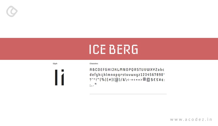
Iceberg is a slim, condensed, and decorative web font for medium to large sizes with monolinear strokes, monospaced fonts, and 45-degree cuts echo letters. Apart from these, it also has long ascenders and descenders to build a rhythm thereby enhancing the overall readability.
Rubik:
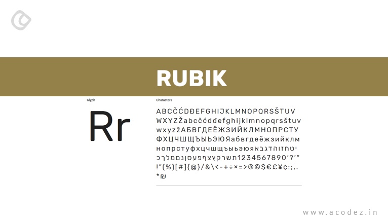
Rubik is a font with subtle and rounded corners that come from Sans-Serif family of fonts. It features five weight family, i.e., Light, Regular, Medium, Bold and Black with Roman and italic styles. These features make it ideal for both body copy and headlines.
Cormorant:
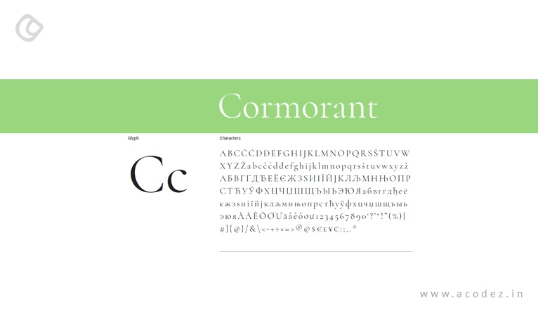
Cormorant is a famous family of fonts that comprises of six fonts like Cormorant Garamond, Cormorant, Cormorant Infant, Cormorant SC, Cormorant Upright, and Cormorant Unicase. This font family ranges from 5 to 10 different styles Roman, Italic, Infant, Infant Italic, Garamond, Garamond Italic, Upright Cursive, Small Caps, and Unicase and five weights like Light, Regular, Medium, SemiBold, and Bold. It was conceived, drawn, spaced, kerned, programmed, interpolated, and produced by Christian Thalmann.
Monoton:
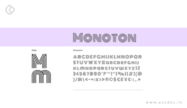
Monoton is a pure display web font and is a contemporary take on metal-press fonts. It can be used on various devices and works the best in the headlines of the website. It is recommended that you use the font size higher than 30 px.
Amiri:
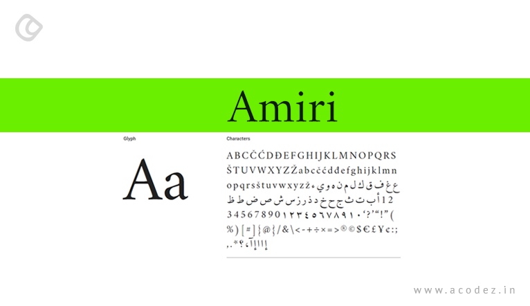
Amiri is an Arabic typeface in Naskh style for typesetting books and other running text. It is available in four different styles like Regular, Regular Italic, Bold, and Bold Italic.
Karla:
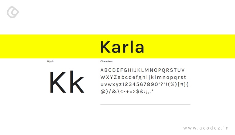
Karla is a grotesque sans-serif typeface family in the support the languages that make use of Latin script and the Tamil script. It is available in four different formats like Regular, Regular Italic, Bold, and Bold Italic. Being the part of Latin script family, it contains Roman and italic styles in two weights regular and bold.
Baloo:
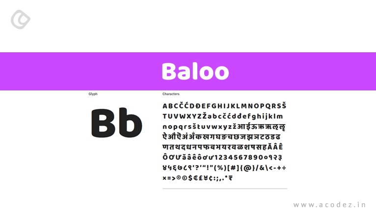
Baloo project is the collection of nine Indian scripts with a Latin counterpart i.e Baloo Bhai for Gujarati, Baloo Bhaijaan for Urdu, Baloo Bhaina for Oriya, Baloo Chettan for Malayalam, Baloo Da for Bengali, Baloo Paaji for Gurumukhi, Baloo Tamma for Kannada, Baloo Tammudu for Telugu, Baloo Latin for Latin, and Baloo Thambi for Tamil. Apart from supporting one Indic subset, it also supports Latin, Latin Extended, and Vietnamese. It is compiled by Unicode compliant and libre licensed. It is a distinctive heavy spurless design with a subtle ting of playfulness and all the bare necessities of type. These scripts focus on providing equal justice to secure a single and multi-script use. These offer a carefree yet confident, warm yet entertaining, sprightly yet intelligible, interface thereby infusing life everywhere it goes.
Lora:
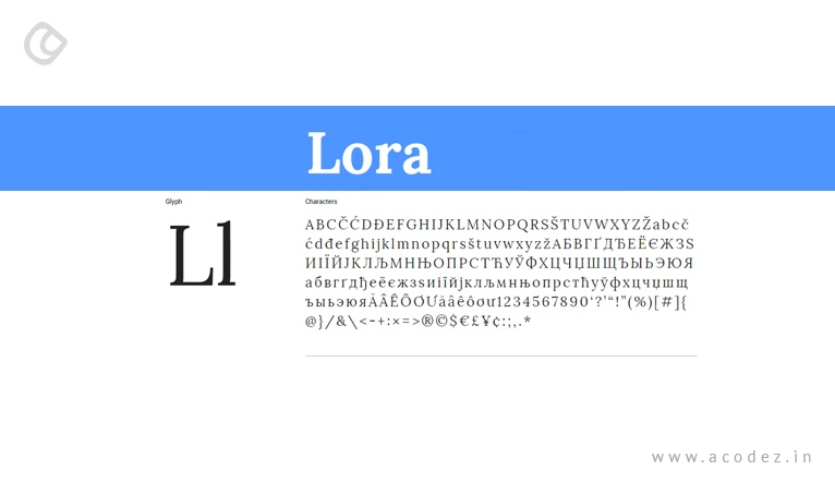
Lora is a well balanced contemporary serif font and is ideal for large body text. It is available in Regular, Regular Italic, Bold and Bold Italic styles. It can be used to convey the mood of modern day story or art essay. One amazing thing is that it works beautifully both on screen and print.
Neuton:
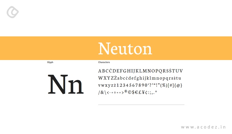
Neuton is a clean, dark, Dutch-inspired serif font and is similar to Times in structure and features large height, short extenders, and a compact width. This makes it a good choice for different screen sizes and helps utilize the space in the best possible way. Hence it is perfect for body copy. It comes in six different styles like Extra-Light, Light, Regular, Regular Italic, Bold and Extra Bold.
Alegreya:
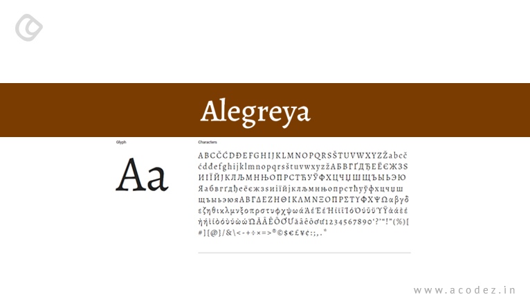
Alegreya family of fonts is a combination of four different fonts Alegreya Sans SC, Alegreya, Alegreya Sans, and Alegreya SC. These typefaces are intended for literature and have been chosen as one of the 53 fonts of the decade. It features dynamic and varied rhythm that facilitates the reading of long texts thereby providing them with a pleasant feeling. Hence it is used on many websites that feature longer versions of the text.
Lilita One:
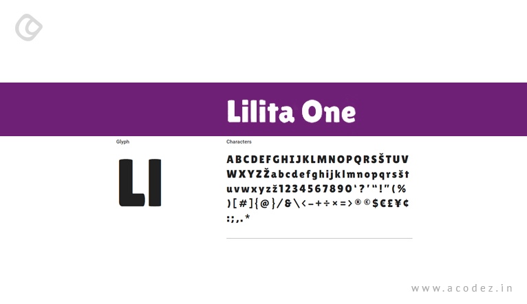
Lilita One display typeface with a fat look and short texts with a condensed structure which makes it ideal for the headlines and shorter text. It also features eye-catching details which adds a personal and soft look. It is rounded, quirky with its rounded terminals and soft appearance. For the best use, it is necessary to use it at 40pt.
EB Garamond:
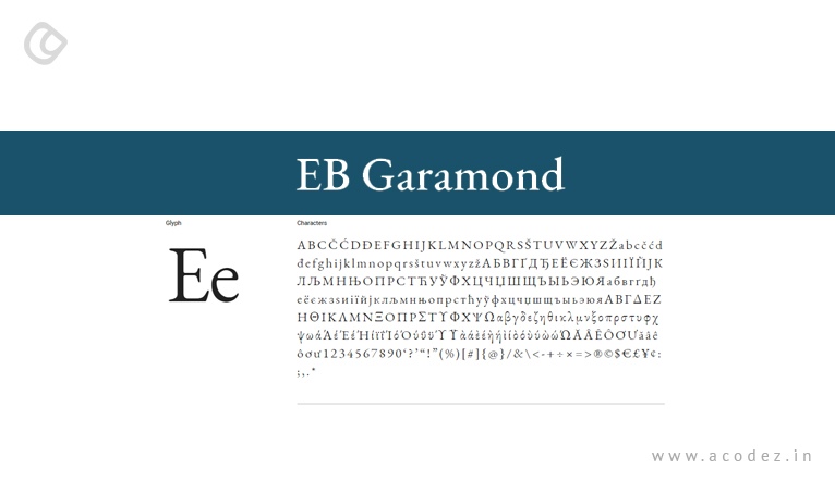
EB Garamond intends to provide an excellent and classical font Garamond which was popular typeface from the mid-16th century. It is available in Regular, Regular Italic, Medium, Medium Italic, Semi-Bold, Semi-Bold Italic, Bold, Bold Italic, Extra-Bold, and Extra-Bold Italic styles.
Space Mono:
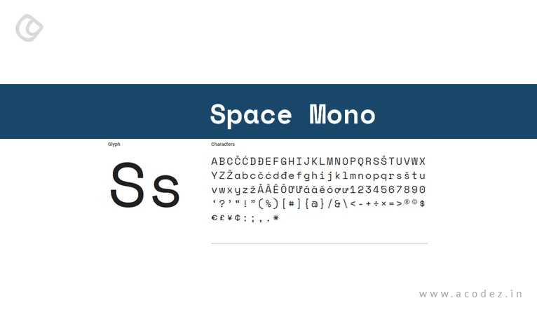
Space Mono is a fixed-width type family and comes in Regular, Regular Italic, Bold, and Bold Italic styles. It can be used in headlines and short texts as its letterforms infuse a geometric foundation. Its typographic consist of old-style figures, superscript and subscript numerals, fractions, center-height and cap-height currency symbols, directional arrows, and multiple stylistic alternates.
Kaushan Script:
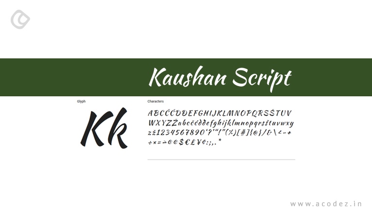
Kaushan Script is a calligraphic font that can help to avoid typographic perfection and stay natural. It can avoid typographic perfection as there is a slight variation in angles between verticals in characters and uneven positioning along the baseline. The vertical strokes of different characters vary, and the positioning along the baseline jumps around with a rustic and natural feeling. One of the best parts of this is that it is readable even when used at 16 pixels and hence is used in many websites.
Roboto:
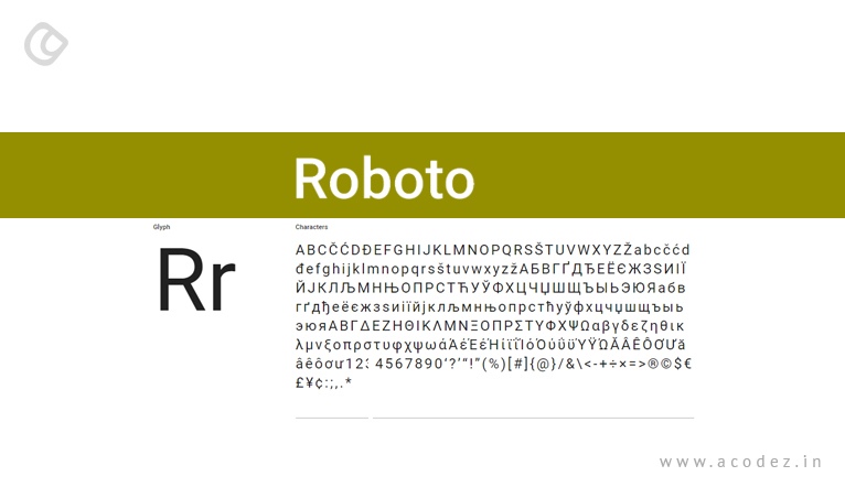
Roboto is a popular font used by more than 20 million websites worldwide. Other Roboto family fonts are also available like Roboto Condensed, Roboto Slab, and Roboto Mono are also used in many websites. These are optimized for readability on different devices and reading environments. Its friendly and open curves add an extra advantage to the same as it allows the users to be settled in their natural width. This makes it easier for reading on various platforms. Roboto Mono makes it easier for reading and writing software source code. One of the best things of these is that in this font there is a vast difference between similar shapes which makes it easier to tell apart like digit ‘1’, lowercase ‘l’ , capital ‘I’ zero, letter ‘O’, curly braces ‘{ }’ parentheses ‘( )’ and braces ‘[ ]’. Periods and commas are also exaggerated to identify them more quickly.
Courgette:
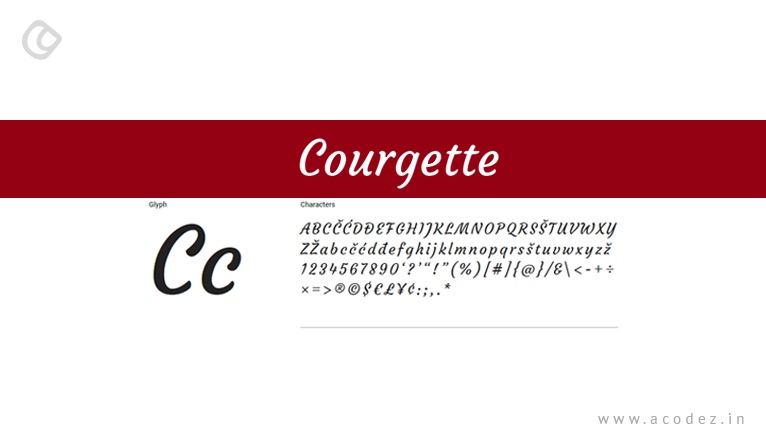
Courgette is a medium-contrast, italic-script, and brushy typeface. Its brush script and low stroke contrast have a flourishing impact makes it easier to use on the web as body text and headlines and can also be used in the form of smaller text.
Wire One:
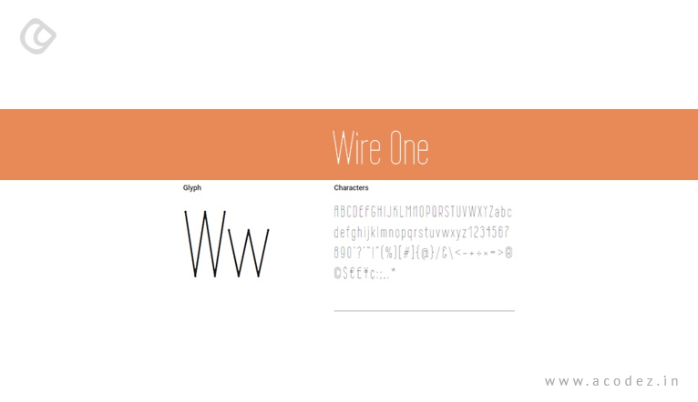
Wire One is a condensed, sharp, stylish, monoline sans font with modular-based characters flavored with a sense of art nouveau. This font is quite thin, and hence it is necessary that you use it above 12pt to make it easily legible. The minuscule dot terminals are sharp, stylish, and beautiful.
Open Sans:
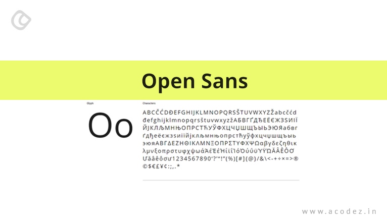
Open Sans is a popular, clean and modern Sans Serif font that is used on more than 21 million websites worldwide. It is a collection of 897 character set which is a combination of standard ISO Latin 1, Latin CE, Greek and Cyrillic character sets. There are ten different styles of Open Sans like Light, Light Italic, Regular, Regular Italic, Semi-Bold, Semi-Bold Italic, Bold, Bold Italic, Extra-Bold, and Extra-Bold Italic. This font is optimized for print, web, and mobile interfaces. It is used as Mozilla’s default typeface for websites, Telegram Desktop app, and various popular websites.
Rammetto One:
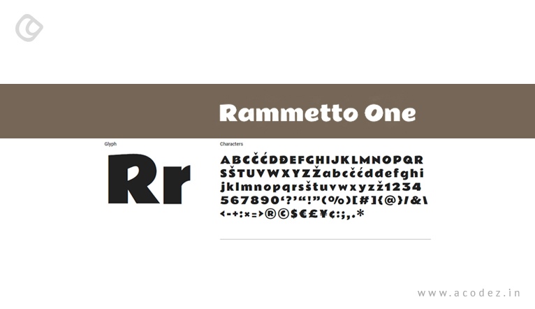
Rammetto One is a typeface display font based on the uppercase display font Basuto. It is a combination of old font and also contains lowercase and other special characters. It provides extra support for the European languages as well.
Lato:
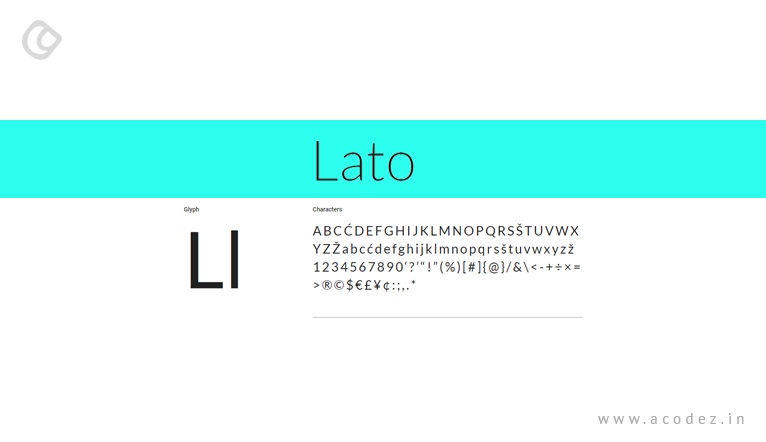
Lato is a Sans Serif typeface and is a collection of corporate fonts for a large client and is available for a different stylistic direction. Lato is available in 10 different styles like Thin, Thin Italic, Light, Light Italic, Regular, Regular Italic, Bold, Bold Italic, Black, and Black Italic.
Montserrat:
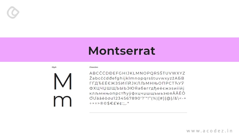
Montserrat is a typeface that can help add the beauty of urban typography. Over 4.7 million websites use it all over the world. It has two sister families Alternates and Subrayada. In the Alternates family, the letterforms are special, and Subrayada has a special style of underline integrated into the letterforms. The weights of Montserrat is adjusted to make regular lighter, and hence it is necessary to use in the long text. It is available in Thin, Extra-Light, Light, Regular, Medium, Semi-Bold, Bold, Extra-Bold, Black, and their respective Italics.
Merriweather:
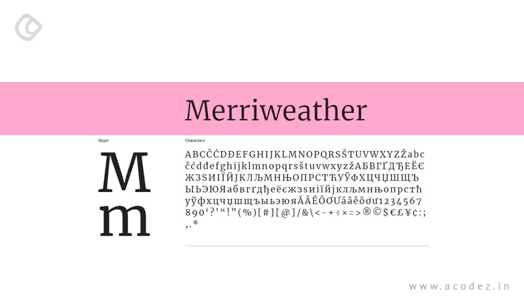
Merriweather is a text face font which is perfect to read on screens. With a large height, condensed letterforms, diagonal stress, sturdy serifs, and open forms make it perfect for websites as it is easier to read. It is available in Light, Regular, Bold, Black, and their respective Italics.
Playfair Display:
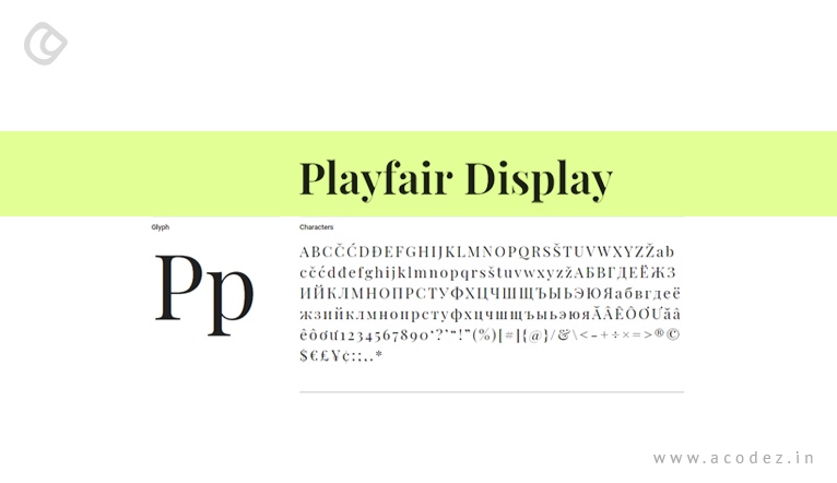
Playfair Display is a transitional design under the influence of Scotch Roman designs. The display design with high contrast and delicate hairlines adds an extra influence of printer and typeface. This makes it quite popular for websites as well and is suitable for title and headlines. Apart from these it also has an extra large x-height, extra short capitals, and short descenders.
Indie Flower:
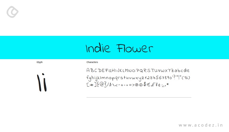
Indie Flower is a simple and handwriting font with a carefree and open design. It has bubbly, rounded edges that make it easy to read in a simple and beautiful design. It makes it bolder than any other fonts.
Summary:
These fonts are available for free and can be quite easily used. It is necessary that you choose the font that is consistent with your website and convey the information in a better way without any negative impact. By making use of these fonts, you can make your website user-friendly and also load faster than the other websites.
Acodez is one of the best web design company in India which has been in the forefront of the web development. Being consistent with the latest web development trends, the websites are designed to take your brand to the next level.
Looking for a good team
for your next project?
Contact us and we'll give you a preliminary free consultation
on the web & mobile strategy that'd suit your needs best.