Images bring liveliness to a website and helps in gaining user attention. All text & no images make a website look dull to a user. This is one of the main reasons why images are vital for the success of any website today. But then again, simply adding images to a website does not mean the job is finished. You need to optimize them for web users & search engines as well to effectively promote your website. However, there are some mistakes to avoid on your website while using images.
Here are the top 8 mistakes people often make with images on their website.
Huge Files Size
Full size and large images are very popular in case of print jobs but what about websites. On websites, these heavy images take a lot of time to load. As a result a user has to wait for a few more seconds until the website loads completely, which gives a bad impression about your site. Images should not be so huge that it loads slowly and also it should not be too tiny to be legible. Search engines too prefer websites that loads quickly & consider it as a criterion while ranking websites in search results. So always strike a balance between image quality & size.
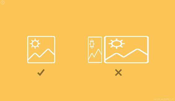
No Cropping
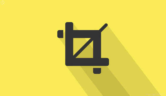
Cropping is a very useful tool, but there are times when ignore this and as a result, the image might have too much blank/useless space in it, while the core content might be concentrated in a small area, which becomes difficult to comprehend. Cropping helps you to cut out & use specific portion of a image which ensures better readability. However, proper care should be taken while cropping to avoid bad borders & incomplete looking images.
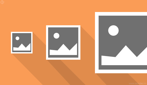
Missing Thumbnails
Thumbnail sizing and resizing is very important and there are many ways of doing it. But in many cases, designers forget about thumbnails and that is when the mess starts. Whenever you make changes to a website, the thumbnails also needs to be attended to.
Improper scaling or stretching
Improper scaling or stretching of images can spoil the website looks. Every image should have an aspect ratio of 1:1 & anything else may not look good.
Ignoring multiple devices
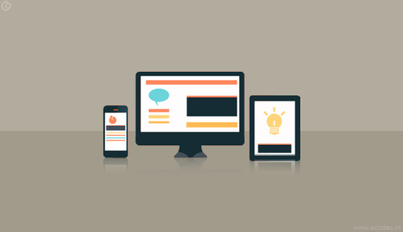
Whenever you work on a image, the first thing you need to know is that this image would be used in different devices. The shape or size of the image can change from one design to another and that is why it is important that you take this scenario into account while using images on your website. The best way to counter this issue is to make use of media queries to plan for these changes by device.
Missing the retina screen
In the past, it was all about using the standard 600 pixels wide at 72 ppi. But things have changed now and there are different devices that show the images and you need to plan these accordingly. Retina resolution changes from device to device, but it is certainly higher than the standard one.
Over using generic art

Generic art provides you a common perception about the presentation which is great, but when the same things pop up on many websites, it is a disaster. That is why always choose the one that is unique, but at the same time is easy to recognize. There are so many websites all over the internet and a common image in most of them bugs users. So the best thing you can do is to look for one such image that is easily recognizable and feasible with the business and is unique at the same time.
Unsearchable Names and Meta Data
Image names & meta data are very important for a website, especially for search engines. When search engines crawl your website, they don’t see what the image is, instead, they make use of the title & associated meta data of images to get an idea of what the image is about. This is why it is important to use descriptive image names & tags, rather than random numbers & characters.
Take care of these mistakes & you are good to go.
Trust us for we have done this before and we know what exactly your business needs are, as we the best ui ux design companies in India, and have won several awards for our designing works. Gets a free quote from one of the top website designing companies in India. Call +91 95 44 66 88 44 right away!
Looking for a good team
for your next project?
Contact us and we'll give you a preliminary free consultation
on the web & mobile strategy that'd suit your needs best.

