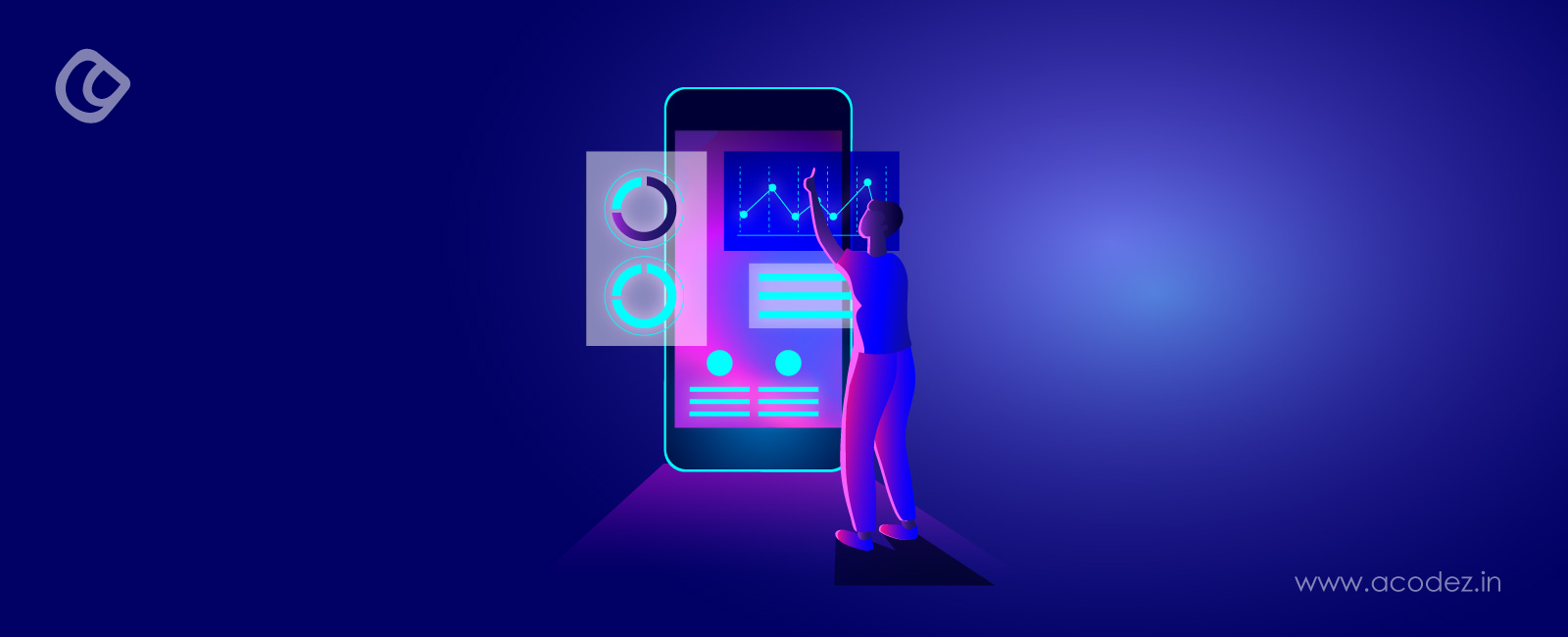
User interface design, a key aspect of UI trends, has undergone considerable evolution in recent years. In the early 2010s, Skeuomorphism reigned with ornate designs that mimicked physical objects. This increased familiarity, but felt dated as digital interfaces advanced.
Neumorphism then emerged as a middle ground, blending skeuomorphic aspects with minimalism through subtle shadows and soft embedded elements. However, buttons could blur into the background.
More recently, Glassmorphism has risen to prominence starting in 2020. Its frosted glass aesthetic gives a sleek, modern look. Yet discoverability may be poorer compared to predecessors. Each approach carries advantages and drawbacks related to usability, longevity, and how well styles resonate as technology changes.
By analysing factors like visibility, intuitiveness, and longevity, designers can opt for the most suitable philosophy that matches their goals and audience. Continuous refining of past successes and inventing new trends will likely further transform the discipline going forward as user needs and capabilities evolve.
This comprehensive guide explores the traits and impacts of these influential movements on contemporary interface design.
Neumorphism, a notable UI trend, emerged in late 2019, seeking a balance between flat and skeuomorphic design philosophies. As a portmanteau of “new” and “skeuomorphism,” this style creates a subtly textured interface with a modernized take on tactile aesthetics.
At its core, Neumorphism leverages monochromatic palettes combined with delicate shadows and highlights. These visual cues generate the illusion of a three-dimensional form, making elements appear to gently press inward or protrude outward from surrounding surfaces.
Soften edges and nuanced lighting further enhance this plastic-like quality.
Notably, Neumorphic designs employ dual shadows on opposing sides of each element—a technique that amplifies the perception of depth. Maintaining consistent light sources across the interface is paramount to preserving this effect.
With an emphasis on gentle gradients, approachable tones, and inviting textures, Neumorphism aims to engage users through a familiar yet refined presentation. However, designers must consider accessibility, ensuring sufficient colour contrast supports comprehension for all.
Like any trend, overuse risks monotony that confuses rather than informs. Judicious placement draws focus to key interactions while preserving clarity overall. Complementing aesthetics with usability demands meticulous attention.
When implementing Neumorphism, designers should:
Maintain consistent lighting across the interface to preserve the illusion of depth
Employ subtle gradations to enhance three-dimensional effects without overdoing it
Thoughtfully space elements to avoid cluttered, confusing designs
Design clear hover and active states to ensure interactive parts are easily distinguishable
Regularly check designs for good colour contrast and readability to ensure accessibility
Let accessibility underpin every step of the design process
Neumorphism excels in contexts where tactility aids comprehension. Dashboards, control panels, and similar interfaces benefit from this style’s subtlety. Its soft, button-like elements also suit music players well.
Modern Set of Media Player Interface Elements Neomorphic Style – Image Source: Freepik
Calculator apps and settings menus likewise align with Neumorphism’s emphatic yet minimalist approach.
However, websites or apps prioritising large amounts of content may find Neumorphism distracting. The visual nuance risks obscuring dense informational displays meant for rapid scanning.
While Neumorphism creates inviting experiences, its emphasis on light and shadow could hinder the consumption of detailed material. Some contexts demand styles permitting swifter processing of complex data.
Moving forward, hybrid approaches integrating Neumorphic nuance promise fresh perspectives. As mastery matures, more sophisticated syntheses may emerge, balancing artistry with practical concerns. Ultimately, Neumorphism reflects an ongoing evolution, bridging physical and digital in service of the user.
Glassmorphism, another prominent UI trend, draws inspiration from frosted glass, creating dimensional digital interfaces through transparent overlays. Coined by Michał Malewicz of HYPE4 after Apple’s macOS Big Sur update in 2020, this trend adds depth while retaining sleek modernity.
Big Sur Uses the Frosted Glass Effect – Image Source: Interaction Design Foundation
Where Neumorphism uses shadows, Glassmorphism leverages opacity and layered transparencies for a polished, airy aesthetic suited to any context.
Definition and Origin
Glassmorphism creates a frosted glass effect where backgrounds appear blurred behind semi-transparent panels. The style draws inspiration from Microsoft’s Windows Vista Aero Glass theme, which pioneered the implementation of glass effects in operating system interfaces.
Windows Vista’s Aero Glass Theme – Image Source: Global Knowledge
Subsequently, Apple’s ios 7 release marked a significant shift toward this design philosophy, introducing blurred effects behind menus and UI elements.
Key Features
Gradient Glassmorphism Mobile App Template – Image Source: Freepik
The distinctive characteristics of Glassmorphism include:
Transparency and Blur: Semi-transparent backgrounds mimic frosted glass, creating a layered, multi-dimensional aesthetic. Background elements appear blurred behind transparent layers, adding depth to the design.
Light and Shadow: Subtle lighting effects and shadows create a floating appearance, helping distinguish between layers and enhance depth perception.
Border Highlights: Light or colored borders delineate edges, enhancing the glassy effect and maintaining visual clarity.
Vivid Colours: Bright background colors shine through semi-transparent layers, creating striking visual impacts and emphasizing the glass-like appearance.
Advantages and Disadvantages
Glassmorphism offers several benefits, yet comes with notable challenges:
Advantages:
Creates visual hierarchy through depth and layering
Maintains context while focusing on overlay content
Adds sophistication to modern interfaces
Provides an immersive visual experience
Disadvantages:
Text readability issues due to transparency and background complexity
Resource-intensive effects may impact performance on lower-end devices
Cross-platform consistency challenges due to varying CSS property support
Potential accessibility concerns for users with visual impairments
Best Use Cases
Glassmorphism proves particularly effective in specific UI scenarios:
Dashboard Interfaces: Creates sophisticated layouts for data visualization with organized, depth-enhancing information overlays
Overlay Panels: Ideal for modal windows where maintaining background context remains important
Notification Cards: Helps information cards stand out while seamlessly blending with the overall design
Creative Portfolios: Enhances visual impact on portfolio and product landing pages
Mobile Applications: Adds modern sophistication to media, lifestyle, and fashion apps
Implementation Tips
To effectively implement Glassmorphism, designers should consider these essential guidelines:
Contrast and Readability
Ensure high contrast between text and background
Maintain legibility against blurred, semi-transparent backgrounds
Avoid relying solely on colour to convey information
Technical Considerations
Use CSS properties like background-colour with alpha channel rgba()
Apply backdrop-filter blur effects judiciously
Test performance across different devices and screen sizes
Accessibility Focus
Keep navigation elements and buttons clearly distinguishable
Provide alternative text and ARIA labels for screen readers
Regularly test designs with accessibility tools and WCAG guidelines
Design Balance
Use glassmorphic effects sparingly to prevent interface clutter
Maintain a consistent light source and shadow effects
The design community has responded to Glassmorphism with mixed reactions. Though many admire its innovative aesthetic and fresh alternative to flat design, others express concerns about potential overuse and accessibility challenges.
Moving forward, the success of Glassmorphism will depend on finding the right balance between visual appeal and practical usability considerations.
Tracing back to pottery imitating metal designs in Ancient Greece, the concept of skeuomorphism, a foundational UI trend, means ‘taking on the form’ and has impacted digital interfaces.
Skeuomorphic Vessels – Image Source: Victoria and Albert Museum
Combining the Greek roots “skeuos” for vessel and “-morphism,” it refers to simulated representations of real-world objects or textures within user interfaces, helping early adopters grasp emerging technologies through familiar metaphors.
Definition and Origin
Skeuomorphism represents a design philosophy where digital elements mirror their real-world counterparts, focusing on textures, lights, shadows, dimensions, and functionality.
iBooks Was Supposed To Look Like an Actual Bookshelf – Image Source: Business Insider
This design approach gained significant momentum during the 1980s, with Steve Jobs emerging as one of its earliest proponents at Apple, believing that computer interfaces would become more intuitive through skeuomorphic implementation.
The original Mac OS desktop, designed under Steve Jobs, arguably first demonstrated skeuomorphism through icons resembling real-world objects like folders, disks, and trash cans.
The Original Mac Desktop and Calculator – Image Source: Business Insider
It also included a calculator application that Jobs designed himself, closely mimicking the visual appearance and interface of a physical calculator – an early example of using skeuomorphic metaphors to help users familiar with real-world items intuitively grasp emerging digital concepts.
Key Features
The distinguishing characteristics of skeuomorphic design include:
Realistic Textures: Digital interfaces incorporate detailed textures that replicate physical materials, creating a tangible connection with users
Three-Dimensional Effects: Extensive use of shadows, highlights, and gradients to create depth and dimension
Physical Object Mimicry: Interface elements closely resemble their real-world counterparts in both appearance and function
Rich Visual Details: Incorporation of ornate designs and realistic elements to enhance user familiarity
Advantages and Disadvantages
The skeuomorphic design presents distinct benefits alongside notable challenges:
Advantages:
Creates immediate familiarity through real-world object recognition
Reduces learning curves for new users encountering digital interfaces
Provides clear visual feedback through physical-world metaphors
Enhances user immersion by aligning expectations with experiences
Disadvantages:
Can lead to cluttered and visually overwhelming interfaces
Limits creative innovation in digital functionality
Requires significant development resources and time
May become outdated as physical references lose relevance
Best Use Cases
The skeuomorphic design proves most effective in specific scenarios:
Educational Applications: Helps users transition from physical to digital interfaces
Complex Interfaces: Simplifies learning curves through familiar visual metaphors
Specialized Tools: Enhances user understanding of professional applications
Gaming Environments: Creates immersive experiences through realistic elements
Implementation Tips
To effectively implement skeuomorphic design, designers should consider these fundamental guidelines:
Balance and Moderation
Apply skeuomorphic elements selectively to avoid interface clutter
Focus on essential functional elements rather than purely decorative details
Maintain consistency in light source and shadow effects
Design Considerations
Ensure accurate representation of physical objects’ behavior
Create clear connections between digital functions and real-world counterparts
Update designs to remain contemporary and relevant
Technical Execution
Pay careful attention to texture quality and detail
Implement proper lighting and shadow effects
Consider performance implications of complex visual elements
In contemporary design, skeuomorphism continues to evolve, finding new applications in emerging technologies. Furthermore, smartwatch interfaces demonstrate its enduring relevance, where traditional watch faces serve as familiar entry points for users adapting to wearable technology.
Additionally, the rise of augmented and virtual reality presents fresh opportunities for skeuomorphic design principles, as these technologies bridge the gap between physical and digital realms.
Comparative Analysis
As user interface design evolves, the relationship between Neumorphism, Glassmorphism, and Skeuomorphism impacts the field. Each brings distinct strengths and barriers, impacting user experience. Neumorphism offers depth cues but lacks realism.
Glassmorphism introduces blurred layers for focus but potentially less clarity. Skeuomorphism leverages familiarity but risks datedness. Exploring hybrids combining their most useful aspects merits study to inform innovative interfaces that enhance user understanding and engagement.
Neumorphism vs. Glassmorphism vs. Skeuomorphism
Neumorphism attempts to balance flat and skeuomorphic design through subtle shadows and highlights that impart a sense of depth, often employing monochrome palettes. This approach can foster tactility and increase engagement.
Glassmorphism embraces transparency and blur effects resembling frosted glass, layering interfaces in multi-dimensional, sophisticated aesthetics made striking through vivid hues shining through semi-transparent layers.
Skeuomorphism, the earliest concept, facilitates rapid familiarization by replicating real-world objects’ textures, three-dimensionality, and details in digital environments, lowering the barrier to entry for novice users.
Each offers merits: Neumorphism through depth and simplicity, Glassmorphism via layering and vibrancy, while Skeuomorphism leverages immediate recognizability. Their hybridization merits exploration to develop interfaces that intuitively engage users through drawing from their most user-centered attributes.
When comparing these design philosophies, several key differences emerge:
Visual Complexity: Skeuomorphism tends toward the most intricate details and textures, while Glassmorphism presents a sleek, modern appearance. Neumorphism strikes a moderate balance with its subtle depth effects.
User Familiarity: Skeuomorphism excels at immediate recognition through mimesis of real-world objects, though Neumorphism and Glassmorphism require more adaptation.
Accessibility: All three approaches face accessibility challenges – Neumorphism’s low contrast impacts legibility for some, Glassmorphism’s transparency can reduce text readability, and Skeuomorphism’s complex visuals risk clutter.
Implementation Complexity: Skeuomorphic designs require extensive development to achieve detailed realism, and Glassmorphism places heavy demands on system resources, especially lower-end devices. While Neumorphism strives for visual impact through balanced execution, consistency across screen sizes and resolutions can be difficult.
Adaptability: Glassmorphism and Neumorphism allow more flexibility in modern, adaptable interfaces as physical references become obsolete, positioning Skeuomorphism most effectively in specific contexts.
Hybrid Approaches
As designers look to maximize benefits and minimize drawbacks, hybrid strategies are emerging.
A notable trend combines Neumorphism and Glassmorphism, leveraging subtle depth effects with transparency and blur for layered, futuristic aesthetics. This approach has gained popularity in apps, dashboards, and operating systems seeking innovative yet accessible designs.
Another hybrid involves selectively incorporating skeuomorphic elements into otherwise flat or minimal designs. This highlights interactivity and provides familiar cues without clutter, helping users navigate complex interfaces intuitively.
Such combinations reflect an industry emphasis on visual appeal, functionality, and bridging styles to engage diverse users through intuitive, cohesive experiences.
Emerging technologies are also integrating these philosophies into novel hybrids.
Adaptive UI combines varying elements to intelligently modify interfaces by device, resolution, and user preferences.
Emotional UI leverages AI and feedback to craft resonant experiences through multiple approaches.
Mixed reality blends physical and digital, requiring skeuomorphic familiarity blended with modern aesthetics.
The convergence of design thinking and innovative computing points to interfaces that dynamically assure ease of use, engagement, and seamless transitions between real and virtual environments through thoughtful hybridization.
Choosing the Right Design Trend
Selecting the appropriate design approach depends on several factors:
User Demographics: User demographics should be considered, as skeuomorphic elements can aid older or less digitally-savvy users through visual familiarity, while younger tech-native audiences may appreciate the sleekness of Glassmorphism or Neumorphism.
Application Type: Complex tools may benefit from skeuomorphic simplification, while media or lifestyle apps could leverage Glassmorphism’s contemporary appearance. Brand identity must align – a cutting-edge company may find Glassmorphism a fit, while a traditional brand may incorporate skeuomorphic tones.
Device Considerations: Target device capabilities also warrant examination. Glassmorphism’s demanding effects risk instability on lower-end devices.
Accessibility Requirements: High contrast and readability should be prioritized, perhaps through hybridizing elements.
Long-term Viability: While Skeuomorphism risks datedness over time, more conceptual styles like Neumorphism and Glassmorphism may age well. Hybrid potential should be explored to uniquely and effectively address user needs and brand goals.
As digital landscapes evolve, designers must remain adaptable through continuous evaluation and refinement. Understanding each philosophy’s strengths, limitations, and potential for innovation is imperative.
By exploring hybrid approaches that marry benefits while mitigating individual constraints, interfaces can be not only aesthetically pleasing but highly usable and inclusive. No single approach alone satisfies all contexts – thoughtful consideration of users, brands, technologies, and futureproofing guides the selection of the right design or hybrid thereof.
Adaptability through understanding philosophical nuances empowers designers to craft human-centered experiences.
Future Trends and Predictions
Reports indicate that by 2025, over half of households will feature smart speakers, a significant shift in UI trends, heralding a transition to voice-focused interfaces.
AI and user-centricity will converge within UIs as algorithms analyze behavior to dynamically customize content, workflow, and even palettes. Chatbots will recognize emotion and proactively assist.
Voice places technologies like predictive interfaces minimizing steps, real-time context adaptation, and dynamic cross-device layouts at the forefront. AI and machine learning will enable automated design optimization. Hybrid approaches fusing aesthetics and functionality through balanced visual appeal and usability will prioritize accessible, inclusive experiences.
Emotion-based responses to moods and feelings promise more engaging personalization.
AR and VR integration continues pushing immersive boundaries. Accessibility remains paramount to serving all people regardless of complexity. Sustainable design, ethical priorities of consent, transparency, and privacy protection, alongside hyper-interactive and personalized elements, shape the user-driven future.
As AI drives personalization, balancing user privacy presents an industry challenge. Implementing transparency, consent-based data collection, and digital footprint reduction will be key. The demand for more ethical practices grows.
The future of UI design centers around convergence – of humans and technology, of various design philosophies, of virtual and physical worlds – to offer intuitive, customized, and sustainable experiences for all.
As we navigate the evolving landscape of UI trends, the interplay between Neumorphism, Glassmorphism, and Skeuomorphism offers a rich tapestry of design possibilities. Each approach brings unique strengths and challenges, influencing how users interact with digital interfaces.
Neumorphism’s subtle depth and tactile aesthetics provide a modern twist on familiar designs, while Glassmorphism’s frosted glass effect adds a sleek, contemporary feel. Skeuomorphism, with its realistic textures and immediate familiarity, remains relevant in specific contexts.
By understanding the nuances of these design philosophies and considering factors like user demographics, application type, and accessibility, designers can create interfaces that are both visually appealing and functionally effective.
As technology advances, hybrid approaches and emerging technologies will continue to shape the future of UI design, ensuring that interfaces remain intuitive, engaging, and inclusive.
Acodez is a leading web design company in India offering all kinds of web design and development solutions at affordable prices. We are also an SEO and digital marketing agency offering inbound marketing solutions to take your business to the next level. For further information, please contact us today.
Looking for a good team
for your next project?
Contact us and we'll give you a preliminary free consultation on the web & mobile strategy that'd suit your needs best.
Rithesh Raghavan, Co-Founder, and Director at Acodez IT Solutions, who has a rich experience of 16+ years in IT & Digital Marketing. Between his busy schedule, whenever he finds the time he writes up his thoughts on the latest trends and developments in the world of IT and software development. All thanks to his master brain behind the gleaming success of Acodez.