Specifically, in the modern world, they have high expectations for a website’s speed and overall performance. One of the known problems of UX is the stability problem, which is the elements on a webpage that are not in their original position, especially when the content is being loaded. Such movements may cause much frustration, making accidental clicks and even questioning the site as a whole. This is known by the measurement of what is called Cumulative.
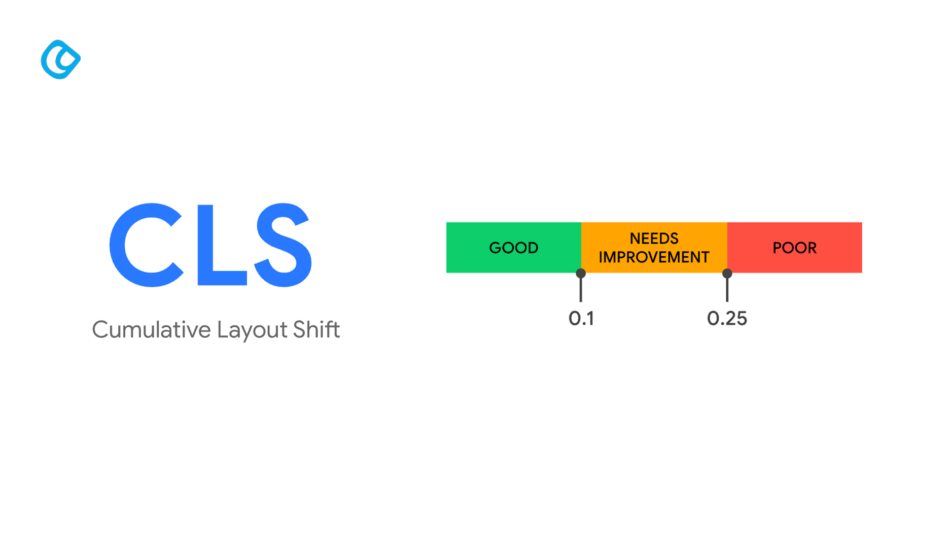
What is a good CLS score? – Image Source : web.dev
Cumulative layout shift (CLS) stands for the total number of layout shifts a page experiences from the beginning to the end of its loading process. A layout shift can be defined as a situation in which a visible element is relocated or resized between two or more frames of rendering, hence shifting the position of other content. While some values are aimed at measuring load time, the CLS index measures the visual contrast, which means users see a stable and predictable interface.
Why CLS Matters for Your Website
A higher CLS means more variance that a user experiences on the webpage, which is also highly undesirable. Think of stumbling upon an article and, while you are reading it, the text jumps up because the image or the ad displayed above has come into view – this is a layout shift. Many of these breaks can mislead a user, make them click the wrong links or leave the site entirely. Operating websites with low visibility stability may tend to experience reduced ranking, thereby reducing traffic flow.
How CLS is Measured
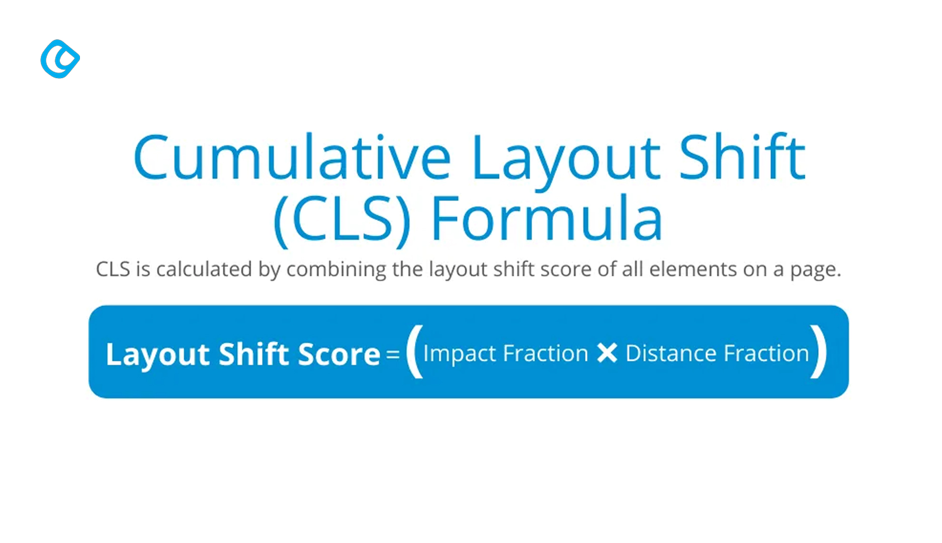
formula for Cumulative Layout Shift – Image Source: The Online Advertising Guide
CLS is done with respect to the fraction of the viewport that has been scrolled and the number of pixels in which the elements were shifted. The formula is:
CLS = impact fraction * distance fraction
Impact fraction: The ratio of the shifting element into the viewport.
Distance fraction: This could be defined as the distance the element travelled, with reference to the size of the viewport being used.
There are different classifications of CLS scores that have been developed by Google as follows:
Good: CLS score less than 0.1
Needs Improvement: CLS between 0.1 and 0.25
Poor: CLS score greater than 0.25
In the context of the presented experiment, it is imperative to keep the CLS score below 0.1 in order to ensure the optimal usability of the conversational interface.
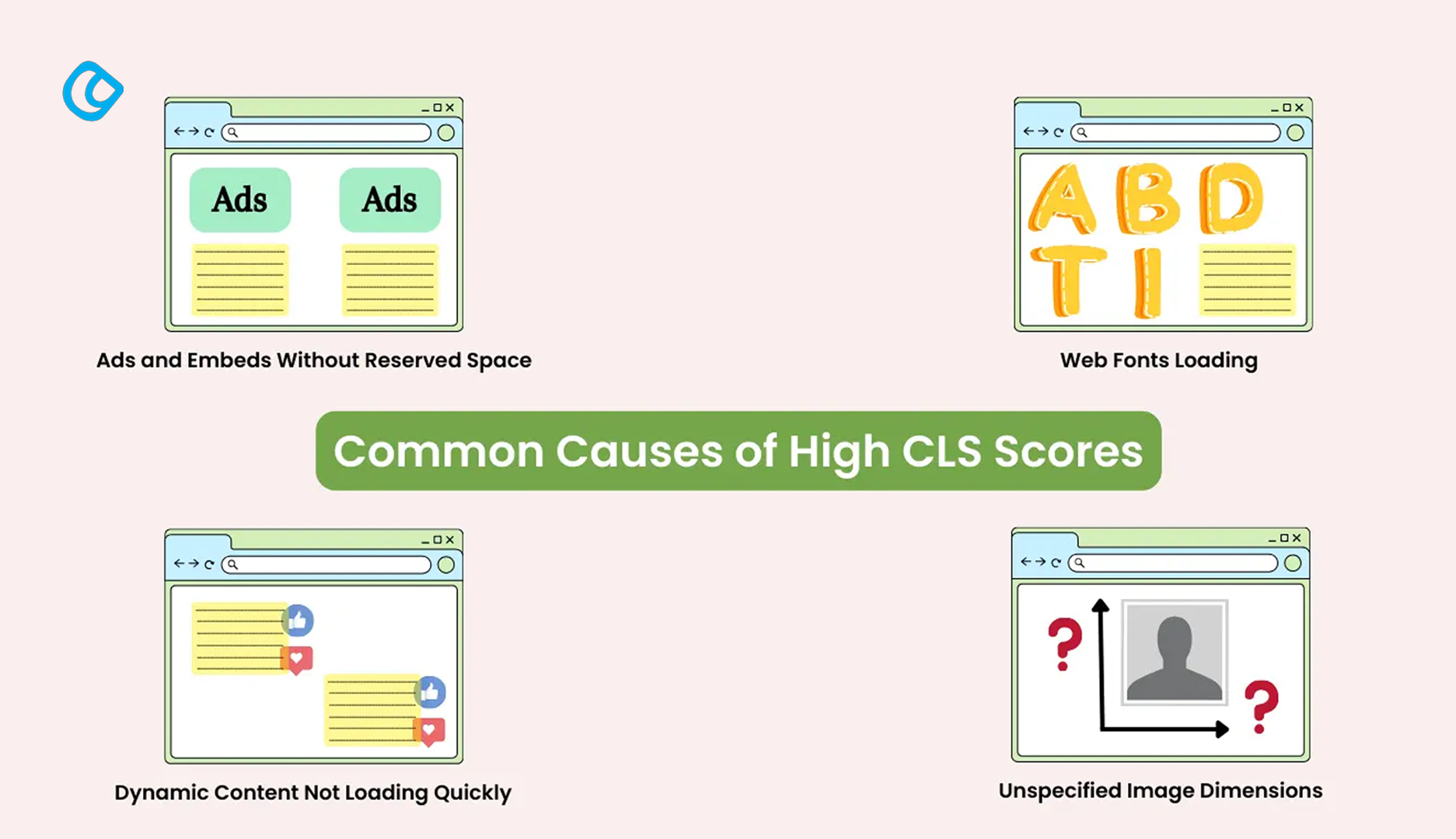
Common Causes of High CLS
In essence, the best way to prevent them is by identifying the causes of layout shifts in the first place. Common culprits include:
Common Causes of High CLS – Image Source:wpmozo
Images Without Defined Dimensions
This is the reason why when one is embedding an image and fails to set the width and height of the image the browser does not know how much space it will require during loading. Therefore, the change in the image may cause the new content to override that which was previously shared or shifted to the sides.
Ads, Embeds, and Iframes Without Dimensions
Advertisements and other elements that are called from other sources can appear at any time on a page. If set free, these elements can move and occupy places on the page, and that statement is not a joke.
Dynamically Injected Content
Specifically, banners or notifications downloaded through JavaScript may shift the page layout if placed above some other content or if no space is provided for them. This has to do with website promotion, like having banners appear or having social proof pop-ups, which are common on ecommerce websites. To avoid shifts, there is a need to make sure that the elements that appear dynamically have a space predefined or are aligned in unobtrusive areas.
Web Fonts Causing FOIT/FOUT
Web fonts have two kinds of problems, namely, Flash of Invisible Text (FOIT) and Flash of Unstyled Text (FOUT). FOIT happens in a context in which the browser masks text until the font loads and creates shifts as soon as the font is revealed. FOUT occurs when the WebKit browser replaces the fallback fonts with the desired fonts distorting text width and reorganizing content.
The next input requires that width and height attributes always be defined for image and video elements. This ensures that browsers give the right width prior to loading the content in order to provide room for the content as it is loaded. For instance, if we use images with aspect ratio boxes, the images are elastic enabling them to adapt to the different gadgets without this moving.
Third-party ads and embedded content are responsible for most of the CLS as they make the overall look of a webpage unstable. CLS is rousing when a number of objects shift while loading on a particular page is being performed. To be able to adequately resolve this matter properly, some guidelines need to be followed when it comes to ads and embedded content.
1. Reserve Static Space:
The best way of avoiding layout shifts is to allocate a certain space for advertisements, even if there is no advertisement to fill that space. When choosing the size of the ad containers in the code of the page will maintain the stability of the content around the ad, whether the ad is loaded or not. For instance, if a specific banner ad has a conventional size of 728×90 pixels, it implies that the container should be configured for the same size explicitly. In this way, the page layout does not shift, and there are no content shifts as the advertisement loads within the webpage.
2. Avoid Placing Ads Above the Fold:
Positioning advertisements above the fold, particularly if the advertisements are loaded asynchronously, might lead to an increase in disruption. It could be the case that users are engaged in reading the content or actually squeezing in an interaction with the content, and the whole page shifts as a result of the late-loading ad. To reduce the impact of this problem, place the ads at the bottom of the page or in the sections where layout changes are not likely to affect the user experience. It also helps users avoid pop-up interference with visible content; they can interact with the latter as directly as possible.
3. Use Placeholder Elements:
For that reason, it remains necessary to utilize placeholders so as to ensure the sincerity and originality of its design. Subsequently, by specifying the length of the blocks as a percentage and placing ’empty’ squares with a size prepared for the ads or the embedded content, a tangible layout picture appears. When an actual ad or embedded media appears, it just inserts into the place of the tag and does not disturb the layout of the page. It is more useful in the development of a responsive site design in which content adjusts to screen dimensions. By styling placeholders with CSS, it is also possible to make the reserved space fit the design of the page.
Managing Dynamically Injected Content
Inserts such as pop-ups, notifications, cookies, and scripts, such as JavaScript-based content, contribute to the instability of the website. She also explains by adding that when new elements are brought in after the page has been loaded, Crashing is created, leading to a Cumulative Layout Shift.
1. Insert New Content Below the Viewport:
To prevent such an interference with the users’ activity, it is possible to post new content at the bottom of the page, which is out of the user’s sight as soon as the page loads. Since loading the content is done with JavaScript, the users do not experience a shock effect of layout shifting when they interact with the above-the-fold content. For instance, if a website adds other articles or even images to the page in the background, which loads when the user scrolls a page down, making them appear only when the user scrolls down to the bottom part of the current content, this will help to avoid positional shifts.
2. Use Animation Transitions:
Smooth animations can introduce new content in a very natural way, and with this, the change seems deliberate and not unmotivated. If content is updated, such as on a and cards, fade, slide, or expand transition can help build an expectation that lays the foundation for visually less stability in regards to layout. For instance, rather than presenting the notification banner popping right on top of the screen, sliding the banner from the bottom or top of a screen enables users to be aware of the new element without startling them. This meant that while animations were used in the designs, they were to be controlled so that they did not interfere with but rather complement the browsing process.
3. Pre-allocate Space:
It is noteworthy that to enhance the layout stability of the Web page, room must, therefore, be provided for dynamic components that are likely to appear soon. Emergency bars, such as cookie consent banners, promotional pop-ups, and live chat widgets, should also be defined in the preliminary space setting. Thus, it becomes possible not to push the content when these components are produced. However, if there is a constraint put in place of carnival, like a cookie banner at the bottom of the page, then design a fixed height so as to keep the main content intact when the banner opens. This is because using CSS to define the minimum possible height and width guarantees that the layout will remain adequate even if the content is not yet present.
Optimizing Web Font Loading
The avoidance of font-related layout shifts is still possible through the use of CSS techniques.
Font-display: swap; Makes fallback fonts load immediately while swapping them with the targeted font and making the text invisible.
@font-face {
font-family: ‘CustomFont’;
src: url(‘customfont.woff2’) format(‘woff2’);
font-display: swap;
}
Preload important fonts: Use <link rel=”preload” as=”font”> to prioritize font loading.
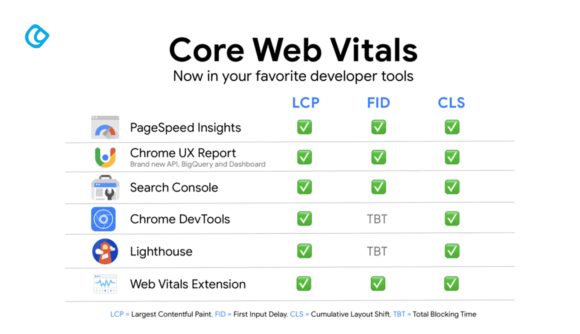
Tools to Measure and Diagnose CLS
Tools measuring the Core Web Vitals – Image Source : Samuel Schmitt
There are a number of tools that may assist in keeping track of and enhancing CLS scores:
Google Lighthouse: Provides information and recommendations about CLS.
PageSpeed Insights: Provides CLS metrics and improvement tips.
Web Vitals Extension: Applying the CLS measure during browsing in real-time.
Chrome DevTools Performance Panel – nothing can be better than having a layout shift of every frame.
Best Practices for Maintaining Low CLS
Continuous Monitoring and Testing
However, to ensure that your website is responsive and working well, you should make some general checks that should be carried out every time you revise or redesign your website. Introducing CLS checks to identify the problems almost in the development cycle
Use Content Delivery Networks (CDNs)
It can also decrease the probability of layout shift due to the delay in the loading of the assets by using Content Delivery Networks (CDNs) that help to speed up the load time.
Prioritize Critical Resources
Some resources must always be loaded first to prevent the application of rules in non-stable initial viewports.
Case Studies: Successful CLS Reduction
E-commerce Site Improvement
The rankings of an online store CLS: It cut down its CLS from 0.3 to 0.08 in the following ways:
Defining image dimensions.
Reserving space for promotional banners.
Preloading web fonts.
End result: Conversion rates rise by 15%, whereas the bounce rates are reduced.
News Website Optimization
A media site was able to reduce CLS from 0.25 to 0.07 through:
This one entails the elimination of advertisements that are injected dynamically above the fold of the webpage.
Aspect boxes for placed media content As the name suggests, aspect ratio boxes refer to boxes created to contain different media elements.
Conclusion
Cumulative Layout Shift (CLS) is an essential parameter that characterizes the stability of the site and the convenience of working with it. As a key Core Web Vital, CLS directly impacts user experience and overall site performance. Through the analysis of its causes and practicing prevention methods that include defining media dimensions, managing dynamic content, and optimizing font loading, CLS can be minimized. Indeed, having a stable website yields better results in the aspects of customer satisfaction, search engine optimization, site engagement, and client conversion. Start optimizing today to have the best browsing experience that will produce fewer defaults.
Acodez is a leading web design company in India offering all kinds of web design and development solutions at affordable prices. We are also industry experts among the best eCommerce Development company in India with cost-friendly plans suited to your needs. For further information, please contact us today.
Looking for a good team
for your next project?
Contact us and we'll give you a preliminary free consultation on the web & mobile strategy that'd suit your needs best.
Rithesh Raghavan, Co-Founder, and Director at Acodez IT Solutions, who has a rich experience of 16+ years in IT & Digital Marketing. Between his busy schedule, whenever he finds the time he writes up his thoughts on the latest trends and developments in the world of IT and software development. All thanks to his master brain behind the gleaming success of Acodez.
