Dark mode UI reduces power consumption significantly by 67% when screen brightness is at 100%, according to a Purdue University study. This energy efficiency contributes to dark themes becoming more popular in digital products, often associated with power and elegance.
Beyond aesthetics, dark mode provides practical benefits. Users are split on light versus dark about a third use each exclusively and a third switch depending on circumstances. Dark mode can help alleviate eye strain in low-light environments, making it valuable for applications used for extended periods like news apps or eBooks.
However, creating an effective dark mode requires careful consideration. The Web Content Accessibility Guidelines recommend a minimum contrast ratio of at least 4.5:1 for normal text and 3:1 for large text in dark UIs.
Users also now expect dark mode to automatically adjust for all applications once enabled at the OS level. This article explores best practices for designing a stunning dark theme to balance aesthetics and usability.
The growing prevalence of dark mode across digital platforms signals more than just a passing design trend. Research indicates that approximately one-third of mobile users exclusively prefer dark mode, with another third switching between light and dark modes depending on circumstances.
This substantial user preference demonstrates why designers must consider dark mode as an essential aspect of modern UI UX rather than merely an optional feature.
Reduced eye strain remains one of the most compelling reasons users gravitate toward dark mode. During prolonged use, especially in dimly lit environments, dark backgrounds emit less light, providing a gentler viewing experience.
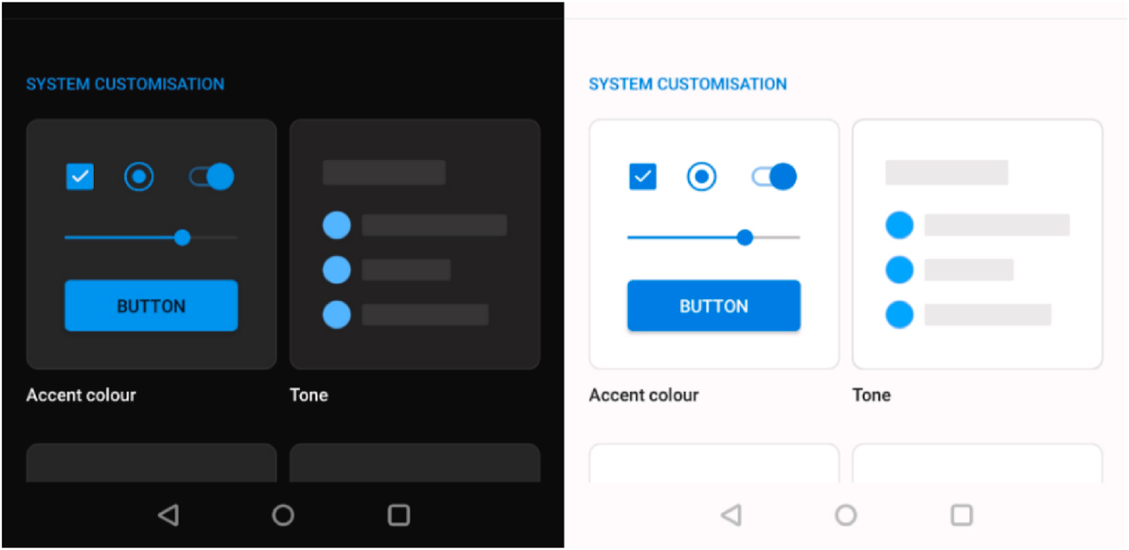
Dark vs Light UI – Image Source: ScienceDirect
Despite some research showing minimal differences in measured eye fatigue between modes, users consistently report feeling more comfortable with dark interfaces in low-light settings. This perception drives many to permanently configure their devices to dark mode.
Beyond comfort, dark mode offers tangible energy benefits. On devices with OLED or AMOLED displays, dark mode can significantly improve battery efficiency.
A Purdue University study found an average 67% reduction in power consumption when using dark mode at maximum screen brightness. Essentially, this happens because OLED screens can turn off black pixels completely, consuming less power than when displaying bright colors.
The aesthetic appeal of dark mode cannot be overlooked. Many users describe dark interfaces as “sleek,” “modern,” and “sophisticated”. This perception extends beyond mere preference; the visual impact of dark backgrounds creates interesting opportunities for designers:
Colors pop more dramatically against dark backgrounds
Light tones create striking contrast effects
White highlights can achieve a distinctive glassy appearance, impossible in light mode
Split complementary color schemes become more effective
For individuals with specific visual impairments, dark mode offers crucial accessibility benefits. People with conditions like cataracts or photophobia (light sensitivity) often find dark mode significantly more usable.
Rather than implementing only one display mode, providing both options respects diverse user needs and system-wide preferences.
Notable advantages extend to content presentation as well. Dark backgrounds minimize distractions and create a clearer visual hierarchy by allowing brighter elements to stand out prominently.
Brighter Elements on Light vs Dark Background – Image Source: viko.ai
This enhanced focus directs attention to primary content, improving readability and comprehension. Similarly, organizations like Spotify deliberately chose dark mode as their default theme to help colorful imagery and album art stand out, much like a darkened movie theater highlights the screen.
Despite these benefits, it’s worth noting that dark mode isn’t universally superior. Screen brightness and environmental lighting conditions play equally important roles in determining optimal viewing experience.
Nevertheless, supporting dark mode acknowledges the diverse needs of users while simultaneously creating opportunities for distinctive visual design.
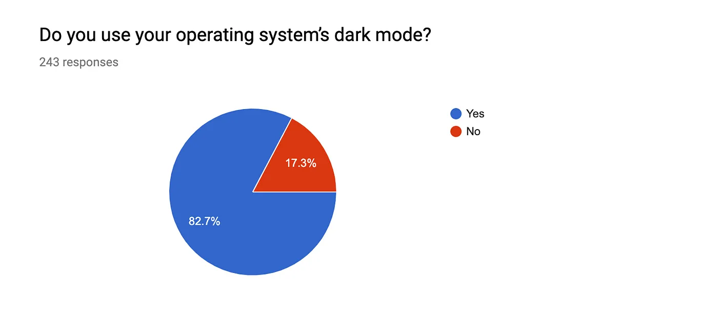
Choosing the right context for dark mode implementation can significantly impact user experience. A survey found that 82.7% of Google’s development team used dark mode at work, citing increased comfort for their eyes.
Participants Who Use Their Operating System’s Dark Mode – Image Source: Medium
Determining when to apply this design choice requires understanding specific use cases and limitations.
Use Cases Where Dark Mode Works Best
Dark mode proves most beneficial in several key scenarios:
Low-light environments: Dark themes excel in dimly lit settings like bedrooms or night flights, where they reduce screen glare and minimize disturbance to others.
Long session applications: News readers, e-books, and creative tools benefit from dark mode as they typically involve extended viewing periods.
Entertainment platforms: TV apps, movie streaming services, and gaming interfaces commonly utilize dark themes since they’re often used in evening hours and dimly lit rooms.
Visual-focused content: Applications showcasing photos, videos, or artwork benefit from dark backgrounds that make colorful content stand out dramatically.
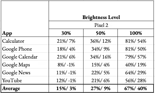
OLED/AMOLED displays: Dark mode can improve battery life, with efficiency gains estimated around 3-9% at common brightness levels of 30-50% brightness. The power savings are more substantial at higher brightness settings.
How Dark Mode Improves Battery Life – Image Source: Bejamas
Scenarios Where Dark Mode Should Be Avoided
Conversely, certain situations make dark mode less effective:
Dark backgrounds struggle with text-heavy applications, potentially reducing readability and causing eye fatigue in bright environments. Content-heavy platforms featuring long blocks of text often perform poorly with dark themes.
Complex B2B applications with varied UI components like forms, widgets, dropdowns, and data tables present significant design challenges in dark mode. Many color schemes don’t translate well to dark backgrounds, limiting design flexibility.
Some users with visual impairments, specifically those with astigmatism or color blindness, may find dark mode less accessible. Studies indicate reading comprehension typically improves with traditional light backgrounds for many users.
User Expectations and System-level Settings
Modern users increasingly expect applications to respect their system-wide appearance preferences.
Both Apple and Microsoft design guidelines recommend mirroring the device’s operating system dark mode settings by default. Forcing users to manually enable dark mode at the application level creates unnecessary friction, as many won’t realize the option exists.
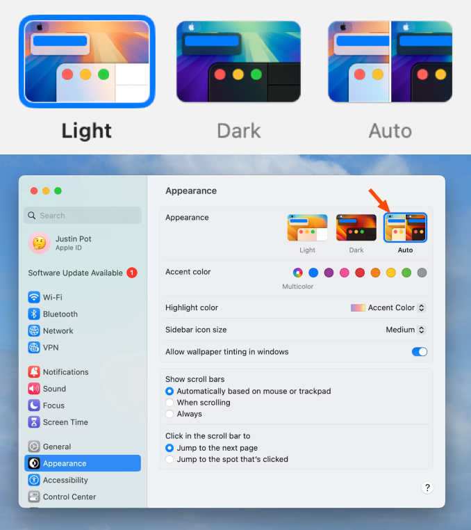
Ideally, applications should provide an easy-to-access toggle between light and dark themes, accommodating shifting user needs throughout the day. Some applications benefit from an “auto mode” that switches between themes based on time of day or ambient lighting conditions.
Mac Dark Mode Depending on the Time of Day – Image Source: Zapier
Overall, dark mode remains a supplemental design option rather than a universal replacement for light interfaces. Respecting system settings while providing flexibility creates the most positive user experience across diverse usage contexts.
A well designed dark mode uses dark grey with off-white text by avoiding pure white and black. This is done to reduce eye strain and ensure long reading sessions. Apps like YouTube use grey backgrounds for visual comfort.
Clear visual hierarchy
Good dark mode designs use clear visual hierarchy with important elements such as headings, buttons and main content stand out clearly. Spotify and Netflix use dark mode to highlight important elements such as play buttons, album covers and movie posters.
Consistent system behaviour
Well designed applications will automatically follow system settings. If the device is in dark mode, the app too becomes dark mode. Many Android and iOS apps follow the system’s dark mode setting. Users don’t have to search for manual toggles each time.
Readable images and icons
Good dark mode does not flip images and icons. Images and icons feel natural against dark backgrounds. Instagram’s dark mode keeps photos and videos unchanged.
Bad Dark Mode Examples
Pure black backgrounds with bright white text
Poorly designed dark mode will have pure black background and bright white text. This will cause eye strain especially in low lighting conditions such as night or dark environments.
Overly bright or saturated accent colours
Overly bright colours used in light mode do not suit dark mode. Neon blue, red, green colours on a dark background feel noisy and distracting.
Poor visibility of UI elements
Buttons or input boxes getting blended into the dark background creates difficulty for users to locate them, leading to a frustrated user experience.
Uncontrolled colour inversion
Bad dark modes automatically invert images, logos and buttons, making some images appear negative and UIelements being strange to the background. This affects overall user experience.
Dark Mode 2.0 : Rise of Adaptive Dark Mode
Traditionally, users manually switch between light mode and dark mode according to their convenience. Unlike this static dark mode, adaptive dark mode, also referred as “Dark Mode 2.0” adjusts automatically based on convenience, lighting and environmental conditions. This mode is designed majorly for user comfort and convenience not just for visual style.
Key features of Adaptive Dark Mode :
Context-aware Adjustments
Changes interface based on the environment, time of day and ambient lighting, mainly to reduce eye strain and increase comfort. In dim lighting conditions at night, dark mode appears softer with reduced contrast and during daylight, it appears a bit brighter with increased contrast to support readability.
System-level Synchronization
When a user switches on dark on their system, the supported apps too turn into dark mode without requiring manual toggles. Adaptive dark mode automatically follows system settings to deliver a consistent experience across all applications.
Content-sensitive surfaces
Instead of one boring dark background, adaptive dark mode uses different dark shades. Something to keep in mind is that cards, dialogs, and menus might look just a bit lighter than the main background. This stepped design adds depth, making it easier for users to tell different sections apart. It is kind of like how streaming apps make movie cards pop on a dark background.
Dynamic Contrast and Highlights
Modifies accent colours and contrast depending on the environment and ambient lighting conditions to avoid eye discomfort.
Usability-focused Design
The primary goal behind designing adaptive dark mode is usability. Unlike static dark mode, dark mode 2.0 which adapts to the environment and lighting conditions ensures better user experience.
Principles Of Dark Mode Design
Design dark mode as a separate theme
When you design dark mode, start from scratch. Inverting colours from your light theme does not make it dark mode. Ensure the backgrounds, text and the UI elements are designed specifically for dark mode, to maintain clarity and depth.
Prioritize readability and contrast
Texts, icons and interactive elements should have sufficient contrast without being overly bright ensuring eye comfort in any lighting condition.
Maintain clear visual hierarchy
Visual hierarchy is important as it helps users identify what is important on the screen. In dark mode, visual hierarchy is done using maintaining proper font size, spacing and different colours to make each element stand out clearly.
Respect accessibility and user preferences
Dark mode should be accessible for everyone including those with visual difficulties. Designs must follow accessibility guidelines.
Designing for Contrast and Readability
Achieving perfect readability in dark mode UI UX demands meticulous attention to contrast.
Contrary to popular belief, creating an effective dark theme involves more than simply inverting colors. it requires deliberate decisions about color relationships to prevent eye strain while maintaining visual hierarchy.
Avoid Pure Black and Pure White
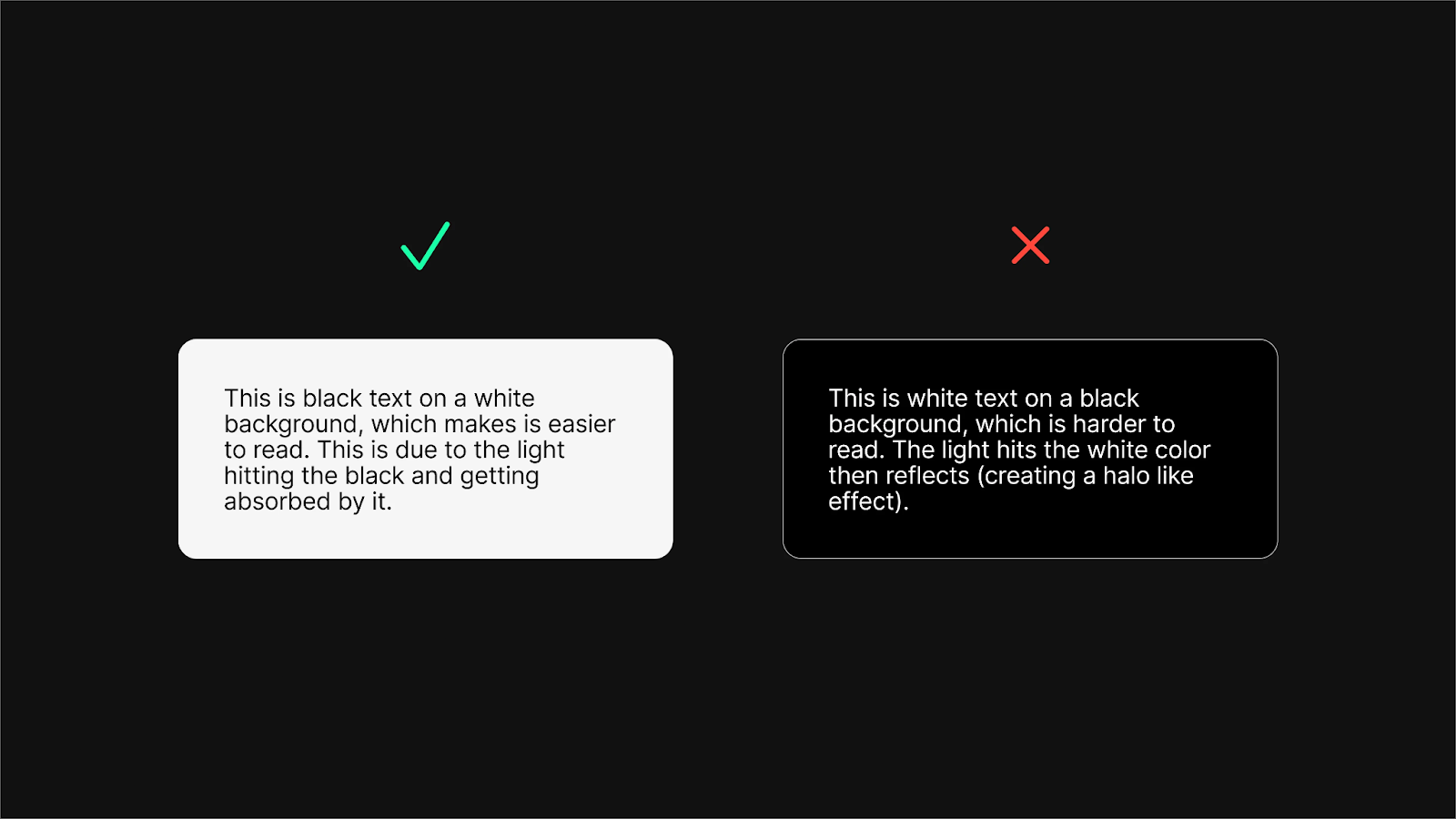
Creating a dark theme with pure black (#000000) backgrounds and pure white (#FFFFFF) text creates excessive contrast that causes significant eye strain.
Pure Black on Screens – Image Source: CreateWithPlay
This high-contrast combination produces an uncomfortable “halation effect” where text appears to glow or bleed into the background. Moreover, pure black backgrounds make it difficult to express elevation and depth in interfaces since shadows become nearly invisible against true black surfaces.
Use Dark Grays and Off-whites
Instead of pure black, Google’s Material Design 2 recommends using dark gray (#121212) as the primary surface color.
Dark Theme Surface Color – Image Source: Material Design 2
This slight shift to dark gray creates a more sophisticated appearance while reducing eye strain. For text elements, using slightly desaturated whites prevents the visual “vibration” that occurs with pure white against dark backgrounds.
Many designers recommend adding subtle blue tints to dark grays when defining dark mode color palettes, creating a more pleasing tone for digital screens. Consequently, opacity levels can be adjusted for different text importance levels:
Normal text requires a minimum contrast ratio of 4.5:1
Large text (18+ pt or 14+ pt bold) requires at least 3:1 contrast
UI components and meaningful graphical objects need 3:1 contrast against adjacent colors
Notably, Google Material Design recommends an even higher contrast ratio of at least 15.8:1 between text and dark backgrounds to ensure sufficient legibility as surfaces become lighter through elevation changes.
WCAG 2.2
WCAG 2.2 (Web Content Accessibility Guidelines) set standards for making digital products accessible and usable for differently abled people. WCAG 2.2 puts more emphasis on usability, clear communication, and giving users more control, which shapes how dark mode should be designed.
WCAG 2.2 for dark mode
Clear and readable content
Visible focus and interaction states
Consistent and predictable UI behaviour
Reduced visual strain for extended use
Tools to Test Dark Mode Accessibility
Testing is essential after designing any product. For dark mode designs, testing is done to ensure that the design is readable, accessible and comfortable for all users. Testing allows to detect errors and redesign or improve the design early, thus making testing an inevitable part of designing.
Some tools to test dark mode accessibility include :
WebAIM Contrast Checker
This tool is used to check whether the text or background deviates from the contrast requirements as per WCAG. It is useful to avoid low contrast in dark mode. It is the industry standard for WCAG contrast checking.
Colour Contrast Analyzer
This tool allows live, on-screen testing and includes vision impairment solutions. CCA is mostly used by UX teams and accessibility professionals.
Chrome Lighthouse
This tool, built into Chrome DevTools, automatically audits accessibility issues. It is commonly used in production workflows.
Figma Accessibility Plugins
It is a popular tool among UI UX designers. It can detect errors during designing. It is helpful to prevent accessibility issues before development.
Test Contrast Across Devices
Thorough testing across different devices and lighting conditions remains essential for effective dark mode implementation.
Colors perceived on screens vary significantly based on gamma settings, screen technology, and environmental lighting. Testing should occur in both low and high lighting conditions, including incandescent lighting scenarios.
When using dark mode with system-level settings, automatic adjustments can create unexpected results. Utilizing developer tools like Chrome’s Lighthouse or dedicated contrast checkers helps identify potential accessibility issues across both dark and light themes.
Undeniably, proper testing identifies problems with saturated colors that might visually vibrate against dark backgrounds, reducing legibility for all users.
Color selection represents one of the most critical challenges when crafting effective dark mode interfaces. Unlike light themes where saturated colors work well, dark backgrounds demand a more nuanced approach to maintain both visual appeal and accessibility.
Limit saturated colors
Highly saturated colors create a visual “shaking” effect when placed against dark backgrounds, making them difficult to look at for extended periods. This uncomfortable visual vibration occurs because bright, saturated hues compete excessively with dark surfaces. Hence, designers should:
Reduce color saturation by 20-30% for dark mode interfaces
Use low saturation or slightly muted versions of primary colors for better performance
Avoid fully saturated accent colors, even if they’re part of established brand guidelines
Use brand-appropriate dark tones
Brand identity remains vital, albeit challenging to maintain in dark mode. Many organizations’ primary colors appear too bright or saturated against dark backgrounds. There are two effective approaches for adapting brand colors:
First, use a much darker version of your primary brand color as the background surface, combined with colored fonts to create a unique branded experience. This technique transforms standard dark gray interfaces into distinctive, brand-consistent experiences.
Secondly, create specific dark versions of all primary colors rather than simply inverting the light theme. This includes separate color variables for backgrounds and text elements, ensuring consistent brand representation across both modes.
Apply color accessibility tools
Color contrast checkers prove indispensable when developing accessible dark themes. WCAG guidelines stipulate specific contrast requirements:
Normal text: 4.5:1 minimum contrast ratio
Large text (18pt or 14pt bold): 3:1 minimum contrast ratio
Graphics and UI components: 3:1 minimum contrast ratio
For balanced color harmony in dark interfaces, split complementary schemes work remarkably well. This approach uses:
One dominant color
Two colors adjacent to the dominant color’s complement
Limited accent colors to preserve dark surface space
Thus, split complementary schemes provide necessary contrast without creating the visual tension often seen with direct complementary colors. This technique proves particularly effective for highlighting important interface elements while maintaining visual cohesion throughout the dark theme.
Typography presents unique challenges in dark mode UI UX that go beyond simple color inversion. Light text on dark backgrounds fundamentally alters how users perceive typography, requiring specific adjustments to maintain readability and visual comfort.
Font weight and size considerations
Typography for dark mode requires careful weight adjustments, as light text on dark backgrounds appears optically heavier than dark text on light backgrounds.
Variable fonts excel in dark interfaces by allowing subtle weight modifications without switching between dramatically different weights. Initially, many designers recommend slightly decreasing font weight in dark mode,reducing to 350 from 400, for instance, to maintain consistent visual appearance across both modes.
For size considerations, headings typically range from 18 to 29 pixels, with body text ideally between 12 and 14 pixels to ensure comfortable reading. Throughout dark interfaces, maintain a line height ratio of approximately 1.48 times the font size to enhance readability.
Avoid thin or overly bold fonts
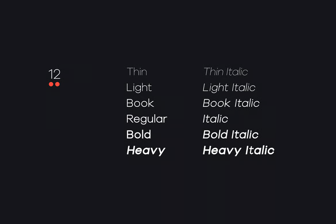
Thin fonts frequently “disappear” against dark backgrounds, creating significant readability issues—particularly for users with visual impairments.
Kross Neue Grotesk Minimal Sans-Serif Typeface – Image Source: Envato
Straightaway, eliminate ultra-thin fonts from your dark mode designs, opting instead for regular, medium, or semi-bold weights that maintain visibility without appearing heavy.
Conversely, overly bold fonts tend to “bleed” into dark backgrounds, creating a visual vibration effect that causes eye strain during extended reading. Sans-serif fonts generally perform better in dark interfaces due to their clean lines and consistent stroke width.
Use opacity levels for text contrast
Instead of using multiple shades of gray, implement a single text color with varying opacity levels to create hierarchy:
High-emphasis text (headers): 87% opacity
Medium-emphasis text (body): 60% opacity
Disabled text: 38% opacity
Create clear visual hierarchy with color and size
Effective visual hierarchy in dark interfaces relies on limited size variations—typically small, medium, and large to maintain clear relationships between elements. Indeed, limit prominent elements to a maximum of two per screen, ensuring they genuinely stand out.
Furthermore, combine size differences with weight variations to establish stronger hierarchical relationships without requiring excessive contrast.
Successful implementation of a dark theme requires careful technical execution alongside thorough testing. Once design decisions are finalized, developers must translate these principles into functional code that works reliably across platforms.
Use media queries for dark mode
The CSS media query @media (prefers-color-scheme: dark) forms the foundation of proper dark mode implementation. This query detects when users have enabled dark mode at the system level:
After implementation, testing becomes crucial. Evaluate your dark theme under varying ambient lighting scenarios,bright offices, dimly lit rooms, and outdoor settings.
Colors perceived on screens vary significantly based on gamma settings, screen technology, and environmental lighting conditions. Progressive enhancement helps ensure basic functionality across all devices while adding more sophisticated features for supporting platforms.
Ensure image and icon compatibility
Images often present the greatest challenge in dark-mode interfaces. To optimize imagery:
Use transparent backgrounds when possible
Add subtle white outlines around logos
Implement automatic image swapping based on mode
Test SVG, PNG, and WebP formats for transparency support
Provide a toggle for light/dark mode
Although respecting system preferences should be your default approach, offering a toggle empowers users to choose their preferred mode regardless of system settings:
function toggleDarkMode() { document.body.classList.toggle(“dark-mode”); // Store preference in localStorage localStorage.setItem(“theme”, document.body.classList.contains(“dark-mode”) ? “dark” : “light”); }
Check email and third-party content rendering
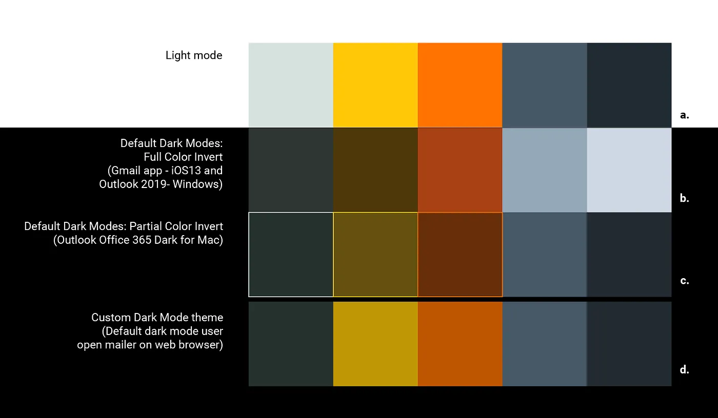
Finally, verify how your dark theme impacts emails and third-party content. Email clients handle dark mode inconsistently Gmail app (iOS 13) and Outlook 2019 (Windows) automatically invert color schemes without developer control.
How Company Corporate Colors Work on Each Version – Image Source: Medium
External content from APIs or embedded platforms may appear jarring against your carefully designed dark background unless specifically optimized.
Creating effective and accessible dark themes requires meticulous attention to visual design details that impact user experience. Following the best practices discussed provides a strong foundation, but ongoing testing and refinement remain crucial.
User needs and preferences will continue to evolve as dark mode adoption grows. Designers must thoughtfully balance aesthetics, functionality, and reader comfort across diverse contexts and user groups.
While this article covered many technical aspects, the overarching goal of any dark theme should be to respect user agency through flexibility of options. Both light and dark modes play an important role in inclusive design that considers individual visual abilities and environmental conditions.
As more applications embrace true color themeing that mirrors operating system preferences, the user experience will feel increasingly coherent. With careful consideration of contrast, hierarchy, imagery and other design elements, dark themes can provide a stunning visual experience while prioritizing usability for all.
Acodez is a renowned web development company india, crafting the best website for your business. We are also industry experts among the best WordPress development company in India, with cost-friendly plans suited to your needs. To expand the success of your business, act now and contact us quickly.
FAQ
1. Is dark mode better for the eyes?
Dark mode significantly reduces eye strain in low lighting conditions. So it is best to use dark mode in dark environments or night time. But in bright conditions, light mode is better.
2. Can dark mode affect reading speed?
Yes. Many studies show that people read faster in light mode, especially in bright conditions. Dark mode is preferred for eye comfort and reduced glare rather than faster reading.
3. What is the biggest mistake in dark mode design?
The biggest mistake in dark mode design is treating dark mode as a colour inversion of bright mode. For a good and effective dark mode design, it requires careful design decisions on typography, contrast and accessibility.
4. Is it better to auto-switch themes by time of day?
Time-based switching can be helpful, but make it optional. Forced switching might interrupt personal preferences of users.
Looking for a good team
for your next project?
Contact us and we'll give you a preliminary free consultation on the web & mobile strategy that'd suit your needs best.
Rajeesh P.K. is the Director and Creative Head at Acodez . With an experience of 10+ years in UX Design & User Interface Design, when coupled with his expert coding skills in HTML5, CSS3 makes him one of the top UX Architects in India, with more than 15 international awards to his credit.