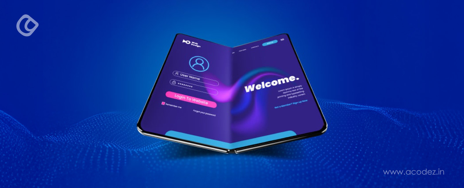
Foldable smartphones are reshaping how websites for foldable devices must be designed, with global market share jumping from 0.5% in 2021 to 1.6% in 2023. This rapid growth, projected to reach nearly 5% market penetration by 2028, presents significant challenges for web developers.
Designing for the future requires understanding how these devices transform the user experience. Foldable and dual-screen devices support advanced multitasking, allowing users to split screens into multiple windows.
Consequently, responsive web design has become crucial for adapting to flexible screens that change size and orientation. The implementation of flexible grids and media queries ensures websites function correctly across different configurations.
Furthermore, developers must address reachability issues, as the top quarter of expanded screens often remains difficult for users to access.
This article explores how to create seamless experiences across foldable and dual-screen devices, examining CSS Viewport Segments, environment variables for calculating display regions, and techniques for building adaptable layouts that enhance user experience regardless of device state.
Understanding Foldable and Dual-Screen Device States
Foldable devices introduce a new dimension to web design by operating in multiple physical states, each requiring distinct layout considerations.
The fold, which divides the screen into two portions, can be either a flexible area of the screen or a hinge separating two displays. On dual-screen devices, the fold has a “full occlusion type,” meaning content cannot be displayed across the hinge area even when an application spans both screens.
Essentially, foldable devices operate in several distinct states that directly impact how websites should be structured.
These devices can be in a FLAT state (fully open) or a HALF-OPENED state (positioned between fully open and completely closed). When in the HALF-OPENED configuration, two primary postures emerge depending on the fold orientation: tabletop posture with a horizontal fold and book posture with a vertical fold.
Foldable Device in Multiple Postures – Image Source: Android Developers
From a technical perspective, these states are categorized into standardized posture values:
Continuous posture: Refers to a flat position where the device displays content across an uninterrupted surface. This includes fully unfolded devices, non-folding screens, and foldable devices when the browser window doesn’t span across the hinge.
Continuous Posture – Image Source: W3C
Folded posture: Indicates when the device is physically folded, creating an angle between display sections. This applies to both flexible single-screen devices and dual-screen devices with a hinge. The angle typically ranges from approximately 30° to 170°.
Folded Posture – Image Source: W3C
When designing websites for foldable devices, the positioning of UI elements becomes particularly crucial. Elements placed near the fold may become difficult to access, and text overlaying the fold can be challenging or impossible to read, particularly with full occlusion hinges.
Dialogue boxes, pop-up menus, and important content should be positioned away from the fold area to maintain accessibility across all device states.
Additionally, the physical arrangement significantly influences how users interact with content. In tabletop posture, content naturally divides into top and bottom sections, while book posture creates left and right divisions. This division presents opportunities for innovative layouts but requires thoughtful consideration of content placement.
The approach to detecting these device states involves using CSS viewport segments and JavaScript methods.
For horizontal fold orientation (book posture), the CSS media feature horizontal-viewport-segments: 2 can be used to apply specific styles. Similarly, for vertical fold orientation (tabletop posture), vertical-viewport-segments: 2 applies.
Through JavaScript, developers can detect segments using window.visualViewport.segments, which returns an array of DOMRects indicating multiple viewports or null for single-screen displays.
Web developers must also account for device rotation and window resizing, as these actions invalidate previously retrieved viewport segments, requiring re-querying through resize or orientation event listeners. This dynamic adaptation ensures websites respond appropriately to changing device states.
Understanding these various states forms the foundation for creating flexible, responsive layouts that optimize theuser experience across the full spectrum of foldable device configurations.
Detecting Foldable Devices with CSS and JavaScript
Developing websites for foldable devices requires precise detection methods to identify when a device spans across a fold or hinge. Modern CSS and JavaScript APIs offer robust solutions for adapting layouts based on device configuration.
Using horizontal-viewport-segments and vertical-viewport-segments
The CSS Viewport Segments media feature enables detection of fold orientation through two primary queries. For devices with vertical hinges that split content into side-by-side columns (book posture), developers can implement:
@media (horizontal-viewport-segments: 2) and (vertical-viewport-segments: 1) { /* Styles for side-by-side screens */ main { display: flex; flex-direction: row; } }
Conversely, for devices with horizontal hinges creating stacked viewports (tabletop posture):
@media (vertical-viewport-segments: 2) and (horizontal-viewport-segments: 1) { /* Styles for stacked screens */ main { display: flex; flex-direction: column; } }
These media features return integer values representing the number of viewports present in each direction, allowing for targeted styling based on device orientation.
JavaScript: window.visualViewport.segments
Beyond CSS, JavaScript offers programmatic detection of foldable states. Initially proposed as Windows Segments Enumeration API, this functionality now builds upon the Visual Viewport API:
const segments = window.visualViewport.segments; if (segments) { console.log(`Device has ${segments.length} viewport segments`); // Apply logic for multi-segment layout }
The segments property returns an array of DOMRects representing separate display regions. This value provides a snapshot of the current device state—it doesn’t automatically update if the device orientation changes.
Therefore, developers must implement event listeners:
window.addEventListener(“resize”, function() { const segments = window.visualViewport.segments; // Recalculate layout based on new segments });
Device Posture API and Fold Detection
The Device Posture API further enhances detection capabilities by identifying specific device configurations. This API introduces the device-posture media feature with standardized values:
@media (device-posture: folded) and (orientation: landscape) { /* Apply styles for landscape folded mode */ .split-view { margin-inline-end: 60px; /* Create gutter at fold */ } }
The API classifies device states into two primary postures:
Continuous: Flat position (fully unfolded or standard displays)
Folded: Angled position between 30° and 170° (book or laptop posture)
These APIs collectively enable designing for the future by creating adaptable layouts that respond intelligently to device configuration.
Moreover, they allow developers to address practical concerns such as avoiding content placement across hinges and optimizing user interfaces for each display segment when creating websites for dual-screen devices.
For comprehensive detection, combining these approaches yields the most resilient implementations that gracefully adapt across the emerging ecosystem of foldable computing devices.
Building Layouts with CSS Grid and Environment Variables
CSS Grid provides a powerful foundation for building layouts on foldable devices, especially when combined with environment variables that respond to unique screen configurations. These tools enable developers to create interfaces that adapt intelligently to the physical characteristics of dual-screen and foldable hardware.
env(viewport-segment-width) and env(viewport-segment-height)
Six essential environment variables form the backbone of responsive design for foldable devices:
The x and y parameters represent coordinates in a two-dimensional grid created by hardware features, with 0,0 always starting at the top-left segment.
For instance, with a device in vertical fold posture (side-by-side screens), the left viewport would be accessed via env(viewport-segment-width 0 0) and the right viewport with env(viewport-segment-width 1 0).
Notably, these environment variables can include fallback values:
env(viewport-segment-width 0 0, 100%);
This ensures layouts degrade gracefully on non-foldable devices.
Avoiding Content Overlap on Hinges
A critical aspect of designing websites for foldable devices involves preventing content from being obscured by physical hinges. To calculate hinge dimensions, subtract the appropriate environment variables:
/* Calculate hinge width in horizontal viewport */ .hinge-spacer { width: calc(env(viewport-segment-left 1 0) – env(viewport-segment-right 0 0)); }
/* Calculate hinge height in vertical viewport */ .hinge-spacer { height: calc(env(viewport-segment-top 0 1) – env(viewport-segment-bottom 0 0)); }
This calculation creates appropriate spacing, specifically accommodating the exact dimensions of device hinges without hard-coding values.
Grid Placement for Dual-Screen Layouts
CSS Grid excels at creating responsive layouts for dual-screen devices. In fact, combining Grid with environment variables produces exceptionally adaptable interfaces:
This approach creates a two-column grid where each column precisely matches its corresponding screen segment, with an automatic gap matching the hinge width.
For image placement against hinges, careful positioning is required:
This calculation ensures images align properly with the hinge edge rather than overlapping it, although absolute positioning requires additional consideration for responsive layouts.
Through thoughtful application of these techniques, developers can create websites for dual-screen devices that feel natural regardless of device posture or configuration.
Responsive design takes a foundational role when creating websites for foldable devices, as these devices necessitate different layouts between their folded and unfolded states. The differences in screen size and aspect ratio between these states can be substantial, requiring more than standard responsive techniques.
Media Queries for Folded vs Unfolded Modes
The CSS Viewport Segments media feature provides a straightforward method for targeting specific device states:
@media (horizontal-viewport-segments: 2) { /* Styles for book mode (side-by-side screens) */ body { display: flex; flex-flow: column nowrap; } }
These queries can be combined with traditional width-based queries to create highly specific styling rules:
@media (horizontal-viewport-segments: 2) and (min-width: 540px) { body { background: #f8f8f8; } }
Flexible Grids with minmax() and auto-fill
For creating truly adaptable layouts, the combination of CSS Grid’s minmax() function with auto-fill or auto-fit keywords delivers exceptional results:
The difference between auto-fill and auto-fit becomes apparent at wider viewport widths. Auto-fill maintains empty columns to fill available space, whereas auto-fit collapses empty columns, allowing content-filled columns to expand. This distinction is particularly valuable when designing for the unfolded state, where screen real estate suddenly increases.
Orientation-Based Layout Adjustments
As users rotate foldable devices or switch between folded/unfolded states, orientation changes trigger different layout needs:
The Screen Fold API exposes posture attributes like “laptop” or “tabletop,” enabling developers to identify specific device configurations and rearrange content accordingly. Subsequently, this allows interfaces to adapt not just to screen dimensions but to physical device positioning as well.
Throughout all implementations, maintaining content reachability remains crucial, particularly for foldable devices where the physical fold might create unusual interaction patterns.
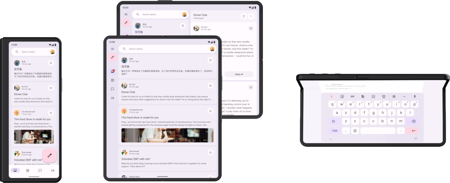
Beyond responsive layouts, seamless user experiences on websites for foldable devices demand careful attention to state preservation when users transition between screen configurations. Indeed, each fold/unfold action potentially triggers application restarts, threatening continuity.
Synchronizing Content Between Viewports
Maintaining consistent content across screens remains crucial when designing for dual-screen devices.
For applications spanning multiple viewports, developers must implement synchronization techniques to ensure visual coherence. Certainly, this involves creating complementary layouts where content on the folded screen logically extends to the unfolded experience.
When implementing viewport synchronization:
Match view direction and zoom factors across segments
Align geometry consistently between viewports
Maintain consistent settings for grid, snap, and perspective modes
Select a master viewport whose properties extend to other viewports
During fold transitions, applications should preserve their state without requiring users to repeat actions. This approach ensures interfaces feel cohesive even as users modify device posture.
Handling Scroll Position and Input Fields
Following a fold action, users expect content to remain precisely where they left it. Several critical elements require preservation during screen transitions:
Text within input fields
Keyboard visibility state
Scroll position within content areas
Active selection states and focus elements
To implement scroll position retention, developers can store position values in memory before transition events and restore them once the new layout renders.
Meanwhile, for effective window management across multiple displays, applications should minimize windows when disconnecting monitors but restore exact window locations upon reconnection.
Media Playback Continuity
Among the most jarring disruptions during fold transitions is interrupted media playback. Users expect videos or audio to continue seamlessly regardless of screen configuration changes.
When implementing media continuity, applications must resume playback at the exact timestamp where interruption occurred. Furthermore, playback controls should remain accessible in both folded and unfolded states, albeit potentially in different positions appropriate to each layout.
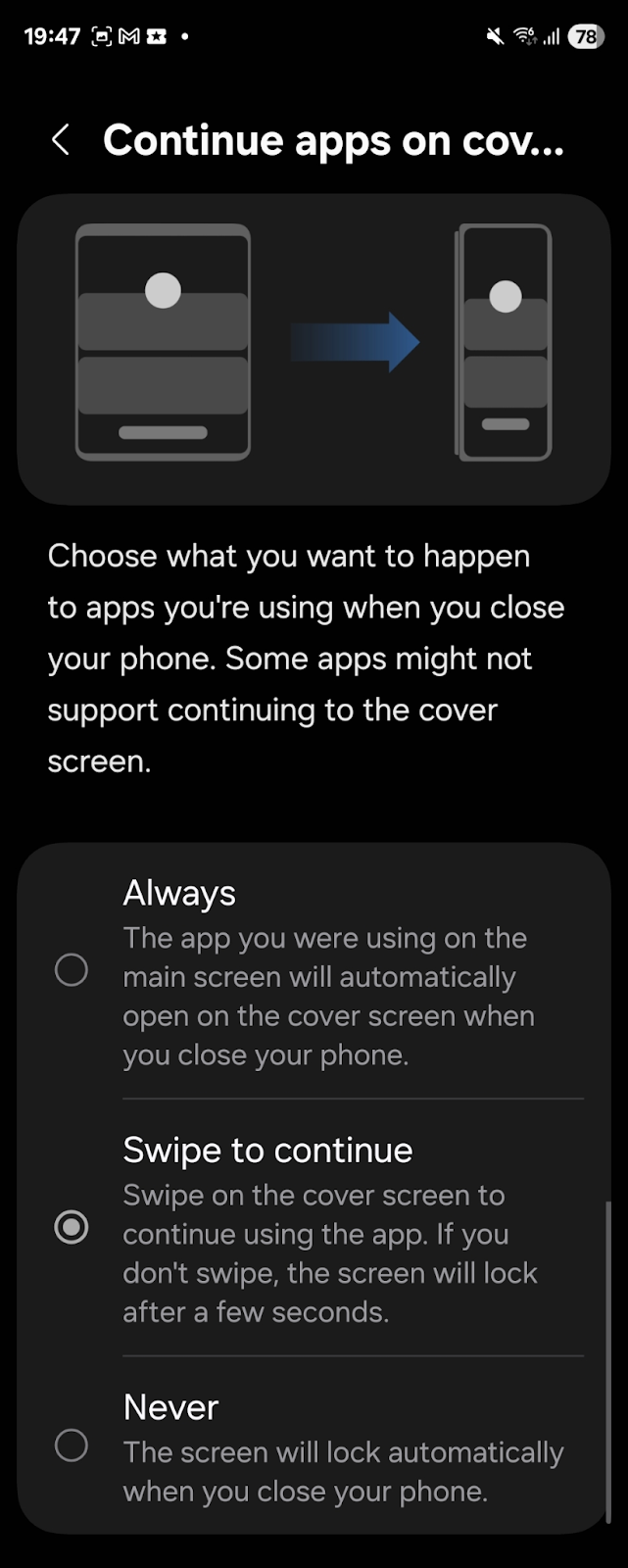
Samsung’s One UI 7 exemplifies effective continuity with its “Swipe to continue” feature, allowing users to maintain application state when transitioning between folded and unfolded modes.
Testing tools serve as critical components when developing websites for foldable devices, enabling designers to verify functionality across different fold states without physical hardware.
Developers can leverage browser-based emulators and specialized APIs to simulate dual-screen experiences throughout the development process.
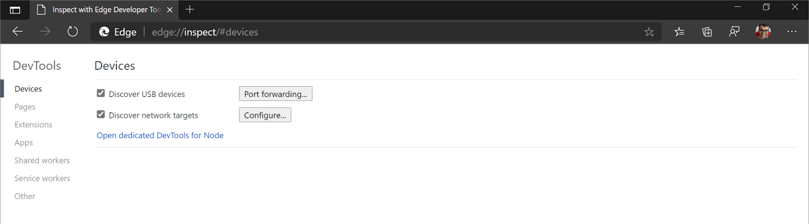
Surface Duo Emulation in Edge DevTools
Microsoft Edge offers comprehensive emulation capabilities specifically optimized for dual-screen testing. To debug web content on the Surface Duo emulator, developers must first launch the emulator, then navigate to edge://inspect in a desktop Edge browser.
edge://inspect on Microsoft Edge – Image Source: Microsoft
After opening the website in the emulator’s Edge app, the desktop browser will display “Surface Duo Emulator” with a list of open tabs. By clicking “inspect” on the desired tab, DevTools opens with access to the “Toggle Screencast” button for real-time visualization.
Web Content on Surface Duo Emulator – Image Source: Microsoft
Henceforth, developers gain the ability to test spanning behaviors, though the screencast has limitations, it shows the new app size but doesn’t visualize the hinge properly. For accurate hinge interaction testing, viewing directly on the emulator remains necessary.
Chrome Flags for Experimental Features
Chrome and Edge provide experimental flags enabling foldable device features during development. To activate these capabilities:
Navigate to chrome://flags or edge://flags
Search for “Experimental Web Platform features”
Enable the flag and restart the browser
Soon after enabling this flag, developers gain access to the Foldable APIs, including device emulation options like the Galaxy Z Fold 5 and Asus Zenbook Fold in DevTools.
This allows toggling between “Continuous” and “Folded” states to test responsive layouts. At this point, developers can also test Chrome’s experimental redesign for foldable interfaces by additionally enabling the tab strip redesign and improvement flags.
Polyfills for Visual Viewport API
For broader compatibility across browsers lacking native support for foldable features, polyfills provide fallback functionality.
The viewportsegments-polyfill package simulates viewport segments on desktop browsers or non-supporting devices. Important to realize, this polyfill doesn’t function on actual Surface Duo devices since they already support the native API.
Installation requires a simple NPM command:
npm install –save viewportsegments-polyfill
Together with the polyfill, developers can manually configure display properties like horizontalViewportSegments, verticalViewportSegments, and foldSize through the FoldablesFeature object. Nonetheless, testing with both polyfills and native implementations remains essential to ensure consistent behavior across the growing ecosystem of foldable devices.
Designing for the future requires thorough testing across emulated environments before deployment to physical devices.
Designing for the Future
By 2030, the global foldable smartphone market is projected to reach USD 74.02 billion, growing at a CAGR of 13.5% from 2024 to 2030. This rapid expansion will drive significant advancements in web design for foldable and dual-screen devices.
Future designs will need to be even more adaptive, incorporating AI-driven layout adjustments that optimize content in real-time based on user interactions and device states.
The integration of AR and VR technologies will become more prevalent, offering immersive experiences tailored to the unique form factors of foldable devices.
As hardware continues to evolve, designers will need to stay ahead by leveraging cutting-edge technologies and continuously testing across a diverse range of devices. The future of web design for foldable and dual-screen devices will be marked by innovation, adaptability, and a relentless focus on enhancing user experience.
As foldable and dual-screen devices continue to grow in popularity in the coming years, designing effective and seamless experiences across these innovative form factors will be crucial.
Web developers must stay abreast of emerging hardware capabilities and implement adaptable solutions utilizing the latest CSS, JavaScript, and browser APIs. Thorough testing across emulated environments and device simulations will also remain important to ensure compatibility and functionality.
While responsive design principles serve as a foundation, creative solutions leveraging flexible grids, environment variables, and synchronized content states will be needed to optimize usability in every device configuration.
With careful consideration of factors like continuous layout adjustments, uninterrupted media playback, and preserved user inputs, developers can create unified experiences that feel natural on any foldable interface. This evolving area promises to drive innovation in how digital content is delivered and consumed across an expanding landscape of form-flexible computing.
Acodez is a web development and Website design company in India offering all kinds of web design and development solutions at affordable prices. We are also an SEO and digital marketing agency offering inbound marketing solutions to take your business to the next level. For further information, please contact us today.
Looking for a good team
for your next project?
Contact us and we'll give you a preliminary free consultation on the web & mobile strategy that'd suit your needs best.
Rithesh Raghavan, Co-Founder, and Director at Acodez IT Solutions, who has a rich experience of 16+ years in IT & Digital Marketing. Between his busy schedule, whenever he finds the time he writes up his thoughts on the latest trends and developments in the world of IT and software development. All thanks to his master brain behind the gleaming success of Acodez.


