Every day we are moving a step closer towards more advanced technology. Brands like Apple, Samsung, Sony, etc., are coming out with sophisticated gadgets like smart watches & other wearable devices that are meant to make our life better & comfortable. The wearable technology has captured only a small market as of now, but is growing steadily as more & more consumers are getting interested in it.
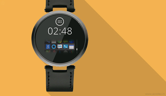
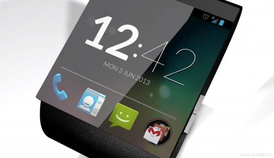
Designing for wearable devices poses a unique challenge unlike other designing projects. The device has to function flawlessly with a design that needs to be optimized for one of the smallest size screens designers have ever worked with. Ultimately, the motive is to create a wearable device which is visually appealing, user friendly and performs all the required functions with a great mobile ui ux designers team. Here are some of the best designing guidelines for wearable devices .
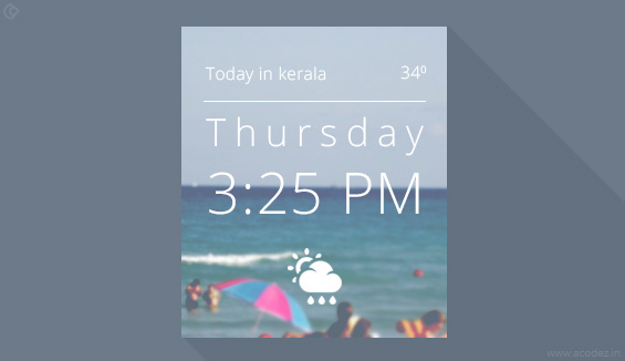
Minimal Design with Creative Aspects
One of the most popular trends in wearable deigns is minimalism. Yes, the same minimalistic design ideas employed while designing websites or even in print or packaging design is considered perfect for wearble type devices.
Everything from color to typography and imagery should be as simple as possible & easy to read since the screen size is small. Flat design concepts such as high contrast, bright color and elimination of design embellishments can also be used.
Add Vibration
One of the most important features to be included in wearables is vibration. Even a simple a buzz or movement can used to have an interaction with the user. Vibrations should be mild and must happen in a way which should be obvious, but not uncomfortable to the user. Another thing to note is not to overuse vibrations as this might make a user frustrated.
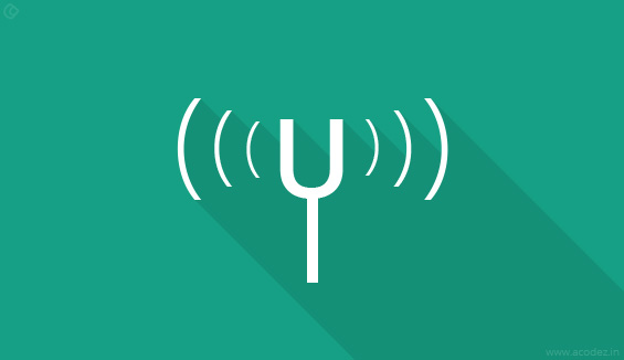
Include Essential Voice Controls

Ofcourse tap & touch will work on wearable devices, but there is no doubt that voice commands are more comfortable from a user point of view. Since the screen size is small, voice commands are more preferred by users around the world to control & interact with their wearable devices. Popularity of SIRI app in iOS devices are a proof that voice controls are important for users & needs to be considered seriously.
Type Has to be Simple
Sans Serif. It might sound boring, but simple sans serif is the only thing you need to know about font, with a uniform stroke width which make it one of the easiest and most readable font type. Try to avoid typefaces which are ultra-light or condensed because the light coming through the watch may create readability issues. Also, be careful with black or bold and super thick styles. Try to stick to a typeface with a moderate stroke with wide letterforms, such as, Helvetica, though it is being used almost everywhere these days.
High Contrast and Low Color

Every bit of color on small screens matters. Right contrast can help in making elements easy to read and grab. Colors play an important role in interactive tap elements or as a backdrop for a text command. The key here is sharp contrast. Try to consider the environment in which these devices will be used such as, in sunlight or in dark rooms – the design should be such that each and every letter is easy to read for the user.
Try to avoid pastels or colors with low saturation. Highly saturated colors and bright hues are considered best, complimented by black or white type for optimum readability.
Easy to Use Interface

Not all wearable devices are same. Every device has something different in terms of hardware or features. When you design, make sure it works with all of these, giving a consideration to the physical components of each device.
The design should be able to work with all the physical parts which a device will be carrying. It should be easy to use with intuitive designs giving the user exactly what he wants from the device.
Design it Trendy & Cool
This may not sound like a big deal, but making the device look trendy & “cool” is very important from a user’s point of view. Sure, you might have put in a lot of effort & included various functionalities that work perfectly. But if it doesn’t look good on screen for users, much of the effort is wasted. The information on the screen has to look like it actually belongs there.
Searching for a web design company in India for your next big project? Call +91 95 44 66 88 44 for a free quote from the experts in web designing and web development
Looking for a good team
for your next project?
Contact us and we'll give you a preliminary free consultation
on the web & mobile strategy that'd suit your needs best.


