A carefully thought-out game UI design is crucial to creating a great mobile game. The user interface and gaming experience are directly impacted by its quality.
Creating fantastic games and pursuing the highest level of gameplay, or “playability,” are tasks done by designers and artists. UI (user interface) and UX are components of the design of mobile games (user experience).
The overall game plan is typically developed by both UI and UX designers, including the colors, widgets, and other interactive features that players will use. And if you want to create a game millions of gamers will install and spread throughout their society, you shouldn’t minimize its significance.
A two-way street exists between the player and the game. An essential element in creating an intuitive, pleasant, and enjoyable gaming experience is a game’s content and how the user interacts with such information.
It can be accomplished in various ways based on the game’s genre, style, and theme.
Still, impactful user interface design, or how the game offers the player access to critical information on the screen and how it layers it all through user experience, has some fundamental guidelines that can elevate your UI to greatness.
Some techniques make your user interface fit in with the player experience regardless of the game you’re building.
We’ll discuss game user interface design best practices in this article, but first, it’s crucial to understand what a game user interface design is.
What Is a Game UI?
As stated, a video game UI is an interface made up of elements that make it easier for players to navigate, access information, and complete objectives.
Level maps, coin counters, and life bars are a few UI elements used in video games. UI design in video games demands excellent focus on performance and specifics, just like UI design for mobile applications.
The user interface goal in video games is to enable players to carry out actions directly within the game environment or via motions on a head-up display (HUD).
The program’s user interface is the part that enables human-computer interaction (HCI).
Building the game’s UI is critical based on a solid grasp of human physiology and psychology since the shape, color, and method you use in the programs determine how well the UI design is created.
Thus, the game UI should improve the gameplay experience and make tasks easier to do.
Why Does UI Matter in Game Development?
The video game industry is enormous and is still growing. According to predictions, there were almost 2 billion video gamers worldwide in 2015, which is projected to increase to over 3.3 billion by 2024.
Number Of Active Video Gamers Predictions – Image Credit: Statista
These figures, however, are not possible if we have poor user interface designs.
We can therefore attribute the importance of user interface design to the fact that it grants access to key video game features and that, depending on how well it is executed, its presence can improve or degrade the overall gaming experience.
All game mechanisms that need player input, such as moving and interacting with the environment’s objects, involve user interfaces.
The primary goal of early UI implementation is to guarantee that the user can carry out all relevant operations at any time during the game.
Developers should strive to design UIs that are simple and intuitive for players accustomed to comparable systems from other games or everyday life.
Game UI Design Best Practices
Now that you understand what a game UI is and why it matters, let’s look at some of the best UI design practices that can enhance a game’s playability and performance.
1. Know Your Target Audience
Discovering your target audience (TA), their tastes, and how to create a game that will attract as many users as possible are essential at the project’s outset.
Some designers struggle due to cognitive bias; they develop what they believe the fans would like without market research. Investigating and comprehending the TA is therefore essential to success.
Investigate the software and clientele of your rivals. You can create better mobile apps by looking for similar mobile games. Think about the aspects of the game you enjoy and the parts you don’t. Put your knowledge into practice when designing.
To create a user-centered design, identify your players. You may learn more about your clients’ requirements, expectations, and interactions with your game by creating personas (portraits of users).
Create incredibly basic prototypes of your ideas to gather as much insightful input as possible. Utilize this input as you iterate your prototypes and develop a concept that will work for your target audience.
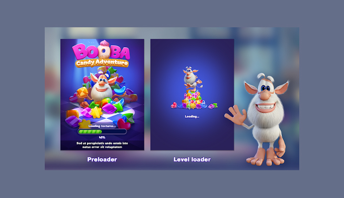
In the entertaining puzzle game Booba Candy Adventure, players can look for candy in a house with a charming little monster.
The game’s user interface, ideal for children older than three, includes crystal objects and buttons, adorable critters, intense colors, fat fonts, and entertaining tutorials to draw in new players. It is an excellent example of how to design a fun game for kids.
Booba Candy Adventure For KIds – Image Credit: Booba
2. Utilize Design Patterns From Other Programmers
You should be aware that Coates makes it abundantly evident that your ideas are not original.
The genres and concepts you want to explore have been explored in many games. The success of other games’ user interfaces should serve as a starting point for your own since it can guide your design choices.
“Design patterns” are a result of the ongoing development of UI, according to Coates. These patterns occur due to designers’ gradual discovery of what functions best for the kind of game they’re attempting to create.
According to Coates, founder of Game UI Database, examining games in the same genre can give you an insight into what to do.
“For instance, it is expected that the health bar will be towards the bottom of the screen in first-person shooters. Numerous other games have already done that, which is why. That’s all there is to it; that’s what people anticipate.”
As Coates puts it, Learn from the best but ensure you take only the proper lessons.
3. Make Your In-App Purchases and Prizes Stand Out
For one to boost game revenue, it’s critical to have your rewards and in-app purchases pop out. Feature the products that are available for purchase and explain why customers should acquire them in order to increase sales.
There are many different ways to accomplish this, and many games have particular methods. Make prototypes of the menus and popups for awards and in-app purchases, test each with actual players, and decide which performs best.
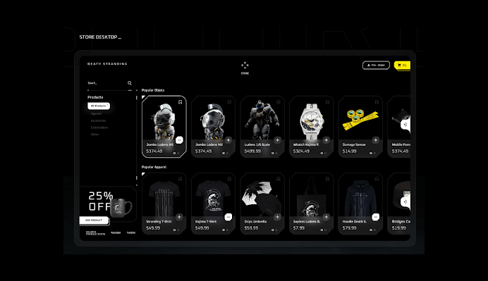
A darkly themed action game called Death Stranding has intricate, lifelike 3D characters and scenery. All items in the in-game store are listed on a card in the store’s layout.
In order to encourage purchases, the discount information is placed in the left-hand corner. The designer also provides screenshots of how the store interface appears on desktop and mobile devices, demonstrating good device compatibility.
Death Stranding 3D Game – Image Credit: Behance
5. Animate Your User Interface
According to Coates, there are several ways to use motion and animation to support your game UI design, including improving its aesthetic design, giving the game a somewhat more “alive” feel, and focusing players’ attention on particular components.
A static screen might be visually unappealing and suggest that the game has stopped. A game can seem more professional and enticing by adding a tiny bit of animation to a screen, whether it’s a modest pulse impact, a flashing vignette, or a moving backdrop.
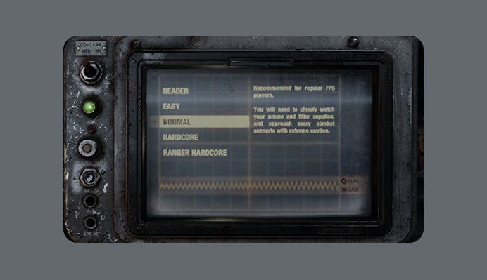
For instance, the monitors in Metro Exodus use distortion effects, a rolling bar, and scanline textures to give them a more vintage vibe.
Metro Exodus Game – Image Credit: Metrothegame
Having stated that, the functionality of the UI itself shouldn’t be eclipsed by whatever animations you decide to use. According to Coates, you should still direct the player through the UI and make sure it is clear.
The players’ gaze ought to go along a particular path. They should examine the menu options before the information and then the UI.
It would be best if you make the text readable and want to allow your user interface freedom to breathe. The player will then know where to look.
6. Never Overcrowd a Game’s UI
Among the essential game UI design best practices to keep in mind is to avoid cluttering the user interface, whether you’re creating a website, app, or game.
An interface will badly impact any messages you are trying to convey with text and graphics all over the place, and the user experience will suffer.
Keep language and graphics simple so that players will only concentrate on whatever you want them to. The UI of cluttered mobile games is frequently overloaded with extraneous information and elements. Additional text, icons, and buttons clutter up the screen.
Mobile apps generally suffer from clutter because they have considerably smaller screens than PCs. Getting rid of everything that would complicate and confuse players with the design is critical.
A Hat in Time is a 3D action-adventure game about a little girl who sets out on a journey to find her family. A stunning 3D game with top-notch graphics gives players a sense of realism.
The designer blurs away anything unrelated to the popup windows or step-by-step instructions to force viewers to concentrate on the instructional. Players may easily access the weapon wheel and pals panel despite being hidden.
A Hat In Time Mode & Screen Select – Image Credit: Game UI Database
7. Make the Navigation Accessible Using a Sidebar
Every online or mobile game has a finite amount of screen space. Designers frequently maximize screen area to keep players engrossed in the game, which may not be advantageous for accessible navigation.
However, this does not exclude you from creating a game with accessible navigation. In fact, streamlined sidebar or hamburger navigation can help you clear of numerous navigational pitfalls.
An intelligent alternative that lessens player annoyances is to give players a simple mechanism to reveal or hide the navigation menus.
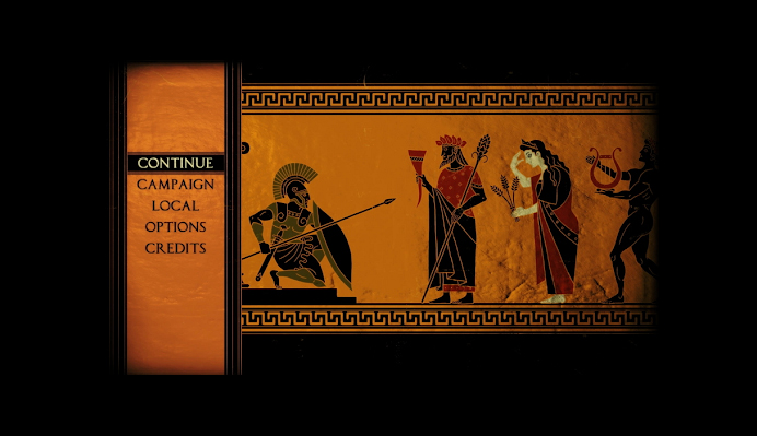
The 2D heroic action game Apotheon features fantastic quests and tales inspired by Greek mythology.
The game’s presentation of all people and scenes is done in a distinctive black-figure ceramic style, giving the impression that you’ve traveled back in time.
The folding side navigation bar, simple-to-use weapon selections, detailed instructions, and user-friendly game UI designs effectively generate immersive user experiences and give players a sense of being in-the-moment gameplay.
Apotheon Game Navigation Bar – Image Credit: Apotheon
- Give Players the Option to Comment
Real user input is crucial for designers or app owners to continuously enhance the user experience.
As users are happy to offer feedback to improve their knowledge, ensure a feedback form has been placed on your game and is easily accessible whenever they need it.
Additionally, it is crucial to notify the player automatically when their input has been acknowledged and addressed.
8. The Standard Is Sufficient
Although creativity is a positive trait, it may also be detrimental to game UI design best practices. As previously said, the utility should drive the design, and consistency in the plan is crucial.
We also want to mention that you don’t have to create something from scratch. For instance, a typical “start button” icon immediately satisfies the criteria and does not need to be modified.
It takes time to develop a new hero and additional time to test it out on the intended audience and make any necessary adjustments.
By utilizing pre-existing design frameworks, you can use standard icons. An overview of the essential components of a user interface is known as a “design system.”
The benefit of such an outline is that the entire development team can develop it with a single click, and the user only needs to test each part once. You don’t need to create your design system if you can draw ideas from well-known corporations like Google, Apple, and Microsoft.
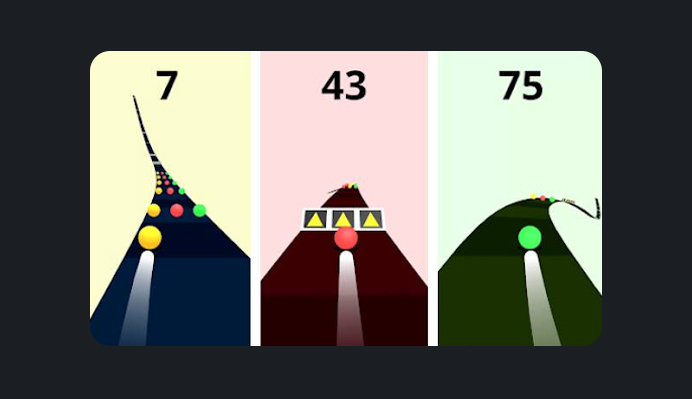
A good example is Color Road, which has a relatively straightforward concept and merely displays the race path and score after a brief lesson.
Color Road Game Display- Image Credit: App Store
The outcome is an immersive experience that serves as an excellent model for how to make your own immersive game UI design.
9. Continuity and Consistency Must Be Maintained
It is crucial to ensure that the game’s conventions are applied consistently throughout and in the same ways. If possible, avoid switching conventions inside a single menu, as this can confuse players.
It can include how the button or element is placed, colored, how big it is, what it does, how it moves, and anything else that makes it easy to recognize.
This step is crucial for the proper and consistent use of icons, particularly when they relate to currency, resources, or other universal concepts that players should constantly be aware of.
Various conventions for the same object or conventions that stray from accepted industry standards are used frequently in video games. The employment of a back, close, and cancel button is a typical example.
Although some games utilize a back arrow in the top left corner, others use an actual cancel button, and some make you tap off the menu to stop it; others have a continuous red X in the top right corner.
However, some games combine all of these. Keep your game’s player interface and navigation constant at all times.
10. Test on Tablets and Mobile Devices
It’s crucial to test your interface across a range of different devices. Because it’s more convenient, many developers exclusively test their products on larger tablets rather than smaller phones or devices with lower specifications.
It frequently results in buttons that are overly small or difficult to read fonts.
Making a mockup of the appropriate size and placing it on your device so you can view it like a photo is one method for fast testing your mockups. For this, Dropbox works excellent. This practice is a straightforward approach to determining the size of your UI elements across different displays.
A website game app’s responsive design is vital because it enables players to enjoy the game on various devices with various features (aspect ratio, screen size, and so on).
Every screen, animation, menu, popup, and other game information should be compatible with various devices and load as rapidly as possible on each one.
If you review your designs frequently while they are being developed, you will save a ton of time and effort because it takes laborious work to adapt the interface to other screens later. Test it frequently, and keep it current.
Additionally, you want a UI that is simple to maintain. It is not advisable to have different systems for many platforms.
The Universal Device Preview plug-in for Unity can be helpful in this situation. While designing your interface, you can have Unity snap pictures of various gadgets and screens.
Universal Device Preview – Image Credit: Asset Store
Conclusion
An excellent game UI design balances a pleasant user experience, a visually appealing interface, and usefulness.
It is the same goal that game designers should have in mind. It’s widespread for the first attempt to make a perfect application to fail. Consider your mobile game a constantly evolving app that has to be enhanced.
Creating a fun game from scratch and refining an existing one is a complex task. The answer is outsourcing game creation and using Innovecs’ game expertise to deliver your next smash on schedule and under budget.
Ultimately, making a new video game demands a lot of creativity, careful planning, and following the above game UI design practices.
UI designers are privileged to comprehend what it takes to develop a game’s user interface (UI) design that stands out and makes players genuinely enjoy (or even addicted to) playing it.
If you’re looking for the best companies in the Web development India arena, Acodez is definitely one among those. Acodez is a multi-award-winning web development agency with 10+ years of experience and clients across 80+ countries. This, in turn, has helped the organizations get better returns on their investment. Acodez is also one of the best digital marketing agencies in India We are also a leading Digital marketing agency in India, providing SEO, SMM, SEM and Inbound marketing service at affordable prices. For further information, please contact us!
Looking for a good team
for your next project?
Contact us and we'll give you a preliminary free consultation
on the web & mobile strategy that'd suit your needs best.


