The checkout page is an important part of any ecommerce conversion process. This is why designers need to spend a little extra effort to make sure that it functions flawlessly & does not create any trouble to users. If you are handed with the task to design a checkout page for an online marketing website, there will be so many factors to watch for, mainly:
- Design
- Functionality
- Security
- Usability
The design aspect is something which has a lot of importance, with which you can make a positive impact upon a visitor. So how do you make the checkout page more appealing & user friendly?
Make the Visual Impactful
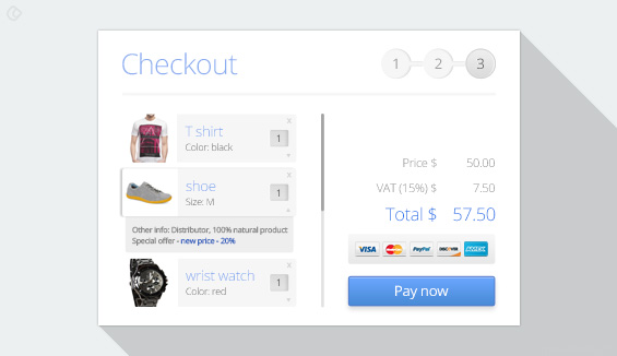
Well, this might be considered as an obvious idea, undoubtedly, the checkout page has to be a visually impactful one. There are several examples available, which have made it look like a basic web form. It also helps if the checkout page is designed in consistence with the overall design of the website. This gives users a secure experience while making transactions. Every visual, be it brand logo or items in the cart, will help users get a better idea on which step they are in the conversion process & why.
So what kind of visuals you must use for your website?
- Make sure to use images for every item in the cart. This helps user to quickly confirm his purchases without having to go back.
- Make sure that your brand logo is easily visible, & at any point of time, clicking on it redirects a user back to the website.
- Big buttons, with calls to action such as, “Add to Cart”, “Buy now” and “Item Updates” is a must. These should be easy to find & click & above fold.
- Many checkout pages can be seen using white color with outlined boxes. It is perfectly fine to use color as long as it is consistent with color scheme of the website.
- Use simple fonts as people generally tend to trust a simple typeface more than confusing ones. Still there is no restriction if you believe there is a need to use larger text elements.
Don’t forget to include Payment, Security Seals and Logos
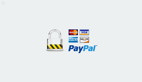
- While majority of consumers understand that they can easily pay with the credit card online, having small logos of these next to the payment buttons reinforces this idea & gives them a sense of trust & security.
- It will help you eliminate confusion about the types of payment mode accepted on the site with just a glance.
- Though most sites do not forget to include various credit cards as payment options, PayPal or Apple Pay seems to be largely ignored by them. Include these as well as optional payment method.
- Do consider downloading and designing using special user interface kit of logos for this purpose. Just make sure that you don’t overdo it with wild styles.
Try to be considerate with enlarged Images
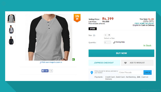
- Checkout pages which allow the users to get one last preview of the item with an enlarged image just before purchase are found to be performing better. Hover and tidy effects used to enlarge each chosen item by the customer in the cart or a pop-up can make it easier for the consumer to see the his/her potential purchase one last time and it also helps them to eliminate the frustration of having to navigate back to confirm the color or size.
- Another best option is to generate oversized thumbnail images for the items purchased by the consumer at the checkout page of the site. This would be an additional image, which can help a user confirm his or her shopping choices and feel even better about the purchase.
There are many designers who still neglect including images at all, and making it easier to abandon a cart. Having an image on the checkout page can well be compared to stand in the line at a physical store with an item in hand. Not many people change their mind at this point of time.
How the usage of Tables makes the site easier to handle?
- The precise information about the product provided on the cart needs to be organized to perfection. The easiest way to achieve this instantly is to design the cart in the form of a table which is similar to grid-based format.
- Usage of rows and columns to display the description, image, price tag, quantity and other relevant information of a product helps you achieve the required transparency. Items should be sorted vertically in columns with the information in the corresponding rows. This is the style of sorting makes it easier for carts with multiple items as users aren’t forced to scroll horizontally which is a comparatively difficult experience than scrolling vertically.
We have a team of best ux designers in India that can cater to all your requirement that you are looking for.Call +91 95 44 66 88 44 for a free quote from one of the best web development company in India.
Looking for a good team
for your next project?
Contact us and we'll give you a preliminary free consultation
on the web & mobile strategy that'd suit your needs best.

