A number of factors decide the attractiveness of your website. This could be the images, videos, the content – the font style, size and color. This says a lot indeed – it is not just the font color that can create a great impact, but also the color used across the website can create a huge difference.
Marketers have been focusing on the color of website as this is one of the major decisive factors that decide whether a visitor will come to your site, stay there and then, and finally return to your site at a later time. There are two sides to this story – one side is where people are confused whether color could influence purchase decision and on the other side, there is another section of people who think that color could make no difference in people’s purchase decisions.
But, yes, color plays a great role when it comes to our purchase decisions. Colors have an impact on the psychology of the people who are making a purchase. There exists a lot of similarity on how some of these colors impact us in a common way. This is one of the reasons that drive many a purchase decision.
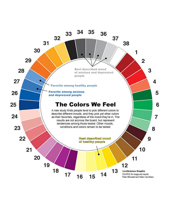
Image Source: LiveScience
A number of businesses have been using colors to convey their brand information. Yes, this has been happening since a long time now. Can you relate to the Coca-Cola and Santa Claus, when you think about red color? Of course, these are those colors that hit our mind when we think about the color red. How about a mix of red and yellow? Mc Donald’s … hmm, yes … Who cannot relate to Mc Donald’s where they have this man all decked up in red and yellow.
So, let us check what each of the different colors does to the human brain:
1. Red
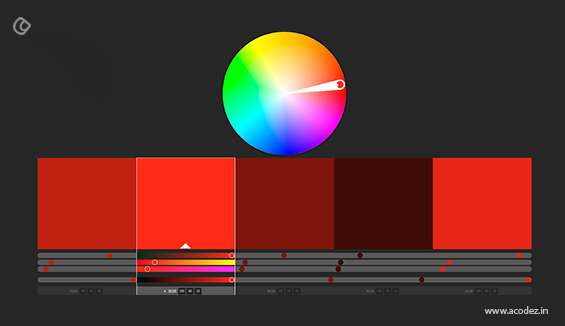
What are the things that come to your mind when you think of the color “red?” Many a time our mind hits with cupids and hearts and all those red roses, when we think of red. Of course, the traffic signal, the color of blood is all red in color. Even danger signs are printed in red some of the times. But, what does this red color indicate? Have you observed when there is a discount sale happening, it would be printed in red? It brings about a flow of urgency. Something is happening and there is a need to rush. This forces your people to take an action quickly.
2. Pink

When we discuss pink is there anything that comes to your mind? Yes, there is. Bouquet of flowers – of course, these can be red and pink. What else? The first thing that hits the mind is babies. Baby pink is something that we are all fond of. Johnson & Johnson has some of their baby products wrapped up in pink – some of their baby lotions, baby soaps, shampoos etc. Even the color of the product inside is pink in color. It actually symbolizes purity. Women are also crazy about pink. So, websites that usually market or promote ladies’ products such as cosmetics are usually in pink.
3. Purple
Just like pink this is one of those colors that are used to bring about a soothing effect to the mind of the women. When you see the color purple what comes to your mind? Women and their fetishes. Women are fond of such light shades that symbolize freshness and if you observe this color does the magic when used with websites endorsing cosmetic products such as deodorants, talcum powders and even anti-ageing products.
4. Blue
State Bank of India or Federal Bank? Which one hits your mind? It gives an expression of safety and security. If you have observed some of the nations have their police uniforms in blue. What does that indicate? They are responsible to provide you with safety and protection and when you see the color blue, it indicates all is well. The same is for banks. You park your money here and you know the banks will stay with you in all your thick and thin.
5. Black
This is one of those colors that are equally preferred by both men and women. It is an ironical color. If you observe some of the websites that endorse car and automobile services use the color black. It indicates style and vigor. And, we are all in love with sophistication and luxury.
6. Orange and yellow
What color is your Call-to-action button? Or just think about the color of the button you find on the landing pages? Most commonly these are “orange” in color. And, this is something that we can easily relate to without getting bored. Yellow is something different that indicates freshness and energy. Most of the motor bikes and similar companies employ the use of yellow color to attract people.
Let us discuss why you need to be more careful when choosing the shades of colors for your website:
1. First impression
When a person comes to your website for the first time, the color of your website is something that will hold them there and make them stay longer. For example, if you own a travel website and you plan to paint it in red. It will never create an impression with red color. But, rather if you are using shades of light blue, orange, green etc. there are chances that the people can easily relate to such colors that ultimately signify traveling.
2. It should be target specific
When you start designing a website, you should keep in mind the kind of people you are planning to attract. Not all of the people would be happier with the same colors. But, you could possibly attract the majority of your customers as this would be a common trait on your website that would attract them to you.
3. Think out-of-the-box
Just because your peers are using a certain shade, it is not necessary that you too employ these colors for your website. It never works that way. Why don’t you try a different shade this time? People love new choices and are indeed happy when their service providers are ready to serve them with something new, unique and different. Indeed this is one of the ways that you can convey them that yes, you are different and there is something magical that you have got for them.
4. Your brand reflection
You cannot keep on changing your color every now and then. Once you implement a color it should be here to stay. This color should be something that people should be able to relate to when they see your brand or logo design from the far away distance. So, ensure that the color you choose should be something that your people can relate to with ease.
These are some of the immediate things that you must be keeping in mind when choosing a color to design your website. Not always does the magic work while choosing a common color for a particular brand belonging to a specific industry sector because sometimes people are bored and are expecting businesses to come up with newer and interesting solutions.
So, when it comes to your website make sure that the background color and the font color and neat, clear and understandable and also, something that does not annoy the visitor.
Do you need help with designing websites?
We can help.
Acodez is a web design and web development company based in India. We have been here for over half a decade now and our services have reached as far as 70+ countries in the world. We have also had the fortune of serving more than 600 companies that belongs to different industry sectors with state-of-the-art technology solutions.
We are here to serve you.
We also provide SEO based solutions helping your business reach far and wide. For further details on how we can help you contact us today.
Looking for a good team
for your next project?
Contact us and we'll give you a preliminary free consultation
on the web & mobile strategy that'd suit your needs best.




i am amazed by reading this article that the color on a blog really matters very much thanks for the information. i will also implement these tips on my blog .
Nice Information about colors is shared in this blog. Most Probably, we never think about colors too deep when we make websites, but this matters alot.
Thanks
Raj Gawdi
TheWebDesign
One of the amazing post I have read ever. Thanks for sharing Abhyudaya. You have listed everything very detailly. One of the worth reading post that even worth the timing.
Thank you for your valuable insights. Your generosity in sharing your expertise has not only expanded my understanding but has also fueled my enthusiasm to create a website that is visually appealing and user-friendly.