Once, someone was quoted saying “it’s hard to make predictions, especially about the future” and back then, I thought why can’t we assume what might happen.
I have made assumptions many times in the past, and the amazing part is that all my predictions have always worked out.
Being a digital marketer you have the liberty to sketch your guesses but it is just a probability of what might be the outcome.
How many times have you encountered a situation where the visitor arrives at your website, scrolls through, feels impressed and finally reaches the landing page and is about to take some action when they reconsider their decision and leave the site.
So what next?
The strategy of your landing page’s design is based on a set of predictions that we believe will deliver the expected results no matter what.
But, sometimes nothing works out and all your effort is in vain.
With the evolving trend in Smartphones and Android devices, our assumption strategy shrinks down even more.
Also, when people access your pages via mobile, their attention span is less than that of a desktop user which accounts it to lesser than 3 seconds.
As HubSpot cites, 75% of the online searchers usually take a few hours before they take a decision, while 36% of the lot makes their decision instantly.
So, what do we do now?
Don’t fret! Even I have gone through similar situations and thought that I can never succeed until I started implementing the following points to create a landing page that is mobile-friendly too:
1. Scale the content appropriately:

You know who your target audiences are, and you have the statistics on what kind of devices your people are using. Once you have an idea of the device your people are using, then it is easy to scale the content accordingly.
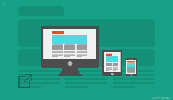
What you can do is program the page to load and get the content scaled to sync well with both the portrait and landscape mode.
2. Come to the point:

A headline that is precise and to the point matters than stuffing in too much of words.
Maybe a few years back people would have loved it if you were using a headline that is six words long, but it would be better if you could reduce it to 2-3 words as the time demands.
We all write stories when it comes to the content part of our website; we don’t care to hold back our pens even if we are writing a landing page.
But, when someone lands on your landing page they are here because they want to take some action. And, what they find is you have written grandmother tales.
They have no idea what they have to do and who cares to read through all those tales you have written.
I will tell you what you have to do.
Once you finish writing the landing page, dissect it into two. And, remember this page is being read via mobile. So, there is no space for any of those superfluous words that you usually add up to enhance the beauty of your content.
Each word mean a lot to the reader and it must be strong enough to prompt them to take an action.
3. Visibility:

You have queued in a lot of PNG-24 images, flashes and plug-ins some of which are relevant while the rest are useless. What will happen?
Do I have to tell you?
Remember your landing page has been designed for accessibility via the mobile phones. So, when you have clubbed in a lot of entities how do you expect it to load within the desired time?
But, sometimes you cannot avoid embedding in these elements which are necessary for your site.
So under these circumstances what are you going to do?
You can use jQuery, HTML5 or JPGs so that the mobile devices can deliver your content with ease.
If you feel that your page fails to convert, then, it is high time you realized that your page was never visible to the people.
4. Don’t Brag:

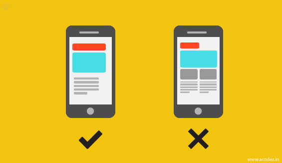
It is always a good idea to showcase your content in a single column as it is being accessed over the Smartphones.
Also, though they say people read the content present below the fold, it could never hurt if you placed the Call-To-Action’s above the fold.
And, it is a good practice to position your CTA’s within the top 100 pixels for Smartphones.
HubSpot says that if at all you cannot place the content above the fold then, put up a teaser that says “Scroll Down for your gift.”
5. Loading Speed:

Several times we all have created scenarios where our pages are grilled up and fail to load on time. Our visitors don’t have time to wait until the page loads.
Quick tips:
Keep your page:
- Slim
- Lightweight
- Under 20 kilobytes
It will help your page to load within 5 seconds or less.
6. Stay relevant to your consumers:

When someone is accessing your page via Smartphones or un-wired devices, it is possible that they are moving. And, of course, the technology has improved so far that we can quickly locate where are they.
Even a less powerful geo-tracking system can locate people within a range of 5 to 20 miles.
Here, what you can do is add a link to your nearest outlets. You can include your location such as the city or locality where your physical store resides.
These are some of the things you could add so that your people will be directed to the “Buy Now” button.
7. Are you available when they need you?

Just add an attractive “Click-to-Call” button and you can witness how the magic unveils for yourself.
Make the process easy for them. Whether you add a phone number on your mobile landing pages or an Email Id, it will bring in conversions.
But a phone number is the best option over an Email id.
It is common sense.
They are using their phone. Add your phone number with a phone icon and add a call-to-action text like “Call Now.” You can highlight this link using a color and maybe make an offer in exchange of the call as a courtesy for acting as was expected of them.
8. Tell them what action you want them to take:

No one wants to do a lot of hard work. They just want to get things done with ease.
So, if they can get something done with fewer actions, they will be happy.
You can improve this portion by including just 3-4 steps which are easy to follow, and you will experience a considerable improvement in the conversion.
With each step, they should feel that they are closer to achieving their goals.
9. Rule of thumb:

Remember the design is for the landing page that is going to be accessed via mobile devices.
So, let us think of making it friendly for the thumbs.
Align your clickable area somewhere between 38 * 38 pixels to 44 * 44 pixels.
Also, don’t forget to add padding to the links and fill up all the negative space between the clickable links.
Get rid of all the misclicks.
10. What is the size of your content?

You have to put up content that matters and each word should be relevant to the reader.
The size of your content matters.
If the font size is small, it is like no content at all. And, they do not want to zoom the content and waste their time.
11. A/B Test:

If you have designed your mobile landing page, then, I would say you need to A/B Test it for mobile.
Some people sit back and relax thinking that their work is famished because they have already tested their page for desktops, and it works fine.
Don’t forget you are designing for the mobile and not for desktops, so the latter has the least relevance here.
These are a few points that you need to keep in mind when you are designing your landing page. Last but not the least your platter of bread is your goal.
What is it that you wish to achieve via the mobile landing page? Think!
Work on achieving your goals.
Whatever you do, ensure that your landing page will prompt your people to perform the desired action.
Our goal is to generate sales and with mobile landing pages that are faster things will happen as per our expectation.
Acodez IT Solutions is a web design company in India offering a wide range of services including web design in India and abroad.
We have experience at creating striking designs that our people are looking for, and also we are constantly researching to develop solutions that are new, unique and the best for a business depending upon its requirements.
We are also an SEO agency in India offering digital marketing and the related activities necessary to take your business to the next level.
We know where exactly your competitors are and what can be done to take you ahead of them. Contact us today and allow us to boost your business.
Looking for a good team
for your next project?
Contact us and we'll give you a preliminary free consultation
on the web & mobile strategy that'd suit your needs best.


