Someone has truly said that – websites promote you 24/7, when no employee will do that!
This means that you should be careful when designing your website, which is the window to your business 24/7. We have discussed this repeatedly whether a website user or even a visitor would want to stick on a little longer on your website, if it has nothing new to offer. Let’s think of another situation where you have been using a website that has been copied from your competitor’s and there is nothing that you could say here is unique. Do you think anyone will want to stick around?
The new cool is to cut the crap and devise new ideas to design your websites. And, these new ideas should be indeed new! The experience and interaction (UX and UI) that a user had while they were on your website is something that needs to be worked upon to ensure that they stay here forever.
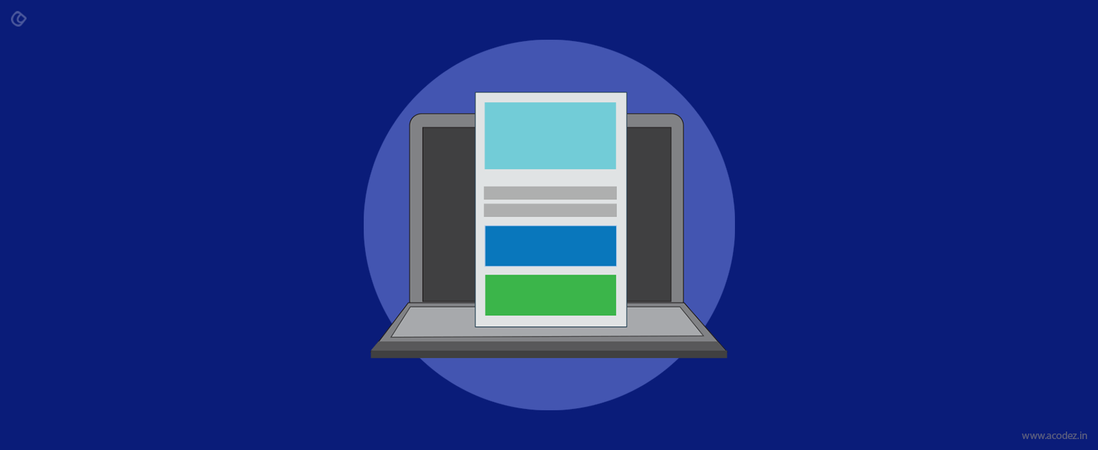
Parallax web designing comes into the scenario at such a point of time
The overall mission of parallax design is to offer parallax scrolling, which would create a 2D impact wherein the foreground images will move faster than those in the background. This is otherwise termed as “asymmetrical scrolling.” The layering of speeds as the user moves across the website provides them with an immersive experience, ultimately keeping them awestruck by your website.
HTML and CSS3 combine together to weave this magic of fluidizing the web, engaging the end users and all together directing to a great website experience. The design components involved in parallax scrolling is minimal and this should be ideally applied to sites that are indeed too long to scroll. Apparently, websites with a lot of content when designed using parallax scrolling renders a great website experience as the users scroll through the enduring visual affects pulling them further.
But, before you shower your websites with parallax scrolling, here are a few things to consider:
1) SEO perspective
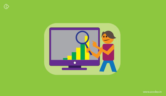
Your site will never be familiar to people or search engines, unless it has been optimized for the search engines, i.e., SEO done properly. So, when you are adding the parallax affect to your website, you need to ensure that it would benefit the SEO part too.
As we have already discussed parallax scrolling is a great experience for sites that are unfolded into a long scroll, so the concept of splitting a website into multiple pages, with a lot of content does not happen here.
So, when the number of pages are less, there will be lesser content, which means you can use only a few keywords, and ultimately this will result in your website being pushed down the ladder of the search engine result pages.
When, the web page is longer, it takes longer to load, which will make its load time higher on hand-held devices such as mobile phones.
But, you need not worry. There are a number of parallax websites around the globe that ranks at the top position on the search engines, which means that there are some secret ingredients that will take you there even though it is not much appreciated from the SEO perspective by experts.
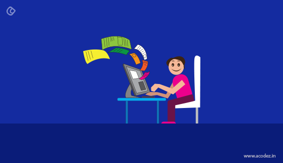
2) Time taken to load
We already discussed that when the webpage is longer, it will take longer to load especially on hand-held devices, such as the mobile phones.
Websites that take more than 10 seconds drive away customers, which is the rule of the world of web. So, what can you do to ensure that it loads on time?
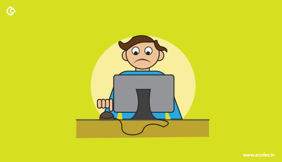
The aesthetic poweress of your site is something that has been driving people to it. But, it is this same aesthetic power that will cause the people to leave as they lose their patience while the page takes longer to load.
This means that if there are heavy components such as high-resolution images, the chances of your site loading faster are minimal.
The point is to introduce aesthetic elements on your site but it should be such that people should be ready to wait while the site loads no matter what.
This means the design elements should be carefully placed.
3) Usability factor
You can never underestimate the power of a normal website in comparison with the parallax website when it comes to conveying the message of your business.
There is a thin line between people trying to enjoy the beautiful experience of your parallax website while it offers them with an intuitive movement across.
There are controversies rounding the use of parallax websites, wherein experts say that this is best suited when you have only portfolios to be exhibited or moreover, when you are trying to display what you are doing here.
This doesn’t synch in with websites that are trying to sell products or services.
When your users are trying to gather more information about who you are and checking to see for more details on the “About” page, there is just only one long page, which has very little or no information about who you are or what you are doing here.
In such cases, parallax scrolling does no good, rather ends cooking up confusion, which is not good for your website.
This means that if your website is here to convey a message or provide more information about your products or services, it could create confusions.
All this brings us to one single point, which says that parallax websites are best suited when you are trying to convey a new idea or message.
The users can have fun while they are on your website because it has the parallax scrolling that gives them some food for thought.
How to ensure that whatever you have done will work?
1) Check whether the website has a story to tell
This is one of the most important phases of your website design. Since, it is one long page where the people have to scroll from top to bottom, this kind of a content display is going to fit well as people will find it interesting to read through.
They do not have to switch over pages, but can just read it from top to bottom.
Expression builders can be used to include expressions on your website and get your users to read through.
This will keep them going and ensure that the reading gets interesting as they move through.
2) Guide them through
As we have already discussed the pair of animations might get annoying after a particular period of time. So, you must be ready to give them something interesting.
As they scroll through your parallax website, ensure that the product or service or whatever message you have got for your people gets conveyed without creating a confusion for them as to what is to be done or leave them thinking where are they.
3) Mobile responsiveness
We have already seen that long scrolling websites do not act like they are mobile friendly, which could be harmful.
When you have a website that doesn’t fit in your mobile device, most of the time, it happens that designers want to save themselves from the effort of making their site mobile responsive.
And, in this while they are losing many a number of customers who would have otherwise turned up to them on mobile.
All this in turn leads to bringing down your ranking as you lose your visitors, which Google doesn’t approve of.
4) Get real users to test it
It is necessary that you find out the pulse of your target audience. Their process of thinking differs from yours. You really do not know what they are looking for. You might have created an aesthetically powerful website, but then, how do you ensure that this is what they were expecting.
Unless you get them test it and monitor and track their actions, how is it that you are going to ensure that the website that you have is what they want.
5) Don’t do these things
Like every other design process, here are a few things that you shouldn’t be doing when designing parallax websites:
- Design it without the bottomless scrolling effect
- Don’t trap the secondary elements with the parallax effect.
- Make it possible for your people to find the information they need.
These are some of the few things that you should keep an eye out for when designing parallax websites to ensure that everything works fine.
Acodez IT Solutions is a web design and web development company in India that offers all kinds of web design and development services based on the latest trends. We have already served around 600+ clients across 70 countries across the globe. We also offer graphic design solutions along with branding and visual identity services. Our SEO team offering all kinds of inbound marketing solutions to take your website to the next level. We know what exactly your business requirements are and hence, we will customize the perfect solution for you.
For further information, contact us today.
Looking for a good team
for your next project?
Contact us and we'll give you a preliminary free consultation
on the web & mobile strategy that'd suit your needs best.