Do designers have a future?
Watch out where you are going or your fate is sealed. I’ m not blabbering useless because I’ve gone mad. But, the truth is bitter. Something that we don’t want to dawn upon us but will soon be groping the reality of virtual web designing.
Indeed, designers are a digital species that is on the verge of extinction.
Elliot Jay Stocks was the first to strike a warning in the year 2014. Though the designers knew this was coming since long.
Technology has been developing every other day repeatedly. As Elliot says technology can create just anything that you need. Creativity seems to have gone out of the way.
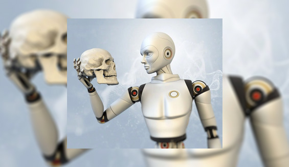
Contribution of robots:
Also, as mentioned in the Smashing Magazine, we need to shake heads to the fact that all sites look the same.

This is mainly because the number of tools we have with us. And as per the record, there are many more things that have been contributing to change the face of web design.
“Designers are no more creative“, says Sergio Nouvel.
What has happened to our designers? Why are they changing?
Noah Stokes came up with a conclusion in the year 2015 that the magic of creativity is no more of importance.
Boxes and Grids are replacing our traditional creativity concept of web design.
Can we blame Responsive Web Designs for this revolution?

Or is it the right thing to say?
Designers are struggling hard, but looks like all this effort of theirs will be in vain.

Sergio Nouvel even went out a step ahead and out of frustration declared that “web design is dead”.
How sad and depressing?
What will all the web designers do?
Will they go back home and think of taking up some other job to make a living?
Because being creative is even more harmful to the web when it comes to design.
What happened all of a sudden?
Let me tell you this was coming. The designers foresaw it. Nothing could be changed.
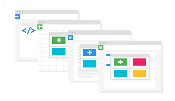
“The Grid” redefined all the existing conventions of web design and architecture. The introduction of this artificial intelligence replaced web designers.
Sergio Nouvel defines “The Grid as the pioneer in automation and artificial intelligence”. It looks like it is all set to threaten the web designers.
According to Sergio Nouvel, this so-called Grid has the capability to analyze your content. Based on its analysis, it can define the best layouts, colors, fonts and extra imagery for your site.
Now this has a point!!!
No one wants to hear of the designers extra effort. The truth is they are struggling hard to make things work.
Their work focus is more on creating a design with an appeal.
They create wireframes by interacting and contemplating with the rest of the team. There is a lot of effort involved which we are unaware of.
But now there is a change in the scenario.
You have got the Grid that is a genius.
With the content in hand, it will analyze the content and provide you with an apt layout.
This layout will hold all the components and elements with just the click of a button… Woah!!!
So, our universe has moved this far in technology that there is no more the need for someone to compose a design mockup.
Let us go back in time.
In the year 2000, the Internet was considered to be a fascination. This was the time when web design was a toddler, and things were different.
Web designers were considered to be geniuses!!!
Businesses worshiped them as Gods!!!
Little did we know the robots we created would threaten us burning the mockups that we designed?
Web design, graphic design, and UI design all emerged from more or less the same bottom line:
The web’s need for creativity…

Maybe in the early 15th- 20th century before the design geniuses like David Carson the system was different. Everything was designed on the basis of rules.
But, things changed when people like him urged the need for creating designs that had a soul.
Creativity begins!!!
Again, we arrive at the point where design is outlined by rules rather than creativity. This means creativity will never dominate rules.
The trend:
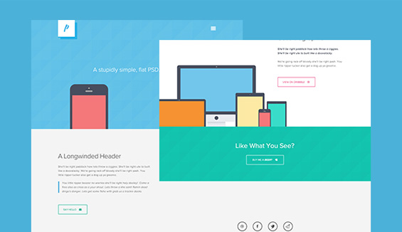
Flat design is what we call as the trend. And those without the starry decorations fall under the category of simple graphic design.

Now we can exercise control over the typography, and infuse in animation and maybe nodes. Everything will be made accessible via retina screens.
What a fantablastic technology do we have?
Hats off to the genius brains behind this transformation…
Sigh!!!
I will tell you what brought about this change…
I would blame content for what has happened…
Content is responsible for how design is implemented across a website.
For a print media such as Magazines content comes first. Design is based on the kind of content that is put into place. The layouts need to be designed as such that these accommodate the content.
Also, a designer and a writer could work hand-in-hand to make a content that fits in the design structure. Yes, content and design works pretty much together.
But, let us come back to the web.
Here, content is different.
CMS changed the face of content writing. People could easily get their hands on the CMS and make the necessary edits and modifications.

This means you have the freedom to change your content as and when needed. There will be no intrusion from the design part.
Content can be added when the design is being created or after it has been created.
And the user has the liberty to make changes as and when required.
Now the situation is designs get created and you need to provide content that fits in.
Many of the software firms are following the same practice these days. When they need to write content for any website, they provide their content writer with the real design.
It makes the writer’s job easier. They can curate content that will fit exactly into the design space.
Also, it helps the designers too. They don’t have to worry that the new content might break the design and make their task difficult.
The content writer can check out the dummy piece of content and the word count that fits in. Now the writer has an idea of what kind of content has to be delivered so that the design remains untouched.
Here, these design agencies do not focus on getting quality content or related specific content. But our fear is whether the content will break the design.
The content writer’s situation is sad!!!
They cannot even exhibit their skills. It looks like the end users will come for something attractive and appealing. Who cares for the information?
So, with designers are content-writers also losing their priority?
Let’s not think of all that!!!
We live in an era where designers prefer atomicity in designs. Seriously what has happened to our designer friends?
The thing is they have gone more mechanical.
The latest design structure consists of empty templates, collages, group of buttons, and feature boxes. The look, feel and appearance are aligned according to the client’s preference.
The actual fact is that your designers don’t care to inquire about the content. Or why the client needs this design in the first place?
Where has the curiosity gone?
This concept of no-context is dangerous for any design and is killing web designs.
All that we need is appearance. People don’t know or don’t care about the context.
They misunderstand that when everything is organized with beautiful decorations things will work out.
Of course no doubt with that. These designs do magic…
Someone said pictures can speak more than 1000 words. But, pictures, when combined with words, are more meaningful than anything else.
I am not asking you to borrow the Word Document from your client. It won’t help. Text and content works well together.
AND
Don’t just settle with “lorem ipsum” dummy content. Talk to your client. Pull out an idea of the content that is required and then design the layout.
And also this will help you to use images that reflect the context.
The disparity between your text and images will keep it more etched in the minds of your people.
Being a designer, don’t forget you get paid simply not because you can regenerate the drupal templates.
But because you can generate their context through your design.
Now, let us check for some symptoms that actually tell us web design is dead:
1.) RWD or Parallax designs:

When a client approaches you with a web design request, RWD or Parallax is what comes to your mind. This means we need not expect anything from these carousel designs. Everything is game…
But users do know what they want and what to look for in designs. When it comes to the kind of checkout forms, or shipping carts or the landing pages, don’t you think of buying creativity.
It can wreck havoc!!!
2.) Mobile needs more:

The influence or upsurge of mobile phones has been demanding for more.
We have a variety of apps to make lives easier with just a scroll of your Smartphone. You know people don’t like to type in web addresses over their mobile phones. Such a boring thing it is.
People are almost used to these concepts of the web and are switching over to mobile data. No one wants to use desktops.
3.) Finally, the Grid:

We have already discussed this artificial intelligence platform. It has the power to analyze the content and define a layout pattern to fit the content.
The need of the hour!!! When you designers are thinking mechanical…
And
Content-writers you don’t have to worry!
Your job is safe…
You have got work!!!

The Grid requires minimal human input. This means designers you can sit back at home.
How Google views these changes?

As discussed, these days all web pages are more or less the same. A lot of competition is happening out there.
We can’t expect people to go through all these pages to finally get the one that they need.
Google has always been at its surface to help people in the best possible way.
According to Google what matters is content.
Have you noticed something lately?
For instance, search for the best cafe in your area/ locality on your mobile. What do you find?
The Google’s search results will bring you the best cafe with its phone number and a button below it. Click the button and make a call.
That is what technology and Google is…
I know as a designer it can hurt you and also SEO might suffer if Google continues this practice.
But the excitement is:
This achieves our ultimate aim of user experience…

Google in coordination with digital giants such as Siri will now provide you with information that you need and when you need.
Content consumption is the key and thanks to the variety API’s that helps us with this.
So, the next big question is designers really facing the threat of extinction?
Yes, web designers are….
But UX design survives and will live long enough till the Internet is dead.
This is evidently visible from the fact that people get their existing digital products redesigned.
Your design strategy and content collaboration will determine whether you will live or die.
Provide people with valuable content inside your UX design grid and satisfy them. They will be happy.
They will provide you with positive marks.
So, designers’ content management with design is the key to live and survive.
We wish that you live a long life!!!
What kind of a design concept are you using? Do you talk to your clients and analyze their content requirements before designing?
Share your thoughts and comments with us…
Acodez IT Solutions is a web development company based in India providing a variety of web development and design services. We have a wide number of clients in India and abroad all satisfied with our services.
We are also a digital marketing solutions provider digital marketing solutions provider helping businesses to build SEO strategies and content marketing strategies that will help them to conquer the world of web.We offer some of the best UX and UI design solutions as the top listed UX research agency india for our clients based on their business requirements.
Regardless of what industry domain you belong to we can customize services for your online business. Just tell us what your needs are.
Call us today and get a free quote…
Looking for a good team
for your next project?
Contact us and we'll give you a preliminary free consultation
on the web & mobile strategy that'd suit your needs best.


