The look of the content is also as important as the content itself. Enhancing the look of the content is a very good idea to increase the visitors. The great body font such as canaro font provides you with good readability. Mostly the font for the heading is more decorative. In professional contents it may not be so good. So care needs to be taken from a great body font. Choosing the body font is a tough task. In professional contents the body font should not overdo. The type of font should represent the image of your business. Here are some of the tips in choosing great body fonts.
Does it match your purpose?
The font you selected should suit your purposes. The font style should complement the content. And care should be taken the body font style should not dominate the head font style. We have different fonts like serif and sans. By keeping the principles in mind you need to opt. the appropriate font for your purpose. So the decision making would become easier. We have fonts like meddle, which is readable even at zoom levels. So the body font should be selected according to the work necessary. The first priority to be given while selecting a font is “what purpose does it perform”.
Shape:
In the body font the letters need to be identifiable. In a header font it would not create much problem even if there is some distraction. We have many letters which are identical like “o” or “e”. There is not even visible difference between the letters like a small case “l” and upper case “I”. This is a big test to the designers in the case of these types of letters.
Rendering:
The next most things after shape are, how the letter would be rendered over the screen. The designer needs to test it in different ways like different sizes, italics, bold, etc. Optical size of the font is another major issue to be considered. Letters with different optical sizes, look in multiple ways over different screens. The variation in the thickness of the letters is also to be tested. Whatever it is the readability of the content is more important.
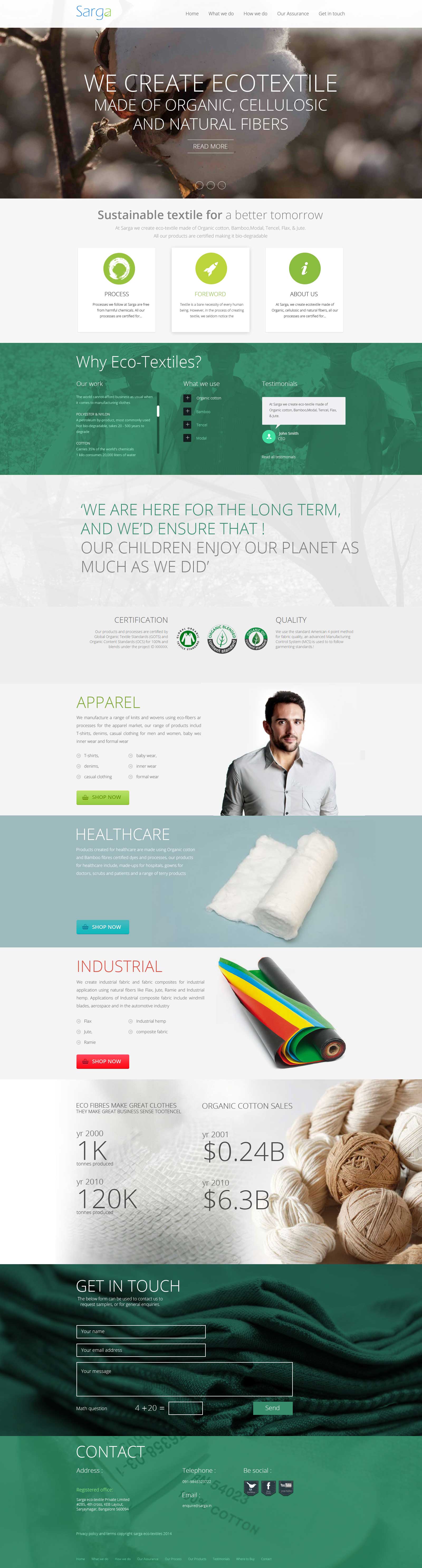
Here’s a fine example of perfect rendering. Sarga Ecotextile website designed by Acodez, feel free to check it out on different devices.
X-height:
X-height is the height of a lower case letter in any given font without any ascendants and descendants. The letters extend to make fonts more legible from greater distances. The letters are optimized if they are having lower x-heights for good readability.
Spacing:
A comfortable space between the letters provides good readability. The contents with good body font enhance the users comfort while going through the content. There are some special pairs of letters called kerning pairs. The spacing is optimized for these kerning pairs to provide greater body font.
Sizing:
The most widely used body font is 12 pt. The font size can also be increased based on the user’s comfort. It can be increased up to 15pt. Other than that it will not look good.
So, by using these tips you can make your content more readable with the great body font.
Are you looking forward to Outsource works to a Web Development Company in India? Call us at +91 9544668844 & get in touch with our team right away!
Credits: featured image
Looking for a good team
for your next project?
Contact us and we'll give you a preliminary free consultation
on the web & mobile strategy that'd suit your needs best.


