Just as with everything else, with websites, first impressions are crucial. There’s no use in driving loads of traffic to your site if your design puts off people! If at first look, visitors don’t like your site, chances are, they are NOT going to buy your products and services. Though the biggest factor that influences the first impression is website design, it is not the only factor. Here are some of the main reasons why people shy away from buying from your website
1. Unattractive Visuals
Regardless of whether it’s the color theme, layout, content or text – poor visuals can really create a very poor impression of your website in the minds of visitors. Use real images – not stock images; include a visual tour if possible; don’t clutter your home page, let it be clean and professional. Use colors that are related to your line of business, and don’t use too many of those; don’t give it a dull look either. Make sure your font is simple and big enough to be easily read. Don’t let your website be just another online catalogue; make it work!
Also Read: Top Color tips that can help you create an awesome website design
2. You’re not getting relevant traffic
Driving the right kind of traffic to your website is very important – though it’s something that is often overlooked. For example, if you are selling boutique, haute-couture fashion, but the majority traffic you get is people looking for everyday casual wear, you’re doing something wrong, and the people who land up on your site are, for the most part, NOT going to buy from you. Sometimes, you may get visitors who are just looking for information. There’s really nothing much you can do about those!
3. Your Competition has a better website
If relevant traffic lands on your home page, and they browse for a while but still go away and buy from somewhere else, it means that your website pales in comparison. Check out your competitor websites, and see what you’re doing wrong.
4. You’re not appealing to your Target Audience
Your website must be customized for your target demographics, or your ideal customers. For example, if the YOLO generation is your target, use short text blocks, funky graphics and catchy visuals; if your site is about financial products, in-depth content along with charts and graphs, is what you need. Get the drift?
6. Boring Content
According to studies, the average Netizen scans a website for just about 6 seconds and decides whether to continue or visit another site. So it’s imperative that you ensure that your content is eye catching, and precise – don’t beat around the bush. Update your content to keep it fresh and relevant. Make sure that they copyright is up to date, and not from a year or two ago. That will not inspire trust.
7. Your ‘About Us’ page and contact information is not seen prominently
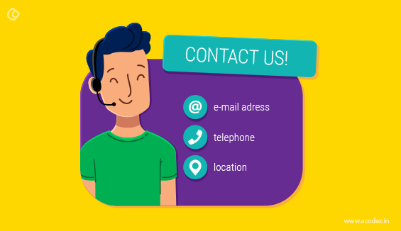
People want to know the person/s behind the corporation; in fact, it’s one of the most visited pages on any website. Don’t be just another faceless entity. Tell them who you are, what drives you and why your business exists. Visitors want to get facts about the company and you, and writing an impressive About Us page will go a long way in helping you make an emotional connect with your audience. You also need to make it easy for your audience to contact you when they need to. Make sure you display your contact information prominently –it helps to inspire confidence in your website and business.
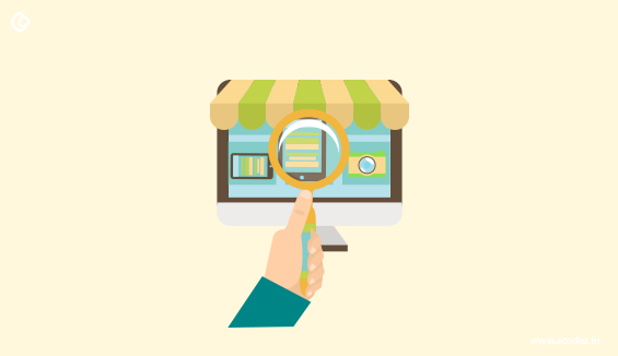
7. The Visitor can’t find what they want
If your internal linking and navigation is not properly structured, you are going to frustrate your visitors. They may be completely confused as to where to get where they want to, how to find what they want and so on. This is sure to drive away potential customers. Keep navigation simple. Your pages should be properly linked so that a visitor finds it easy to jump to whichever page they desire, from any page on your website.
8. Customer Objections are not answered
A lot of people will have a lot of questions about your product when they are buying it for the first time. Make sure that you enable them to ask you on the site, and make sure you respond. This also helps create trust, and build a relationship with the customer. Reassure them that you are not a fly-by-night operator but a genuine business.
9. Complicated Checkout
Don’t force everyone to create an account; enable guest checkout, or you will see an increase in abandoned shopping carts. Let the checkout be a simple one step process, on a single page where people can enter their information easily.
10. Limited Flexibility
Make sure you provide several options for your customers to make payments, and also for shipping. If you have just credit card payment enabled, those without credit cards, but with other methods like internet banking, mobile wallets and so on will simply go elsewhere. Offer free shipping, at least for orders above a certain value. Most customers will be unhappy about paid shipping, and may abandon the cart.
11. Restrictive Returns Policy
If you make it difficult for the customer to return a product, especially for a valid reason, they will hesitate before clicking on the Buy button. Clearly mention your returns policy, and allow them some time, say 30 days, to change their minds, or return it in exchange for another product, unless it’s a personal hygiene/lingerie product, of course.
12. No Trust Indicators
Include buttons from review sites, social media networks, or display user testimonials directly on your website; because when people land on your site, they may not really know anything about you. Google Plus Local, Trip Advisor buttons, media mentions, and so on can help establish faith. Continuously monitor what people are saying about you. Respond to bad reviews as well as good; take responsibility if you have goofed up somewhere and assure them you’ll work on the shortcomings.
13. Unresponsive site
If your website can’t be viewed, browsed and navigated properly on mobile devices, you can expect that more people are going to go elsewhere. A huge number of people browse and shop via their mobile devices nowadays, so if they are not able to do what they want to, it will frustrate users. Therefore it’s crucial that your site is responsive, and provides consistent viewing experience across devices. Make sure your site loads fast, has finger friendly buttons, one direction, minimal scrolling and click to call facility.
14. Poor SEO
Without good SEO techniques, not only will your Google ranking suffer, your customers will also find it difficult and may even be put off. Stuffing your pages with keywords and irrelevant links spoil the user experience, and you need to stay away from such tactics.
15. You don’t have video
Today’s customer is pretty impatient, and you need to cater to that. They want information fast, visually, and in minimal time. Rather than have long blocks of text, you need to have short videos – explainer videos, FAQs, product demos, and so on, which will interest the viewer and keep them on your site. It will help build trust, and they are more likely to purchase from you. Also, Google owns YouTube, so when you use another service of theirs, they are definitely going to reward you and drive more traffic your way. Making a video is not very difficult or expensive – so go out there and do it.
16. You’re not communicating your USP
It is extremely important that your unique selling proposition is conveyed very clearly to your potential customers. Make sure that you include in your copy: How your product or service can solve their pain points, the benefits of purchasing your product, and why your product is better than the one from your competitors. One of the best examples of a killer USP is from Domino’s: You get fresh, hot pizza delivered to your door in 30 minutes or less—or it’s free. In this one sentence, the customer gets to know exactly what benefits they are going to get from the company’s product, very succinctly.
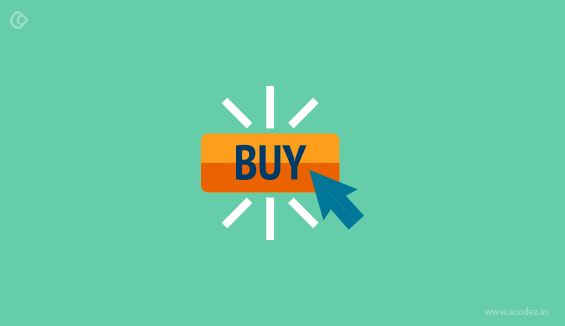
17. There is no clear call to action
Believe me, you need to tell your customers what you want them to do next. A clear, precise CTA button must be prominently displayed above the fold, asking them to take the action that you want. IT could be anything from downloading a free ebook, to booking a consultation to purchasing a product; but it must be visible and clear. A CTA helps you capture their contact information so that you can follow up and nurture that prospect, and eventually convert them into a customer.
Acodez IT Solutions is a web design company based in India offering all kinds of web design and development services to our clients in India and abroad. We are also a SEO agency offering all kinds of inbound marketing services. We help our clients with business analysis and then, fix up their business to fit into the modern day needs.
For more information, contact us today!
Looking for a good team
for your next project?
Contact us and we'll give you a preliminary free consultation
on the web & mobile strategy that'd suit your needs best.