In today’s fast-paced digital landscape, sophisticated web animation has become a strategic tool for designers and developers to engage users and enhance experiences on websites. As audiences’ expectations continue to progress, advanced web animation techniques are increasingly necessary to maintain engagement.
By harnessing the combined functionality of CSS and JavaScript, animation provides the ability to transform static pages into dynamic and interactive spaces that capture attention.
This article will explore web animation from foundational principles through more complex implementations. We will examine CSS animations and leverage popular JavaScript libraries to bring new life to pages.
By the end, developers will gain a holistic understanding of current possibilities and best practices when leveraging animation to its fullest advantage. Implementing cutting-edge animation strategies allows creators to build truly captivating digital experiences on the web.
Maintaining expertise in these evolving techniques ensures designers and developers can continue resonating with modem audiences.
Web animation has become an essential technique for crafting visually engaging websites and improving user experiences. It enables developers to transform static pages into lively, engaging experiences that guide users through workflows and enhance the enjoyment of interactions.
Mastering the fundamentals of web animation necessitates comprehension of various techniques and factors that developers must consider to generate smooth, optimized animations.
CSS Transitions and Keyframes
CSS (Cascading Style Sheets) animations provide a powerful and easy-to-use method for creating smooth transitions and complex animations. They consist of two main components: the animation style and keyframes. CSS animations offer several advantages over traditional script-driven techniques:
Ease of use for simple animations
Better performance under moderate system load
Browser optimization for smoother playback
To create a CSS animation, developers use the animation property or its sub-properties to configure timing, duration, and other details. The actual appearance of the animation is defined using the @keyframes at-rule. Keyframes describe how the animated element should render at specific points during the animation sequence, using percentages or the aliases from and to.
For example, a basic keyframe animation can be created as follows:
This animation moves an element 100 pixels horizontally over 3 seconds, repeating infinitely and alternating direction.
JavaScript Animation Basics
JavaScript animations provide more flexibility and control in comparison to CSS animations, allowing developers to address complex scenarios that CSS alone cannot handle.
The fundamental principle of JavaScript animation involves making slight, incremental adjustments to element properties at consistent intervals, creating the illusion of smooth movement.
Advanced CSS Animation Techniques
Keyframe Techniques
Keyframes are the foundation of CSS animations, defining the start, end, and intermediate steps of an animation sequence.
By incorporating various properties such as transform, opacity, and color within keyframes, developers can create complex and captivating animations that smoothly transition between states.
In order to create advanced web animations, it’s often effective to stack multiple simple animations, breaking down complex movements into smaller, manageable parts.
One powerful technique is using the cubic-bezier() function, an easing function that provides complete control over how an animation behaves with respect to time. This allows for creating smooth, natural-looking movements.
For instance, to create a sliding ball effect, developers can combine two animations along the x and y-axes using cubic Bézier.
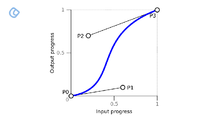
A cubic Bézier Curve – Image Source: CSS-Tricks
A cubic Bézier curve is defined by four points – P0, P1, P2, and P3. For the purpose of easing, P0 and P3 are fixed at the start and end of the animation respectively.
P0 sits at the coordinate (0,0) and P3 is fixed at (1,1). This sets the x-range from 0 to 1. The y-range also runs from 0 to 1.
P1 and P2 are the control points that dictate the shape of the curve between P0 and P3. Their x-values must fall within the 0 to 1 range.
If we have a two-second animation, the x-axis time would be:
0s = 0 1s = 0.5 2s = 1
And if animating a left value from 5px to 20px:
0 = 5px 1 = 20px
So, the x-coordinate maps to time over the duration, while y maps to the animated values. This allows the creation of variable movement over the duration by manipulating the control points.
CSS Variables for Dynamic Animations
CSS Variables, also known as custom properties, have revolutionized the way animations are created and managed.
Unlike Sass variables, CSS Variables can be updated dynamically using JavaScript or CSS itself, following the CSS cascade. This dynamic nature makes them incredibly useful for triggering CSS animations based on JavaScript events.
By establishing variables with values on a parent container, developers can adjust these variables for individual child elements, affecting how their @keyframe animations play out.
This approach offers greater flexibility and reusability in animations across a project, promoting consistency and reducing redundancy.
The animations can lead to eye-catching visuals that enrich the user experience while providing high-quality graphics regardless of display resolution. CSS enables the animation of various SVG properties, making them an excellent addition to an advanced web animation toolkit.
The <path> element is particularly versatile, allowing developers to create complex shapes and animate them using CSS or JavaScript.
To create dynamic SVG animations, developers can use properties like transform, opacity, and color.
For example, a rotating ring for loading screens can be created using a circle element with a transparent fill and a four-pixel stroke.
By adjusting the circle’s position and radius, developers can achieve a smooth, circular animation.
Another popular technique involves creating a line drawing effect in SVG by utilizing stroke properties effectively. This can be achieved by animating stroke-dasharray and stroke-dashoffset properties.
This creates the illusion of a path being drawn gradually on the screen. For text animations within SVGs, developers can use the text element and apply keyframe animations to toggle text opacity, creating smooth fade-in and fade-out effects.
To animate SVG elements along a path, developers can use the offset-path and offset-distance CSS properties. These properties allow for precise control over an element’s position along a defined path.
3D Transforms and Perspective
CSS perspective enables the creation of three-dimensional space on elements, allowing for captivating visual effects.
To activate 3D space, developers can use the perspective property on a parent element or the perspective() function within the transform property for individual elements. The intensity of the 3D effect is determined by theperspective value, with lower values producing more dramatic effects.
When applying 3D transforms, it’s crucial to use the transform-style: preserve-3d property on parent elements to ensure cross-browser compatibility. This property maintains the 3D positioning of child elements within the parent’s 3D space.
Developers can utilize various 3D transform functions to create dynamic animations:
translate3d(tx, ty, tz): Moves an element along the x, y, and z axes.
rotate3d(x, y, z, angle): Rotates an element around specified axes.
scale3d(sx, sy, sz): Scales an element in 3D space.
CSS Custom Properties for Dynamic Animations
CSS Custom Properties, also known as CSS Variables, have revolutionized animation techniques by allowing for dynamic updates to animation values. Unlike preprocessor variables, CSS Custom Properties can be modified in real time using JavaScript or CSS itself.
To implement animations using CSS Custom Properties, developers can define variables on a parent container and adjust them for individual child elements. This approach offers greater flexibility and reusability in animations across a project.
One exciting application of CSS Custom Properties is creating radial menus for VR UI. By defining properties for menu styling and animation, developers can create intuitive and immersive interfaces that respond dynamically to user interactions.
By mastering these advanced CSS animation techniques, developers can create visually engaging websites that captivate users and enhance the overall user experience.
GSAP’s core strength lies in its ability to animate almost anything JavaScript can touch, regardless of the framework. This includes CSS properties, custom object properties, CSS variables, and even complex strings.
GSAP offers a shorthand for transforms, making it easier to write animations. For example, instead of writing complex CSS, developers can use concise syntax like { rotation: 360, x: 10, yPercent: 50 }. The library supports various units such as pixels, degrees, and even custom calculations.
One of GSAP’s unique features is its ability to animate properties of non-DOM objects. Developers can target any property of any object, even arbitrary ones. This makes GSAP particularly useful for animations in Three.js, HTML Canvas, and Pixi.js.
Anime.js is another powerful JavaScript animation library renowned for its simplicity and compact API. It supports all modern browsers like IE/Edge 11+ and maintains a small file size. To utilize Anime.js, developers simply need to incorporate the anime.js file in their HTML page.
Animations in Anime.js are created using the anime() function, which takes an object as an argument describing the animation details. The library categorizes animation properties into four groups: Targets, Properties, Property Parameters, and Animation Parameters.
Anime.js offers features like function-based parameters, which allow for creating complex animations with varying delays for multiple elements. It also provides callbacks like update() and complete(), enabling developers to create intricate animations with precise control.
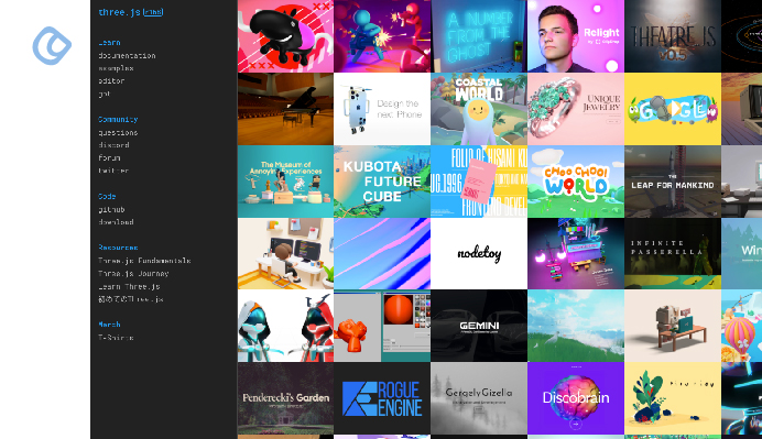
Three.js for 3D Animations
Three.js (JavaScript 3D library) – Image Source: Three.js
Three.js is a powerful library for developing 3D animations in web browsers. It provides an ample selection of functionality for 3D graphics, such as diverse geometries, objects, and animation tools.
The library provides extensive support for animation, with classes like AnimationAction, AnimationClip, and AnimationMixer. These tools allow developers to create complex 3D animations, including character animations and object transformations.
Three.js also supports advanced techniques like inverse kinematics through its CCDIKSolver, enabling realistic character animations. For more specific needs, it offers specialized geometries like ConvexGeometry and DecalGeometry, expanding the possibilities for 3D web animations.
JavaScript-Powered Animations
requestAnimationFrame API
The requestAnimationFrame API has become the preferred method for creating smooth animations in JavaScript.
Unlike older techniques using setInterval or setTimeout, this API syncs updates with the monitor’s refresh rate, resulting in more consistent and efficient animations. It automatically stops when the tab is not in focus, conserving system resources.
To use requestAnimationFrame, developers pass a callback function that updates the animation state. This function is called before the next repaint, allowing for seamless frame-by-frame updates.
The API also provides a timestamp, enabling developers to calculate the time elapsed between frames and adjust animations accordingly.
Web Animations API
The Web Animations API combines the benefits of CSS transitions/animations with JavaScript-based animations. It offers a powerful interface for creating complex animations directly in JavaScript.
The main entry point is the Element.animate() function, which takes an array of keyframes and options as arguments.
This API provides methods for controlling playback, such as pause(), play(), finish(), and reverse(). It also offers a finished promise that resolves when the animation is complete. These features allow for precise control over animation timing and behavior.
Canvas and WebGL Animations
Developers can utilize the Canvas API and WebGL to create more advanced web animations. These technologies facilitate crafting intricate 2D and 3D animations directly within the browser. WebGL specifically leverages the GPU for rendering, yielding high-performance animations.
When animating with WebGL, developers typically use shader programs to define the behavior of vertices and fragments.
The animation loop involves updating the scene data, such as rotation and scaling factors, and redrawing the canvas for each frame. This process allows for the creation of intricate, dynamic visualizations and interactive graphics.
Combining CSS and JavaScript for Complex Animations
Sequencing and Chaining Animations
Combining CSS and JavaScript enables developers to create intricate animation sequences. One approach involves using the animationend event to trigger subsequent animations.
However, this method can lead to complex callback structures, making the code difficult to read. A more elegant solution utilizes Promises, allowing for a linear and readable code flow. For example:
function animate(element, animationClass) { return new Promise(resolve => { element.addEventListener(‘animationend’, resolve, {once: true}); element.classList.add(animationClass); }); }
This function applies an animation class and returns a Promise that resolves when the animation ends, enabling smooth chaining of animations.
Here’s a complete example that demonstrates this concept:
When you run this HTML file in a browser, you’ll see a blue box moving in a square pattern, with each movement occurring sequentially. This demonstrates how Promises can be used to create complex, chained animations in a clean and readable manner.
Scroll-Triggered Animations
Scroll-triggered animations enhance user experience by animating elements as they enter the viewport. The whileInView prop can be used to define properties and transitions for elements when they come into view.
Developers can customize the viewport detection by specifying margins and intersection thresholds:
This approach allows for precise control over when animations are triggered during scrolling.
Particle Systems and Generative Art
Particle systems are powerful tools for creating complex visual effects like fire or smoke. These systems typically involve managing thousands of individual particles, each with properties such as position, color, and lifetime.
For instance, a basic fire effect might use multiple layers:
Core fire particles with additive blending
Embers that float away
Smoke particles with darker colors and different blending modes
function createParticles() { for (let i = 0; i < 5; i++) { particles.push(new Particle( Math.random() * canvas.width, canvas.height )); } }
function animateParticles() { ctx.clearRect(0, 0, canvas.width, canvas.height);
createParticles();
for (let i = 0; i < particles.length; i++) { particles[i].update(); particles[i].draw();
if (particles[i].size <= 0.3) { particles.splice(i, 1); i–; } }
requestAnimationFrame(animateParticles); }
animateParticles(); </script> </body> </html>
This example creates a simple fire effect using a particle system. Particles are continuously created at the bottom of the screen and move upwards while shrinking and changing color, simulating a fire-like effect.
Developers can adjust parameters like particle count, alpha values, and motion to achieve the desired effect. For more static visuals, alternative techniques may be more appropriate for more static visuals.
The techniques explored in this article open significant possibilities for crafting engaging web experiences through the considered implementation of animation.
Whether utilizing foundational CSS workflows or harnessing powerful JavaScript libraries, prioritizing user-centered design and technical excellence ensures optimal impact. The continuous evolution of these fields invites ongoing innovation, such as emerging WebAssembly capabilities extending animation scope.
For the professionals dedicated to elevating digital platforms, remain abreast of advancing methodologies and judiciously apply appropriate solutions. While creativity fuels expressiveness, focus on clarity and performance sustains value.
Animation, well-deployed, enriches understanding and engagement; its potential rewards those committed to nurturing skill. May this overview of current approaches inform design that delights.
Acodez is one of the best web design company in India which aims to provide a beautiful aesthetic website to the clients. It also aims to make sure that the website designed follows the latest web guidelines mentioned by the experts by implementing the latest web technologies.
Looking for a good team
for your next project?
Contact us and we'll give you a preliminary free consultation on the web & mobile strategy that'd suit your needs best.
Rithesh Raghavan, Co-Founder, and Director at Acodez IT Solutions, who has a rich experience of 16+ years in IT & Digital Marketing. Between his busy schedule, whenever he finds the time he writes up his thoughts on the latest trends and developments in the world of IT and software development. All thanks to his master brain behind the gleaming success of Acodez.