A responsive website is one of the best things that you can see on the web today. If you are offering a responsive website, then there is nothing more than your users can ask for. And in order to make a website responsive, the web developers have got a great role to play. Moreover, CSS frameworks are the part of the development process where they can contribute some of their skills to ensure that some excellent hovering effect is relished. With the hover effects in CSS, you can gift the animation experience to the images, texts and other elements of your website, ensuring a dynamic appeal, while also ensuring that these are compatible with all web browsers.
As you might be aware of the fact that the CSS3 has a huge community backup (which is updated with each of the new releases for browsers). And the outdated CSS2-supported browsers are slowly disappearing from the scenario, which opens up further platforms for us to experiment with our new ideas. In order to catch the visitor’s attention and to make them fall for a website and its contents, most of the times, developers use this methodology of generating hovering effects (to impress the visitors and thereby engage them).
From our research across the web, and discussions with a few of the developer and designers, we will take you across some interesting transitions that will help you with the creation of hovering effects for your site.
Here are some excerpts from a freelance web developer, Sara’s ideas that we worked with and found interesting effects being generated.
As you might be well aware of the ease and convenience of working with HTML across your projects, let us give you some relief as we will be implementing simple HTML as well for creating the hovering effects. Apart from this simple HTML, we will introduce a core set of CSS styles, which will help you with the transitions and animations. Here you have to merely set some simple default values for the font size and background color. So, what Sara suggests is to assign 500ms ease as the value for transition – which ultimately will lead create animation effects across all properties that are modified within a period of 500 milliseconds.
button {
border: none;
background: #3a7999;
color:#f2f2f2;
padding: 10px;
font-size: 18px;
border-radius: 5px;
position: relative;
box-sizing: border-box;
transition: all 500ms ease;
}
Let us Discuss Horizontal Immersion 2422
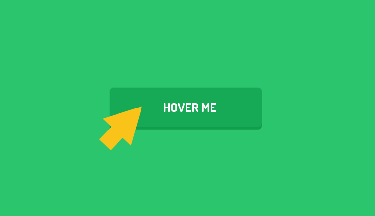
This is one of the latest styles that are being witnessed across the internet – a semi-transparent background color to make a button appear immersed within the hangover. You will find it coming from one side and transition, encapsulating the whole button. This can be done using the ‘button’ pseudo component:
button:before {
content:"";
position: absolute;
top: 0px;
left: 0px;
width: 0px;
height: 42px;
background: rgba(255,255,255,0.3);
border-radius: 5px;
transition: all 2s ease;
}
Now, the content is appropriately positioned and shifted to the top left of the button. As you can see, the width is 0px, which is where the animation slips in. So to animate it, we will set the width as given below:
button:hover:before {
width: 100%;
}
Let us Discuss Vertical Immersion Next
Very much similar to the one that we discussed above. There is only one exception, in this case, that we are animating the height to make the color appear as if it is falling from the topmost portion of the button.
{
color: #3a7999;
box-shadow: inset 0 0 0 3px #3a7999;
}
Next, Let Us Discuss Ghost Button
It comprises a snippet, wherein you can add a highly effective transition to the button – and this would be simple as well. The ghost button effect gets created upon inverting the color within the button and adding a border:
button:hover{
background: rgba(0,0,0,0);
color: #3a7999;
box-shadow: inset 0 0 0 3px #3a7999;
}
Here, you are setting the background as transparent within the hover. This will help in plucking the surrounding background element. And later the color is being added along with the box-shadow.
Now, Let Us Work On The Icon, Animate In
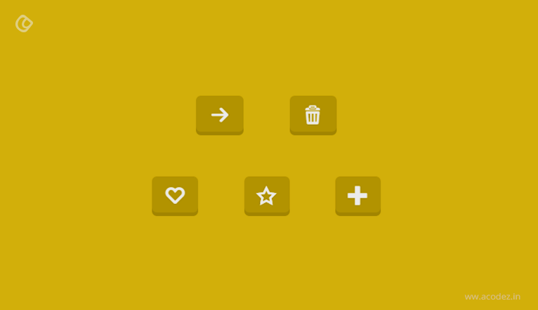
This effect is important, especially, for functions – as it helps to add items to carts or even submit a form. You can simply have an icon slide in and appear next to the text, while the user hovers or hangs across the button. Here, as per the instructions, we are adding a bit of padding effect to the button, which will create space for the icon and set the overflow property to hidden.
button{
padding: 10px 35px;
overflow: hidden;
}
Now, you can proceed by adding the cart icon in the ‘before pseudo element and positioning it outside the reach of the button.
button:before {
font-family: Font Awesome;
content: "\f07a";
position: absolute;
top: 11px;
left: -30px;
transition: all 200ms ease;
}
Next, you can animate the icon by setting its left property.
button:hover:before{
left: 7px;
}
Creating a Bounce Effect
Within this animation, let use set some keyframes for the button in order to create a bounce effect, while the user hovers across it. This is one of the interesting ideas that developers are implementing these days to grab the user attention. Let us create keyframes.
@keyframes bounce{
0%, 20%, 60%, 100% {
-webkit-transform: translateY(0);
transform: translateY(0);
}
40% {
-webkit-transform: translate(-20px);
transform: translateY(-20px);
}
80% {
-webkit-transform: translate(-10px);
transform: translateY(-10px);
}
}
Apply the below-given animation on the hover:
button:hover{
animation: bounce 1s;
}
Let Us Check SKEW
One of the most important transformations in CSS3 is the SKEW. You might have come across it when using Photoshop, but with CSS3, it becomes more interesting. It is simple to use and the transition is rather interesting too. Let us set it on hover.
button:hover{
transform: skew (-10deg);
}
Using Dotted Borders
This effect acts more or less like the ghost button effect (we have already discussed). The difference is that rather than getting a uniformed border, we will be presented with a dotted line. Here we have to add the border to the button and get the colors inverted.
button {
border: 3px solid #3a7999;
}
button:hover{
border: 3px dotted #3a7999;
color: #3a7999;
background: rgba(0,0,0,0);
}
Applying The Flip 3D Effect
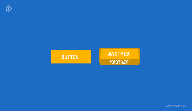
This might seem to be a little more complicated than all other effects that we have discussed so far. It mainly involves flipping the button, which will reveal the message added to the after pseudo-component of the button. We can start by setting the button’s transformation style to preserve-3d, which will help the progenies of the component to inherit the same 3d position as given below:
button {
transform-style: preserve-3d;
}
Once done, let us work on the after-pseudo element:
button:after {
top: -100%;
left: 0px;
width: 100%;
background:#3a9999;
border-radius: 5px;
content:'Flipped';
transform-origin: left bottom;
transition: rotate(90deg);
}
Now as you can see this has been added to the top, before the button, and also the width and border-radius have been adjusted to match the properties of the button. If you take a look at the transform properties, you will understand that the bottom left corner of the element is the point of origin. This is where we have set the x rotation to 90 degrees, such that it will appear to be flat.
Next, we can create the hover animation:
button:hover{
transform-origin: center bottom;
transform: rotateX(-90deg) translate(100%);
}
The transform point of origin has been set to center to create or activate the effect. In order to apply the transform, the element has been rotated.
As you can see, to activate the effect I set the transform point of origin at the center, and also rotated the element to apply the transform
Acodez is a leading web design company based in India offering mobile-friendly website designs implementing the latest and modern design trends and techniques to enhance the accessibility of these sites across a variety of devices.
Looking for a good team
for your next project?
Contact us and we'll give you a preliminary free consultation
on the web & mobile strategy that'd suit your needs best.