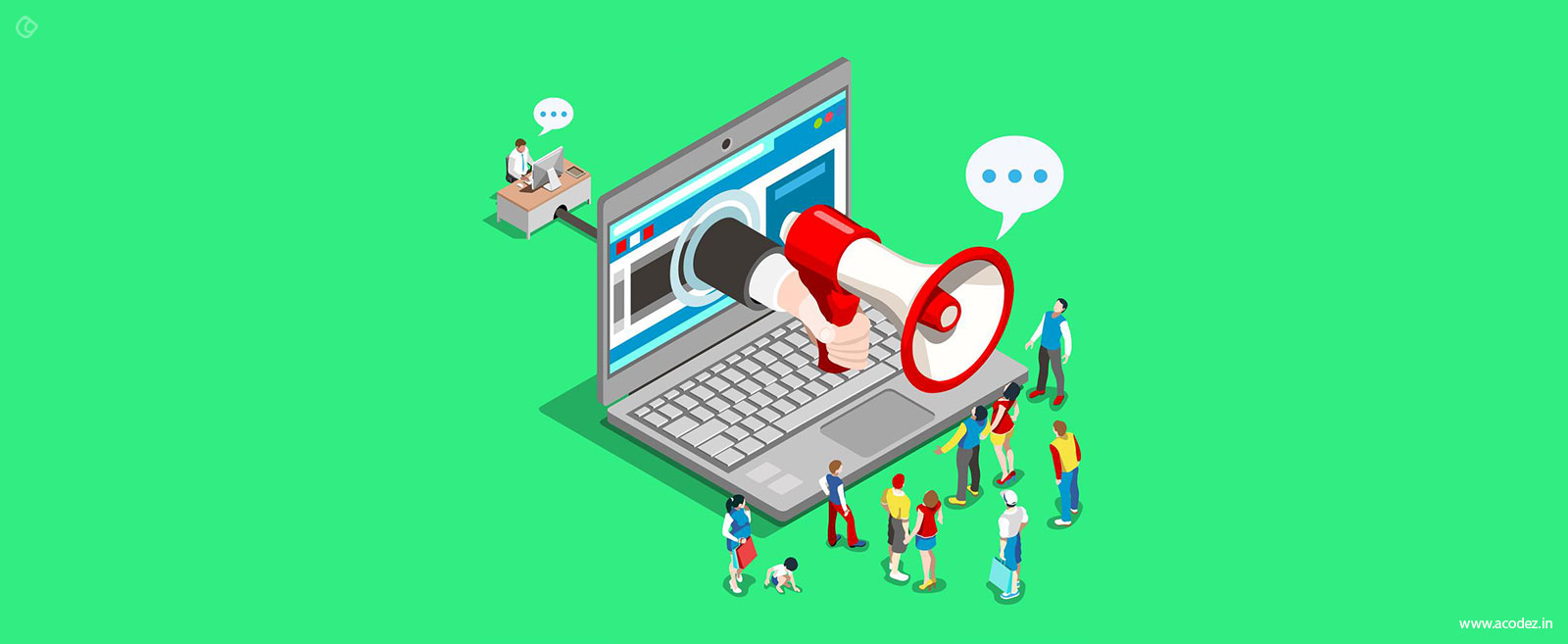
There was a time when people were less acquainted with Information Technology. Hardly did they know anything about the websites or what browsers are capable of.
I am talking about the internet era around 15-16 years ago, before Internet of Things came into place. The time when the internet was a new term and only a few people found computers useful.
But, now things have changed.
Gone are the days of “above the fold”? Hey, what am I talking about? “Above the fold”? Yeah, well you might have heard of it quite a few times.
It is a common terminology used with newspapers. Then, what is it doing in a web design? Relax… It has a similar application in both the newspapers and web design strategy.
Where did web designers get the “above the fold” idea?
It evolved from the newspapers. It has a magical charm to attract the reader’s eye. When a story headline or image placed above the fold is appealing then people are curious to know more.
Newspapers apply this concept. An eye-catchy headline or an appealing image improves sales and brings in more readers. Great idea!
The concept works like this:
Positioning things on the top half of the front page creates a curiosity in the readers. The people force themselves to read ahead and find out more.
Web designers thought why don’t we apply the same logic to our designs. Logic???
Yes, “above the fold” logic comes into the scenario.
Actually, there exists a myth that web users never scroll above the fold. This is crap!
Because the truth is people with real faces living in the real world come to your site and they do scroll.
If someone comes and tells you that scrolling does not happen below the fold. Face them and with confidence tell them, yes people do scroll below the fold.
If you have been designing with this concept in mind, stop doing it today. Think of the loss you incurred, just because you have been annoying your people for long.
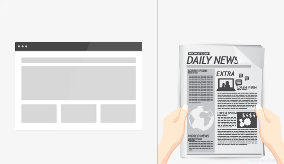
Let us discuss what is “fold” about the newspaper and how it differs from the web “fold”?
Fold is a common term when it comes to newspapers that are always folded. Its physical dimensions are such that it needs folding.
Take a newspaper and observe its first page. What do you find?
This is where all the major news gets reported. You can find all the big stories of the issue printed here. And there are those stories that follow in the corresponding pages.
These are the ones that users find only if they flip through or unfold the newspaper. People will on purpose or not-so-deliberately miss out what’s on the inside.
What is “fold” in web design?
In web design fold refers to the “scroll-line”. The line after which the user needs to scroll to view the remaining information via the browser.
It is true that the users do scroll below this line to grope in more data.
But, web designers follow the same rule of stuffing more data above the fold. This makes the design appear too complicated.
In the budding stage of Internet, things were different.
The limitations:
- People had either no or least idea of how browsers worked.
- It was the time when the world wide web was omnipresent.
- Also, the monitors were small when compared to what these are now.
This forced web designers to design aligning across these limitations.
What did they do?
This gave rise to “above the fold” concept, which incorporated designs for small screens.
- Limited everything within the boundary of the screen.
- Everything appeared within the 800*600 pixel dimension or the visible area of the screen.
Like the folded newspaper concept, people got everything from “above the fold”.
What was the outcome?
Websites designed for “above the fold” contained many pages. People had to click from one page to another to find more rather than scroll through.
At present, what are we doing?
Think about the websites that you visited recently. How many of them made you click through them several times before you found what you were looking for?
To be frank, there are hardly any such sites these days. Because scrolling is a lot easier than clicking through each page.

This is important because your desktop PC’s monitor is not the only screen now. There are more…
It extends across many others like the tablets and mobile phones. Imagine how annoying it would if a website forces you to click through many times to find what you need.
So, now we arrive at the scenario where there is no clicking but scrolling…
Before I discuss clicking and scrolling in depth, let us first find out what are the facts and myths.
The truth is no one likes to scroll. One reason why designers choose to keep their designs short.
This is a belief, and I would like to put it aside. Users do love to scroll. But terms and conditions apply.
It’s what their gut prompts them to do. Give them a clue that they will find what they are looking for as they finish scrolling.
“Convince your people that scrolling will take them to what they need”.
Designer’s play!
Short or long pages?
First, let us discuss what makes designers choose short pages:
It might not take too long to create a website with many short pages.
In such situations, you can spare the effort to scroll through.
To make it easy for your users to select, you can limit the number of links.
But, this forces the users to visit many pages before they finally get what they want.
Keep it simple and long:
Lots of content and lots of links, this is what long web pages are all about. Scrolling and scrolling! Now you might be thinking whether people will actually scroll? Yes, they do…
Longer pages force the users to scroll through to find out what lies below the fold of the screen. It might be trickier. Indeed, it becomes difficult for the users to choose from more links, the things they want.
Here, the answer to their concern lies just a few scrolls away.
If you are focusing on users, the second approach will be a brilliant idea.
At Acodez, we do apply the same strategy for our clients and it actually works.
So, long websites designed for scrolling is the new cool now.
Jared M Spool in his article “As the Page Scrolls” discusses the fold concept. A lot of contemplation comes into the process while streamlining to make a decision. Decision???
Yes, whether you would hide your content or spread it across many pages?
Users love it when they can find everything on a single page. Should I say anything more to convince you?
Time for some action…
Designers are often told that you need to put the “Calls-to-Action” below the fold.
Confusing!!!
Web designers either have no idea or are least concerned about what happens at the marketing side. A lot happens with the content and SEO part when it comes to promoting a business over the web.
Designers need not worry about this part. But, in fact they need to think across these lines.
It is an important aspect of their web design.
How or what prompts a visitor to click through or check a call-to-action?
As mentioned in Kissmetrics, I would like to introduce you to the term “templatification“. You might have heard of this term.
What does it actually mean? Why do I have to mention it here?
What about all those websites that look alike?
Yes, this is what templatification is all about…
Isn’t it suspicious when all websites look alike?
When a same kind of theme appears across all the websites. What do you think people will do?
For instance, I would like you to browse across a few websites that belong to the same industry domain. What do you see? They are all alike. There exists hardly any differences between these.
Here, I will take you across the 3 images that I found on Kissmetrics blog to make my point clear:
In all the three images, you can find the following three things in common:
- The content copy: This never exceeds a limit of 3-4 sentences. Simple, short, and beautiful
- An image or video that will draw attention.
- A Call-To-Action button towards the end.
In the first image, you can find that all the content fits into the 600 pixels.
Now, the second one:
There are differences in the color and content format.The content position varies. But, what about the layout?
Again, we come to the same point of templatification.
The third one is junky and quick to churn attention. But, more or less the theme is same.
I didn’t mean to say that these are not attractive. The layout is appealing, but I find it uneasy when all position their Call-To-Action (CTA) above the fold.
Now my question is what if we had all been doing it wrong?
Think of a scenario wherein Call-To-Action’s work the best when placed below the fold.
Easy going!!! as I can imagine my readers raising their eyebrows while we are stuck with “above the fold”.
This is in contradiction to the study that says 20% of people read below the fold. That is quite a creepy small number.
It would have been impressive if it was 80% of people reading below the fold.
But, an analysis says that the content above the fold interests more than 80% of the people.
This means that your Call-To-Action gets only 20% of the attention. How sad? You cannot sit back and relax with this small a number in your kitty.
Here, you have no vital reason to believe that the remaining 80% will convert.
Let me help you with this.
Statistics say that about 80% of read the newspaper headlines. Out of these only 20% manage to read through the body of these headlines.
In most of the cases, the Call-To-Action gets pushed below the fold and the truth is that 80% don’t read below it.
Now, let me tell you the truth- “Fold” is dead. There exists nothing as such as the fold.
It actually has no role to play on the conversion rates with regard to the Call-To-Action.
I know what you are thinking. How absurd it sounds? When I am myself contradicting the facts I mentioned.
I gave you the percentage of the people who read above and below the fold.
But, actually, it never works that way.
There exists no above the fold or below the fold thing. All that people need is a motivation to click.
This motivation can arise almost anywhere inside any component of your design.
Motivate, motivate, motivate… This is the mantra to increasing sales.
Now, I will tell you how people convert?
Your prospect needs to feel motivated to click a button.
When you make an offer, it should be so strong that your prospect should click through it to find more.
Call-To-Action below or above the fold has nothing to do with conversion. It comes from the motivation to take action. This urge arises after reading the content copy.
So, we arrive at below the fold thing.
This means you can position your content below the fold and place your Call-To-Action button after this.
Now the next question is the amount of content that will motivate your people?
A large amount of content will do the work.
How do you get this done?
Position your content at the entry point to catch your visitor’s eye. Remember, it does not work that way.
Sales never work that way. You don’t have to give in when someone pressurizes you to sell at the doorstep of your site.
- Welcome your guests
- Show them around
- Be hospitable
- Treat them well
- Tell some stories and then make an offer.
You are letting them down if you work along the old concept. Imagine their plight when they find that everything of high-quality is in the beginning.
There is nothing beyond the 600*800 pixels of your web page. And, as they move ahead you are annoying them as the website has nothing more to offer.
All that you want your people to do is move ahead, read across, explore your product, content and buy.
There are those panic -creators who say visitors have no time as they don’t stick onto a site for more than 3 seconds. And, that you need to impress them within this time.
If you have no data or little data in that small space, then they will not stick even for a second. This is the truth.
Tell them a story as they scroll down. Here is an example that I found in Paddy Donnelly’s blog on “Life below 600px“. They illustrate how you can design each section of your blog to please people and prompt them to read more.
Now, we can go back to scrolling and clicking.
Personally, I would like to scroll through rather than clicking.
Analytics does not support the concept of scrolling. Aren’t all those modern devices such as iPhones and iPads designed to support scrolling?
Things are easy as you scroll through.
So, why scrolling and not clicking?
Clicking:
Think of what comes to your mind first when you find a button that you need to click through. The general instinct is to pause and think before you click.
Scrolling:
Scrolling is a continuous process. You need not think when you scroll. You can continue with what you are doing and that is reading.
When it comes to clicking you need to think and consider whether you actually want to click.
There happens interaction. But, it is something that makes them think whether they need to click. People think whether they will find something new or the same things if they click through.
As mentioned in a post on Bokardo, scrolling is easier than clicking.
People scroll and scroll. There is no end to it.
So, when you design the next time think of whether you want your people to move ahead a little and then return. Or you want them to take an action after moving across.
There are those UX myths that say people do not scroll. But, how long will we fool ourselves because people do scroll.
What more do you want?
Now, I will tell you who are the people you need to please and who will scroll through?
- Your existing prospects:
This category of people are aware of who you are and what you have in store for them. They already know what they want and what brings them here.
Don’t make things hard for them.
Offer a quick Call-To-Action. This will keep them happy as they get what they are looking for.
- First time prospects:
They are potential ones. They will transform. But still unsure?
Offer them something that they can understand and is valuable to them. You don’t have to blabber too long to convince them.
Keep a small, concise and short Call-To-Action to convince and drag them into clicking through the Call-To-Action (CTA).
- There exists another category of first time prospects that is quite unpredictable:
What will you offer them with?
You need to provide them with an explanation for your offering. Your copy of the content should be clear and long. It should exactly convey the message and make them understand that you will give them all that they want.
This includes everything starting with the headlines to the Call-To-Action that winds up the site.
Don’t push them into a commitment too soon. No one wants that.
Tell me why do you think someone will make a commitment with no reason. You might keep prompting them to take an action long before you have even completed your story.
That is absurd! Things don’t work that way.
Give people evidence. Something that strongly supports your stance. Why do they need to choose you? What have you got that is unique?
Give them time, let them think. As they scroll through they should feel that indeed yes I will reach a point where I can find what I need.
This is why we all scroll. No one wants to click through all those pages.
A single page on your website can change the face of your business. Do not complicate things with too much of clicks when a scroll can work magic.
So, let us go with scrolling. Now let us get off with the “above the fold” and “below the fold” concept. Give people what they want whether it is above or below the fold.
Please them!
What kind of fWhat kind of fold are you using for your website design? Are you still following the traditional concept of above the fold? Where do you place your Call-To-Action’s? old are you using for your website design? Are you still following the traditional concept of above the fold? Where do you place your Call-To-Action’s?
Do people take action? If so you are doing exceptionally well and rising above our point of discussion.
We would appreciate it if you could share your formulas with us.
Let us know what you think of our post. It would be great if you could provide us with suggestions and feedback to enhance it further.
Acodez IT Solutions is a web development company based in India . We provide a wide range of web design and development services to our clients all over the world.
We are also a digital marketing solutions provider. We are experts at SEO, content marketing, social media marketing and more. We help our clients with effective business solutions customizing services as per their requirements.
We use the latest technologies to design perfect solutions that people are searching for. Tell us what your business requirements are and we will customize a perfect solution for you.
Talk to us today!
Looking for a good team
for your next project?
Contact us and we'll give you a preliminary free consultation
on the web & mobile strategy that'd suit your needs best.