The more you simplify the shopping experience, the happier your customers will be…
This is the golden rule of website design for e-commerce as the customers need to shop quickly. The simple design and easy shopping make a customer happy and to make this happen, a designer must think in a customer view and not as a designer, as the designer thinks only about trends and attractive pages.
Thus when you design an e-commerce site, it is the success point and not the least priority arena in this competitive digital world.
When the design process is started, it must target audience and meet both elements like organizational goals and satisfies users’ desires. The elements while designing a site not only contributes for an awesome experience but also enhances brand appeal and customer appreciates the organizations that perform those with sincerity.
A good design influences customer and helps to build an emotional connection which in turn helps for customer retention till the brand exists. Have you even imagined why huge brands like Apple, BMW etc have more and more customers?
This answer is simple. It is because a good design brings about passion in the customers. Thus a designer must implement a balance between creativity and design elements for e-commerce.
Important e-commerce design elements for conversions
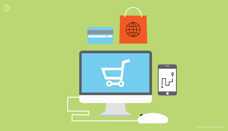 Designing an e-commerce website requires that commitment while designing the interior at home. You will never simply put some paint on wall or you will never keep things here and there. But you will make everything in a clean and perfect way to make the room quite attractive. In the same way, when your e-commerce design is perfect with all essential elements, it will automatically satisfy customers and drive conversions.
1) A homepage to engage customers
A homepage is the first thing what your users see on your website. So let’s count the fact that first impression is the best impression. The homepage doesn’t make conversions, but it promotes and leads customers to the product or category page. It must attract, engage and convince the users to become the customers.
Since the smartphone users are increasing, your website must have a mobile-friendly user interface. You can choose skeleton screens for quick loading time and also you need a robust content management system for it. Always simply your menu and padding around items which enables users to peruse it.
Sometimes your site may be particular niche customer based or it can have different types of audience. In both situations, it is better to have clear CTAs and highlight your brand even with white space. A best designing company always looks forward to improve homepage and e-commerce design quickly.
2) Clear CTA buttons to grab attention
A clear CTA buttons grab the attention of visitors. You can use microinteractions and animated CTAs to provide an engaging experience to the targeted audience. You can also work on font, size, color, CTA typography, content etc as these will make them even more attractive. If the CTAs are smaller, this will lead to frustrations. So it is advisable to make it bigger on devices.
CTAs must standout, so use contrast colors and have short, crispy button copy too. If you want to sell a product that requires information for a decision making, use CTA below the fold or if you are selling simple products, you can use CTA above the fold. Test CTAs with A/B testing to identify the effectiveness of various colors, design, fonts of your CTAs.
3) Showcase real colors to express your brand
Yes, true colors are an expression of your brand. It directs shopping and don’t conflict. You should not add more colors simply as you must consider different age groups and also people with color blindness. Use contrast colors to grab attention easily and to stay longer for offers or promotions or to drive conversions. In order to skim through products, white space is essential to make your website digestible.
4) Quality product images to build trust
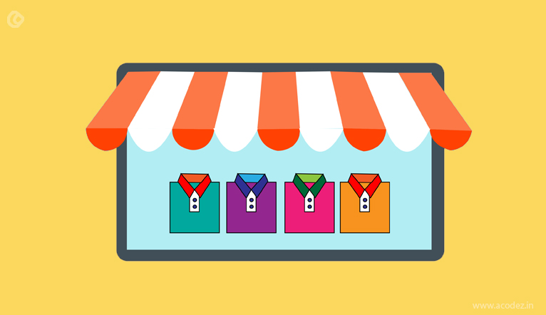
When high quality products are displayed, it will be the real deal breaker as the users can feel the product with the information provided and they can easily decide whether to buy or not. The easier way to increase conversions is to use better product images. The images must be edited for exposure & sharpness/filtering/composition to give them an appealing look.
5) Easy site navigation – better user experience
A better, logical and clear navigation which is also user-friendly allows your customers’ online shopping experience the best one and better SEO for your e-commerce. When you go for shopping in nearby stores, you will get easily near the product with the signposts, similarly if the navigation is easier on the website of your e-commerce store; it guides the visitor to accurate products and services.
Thus it is a must that design and usability must go on together. To make the navigation easier, now it has become the alterative search guide with filters, arranges to help customers to find products from various categories to complete the process faster. Navigation can also be improved by breadcrumb navigation, meaningful labels, listing categories, re-listing categories and maintaining logo at homepage.
6) Quick check out not to lose important orders
It is quite important to note that if the checkout takes time, it is likely to lose potential orders on your site in any case. The whole process of adding products to cart, analyzing them, payment procedure should be smooth, simple and quick. You can choose calm color for checkout page and can also avoid more information fields. A fast editing filed of summary with live chat is the best option. It is also advisable to provide lots of payment options so that user won’t get disturbed with the less payment options available. A common mistake every designer does is that they force user to register at check out page and lose the user there itself. Instead, you can give it at the starting stage itself.
7) Collect customer feedbacks and reviews
If you really need to convert the users to customers, make use of the past buyers reviews make customers your high-performing marketing asset. Trust us!! Reviews, ratings and testimonials from verified customers have an important role in driving sales for your e-commerce by engaging the customers. It helps in brand conversations online, increases credibility and SEO. Utilization of social media channels like Facebook, Twitter to collect reviews can encourage to-be customers too.
Conclusion
An e-commerce site is said to be successful when it requires perpetual testing to find what customers requires and what works. Thus it is an inevitable step to test each of the seven elements to provide the better shopping experience the customers need.
The e-commerce site must render a rewarding experience for both customers and you to make it a win-win situation.
Acodez IT Solutions is a web design and web development company offering all types of web design and web development services to our clients across the world. We have more than 600 clients from around 60 countries. We are also a SEO agency based in India offering all kinds of digital marketing services at affordable prices.
For further queries, please contact us today.
Looking for a good team
for your next project?
Contact us and we'll give you a preliminary free consultation
on the web & mobile strategy that'd suit your needs best.


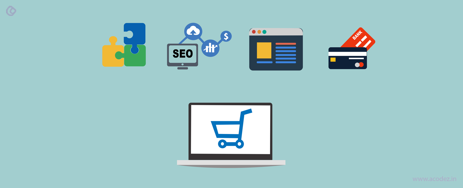
 Designing an e-commerce website requires that commitment while designing the interior at home. You will never simply put some paint on wall or you will never keep things here and there. But you will make everything in a clean and perfect way to make the room quite attractive. In the same way, when your e-commerce design is perfect with all essential elements, it will automatically satisfy customers and drive conversions.


The article provided is excellent and very useful.