Have you ever given a thought to how reading from a book differs from that when you read from an e-book? Most of us have not. But it is in fact different. What happens when you go to a website and read it? We automatically happen to skim through and scan the content looking for points relevant to us. As someone who is trying to get information from the web, we know well how to look for information that is relevant to us – and hence we get into moving quickly through information, while we take a pause at only the information we need.
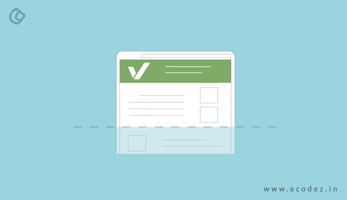
So now researches and studies on eye tracking have found that the eye motion of a user happens to scan information in the shape of the letter ‘F’. Yes, you happen to gather information from the web, moving your eyes through the content in the shape of the English alphabet ‘F’. Still doubtful? Just think about how you read through this content now. Isn’t it fact?
Now, all of a sudden this seems so important to your business website if you have never given a thought to the eye motion of a user when they come to get content from a site. But of course, as designers whenever you have tried to improve user experience, you might have always decided to help them with the best and the F-pattern design would also have come across your list of itineraries often whenever you design.
But for a beginner, it is important to understand what an F-pattern is.
As we already discussed, the F-pattern is how a user’s eye scans through your content on the web. F refers to ‘fast’ – the speed at which the eye happens to move through the content though there is a Z-pattern as well. But for now, we are going to focus only on how to help you improvise the F-pattern on your site for your people. Fast – undoubtedly, this is how people supposedly read the content on any site. Within no time, you can see that their eyes are scanning at an unbelievable speed across the pages of your website. The NNGroup conducted an eye-tracking study, recording about 200 and more users to find out how their eyes moved through web pages (not one just but thousands of these pages). The pattern was simply common in most cases and sites, no matter what the task they chose.
The Reading Pattern Resembled an F and it Comprised of three Main Components as Listed Below:
First:
The eye tends to move in a horizontal manner while reading at first – this is mainly applicable to the upper part of the content – and also, it forms the top bar of the F-pattern.
Second:
People happen to scan in a vertical mode as they move down to the left side of the screen – where they are in quest of interesting points, skimming through the initial sentences of a paragraph. Once the eye hits what they find interesting, next, again the horizontal movement is repeated the second time – which covers an even shorter portion when compared with the first time. This is where you will find the lower bar of F coming into formation.
Third:
This is the final one – where the eyes scan through the left side of content in a vertical pattern specifically.
Now, it is important to understand that the scan patterns are not limited to these three patterns we discussed. But there is more – it is essential that you take a note to what happens when someone finally finds out what they like. They start reading normally – and the movement forms a horizontal pattern.
Being a beginner, it is important to understand why you should be using it because all your predecessors have already been implementing this mode in their designs for a long time now. And you should also start.
A beautiful and awesome visual hierarchy means a lot – this is where an F-shaped pattern helps you with – this will help people to scan through content with ease. The usual layout that appeals to the eye is F-shaped because people take comfort in reading from top to bottom, left to right rather than vice-versa (though there is a part of the population that prefer to do the opposite while reading through, the other pattern is more specific to people in Western countries).
This pattern is specifically suitable as a layout within websites that are content heavy, such as blogs and even sites wherein you are planning to promote a lot of information. This is how you can grab user attention to the content as they are likely to read through if it is adapted to adjust to their natural scanning format. With this, it is in your control to decide what you want your people to read.
Let us find out more on how the F-pattern design should be aligned to comply with your needs.
Content Prioritization

When you are thinking of strategizing the components within your page – it would be ideal to start with prioritizing the ones that are most important to the ones that matter least. If you are clear on what your users are looking for, all you need to do is position these within the pattern’s most vulnerable points, which will direct scanning as intended.
The First Impression is Always the Best
The fact is that most people don’t take the effort to read what lies ahead of the first two paragraphs. So now you know the ideal spot to place your content – the topmost part of your page – where you can garner user attention to the maximum to help your people find exactly what they are looking for. It should allow users to read horizontally through the header – which means the navigation bar is the appropriate place to start.
How Would you Design for Reading?

It is not ideal to design for reading – but scanning is the best thing that you can offer your people with. So it is best to think of the pattern in lines with your scanners and then position the content in a manner that the people would like to read as they move through the F pattern.
So how do we do this?
Use words that find a way into people’s heart directly.
Your people will start scanning through any of the components or areas that has got the highest visual impact on whichever page they are. So this means it is important to give importance to components that actually matter – typography or fonts play an important role when it comes to the text on your website – colors are the visual cues you need when you are highlighting an element, specifically buttons.
Bullets are the best way to list out information – and ensure that you do not cram in a lot of information within one paragraph alone – but give room for the details through other paragraphs as well.
Where do you place the most important components, such as CTAs – to the left and right side of your page – where your user starts and happens to end the scanning in a horizontal pattern. There is a halt that comes here as the user moves from one side to the other (as in this case, left to right) – so as they move and pause they get that extra seconds for a reconsideration.
Now, why do you have the sidebar?
With sidebar, users have an access to content from a greater depth – which means we are driving more user engagement. You can collate any kind of component that your user wants to see – but make sure that you do not include anything apart from what does not fit with the most important content. You could think of a social media widget, an ad or maybe a list of relevant articles and others. You can use this as a tool to help users find content that is relevant to them. This could be anything such as a tag cloud, category listing or popular posts widget.
Let us start thinking about designing better layouts.
Get rid of the usual boring ones that people are tired of seeing everywhere.
Let us think of something innovative and different.
When we say boring, you might think how does F-pattern not fit into this, as it is the same kind of old content arrangement – it is how your people read the content. Of course, the same shape or pattern what you have been using would appear repetitive and same – and people will leave – so there is something boring or dull about it that you should identify and get rid of before thinking of going against the traditional pattern, which would take your people to the scanning area to keep them engaged.
How does this pattern actually attract people’s attention? When you learn this, you will understand why you need people’s attention drawn in the exact F-pattern design more than anything else.
This pattern has been effective always – why? It is exactly how your user’s eye pattern happens to move through a content. As we discussed earlier, people tend to read from top to bottom and left to right rather than the other way round. Of course, even you and I do the same.
So when you have your site designed in the F-pattern, you are automatically adjusting your site’s pattern in lieu of what your people want it to be, adjusting it to their requirement automatically.
This is also the best pattern that you can apply when designing your site’s landing pages. Get the most important components aligned in the F-pattern, such that people would find it where they need it when they need it the most.
Acodez is a web design company India, offering some of the best web design solutions at affordable prices. For more information, please contact us today.
Looking for a good team
for your next project?
Contact us and we'll give you a preliminary free consultation
on the web & mobile strategy that'd suit your needs best.


