With Google making ways for technological excellence, the concept of Material Design was initiated by the company in its internal office meeting on June 25, 2014. Nicknamed as Quantum Paper, the Google’s Material Design is a specialized design language that happens to direct people or users about what action has to be taken on clicking which image or symbol. This design is said to empower Google’s presence in the world through enhanced use of grid-based layouts, padding, responsive animations as well as high-end effects of lighting and shadows.
Executed with the aim of expanding and reforming astutely, the Material Design has physical surfaces and edges with shadows offering a distinctive meaning to the touch senses. As the process starts, the Material Design is created to work in compliance with Android Version 2.1 and above through the support of the v7 appcompat library. In this technology-oriented world, the Google has managed to gain recognition for developing extensive options to enhance the overall appeal on the web world. The experts are exclusive knowledgeable on the traditional and modern technology for making something unusual out of it.
Being a special system, it is purposed for all the devices across the world; along with Lollipop interface improvements. Since it is available for smart phones tablets and laptops; the Material Design is also essential to perform on platforms like Android, Windows, iOS and numerous other web platforms. It is the technology that has intended to transform it for user’s excellent experience and making them initiate towards creating options to serve as brilliant platforms for high-quality performance.
Goals of Google’s Material Design
The Google Company charted its efficiency in modulating a visual language for the users by channelizing the standard principles of first-rate design with advanced technology.


As all know, technology is advanced to make the entire process of working on a platform easier for the person. It reduces the time taken by manual work platforms and enabling them to be quicker in response. Basically, the aim of technological design revolution is to offer more personalized features and easy-to-use aspects of the web world to make it customize as per need.

Principles of Google’s Material Design:
Following are the three core principles of Material Design that conceptualizes its entire functionality and purpose.
Material is the Metaphor:

The growth of the Material design was enthused by the study of perceptible elements utilized everyday like paper and ink. Even, the platform is basic; the technology is materialized in such a manner that it is open to advancements and innovations. It happens to make the entity light, surface and activities that are superior on communicating with each other. Indeed, it is a cohesive theory of a streamlined space and a structure of motion. Certainly, the best part of this facility is that similar tactile enables users to understand the technicalities driven. Also, it is made flexible enough to develop newer edges that go beyond the set rules of physics. This is the reason that material metaphor should be getting accustomed to technical changes.
Bold, Graphic and Calculated:

Since, Material Design is the visual language, the need of efficient typography, spacing, grids, colors and even images happens to form as the reason to enhance the Material’s content. These elements are channeled to develop a hierarchy, justification, and also focus on the betterment of visual appeal. Each and every aspect of designing has to be kept in liaison with the visual essence, which needs to be maintained for the excellent outlook. In fact, they are intended to make the experience of the user better.
Motion Lending:
As an essential part of the designing, it needs to have a suitable motion, crystal clear feedbacks, and coherent transitions for a better visual experience. The basic target of the motion is to accept and reinforce the user as the main mover. Basically, it is the essential user’s actions that happen to initiate the motion and affect the entire design for betterment. Each and every action is positioned in a singular environment. Also, the objects are offered to the user for a continuous experience.

The Google has managed to surpass the need of its users and provide them with integrated services that calls for simplifying their web-based tasks. With technology changing at a rapid pace to transform modernism into high levels of usage. Nothing in this world is so easy to use without technology. Its idea is to simplify complex procedures and give integrated user experience.

Components of Material Design:
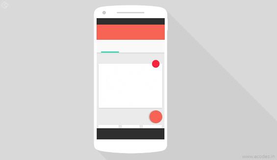
Laying emphasis on the essential details of the components created, Material Design is made to serve universal needs. In fact, these components are empowered to develop useful applications and websites. With numerous buttons, cards, switches, text inputs, floating action buttons, sub-menus, dialogs and even tabs, all of them has been lent a specialized rule and instructions on how to create them for avoiding any kind of trivial elements.
Patterns:

The Material Design tends to offer the users with certain basic patterns for an additional user interface. Such patterns are intended to improvise on the interface level developed with the support of the Material’s component. Generally, the patterns happen to use format of the data, gestures, errors, routing drawer, scrolling down method, loading images, searching, setting, and also swiping to restore.
Colors:

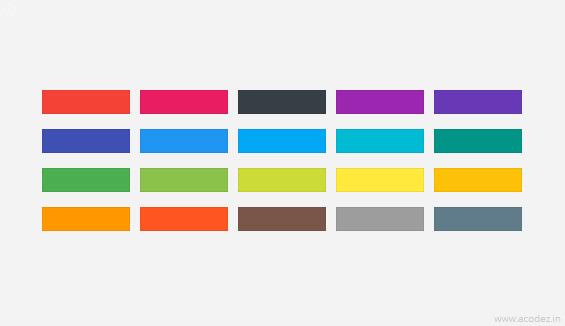
The best part of Material Design is that the colors are created in a manner, so that they may not trouble the user or make them uncomfortable towards appearance. It is the main inspiration from day to day environmental signs and colors that Material Design utilizes an array of coloring effects that are soothing to the eyes and not feel to be gaudy. One can select from a wide range of color palettes in terms of developing applications and websites. Indeed, downloading color swatches for local usage from other sources is also possible.
Icons:
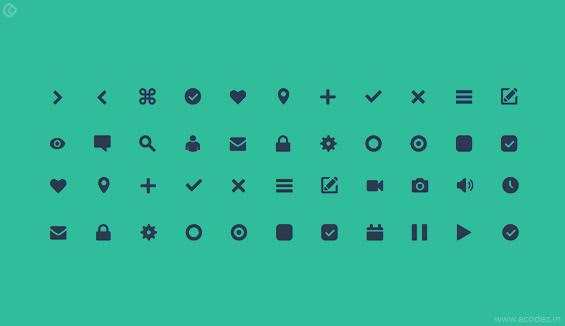
Ideally, the free icon pack offered by Google is basically used for the primary element and action bar aspects only. And for other actions, one had to search for the icons. This is one such issue that has been resolved by the Google’s Material Design because there are hundreds of icon packs available to be used. Every icon pack has been created with an extensive design approach having the support of studied perceptible materials. The icons can be downloaded and used as per the requirement. It is the effective use of icons that directs the users towards performing a task on the application or website.
Animations:
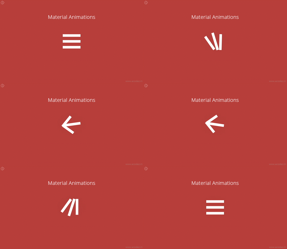
As an efficient means to attract the users towards ideating a task in the application or website, animations are meant to give a meaningful purpose to the entire design. They are exceptionally creative and useful that all of them are designed to maintain the consistency level in the entire design. Since, they are responsive and engaging, the animations are meant to explain the process easier than the words. The best part of animations is that they are mostly utilized on buttons as well as cards.

Implementation of Material Design:
Certainly, Material Design is available as the new User Interface update for the Android Lollipop. Every guideline applied with the Material Design is aimed at allowing it to get adjusted for each type of environment. Since, it is designed to adapt to varied environments, implementing Material Design is not a big hassle. There are certain methods that will help the users to implement Material Design beyond Android or Web platform:
Use CSS Framework:

It is the simplest way to implement Material Design because frameworks allow the user to initiate the process by writing the elements required. With so many frameworks available to be used like Materialize, Material User Interface, and even Polymer, it becomes easy to understand the documentation and guidelines of the design for easy implementation.
Without Framework:
If the users are willing to adapt the coding process to their needs; then, it is necessary for them to follow the instructions mentioned in Material Guidelines. The guidelines will allow the users to understand the factors essential and not required for the proper implementation. Undoubtedly, the users are required to adhere by the guidelines for implementing the Material Design without any error issue.

Understanding Material Environment:
3D World:

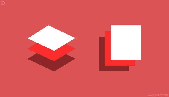
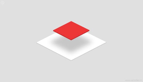
Indeed, the environment of the material is a 3D space, allowing all the objects to have multi-effects and angles. With X, Y and Z dimensions All the dimensions are perpendicularly aligned to each other for the purpose of extending the view. Each sheet tends to have a singular position in liaison with the other to maintain thickness. Ideally, the world of 3-dimensional effect is emulated by controlling the Y axis. Certainly, the 3-dimensional effect is becoming an integral part of the technological development and has been used to create super clear views from different angles.
Light and Shadow:

As per the internal working process of the material environment is concerned, virtual lights happen to elucidate the entire scenario. On one side, the key lights are activated to generate directional shadows; while, the ambient lights are meant to craft softer shadows from varied angles. These two light forms are responsible for casting shadows in the Material environment for better designing. Generally noted, the shadows tend to occur in the Android development process on the light source getting blocked by the sheets of the material spread on varied positions. It is an important part of the Material Designing method because the lighting source is needed to understand the visuals efficiently.

With the changing scenarios, Google is getting more and more enhanced as per the user’s demand. Now, the scenario is such that its Material Design has managed to simplify the process of web designing and application development by adhering to the guidelines for efficient results.
Google has managed to create a masterpiece in the technological world because its Material Design is proposed to serve the advanced needs of the users. In fact, the features and creative inputs have managed to gain recognition for highly integrated technicalities. The design is meant to simplify the entire working process for the user and help them in creating options for understanding the guidelines better to create useful designs. An essential aspect of the Design is that it is meant to project the excellence served by technical trend changes and is open to adapt to the varied environments served.
The Big G is making use of highly technocratic terms, to help users get the new face of websites and applications. By making use of Material Design, it has managed to gain recognition for high quality work performance and allowing users to have enhanced features that might not have been possible before.
Are you looking forward to Outsource Web Design and Development in India? Call us at +91 9544668844 & get in touch with our team right away!
Looking for a good team
for your next project?
Contact us and we'll give you a preliminary free consultation
on the web & mobile strategy that'd suit your needs best.


