Regardless of whether you’re a new UX designer or a seasoned marketer, you need to understand the fundamental laws of UX. According to Nielsen Norman Group, “‘User experience‘ encompasses all aspects of the end-users interaction with the company, its services, and its products.”
True UX extends much further than simply offering consumers what they think they really want and offering a laundry list of features. To achieve a high-quality UX in a company’s products and services, several disciplines, such as engineering, advertising, architectural design, and interface design, must be seamlessly integrated.
However, the varied areas of expertise required for a quality UX make it difficult to attain. It is also desirable since it adds to the acceptance of a service or product.
Fortunately, there are UX laws that can assist experts in selecting products, developing custom solutions, or designing usability tests while adhering to specific principles. They serve as guidelines on features that are proven to enhance UX.
These user experience principles assist product design by illuminating the psychology of consumer expectations. As a result, adhering to them is essential for anyone seeking to produce profitable designs.
So, in this article, we’ll look at the Laws of UX, created by product designer Jon Yablonski that encompass many fundamental UX standards, laying a firm foundation for UX designers.
But, before we dive into the details, let’s first set a common ground and clarify the basics.
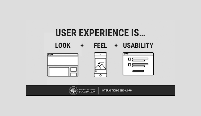
UX Concept – Image Source: Interaction Design Foundation
The feeling that people have when utilizing a product, software, system, or service is referred to as user experience (UX). It is a broad phrase that can refer to everything from how well a person can navigate the system to how simple it is to use and how pertinent the content provided is.
In fact, the word “user experience” was coined in the 1990s by Don Norman, co-founder of the Nielsen Norman Group. As Norman puts it, and as earlier stated, “User experience encompasses all aspects of the end-users interaction with the company, its services, and its products.”
It includes not only direct user encounters with the company and its products but also how the product or service fits into their broader task completion process.
Whether distinct components of the experience are directly controlled by the product or are simply connected with it, the overall encounter is regarded as part of the user experience from the customer’s viewpoint.
Watch Don Norman on the term “UX,” a 2-minute video in which Don Norman discusses the origins of the term “UX” and how designers should and shouldn’t use it.
User experience is significant since it attempts to meet the needs of the user. Its goal is to deliver great experiences that keep users devoted to a company or service.
Solutions that allow a visitor to navigate a system more smoothly and intuitively enhance the likelihood of that user sticking around. Furthermore, the longer they stay on your platform, the more likely it is that they will execute focused or targeted actions.
Secondly, defining customer journeys on your services or solutions that are most favorable to commercial success is made possible by a meaningful UX.
The ability to direct the client down the desired path while also providing a satisfying experience could be a big difference. Effective UX design distinguishes your business and its products from the rest, while poor or confusing UX causes customer irritation, desertion, and a lack of direction.
7 Essential Laws of UX for Designers
1. Aesthetic-Usability Effect
The aesthetic-usability effect describes how customers regard attractive things as more useable. Humans have a tendency to believe that anything that appears better will perform effectively, even when they’re not particularly efficacious.
In other words, your graphic aesthetic elicits a strong emotional response from consumers, making them more forgiving of minor accessibility difficulties on your platform. In just about all circumstances, this is a good thing from your point of view.
This effect is a primary justification why a quality UX cannot simply be a functional UI; developing an interface that is both appealing and useful is worthwhile.
In 1995, the effect was initially investigated in the realm of human-computer interaction. The Hitachi Design Center’s Masaaki Kurosu and Kaori Kashimura assessed 26 iterations of an ATM UI, requesting the 252 research respondents to rate each model on ease of use and visual appeal.
They discovered a higher association between the respondents’ judgments of visual appeal and usefulness and ease of use than between respective ratings of real ease of use. Kurosu and Kashimura came to the conclusion that consumers are influenced heavily by the aesthetics of any particular interface, even when attempting to analyze the system’s base functioning.
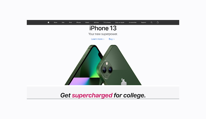
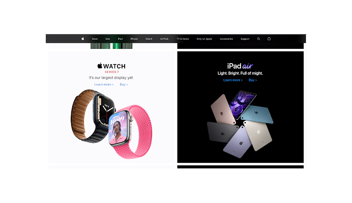
This effect can conceal UI flaws and impede issue detection during the testing phase. Apple’s success exemplifies the comparative benefit of paying close attention to aesthetics.
Apple’s Home Page – Image Source: Apple
Visitors expect a visually appealing interface that allows them to find what they want quickly or need and return back to their normal lives.
When conducting user research, look for cases of the aesthetic-usability impact by monitoring what your customers do and paying attention to what they tell.
2. Doherty Threshold
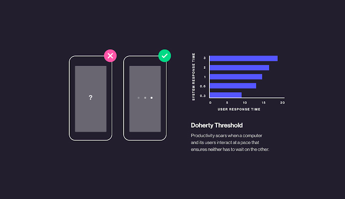
Have you ever been worried when you visit a site or a product page on a website, and the response takes an eternity? That is exactly what Doherty Threshold states. The law is associated with response time in technological resources.
According to the law, an action should give an immediate response in (<400ms) in addition to keeping customers’ interest and boosting productivity.
Doherty Threshold Response Concept – Image Source: Medium
Productivity rises when a system and its operators engage at a rate that doesn’t allow a delay from one another.
The wait between both the customer’s query and the system’s response is referred to as response time. When the system response is excessively long, the user loses patience as well as interest.
IBM experts determined the perfect reaction time for keeping users interested. Walter J. Doherty and Ahrvind J. Thadani presented a research report in 1982 requiring a system response time of no more than 400 milliseconds.
As a result, in order to retain and keep your customer interested as well as boost productivity, designers should offer system feedback within 400 ms. Increase response time and lessen the sense of waiting by using perception and expectation.
Animation is one method of visually engaging users when processing is taking place in the background. Introducing a wait to a system on purpose can actually raise its perceived worth and engender trust, even though the operation itself takes considerably less time.
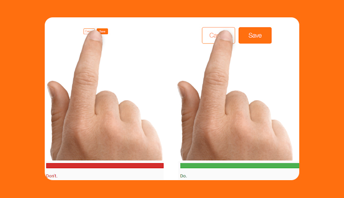
3. Fitts’s Law
Fitts’s law asserts that the time necessary for a person to acquire a target is proportional to the target’s distance and size. As a result, the longer the distance and the smaller the size of the target, the longer it takes to acquire it.
In 1954, psychologist Paul Fitts discovered that the time needed to move to a target relies on the distance to it but relates inversely to its size.
Due to the speed-accuracy trade-off, fast motions and small targets result in higher error rates, according to his law. Although there are several variations of Fitts’s law, they all include this concept.
Fitts’s law is commonly used in the design of user experiences and user interfaces. This concept, for example, impacted the practice of making interactive buttons large, particularly on touch-screen devices, because smaller controls or buttons are hard to click and navigate.
Dos and Don’ts of Touch Target Size – Image Source: Medium
Similarly, the distance between a person’s activity area and the task-related buttons should be minimized.
Key design takeaways:
Touch targets should be large enough for users to choose them properly.
Touch targets should be separated by plenty of space.
Touch targets should be positioned in locations of an interface where they are easily accessible.
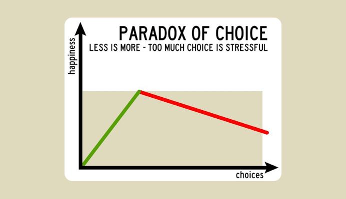
4. Hick’s Law
To provide a successful UX, you must first determine the functionalities that would best meet user demands; next, you must direct them to the exact functions they desire the most.
Visitors may feel confused, irritated, and abandon your site and its services if they are caught in a stressful judgment call stage of what to do next.
The Paradox of Choice – Image Source: Doist
This law is named after William Edmund Hick and Ray Hyman, a British and American psychologist team. The pair set out in 1952 to investigate the correlation between the amount of stimuli present and a person’s response time to any given input.
As one might imagine, the more stimuli there are to pick from, the longer it will take the individual to decide which one to interact with. People who are overloaded with options must take some time to understand and decide, resulting in work they do not want.
The law is a basic concept that states that the more options you give your users, the longer it will take them to decide or come to a conclusion. It’s obvious, yet it’s sometimes overlooked in the drive to jam too many features into a website or program.
Designers should apply Hick’s law to determine how many features they should provide on every given page of their site and how it will affect your users’ entire decision-making process.
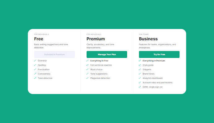
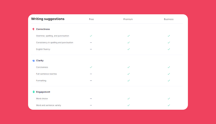
Grammarly, for instance, uses Free, Premium, and Business plan options to limit the number of choices, as shown below.
Offer fewer options. Image Source: Grammarly
Then, in a simple and easy-to-digest table, they compare features across plans.
Make it easy to compare features across products. Image Source: Grammarly
Users can now easily choose the plan that is perfect for the features they require, rather than feeling confused and nervous about which plan to buy, and ensure that everything they write is precise, engaging, and flawless.
The primary design takeaways are as follows:
Reduce the number of options/choices available when response speeds are crucial in order to maximize decision time.
Break complicated tasks down into smaller parts to reduce cognitive stress.
Highlight preferred options to avoid overloading consumers.
Make use of progressive onboarding to reduce the mental burden for new users.
Avoid oversimplification to the extent of abstraction.
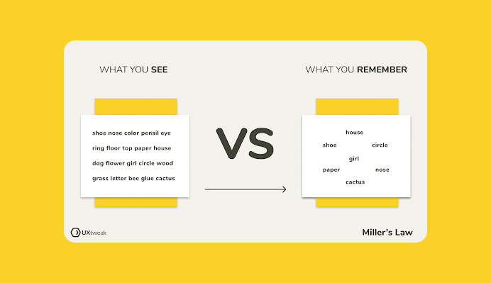
5. Miller’s Law
Humans have a limited capacity for short attention spans. The average human can only hold 7 (plus or minus 2) items in working memory at any given moment.
Magical Number Seven – Image Source: UXtweak
In 1956, cognitive researcher George A. Miller coined the term “Miller’s Law,” claiming that the range of recall, recognition, and absolute judgment was restricted to roughly seven pieces of information.
The bit is the primary unit of information, the volume of data required to choose between two equally probable possibilities. Similarly, 4 bits of information represent a choice amongst 16 binary options (4 successive binary decisions).
The channel capacity is the point at which confusion leads to an inaccurate conclusion. In other words, the number of bits that can be reliably communicated across a channel in a predetermined period of time.
According to this law, and as previously stated, the human brain has a finite capacity to process data; the average individual can keep seven perceptual “chunks” in working memory (plus or minus 2).
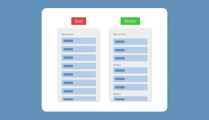
This concept is widely adapted to user interface design: the more content you add to a user interface, the more challenging it is to interact with it.
Reduced Amount of Chunks – Image Source: Two Hours Sleep
As a result, ensure to divide content into smaller bits to make it easier for consumers to absorb, comprehend, and remember. Note that short attention span capacity varies depending on previous information and current circumstances.
6. Jakob’s Law
Users spend the majority of their time on other websites. This indicates that users like your site to function in the very same way as all of the other sites they are already familiar with.
Jakob Nielsen, a User Advocate and principal of the Nielsen Norman Group, established Jakob’s law, which argues that designers should design for familiarity.
Users prefer user interaction patterns that they are comfortable with. And while this may appear to be a limitation on creativity, the reality is that regardless of how innovative you are, you need your product to be used at the end of the day.
Adopting some patterns that the user is already familiar with minimizes complexity and enhances the likelihood of retention.
The above means that after long periods of doing things in a certain way, consumers expect certain features to occur or to be situated in specific locations. Also, because the best designs are user-centric, leveraging existing mental models or creating designs that fulfill users’ expectations can help.
For example, Shopify states, “the header section includes the main navigation, a search bar, a cart button and additional information like customer service, store locator, top selling items etc. Those extra items are determined by your visitors onsite behavior.”
H&M Home Page – Image Source: H&M
If a large number of them are seeking your shop locations, include that in the header. According to this law, consumers will shift expectations they have developed around one familiar item to another which bears some resemblance.
And by exploiting existing mental models, designers may design the best user experiences, which enable users to focus on their activities rather than trying new models or designs.
7. Law of Common Region
The basic grouping principles, which include proximity, resemblance, and closure, were identified in the first half of the 20th century. Later study towards the turn of the 21st century introduced a few more grouping principles to the list originally discovered by Gestalt psychologists.
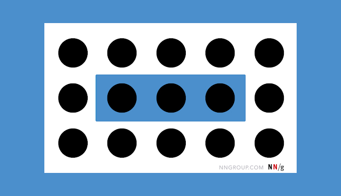
Among them, probably the most important for user experience is that of the common region – items are viewed as belonging to groups if they share an area with a clearly defined boundary.
Principle of Common Region Illustration – Image Source: Nielsen Norman Group
The barrier across the three middle circles in the example above (from Nielsen Norman Group) makes them seem like one group and distinguishes them from the other circles.
Adding a boundary or background shade to create a container for related objects in a UI enables consumers quickly and efficiently comprehend the UI’s design and which parts are related.
Sites with sticky headers (or persistent headers) can benefit from a distinct background shade or clear border to properly divide the header from the content below it while the user scrolls down the page.
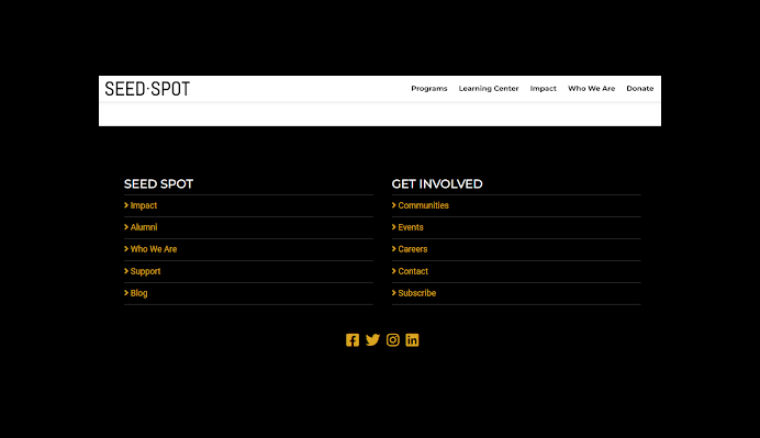
SEED SPOT Unique Footer Example – Image Source: SEED SPOT
Furthermore, for large footers, a unique, consistent background color clearly signals that all of the items in that region relate to the same group.
Conclusion
Designers should attempt to lessen the mental burden of the user and the expense of engagement by creating simple-to-use products. The principles listed above need to be in your architectural arsenal. They will assist you in designing a better UX for your users if used correctly.
As we conclude these seven laws of UX, here are some key takeaways to keep in mind:
Speed is essential.
Users’ memory is not limitless.
A sense of order is also important.
Users enjoy things that are familiar to them.
Targets should be visible and easily accessible.
Choices should not be excessive and overwhelming.
Begin making better decisions today by incorporating the laws of UX. They will undoubtedly help in the future of design.
Acodez is a web design company in India offering a wide range of services. We are a digital marketing agency offering all kinds of digital marketing services to our clients helping them take their business to the next level.
Looking for a good team
for your next project?
Contact us and we'll give you a preliminary free consultation on the web & mobile strategy that'd suit your needs best.
Rithesh Raghavan, Co-Founder, and Director at Acodez IT Solutions, who has a rich experience of 16+ years in IT & Digital Marketing. Between his busy schedule, whenever he finds the time he writes up his thoughts on the latest trends and developments in the world of IT and software development. All thanks to his master brain behind the gleaming success of Acodez.