The present online trend has a simple design that makes a website look attractive and appealing.
Designers really love the concept of minimalism because it involves making a website design look impressive without any of those steamy components that were traditionally implemented. The concept and idea seems to be impressive but the fact is things are not so simple and easy as it sounds to be.
In fact, designers find it difficult to curate designs that covey everything from a minimal space.
Defining Minimalist Designs:
Minimalist designs can be defined as design in its basic form devoid of those extra-terrestrial components, camouflage, colors, textures and everything else.
We have been repeatedly advised that “Content is the King”. So, with Minimalist design the idea is to allow the King to rule.
It provides the reader to focus on what is important, “content”, and divert their attention from least important things that are momentarily impressive.
The concept of Minimalist Design started somewhere in Switzerland decades ago though it was introduced to the web not until recently. Just imagine the marquees and a lot of flashes in a website design! Don’t you think they are an unfit for the website design?
Though a lot of web designers are trying to join the revolution that minimalism has brought about, but still somewhere or the other they struggle to comply with the strategies that minimalist design implies.
We will take you across a few tips on how to implement minimalist design for your website and the benefits of these for your website.
1. Minimal Clutter and Maximum Focus
Many new websites have their focus on a lot of different components. This could include even the unimportant elements and information.
Such an issue arises when the designers are firs timers and these newbies usually have a misunderstanding that their work would be considered worth only if they fill up the design with a lot of widgets and other things on the web page.
Your skill lies in identifying the entities that every visitor would search for in a website and work on it to create a minimalist website.
2. Stay on the Upper Fold
Many people have the habit of not scrolling down the page to read the whole content. And, here we again face the problem of “above the fold” design.
The visitors would always like to read the content on the first page of the website and above the fold. The web designers can improve the overall effectiveness of a website by keeping all the main elements the most needed call-to-action above the fold on a web page.
Reduce the height of the header by inserting the sign-up forms and the buttons above the first fold in your web page. A cool idea, still a lot of controversies and conflicts are happening regarding whether people read below the fold, but it is better to keep everything above the fold because no one really has time to see what goes below the fold.
3. Bring down the Page count:

If you want your website to be an informative one, then you must bring down the page count so that the visitor would not confuse with the number of pages on your website.
Too many pages in your website can mislead the visitors and they will be annoyed and leave the site. While writing down the content for a website, always write from your visitors’ point of view, so that you can stick to the point and write the main content short.
Also, a paragraph of content should be as short as five or six lines, so that the visitors can read them quickly.
4. Minimal colors for the best quality
The most common mistake that many new designers make while creating a website is the colors. The main key to create a quality design is to limit the colors in your website. When you work on creating textures, then it would be great if you can apply the same color in different shades. 
Making use of too many colors on a website can be annoying to the human eye and the visitors can easily get distracted.
Always stick to two main colors that can be added everywhere in your website. If you bring in a third main color to your website, then you are about to distract the visitors’ eyes from reading the content on your website. Follow different shades of the two main colors to create a minimalist website design.
Also Read: 9 top psychology tips behind using colors in website design
5. The 80/20 rule
The 80/20 rule can help you to simplify the overall website design and pushes the focus on the main content of your website.
Identify the content on your website that focuses on the topic so that the visitors can easily read the content without getting distracted.
6. Simplicity fusion:
First of all let us not confuse minimalism for simplicity. Both are two different concepts but equally applicable to minimalist designs.
Minimalism is nothing but implementing or minimizing the use of a lot of unnecessary components in the web design. But, simplicity is more a state of the mind wherein you can easily interpret things. When minimalism fuses with simplicity you are drawing closer to accomplishing a minimalist website design.
7. Less is Always More and more is always less:
Are you thinking whether it makes senses when more is less? Yes, with Minimalist designs everything is more which should appear like it is less.
The concept of Minimalism is that you are not supposed to include a lot of components on a single web page and cut off all the clutter as we discussed in #1, but be sufficed with whatever you have.
All this depends on the purpose of your website. What kind of business you own?
Sometimes it is ok to remove those elements such as the social media icons, buttons, newsletter sign up boxes, flashes, graphics colors, lists such as RSS feeds etc.
Your website will look more beautiful and minimal.
8. Take care of Typography:

Now that you are reducing the extra components on your website your content will be one of the things that will be more visible and when your content becomes the central focus, you need to ensure that it appears impressive.
So, what do we do?
Let us make a smart font selection!
Use a distinguishing font for the header, title, body and the conclusion. Also, the size, type and weight of these fonts matter. Try maintaining a unique color across the website so that it doesn’t irritate the readers.
Let people read and enjoy without hurting and straining their eyes.
9. How about a background in white?
It makes things easier.
As we have already discussed from #1 to # 8 points, the need for reducing components is the foundation of Minimalism in web designs, so it is to keep the background in white.
Why white?
You have minimal entities on your website and also, your content is the most visible thing on your website. When there are white spaces, a background in white would really make your website appear flawless and also, the content looks beautiful without a need for any other highlights to show what is important to your site.
And, the reader’s eye will automatically drift to the content on the site.
10. Let us develop a wireframe and sum it up in a grid:
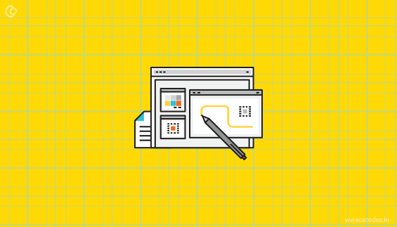
Why not develop a wireframe?
Add all the colors, typography, images, content and everything that will make your website to the wireframe.
The things that you need to take into consideration when designing a wireframe are:
- The content that you are planning to blend into the website.
- Start with prioritization of the content.
- Experiment with various wireframes before you start working on the original website.
A grid could be really helpful in organizing the content and all the other elements of your website in a neat and beautiful way.
Alos Read: 9 Top Moodboarding tactics that web designers need to implement in the year 2016
You can use an image and a logo that would help to distinguish your brand’s identity.
With a grid it is easy to manage all these things.
These are some of the basic aspects of creating a minimalist design.
But, I know you might not take the effort unless you know more about its advantages which includes the following:
#1. Maintenance and upgrades:
Website Maintenance was never as easier as with using Minimalist Design. As you know there are lesser entities and components on such a website, and so it is easier to implement and upgrade to the changes that arrive every day.
With those heavy websites, a lot of underlying entities are affected when an upgrade is required.
Also, when there are lesser entities you need minimal maintenance for your site.
#2. Content is King:
When there are a lot of elements on your website, there are all chances that the attention is diverted and the reader’s eye shifts more to these than the content that is important.
But, with minimalist design you do not have to worry as the content is king as always and people can get more to read than lose attention due to other unnecessary disturbing factors.
#3. Ease of navigation:
As it is Minimalist design, so are the entities that would be kept to Minimal. What does this mean?
It merely means the navigation part is very easy.
You have a simple design with a simple call-to-action all blended into your website design and it is easier for people to take a decision rather than migrate across different pages before deciding on whether they want this or not.
It is less annoying!
#4. No pop-ups:
The truth is that people hate pop-up’s but somewhere someone told us that keeping pop-ups is a great practice as it helps people to take decisions and give in.
But, it is one of the most annoying practices that will ward off your visitors from your website.
In a minimalist website design, there are no pop-ups that distract visitors.
#5. Download Speed:
With minimal components and avoiding the use of all those annoying graphics and other images that prevent the site from loading faster, we have a minimalist website design that ensures that your site loads faster.
#6. No overburdening the server:
As we have discussed there are lesser components and we are not burdening the server with graphics, flash, complex platforms or anything that will overload it.
#7. User experience:
You are offering a great user experience because you are not annoying them with a lot of components that are disturbing. And, when they have to navigate from one page to other before finding the landing page components they are tired and all they do is click the back button.
But, here they will stay because everything is defined above the fold in a minimalist design.
After reading this I bet you wish to implement Minimalist Design concept in your website at the earliest.
As you know the benefits and if your website has been failing to adhere to these, then, you have been missing out on a lot.
Migrate to Minimalist Design, let us forget the conventional design concepts that are too boring and overcrowded forcing people to abandon our site and reach out our competitors.
So, are you ready?
Acodez IT Solutions is a web design company in India offering all kinds of web design and development services to our clients in India and abroad. We also offer mobile app designing and big data analytics services in India. We are a SEO based agency in India offering inbound marketing and others to help take your business to the next level.
For further inquiries, contact us today.
Looking for a good team
for your next project?
Contact us and we'll give you a preliminary free consultation
on the web & mobile strategy that'd suit your needs best.


TYSM man for these awesome tips.
Gonna use it on my blog 🙂
Thank you very much for your valuable comments Shafi Khan, we will try to provide more valuable content in future.
That is an outstanding article that is very well written. I enjoyed the little history piece for u comment I follow as well.
Minimalism is a bit tricky, yet effective part to get most out of it.
One have to use the right vector to present the message, but if its achieved, you can easily update and maintain your website!
It’s my first time to visit this site & I’m really surprised to see such impressive stuff!