“A picture is worth a thousand words.”
– Anonymous
This is the web designer’s platter of bread and butter. Sometimes, you might fall short of words or most of the times it is not necessary that people realize what you are trying to communicate. Web designing is like a game of gambling when you are trying to express or communicate a chain of feelings or mood or anything and everything.
You might have put in a lot of effort and created an aesthetic design for your client and imagine the plight and pain when they reject it. No, you don’t want your efforts to go unappreciated when you are an expert at designing. Saying this, I would like to point out one of the most important and basic rules of website development, which is involving the client at each phase of the project development process.
This kind of an approach has always helped web designers and developers to create products that meet the client’s expectations and their business requirements. And this is when we arrive at moodboards and perceive their prominence in web designing. The effort involved in creating website designs that are appealing and catch the visitor’s eye is way too far from what you can visualize or imagine.
While you are moving across your expedition to research design components and include these in your project you can utilize moodboards to maintain a sketch of what are all the things that you wish to incorporate in your design and you can review the same frequently to ensure that you are not deviating from the original path of execution.
Now, if you are hearing the word moodboard for the first time, let me tell you this it is not an asset of the IT industry as it was already here long before the first web designer started his career in web designing. It is commonly used in interior designing and fashion designing and now the web and graphic designers are weaving their stories across these. Moodboards are a great tool that helps to translate your perseverance of the client’s story in visuals.
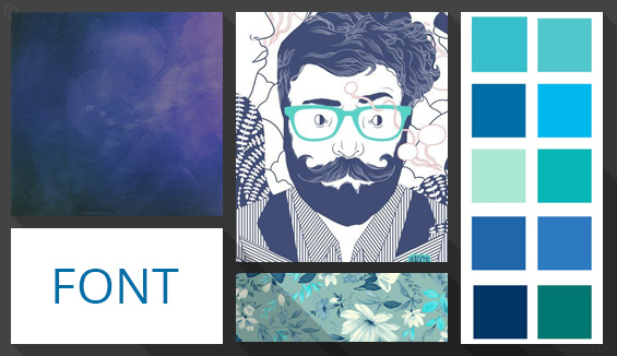
My definition of a moodboard is quite simple- the moodboards or design boards are either a virtual or real representation of your ideas before implementing these. It can be anything and everything including photographs, color palettes, textures, designs and even words that might describe your business objectives.
Here is Wikipedia’s definition for a moodboard: “A type of collage that may consist of images, text, and samples of objects in a composition of the choice of the mood board creator. Designers and others use mood boards to develop their design concepts and to communicate to other members of the design team.”
Why designers mood board every time?

Let me ponder my thoughts on this topic with a warning to those designers who do not moodboard that if you have never tried this out, the next time you work on a project do not skip this part. Also, I bet if you are not yet moodboarding then the number of reworks you might have done must be limitless. Why waste your time and budget resources unnecessarily when you can get it done with ease?
At what point of a design process do moodboards emerge?

Exactly, it fits in the web design process somewhere in between design mockups and wireframes. What is more interesting about a moodboard is that it is deliberately a comfortable tool that allows designers to make a rough sketch of their project and you can easily take this to your clients to get their suggestions and feedback before it is too late and you end up investing too much time and money unnecessarily.
Now let me unveil how moodboarding helps both the designers and the clients:

Designers: Imagine that you have undertaken a project and you are starting to work on it but where do you start when you have the least idea of what you are going to do. Are you just going to sit and stare at the blank screen? The client’s role is to put forward their requirements while some people might be a step ahead when it comes to providing a brief sketch of what they are expecting while others deliberately do not provide the further details or are least aware of their requirements. So, why not contemplate on generating some ideas and transform these into broad strokes on a moodboard.
This will save you a lot of time and effort as you can take it to your clients and confirm whether this is what they are expecting. The plight of a project design that gets rejected once you have been dedicatedly working through it for a long time is something that no designer can bear.
Happy & satisfied clients: “Involve your client at each phase of the project development cycle”, we have been hearing this for quite some time now. This is a true fact that actually works as it helps to generate great results that fulfill the client expectations. When you moodboard inspiration and present it to your client, they have an idea of what the final product will look like. They can also provide suggestions and feedback that will further help you in your efforts to create a great design. Also, as we have already discussed there is no unnecessary wastage of time and resources when clients disapprove of the design at a later time because you kept them in the dark while you worked on the project.
Dear designer, do not forget that words can complicate things. If you think that you can convince your clients about the design through verbal communication, I’m sorry to say but my dear friend you have got it wrong. It will spoil your efforts because expressing through words is differently interpreted when compared to the moodboard visuals that actually conveys the design you have in your mind.
This makes us clear on why Moodboarding is an essential necessity of any design process.
Now let me take you across how to create a Moodboard and the essential elements to consider while working on it:
A Moodboard gives the client an idea of what are the components that will come across in the actual design. So, It will be worth the time and efforts that you will allocate to Moodboarding. Here is a list of entities that needs to be present on your Moodboard (this is a normal list though you can choose to add much more as per the availability of time and other resources and also depends on your client’s attitude towards a problem).
First let me start with the list of things that cannot be represented using a Moodboard:
Page template designs ( including Home Page, About Us, and even Services). Try moodboarding template designs and you’ll realize how skeptic moodboards are with these.
Content in the body, title, headlines and the one that appears on the image selection.
User interaction and the final components or appearance of your site.
Don’t confuse Moodboarding with prototyping or wireframes.
These are the things that come to my mind when I think of Moodboarding:
Layout:
- Colors
- Font styles
- Photography
- Navigation style
- Spacing
- iconography if necessary
- textures
Here are the 9 top Moodboarding tactics that you can implement in the year 2016:
-
Now let us explore how to gather inspiration for your Moodboard:

Collecting Google Images and presenting these across your Moodboard might seem to be a great idea. But, let us get this straight you do not need a moodboard that is being implemented on outside inspiration and has no uniqueness in it. Use the entities that you have created with regard to any design project that you are working on. Also, ensure that you are using the ones that represent your final design. This saves you of the effort to develop a final product though you can present something similar to get the client’s approval during the initial stages of planning. This can include:
- Textures
- Illustrations
- Color palettes
- Overall style
- and Fonts
-
Sources for inspiration:

Designers are great photographers too. When it comes to choosing images or snapping a shot, designers will wow you with their awesomeness. Carry your camera with you as this will help you to derive inspirations from the real world which means a lot to the people in the real world.
Also Read: Designing in the Browser or Designing in Photoshop: Which is your Choice?
Let me put a personal note here. Collect the old photographs that belong to the 90’ and 80’s era and utilize the aesthetic power of these to strike an impression. For instance, if your brand deals with stamps, why not use the images of those old rusty stamps that are saved among your grandpa’s old box of collections.
-
Branding and content:

This can be in contradiction to what we discussed about gathering inspiration. Moodboards can include components that will never appear on your final design. Now don’t raise your eyebrows. These can be anything and everything from defining the brand representation to generating aesthetics. For instance, if the brand relates to something like a designer boutique, then image themes that relate to traditional attire jingling infusion with the most modern trends can be the game changer which is entirely different from the actual design elements that we explored initially.
-
Do it more than once:
Designers, why not moodboard multiple times? Why limit yourself to just one design when you can represent your ideas in several ways and forward it to your client presenting them with a wide range of options to choose from. Experiment with your ideas apart from what the client has specified. For this, you need to moodboard more than once because you are experimenting with colors and styles multiple times.
-
Conveying the concept:
This is the most important pace of any design direction which actually reminds me of a scenario where I was invited to an exhibition of old artifacts and collections and imagine my surprise when all that I saw there was some hand made pots and tattoo designing stalls. How weird is that? Relate to your concept, Focus on curation rather than collection as the first impression is always the best.
-
Formatting is important:
Though moodboard depicts a rough sketch of your final design, it doesn’t mean you can go easy with it. Whether you are planning an online or offline moodboard you have to work hard. If you are working on an online or virtual design, include style choices of font and color palettes and also don’t forget the mockup designs such as headings, buttons, icons and even the content.
When you are with a physical collage, order everything in a manner that will generate an emotional spark once the client views it.
-
Images and text:
Having bigger images on your moodboard supported by smaller images actually creates an interest in the minds of the viewer and they can possibly put forward their thoughts. Also, do not fail to include some substantial text as again these give some actual possibilities for your client to think about and make further suggestions. Though pictures are powerful than words, the latter has even a higher power to communicate better. It comes in handy when images fail to express.
-
Rework if need be:
Yes, it happens! Often your thoughts vary from what the client expects and when this is put across the moodboard you will realize that you have to rework. Sometimes, even minor tweaks will make it necessary that you design an entire new moodboard which inclines with the client’s expectations.
-
Don’t miss out to test:
As always testing is an important phase and you cannot escape this while moodboarding. Get your related audience test your moodboard. This will help you to get a better understanding of what their needs are and help you to work towards creating moodboard components that are essential.
As we have already discussed traditional moodboarding is quite easy with a collage of ideas and inspirations that relate to a particular brand. But how do you find success with online moodboarding?
If you have not yet used Moodboards try with these in your next project. These are really helpful and fun to work on.
Have you ever used Moodboards for your designs? Is it offline or online Moodboarding that you find easy to work with? Share your thoughts and feedback with us…
Acodez IT Solutions is a web design company based in India providing a number of web design and development services to our clients all over the world. We are also a digital marketing solutions provider offering inbound marketing strategies to our clients to help them with their business efforts over the web. It is possible to increase your conversion rates if you choose the best ux design company in india like us. Do you want an awesome web design for your business? Contact us today and we will provide you with a free quote!
Looking for a good team
for your next project?
Contact us and we'll give you a preliminary free consultation
on the web & mobile strategy that'd suit your needs best.


