What do you think forms one of the major component or element of any website?
Could it be forms?
Could it be design?
Could it be content?
Yeah, of course all these are some of the most important aspects of any website design. But, are you aware of the fact that buttons can also play a great role in your website design and your business?
Also read: An Ultimate Guide for your Website Design Budget Plan in 2017
Buttons are the vital parts of call-to-actions and hence, if your buttons do not reflect any kind of impressive elements, then, you are going to fail.
Because, these buttons are going to ensure that conversions happen.
So, what are the different aspects of designing call-to-actions that will convert?
It could be anything and everything ranging from – the style, size, and color – of the buttons.
Apart from these factors a small change in the position of the button could also contribute to creating a disaster when it comes to ensuring that it converts.
The first and foremost thing that you need to keep in mind when you are designing a button is that it is for the people out there. Maybe if it is for a personal use, then, the placement or color or anything could be chosen on the basis of the designer’s personal interests; but when it is for a global audience let us not make them feel bad for having decided to stop at your page.
A wrong position or a wrong color in the background where you place your button could spoil the entire thing ensuring that the visitor never returns to your page.
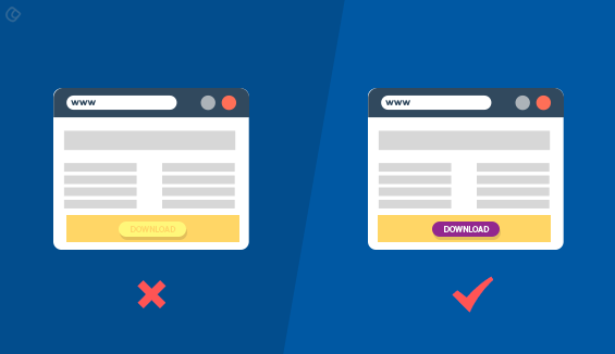
Also, let us stop giving ourselves false hopes when we are not doing it the right way.
You might think that this is the perfect place and position it at the place where by no chance the user is never going to check out at any cost. Period! Also, you might choose a color that is too dull or too freaking and makes the user think of it as “weird”.
The most important of all is that the user is unaware of the fact that either it is a button or the very fact that a button exists.
Even though we are designers many a time it happens that we ignore such small things which are in fact the bigger ones.
All this leads to one place – make your buttons clickable.
So, how do we manage to create buttons that are intuitively clickable?
“Be clear, precise and simple.”
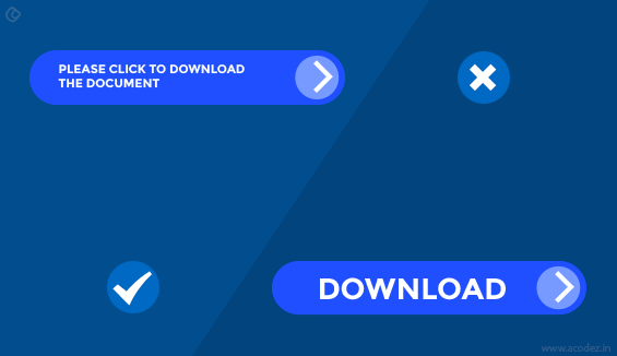
This should be your motto when designing a button intended for call-to-actions.
It is okay if you have a lot of creativity and are excellent at implementing your artistic bravery across your designs. But, remember to check whether the creativity would be understandable from other’s perspective?
Unless it is do not go ahead!
Because we all love simple things. Why complicate when we can reach out to people and connect with them with whatever is simple and humble?
We have all had experiences where we reached an awesome landing page and decided to help the “specific” business by clicking on their CTA, but to our amusement we found that rather than a simple “submit” button they have something that says – “It’s cool here,” and we all left the scene, because we were unclear whether we were being asked to take the action we were planning to or we will be led to do something else?
Let us not repeat history but let us create one!
1. Size of your button: Don’t create too tiny or too large ones! It’s imperative that the visitor notices your button and takes the intended action, but if it is too small then, we cannot blame them if they haven’t noticed it and left. If it is a large one it might again frustrate them. The most important of all is to ensure that this “button” stands apart from the rest of the buttons on your landing page.
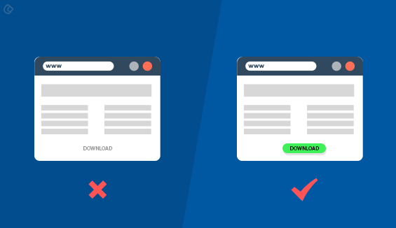
2. As mentioned earlier the text on your button has a great role to play when it comes to the action that the user takes. Rather than writing something like, “it’s cool here,” make it simple and clear by showcasing the intended action expected of them. Say for example, you could use “submit”, “send” or “sign up”. There is nothing confusing here. Everything is well conveyed!
3. Of course, users need some direction when they are on the landing page to realize and perform the intended action. So, while they are here apply some hues and colors to your button, so that they feel like clicking on it.
Another, most important point is that let’s not fuse in the background color across our CTA’s so that all of them looks similar and the user leaves the page with no clue that they missed the CTA that was right in front of them waiting to be clicked through!
The spacing of a button is also a factor that needs to be considered when positioning your buttons. Don’t make it look too crowded. Leave some room for the button to breathe. Provide a margin between the text and the button so that it doesn’t look overcrowded.
Before we ponder further into getting a perfect button designed, let me ask you a simple question how many of us follow or keep in mind the types of buttons:
1. Neutral
For example, the cancel button or the one that doesn’t do anything other than redirect the user back to the home page.
2. Negative
When the entire information gets deleted or rearranged.
3. Positive
This is the one that prompts for an action. It could be something like changing, sending or adding up information.
Let’s find out where it should be placed for the user to find it:
Intuitive placement of buttons has an important role in deciding whether a user will click through or will not.
The user has an instinct when they land on this particular page and while they are here you are expected to direct them towards the intended action and here, again the placement of the button needs to be done instinctively which is logic-driven too.
Let us examine what experts have got to say about the same:
There are two different kinds of patterns that can be implemented depending upon the mood and intend of your business and website:
1. The Z-Pattern
We call this pattern so because the content on such websites are organized in a spacious manner. And, when you are using a Z-Pattern, you can possibly fit in your button along the same line and make sure to put it at the end of the line.
2. The F-Pattern
When you are designing for websites that contains a lot of text that include blogs or news sites the reader’s eye follows a left-to-right reading pattern. Here, wisdom lies in placing your CTA at the end of the line where the left-to-right reading pattern comes to an end.
So, finally, you are following the user’s path or at leading them across the path that they need to be following to complete a desired action.
It is recommended that you use rectangle shaped buttons as it is followed globally and something that your people can easily relate to.
One-liners on best practices to be followed while designing buttons:
1. First things first
Have you noticed that your eyes drifts towards the top-most largest elements while on a page? General human tendency that cannot be changed! But, we could possibly apply this policy when designing our buttons so that it gets noticed straightaway. Of course, we need to explain it to them why they have to click through but if it could be summed up in a few words you could possibly consider placing your button here. The “above the fold” concept works here.
2. Lesser important things come next
The eyes starts moving towards sub-titles or sub-heads on the page.
3. Content comes next
As we already discussed in #1, it is important to convey to your people where all this starts and where can they find their call-to-actions. Your content should do the magic: it should tell them why they need this; moreover, it should explain the benefits of clicking through.
4. Call-to-actions
This is the regular pattern that is being followed since ages; unless, there is an “otherwise” situation. Your call-to-actions should follow the below-listed rules:
- Clean and legible. Let us not complexicate the content. Sans-serif is the recommended font-type.
- Place it in a clear and even row.
- It should never be the color of the background. Make sure it is in contrast to the background color.
These are some of the quick and simple things that you need to keep in mind before setting out to design your CTA buttons.
Would you like some help in designing your landing pages or your CTAs that would convert with no doubt?
Then, we can help you.
Choosing the right partner who brings you the business success every time is quite a challenging one. But, you have come to the right place with one among the top ux design companies in India.
Acodez IT Solutions is a web design company based in India offering services to our clients in India and abroad. Within the past 5 years, we have served more than 600 clients across 60 different countries with solutions that are out of the world.
We use the latest technologies and techniques to deliver solutions that are an answer to all their business queries helping to take their businesses to the next level. The world of online marketing is experience a tougher competition as there are a number of people out there with similar products implementing the same kind of resources and technology to attract attention. But, not all works!
We have an inbound marketing team of experts who take care of all your digital marketing needs. All you need to do is contact us for more information on how and what we can do to help you!
Looking for a good team
for your next project?
Contact us and we'll give you a preliminary free consultation
on the web & mobile strategy that'd suit your needs best.



Great article, thank you for sharing these useful tips with us!
Agreed with your all points, good CTA will increase your chance to getting attention and potential query too. Thanks for sharing mate 🙂