Websites for technology companies serve as a focal point and effective tool for marketing initiatives. In order to succeed, your technology site has to deliver higher exposure content and sales touchpoints while not overwhelming the reader or potential customer.
However, if you’re not considering what product or service you offer, the sectors you serve, and the characteristics of your prospective customers, it may be time to reconsider how you’ve been designing and structuring your website.
A website truly thrives when its design contributes to its user experience (UX) and performance and suitably matches its content.
To build any technology company website, the essential depth of your site, providing the appropriate content, and adding powerful CTAs (call-to-action) should all be addressed and handled in the most client-centric way possible.
A website may be the most crucial customer-facing marketing tool for a technology company.
It’s all too tempting to dismiss the above web design changes as the lowest priority on your website’s totem pole. Still, a great website that has both high-performing information and a fantastic user experience must strike a balance.
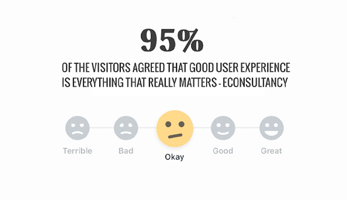
It’s a fact that 95% of visitors agreed that a good user experience is everything that really matters.
UX Statistics – Gif Source: SAG IPL
In fact, after your web pages load, you only have 0.05 seconds to impress your visitor. Given that 94% of these visitors identified website design as the reason they mistrusted or rejected a website.
If the statistics above aren’t enough to scare you, consider what this means for your small technology company: Customers will not trust you if your website is difficult to navigate.
This step has an effect on everything from site traffic to gross sales or revenue. Particularly since customers would not make a trade with companies they do not trust.
As a result, the last thing you want is to spend a lot of time creating high-quality content or product pages only to have it go unrecognized due to design problems, usability challenges or complex layouts.
However, when it comes to website user experience, it can be challenging to understand what to include while determining the most crucial elements to address.
Thus, what are the website design tips and tricks you should be aware of to begin optimizing your technology company’s website?
Read on to learn more. You can develop a website for your technology company that delivers results by following our best tips and tricks, suggestions, and inspiration.
Top Website Design Tips and Tricks for Technology Companies
Here are some effective website design tips and tricks for technology companies that can assist your company in ensuring that the website functions as a robust lead-generation tool rather than a tool that turns potential consumers away.
Allow For Plenty of White Space
Any technology website with excessive content, graphics, or an unbalanced color scheme will not interest readers.
When designing pages for your website, you want to assist consumers by preventing them from becoming overloaded by the amount of information available. You want the visitors to be there for a considerable time.
You can accomplish this by focusing on leaving plenty of white space.
Whitespace is an important design feature that serves to split up the page and improve visibility and readability. White space pertains to the regions around objects on an empty web page without text or graphic elements.
In one of its posts, Medium references a study that revealed that “proper use of whitespace between lines of paragraphs and its left and right margins can increase comprehension up to 20%.”
Whitespace is also significant in the web design process and in the arrangement of web content on the page.
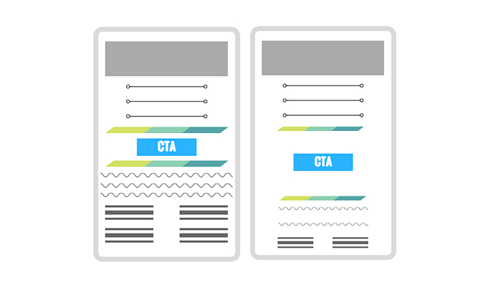
Just take a look at these two website layout examples from HubSpot:
White Space Concept – Image Source: HubSpot
The CTA button on the left layout has little breathing space compared to the one on the right, which has been filled with much whitespace.
The button on the right layout looks to be a central focus on display by having plenty of space, inviting visitors to pause and pay attention.
Although plenty of whitespaces can indicate which sections are distinct and direct more attention, lesser whitespace can specify which sections are expected to be linked to each other owing to their vicinity.
Create Captivating Content
Having white space and simple navigation is critical for your website, but only if you have content to use on that website. And besides, your website can’t be confined to color palettes and interface tabs alone. There must be content for any of this to be meaningful.
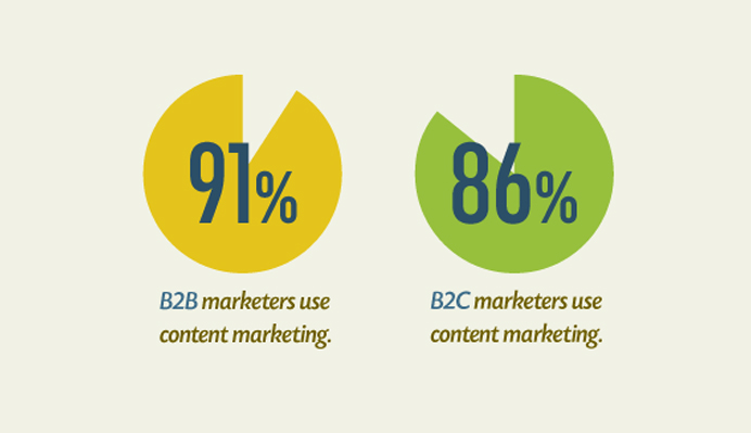
It’s no wonder that content marketing is becoming more popular. In fact, 91% of B2B marketers feel content marketing is an important part of their entire strategy, compared to 86% of B2C marketers.
It’s a trend that we all anticipate will continue for years.
Marketers now clearly understand the power of content. But why then do only a small percentage of firms succeed with content marketing?
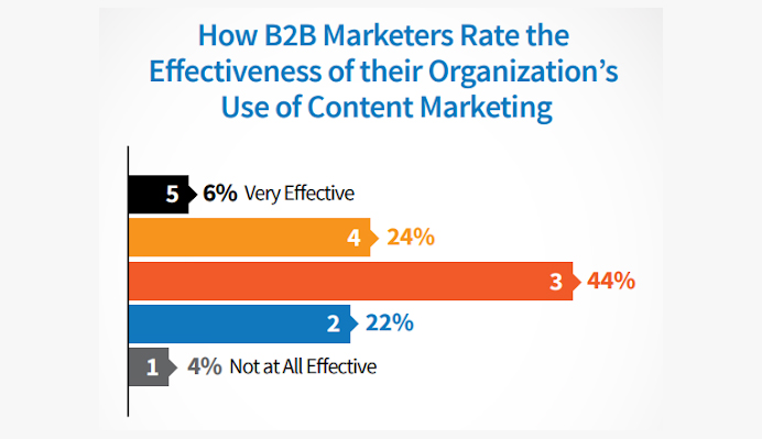
B2B Statistics – Image Source: SocialMediaToday
As illustrated above, 44% of marketers feel that content marketing is relatively ineffective for their firm. This data provides unsatisfactory performance.
All of this is happening because not everyone is producing compelling content.
The content on your tech website should be comprehensive and meaningful, and it should also be suitably stretched apart. Avoid building pages that are entirely composed of large blocks of text or sentences and paragraphs.
And once you grasp how to develop it, you’ll notice a significant improvement in your content marketing results:
Increased traffic
Increased sharing
Increased engagement
Increased conversion rates
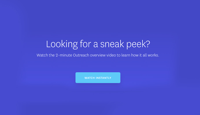
Display Products Using Videos
Consider showcasing product demo videos on the product pages or on the homepage to capture the potential customer.
For individuals who want additional insight, you can provide explanatory material underneath, but a video tour or demo can assist the viewer in truly comprehending the item or service.
Your challenge as a technology company is to be able to properly convey the right use of your products or how your program operates. Visitors can learn about your software and how well it fits into their lives by visiting tour websites.
In fact,73% of consumers prefer to learn more about a brand’s products or services by watching a short video.
With88% of people saying they’ve been convinced to buy something after watching a brand’s video, it’s clear that video content is the way of the future, and product demos video formats are a successful way to get there.
As a result, you need to provide simple/straightforward, and logical steps for using your software, much as Shopify does on its homepage.
Shopify Product Demo – Video Source: Shopify
Your material should be able to clarify what obstacles or constraints the service or item is intended to answer before moving on to its features/characteristics and proper usage.
Short guidelines are vital for holding the attention of the customer. Try not to pack your whole user manual onto a single page.
Make Your Website Mobile-Friendly
Mobile optimization is one of the things that cannot be overlooked when it comes to website design tips and tricks for technology companies.
Although laptops or desktop computers may provide the optimum display for your smooth graphics and videos, the fact is that the majority of visitors will access your website using their mobile devices.
In fact, US adults spend more than 5 hours every day on their mobile phones, while 35% of consumers do all of their online shopping on their phones. Therefore, the mobile website for your company must provide an excellent customer experience.
Suppose prospective buyers visit your tech website but find it challenging to browse or navigate on a smartphone. In that case, they may consider leaving and going to a competitor with a better mobile responsive site.
However, it’s more than just being aesthetically responsive. It is essential to personalize your site to the interests and needs of your consumers.
Consider why someone might visit your website on a mobile device. What would they be looking for? Is it possible at the moment for them to achieve those things because of my experience?
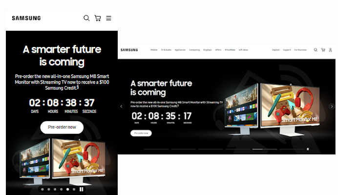
When it comes to this feature, Samsung is one of the top technological company websites out there.
Mobile & Laptop Optimization Concept – Image Source: Samsung
As a brand that is continually on the cutting edge of technology transformation, it’s no surprise that its tech website caters to its tech-savvy customers.
Because Samsung’s website has an eCommerce component, it is critical that they appropriately optimize their website for smartphone subscribers in order to enhance the possibility of a smart device buying from them.
The company also understands that a poor mobile user experience can harm its website’s SEO rankings, making it more difficult for visitors to find via a Google search.
Design Easy, Effective Navigation
The importance of navigation while developing a website cannot be overlooked.
It’s how visitors can easily delve deeper into topics like your solutions, products, news site, and so on, making the feature the very first thing you must get right when building your tech website.
Even the most perfectly designed websites will not serve as a useful tool if customers are unable to navigate them.
Overcrowding your navigation, employing unclear or misleading web pages, and a lack of organized designs can all make it difficult for your potential customers to navigate their way around.
And as a result of this, these potential buyers will leave your website and go to a competitor who provides a better customer experience if they cannot locate what they are looking for.
Thus, it is critical to ensure that your potential customers can simply locate what they are looking for while optimizing your website’s navigation.
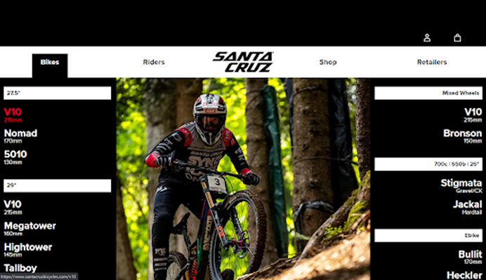
Using navigation tabs or drop-down menus that clearly explain the design and layout is indeed one of the easiest ways to ensure top-notch navigation.
The brand goes a step further with a menu that is entirely based on product images and specifications. This is an excellent strategy for a bicycle company.
At the same time, the visuals make it enjoyable to explore and simple to locate a certain product. You can apply the Santa Cruz Bicycles website approach, such as how their drop-down menus employ images to bring attention to categories such as Gears and Tires.
Optimize Above-the-Fold Content
When customers visit your website, you want them to see the benefits of your program quickly. You should also act swiftly because visitors only read slightly more than a quarter (28%) of the content they view on a web page.
First impressions are critical, and if your visitors are dropping and failing to maintain their attention, it might be because your “above-the-fold” content isn’t engaging enough.
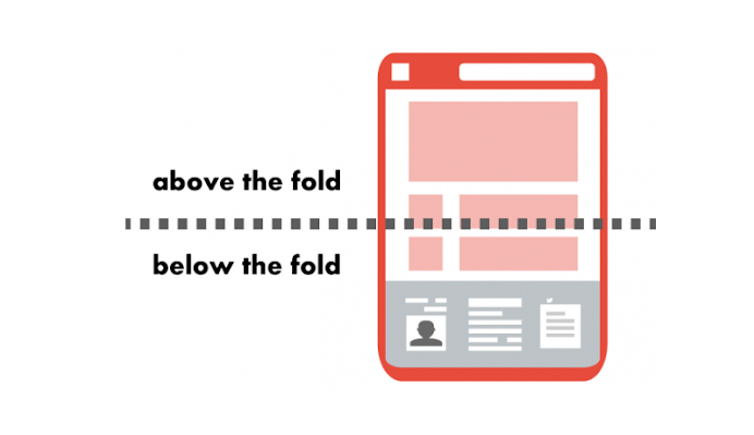
But what exactly does “above-the-fold” mean?
Above-the-Fold Concept – Image Source: GlobalDots
Above-the-fold refers to the area of your website that appears upfront when a user arrives on a webpage.
Above-the-fold, content includes the headers, images, or a video that is displayed before viewers start scrolling. It should preferably express your tech company services as well as the benefits that come with the service.
Since it can entice people to explore the remainder of the web page and its services, your above-the-fold content significantly impacts your engagement numbers. If it is not properly optimized, you will most likely see an increase in bounce rate and a fall in conversions.
How to Optimize Above-the-Fold Content
Make sure that any material above-the-fold engages the visitor and informs search engine bots or web crawlers.
When a potential customer arrives at your page and is puzzled or dissatisfied, they will return to the Search Engine Results Page (SERP). Catch their attention with above-the-fold content.
A captivating H1 tag, eye-catching pictures, and additional menu options linking to other parts of the website can help illuminate what’s on the web page and let visitors know whether they want to browse your content even further. Example of Above-the-Fold Content – Image Source: Forest Hill Family Clinic
All data should be available in an easy-to-understand and non-overwhelming manner, as seen in the image above.
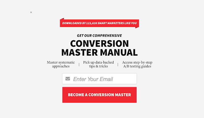
Make Your CTAs More Engaging
A call-to-action (CTA) is essential for converting traffic into potential customers. CTAs are graphics, banners, or text that entice users to perform a certain action, such as downloading an eBook or making a purchase.
CTA Example – Image Source: Zoho
However, not all CTAs are made the same; some are ineffective and unable to grab people’s attention or fail to communicate.
On the other hand, an effective CTA will assist you in getting users to take action and take a step further from your website, emails, and social media network postings to a landing page tailored to convert potential customers into buyers.
But what makes an effective CTA?
Effective CTAs ought to be consistent with your brand while also standing out from the rest of your website content.
You can make them stand out from the crowd by using bright colors and a large, simple font. You could also incorporate a large button that stands out so much that prospects feel compelled to click on it, like in the example below.
The bright red CTA stands out against the rest of the page, as seen in the image. It contrasts not only with the background’s white but also with the website’s black color combination.
Instead of a simple CTA with a simple phrase like subscribe, the CTA also includes a benefit-oriented phrase in the CTA content, “BECOME A CONVERSION MASTER,” making it an effective CTA button.
If you apply this design to your website, visitors will be primed for the benefits they will receive. It will encourage them to engage and convert more.
Test and Optimize
Any technology company should constantly A/B test and optimize various components of its website design for successful online marketing, which implies constant upgrades and modifications.
Most consumers want website pages to load fast, and if yours takes longer, you’ll likely notice an impact on conversion rates.
But what is a good page load time?
According to a 2019 Portent finding, a 0-4 second load time is optimal for conversion rates, and the first five seconds of page load time have the greatest impact on conversion rates.
In fact, pages with load speeds ranging from 0 to 2 seconds have the highest online conversion rates. According to the report, each additional second of load time reduces website conversion rates by an average of 4.42%.
Caching web pages and compressing images are two main things you can try to improve web pages speed. To see how fast your page is, you can utilize Google’s PageSpeed Insights tool.
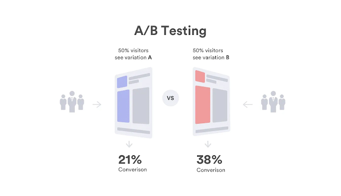
In certain circumstances, your web pages may work admirably but feature out-of-date content. This is when A/B testing comes into play.
A/B testing involves splitting your visitors to test a variety of campaign variations and determining which performs the best. In other words, you can present variation A of your marketing content to 50% of your visitors and the other 50%, variation B.
A/B Testing Illustration – Image Source: Imagekit
A/B testing the webpage can show you how big of an impact the content has had when it comes to engagement or conversions.
In other circumstances, you can run A/B tests to determine if design changes will have an impact on the performance of a webpage. Easy tweaks on buttons, headers, or wording can greatly impact the conversion rate.
Conclusion
It’s one thing to read these eight website design tips and tricks; it’s quite another to put them into effect on your own website.
Since we’ve only tackled the most important website design tips and tricks for technology companies, you may conduct additional research for more design tips.
However, keep in mind that plenty of white space, captivating content, product demo videos, mobile optimization, effective navigation, and other points highlighted in this piece are critical to maintaining high conversion rates and attracting more leads.
Acodez is a leading web design company in India offering all kinds of web design and development solutions at affordable prices. We are also an SEO and digital marketing agency offering inbound marketing solutions to take your business to the next level. For further information, please contact us today.
Looking for a good team
for your next project?
Contact us and we'll give you a preliminary free consultation on the web & mobile strategy that'd suit your needs best.
Vipin Nayar is the Digital Marketing Head at Acodez. As a Social Media, SEO & SEM expert with over 8 years' experience in online marketing, he uses his keen insight into customer behaviour to formulate innovative strategies that helps clients enhance their online presence & open up new business avenues.
 Example of Above-the-Fold Content – Image Source: Forest Hill Family Clinic