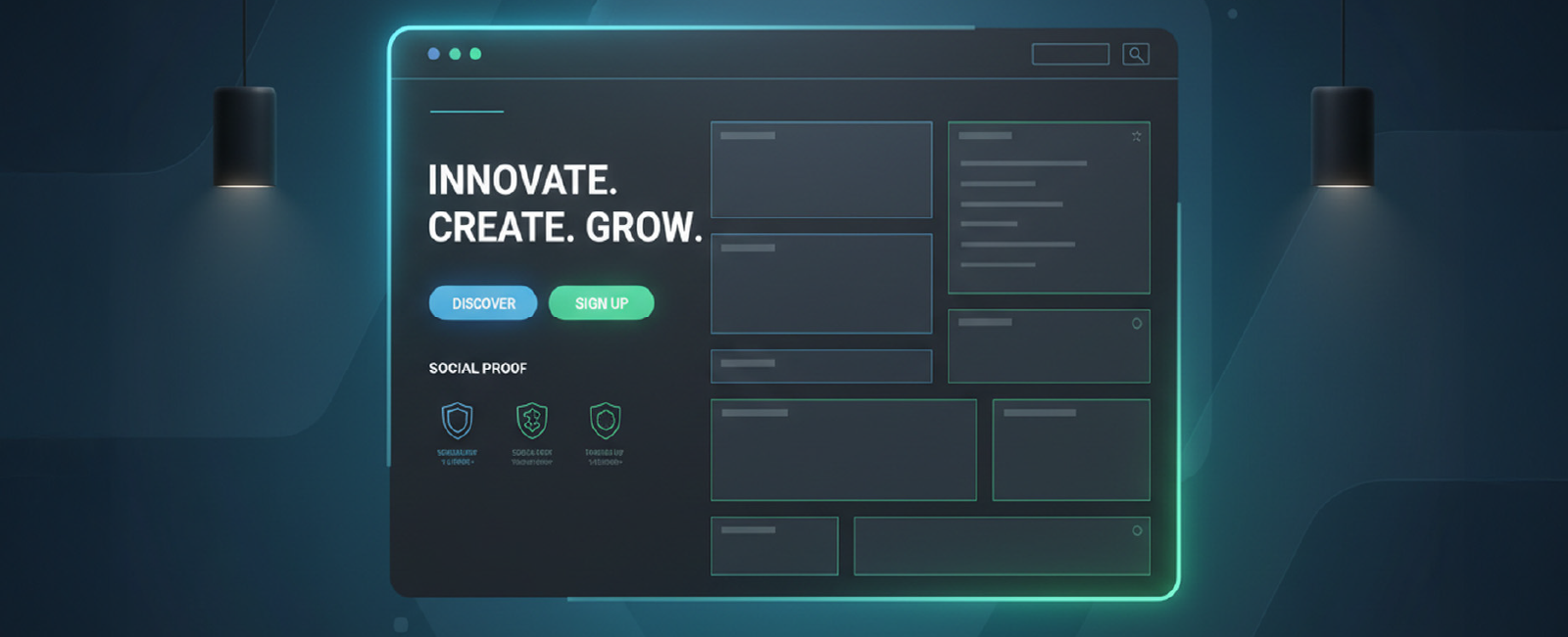
Your home page is not “a page.” It is the front door, the handshake, the elevator pitch, the first date, the display window of the storefront, all crowded into 8-12 seconds, do or do not get the attention of somebody. Make it not right, and all the other work you have created (the beautiful inner pages, the killer product, the heartfelt manifesto) goes to waste since no one is around to see it.
Having created or recreated over 400 home pages for startups, SaaSs, e-commerce brands, and personal portfolios, I have whittled the art into a series of principles that can be reused in all and continue to make the needle move. This is the playbook.
Trust elements: grayscale or 50 % opacity until hover
Pro tip: Never center-align everything. It looks pretty in Dribbble shots, but kills perceived professionalism. Left-align text blocks on desktop; center only on mobile.
alsoRead
3. The Psychology of First Impressions
It only takes 50 milliseconds before human beings can make decisions on whether they will trust a site or not (Lindgaard et al., 2006). Faster than conscious thought. What is affecting such a snap judgment?
Color contrast (WCAG AA minimum 4.5:1)
Visual complexity (too much = cognitive overload)
Whitespace (the ultimate trust signal)
Typography pairing (one serious font + one friendly)
Face presence (a human face increases warmth by 40 %)
These elements matter because 38% of users will stop engaging with a website if the content or layout is unattractive. A single design misstep can lose trust before a word is read. Real-world example: When we redesigned the home page for a B2B SaaS that was converting at 1.8 %, we removed the stock-photo team grid, replaced it with one real smiling founder photo, increased whitespace by 40 %, and changed the palette from aggressive red to calm blue-green. Conversion rate jumped to 4.6 % in two weeks, same copy, same offer.
4. Navigation: The Invisible Conversion Killer
Bad navigation is quite sabotaging.
Common crimes:
Mega menus with 50+ links
Hamburger menu on desktop (conversion rates drop 20 % on average)
Sticky headers that cover 30 % of the screen on scroll
Users don’t just glance at navigation; they spend an average of 6.44 seconds viewing the main navigation menu, making it the second most-viewed element after the logo. So when navigation fails, the rest of the site suffers.
Best practices in 2025:
Maximum 5–6 top-level items
Use descriptive labels (“Pricing,” not “Plans & More”)
Highlight the most desired action (usually Pricing or Sign Up) with color
On scroll, shrink the header height by 30–40 % but never hide the CTA
Mobile: hamburger is fine, but place the primary CTA as a fixed bottom bar for apps/dashboard products
5. Social Proof is the New Headline
In 2010, you could get away with fake testimonials. In 2026, people smell inauthenticity from a mile away.
The trust stack that actually works:
Logos of known companies (grayscale → color on hover)
“As seen in” media row
Number counters (but only if impressive and real: “10,000+ teams,” “$2B+ processed”)
Real testimonial with photo, name, role, company
Video case study snippet (60–90 s, auto-play muted with captions)
Third-party ratings (G2, Capterra badges with exact score)
Placement matters. The optimal order I’ve tested:
Above the fold → Logos + counter
Mid-page → Full testimonial carousel or grid
Near final CTA → Star rating + “Join X customers”
6. The Fold Is Dead, But Scrolling Behavior Isn’t
Yes, people scroll. No, they don’t read everything.
Average attention curve on a home page (Hotjar + CXL data):
100 % view the hero
70–80 % scroll to the second section
50 % reach mid-page
20–30 % reach the footer
Design for the 50 % who are moderately interested, not the 5 % who will read your manifesto. Practical tactic: the “zigzag” or “Z-pattern” layout
Section 1 (hero): Problem
Section 2 (left-aligned image right): Solution
Section 3 (right-aligned image left): Feature deep dive
Section 4 (full-width): Social proof
Section 5 (centered): Final objection-killer + CTA
This creates visual momentum that carries the eye downward naturally.
7. Mobile Is No Longer “Second Screen” It’s the Only Screen for Many
In 2025, 60–75% of your traffic will be mobile for most industries. Yet I still see home pages that are clearly desktop-first with tiny text and tap targets. And it matters more than aesthetics, 57% of internet users say they won’t recommend a business with a poorly designed mobile website, which means weak mobile UX directly costs credibility and referrals.
Mobile checklist (non-negotiable):
Headline ≤ 12 words
Font size ≥ 20 px for body, ≥ 44 px for headlines
Buttons ≥ 48 px tall with 12 px internal padding
No hover states (replace with tap feedback)
Images load lazily, but the hero loads eagerly
No carousels (swipe carousels have 1–3 % engagement)
One CTA per screen height
Bonus: Use “progressive disclosure.” Show a simplified version on mobile, with “See more features” expanders instead of forcing endless scrolling.
Google’s Core Web Vitals are now ranking factors, but more importantly, Amazon found that every 100 ms of latency costs them 1 % in sales. Speed isn’t optional anymore; the average page load speed for a first-page search result on Google is just 1.65 seconds, showing how fast top-ranking sites already are.
Non-negotiable targets (2025):
Largest Contentful Paint ≤ 1.8 s on 4G
Cumulative Layout Shift ≤ 0.05
Total blocking time ≤ 150 ms
How to get there:
Next.js or Remix with SSR + edge caching
WebP/AVIF images under 100 kb for hero
Critical CSS inlined, everything else deferred
No third-party scripts above the fold (yes, that includes Intercom)
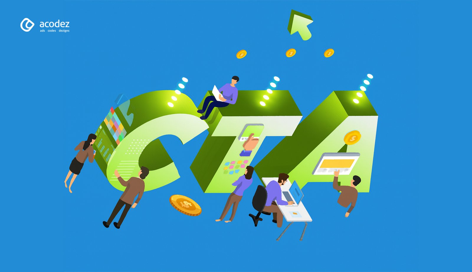
9. The Two CTAs Rule
Every home page should have exactly two calls to action repeated throughout:
The “low-commitment” CTA (Start free trial, See pricing, Watch demo)
The “no-commitment” CTA (Learn more, Read the guide, See how it works)
Never make the visitor guess what to do next. Example from ConvertKit:
Primary: “Start free for 14 days.”
Secondary: “See how it works.”
That’s it. No “Contact sales,” no “Book a demo,” no “Join waitlist” cluttering the page.
10. A/B Testing is Not Optional
Assumptions are expensive.
The highest-ROI tests I’ve run on home pages in the last 24 months:
Headline change → +42 % conversions (B2B dev tool)
Replacing stock illustration with product screenshot → +28 % (SaaS)
Final Thought: Great Home Pages Are Never “Finished”
The internet moves too fast. What was crushed in 2023 looks dated in 2026. Treat your home page like a product, not a brochure. Ship weekly experiments. Measure everything. Kill what doesn’t work mercilessly. Because in the end, your home page isn’t art for art’s sake. It’s the top of the funnel that pays everyone’s salary, including yours.
Now go open your analytics, look at that bounce rate, and tell me with a straight face that your current home page couldn’t be 30 % better.
Acodez is a leading web design company in India offering all kinds of web development and design solutions at affordable prices. We are also a mobile app development company in india offering Robust & Scalable Mobile App Development to take your business to the next level.
FAQ
What is the ideal length for a homepage?
There is no “perfect” pixel length. A homepage should be as long as necessary to answer the visitor’s questions and handle objections, but no longer. Short pages work best for simple, low-risk offers (like a free newsletter). Long-form pages work better for high-ticket or complex products where trust needs to be built. The key metric isn’t length; it’s engagement depth.
How often should I redesign my homepage?
Don’t think in terms of “redesigns” (which are risky and expensive overhaul projects every 3 years). Think “iterative optimization.” You should be running A/B tests monthly and making small tweaks weekly based on data. A full visual refresh is typically needed every 18-24 months to stay looking modern, but the core structure should evolve continuously.
What is the most important element on a homepage?
The Headline. It is the 80/20 of your page. If your headline is weak, confusing, or clever-but-vague, it doesn’t matter how beautiful the design is or how fast the site loads—people will leave. Your headline must clearly state what you offer and who it is for in under 3 seconds.
Looking for a good team
for your next project?
Contact us and we'll give you a preliminary free consultation on the web & mobile strategy that'd suit your needs best.
Rithesh Raghavan, Co-Founder, and Director at Acodez IT Solutions, who has a rich experience of 16+ years in IT & Digital Marketing. Between his busy schedule, whenever he finds the time he writes up his thoughts on the latest trends and developments in the world of IT and software development. All thanks to his master brain behind the gleaming success of Acodez.