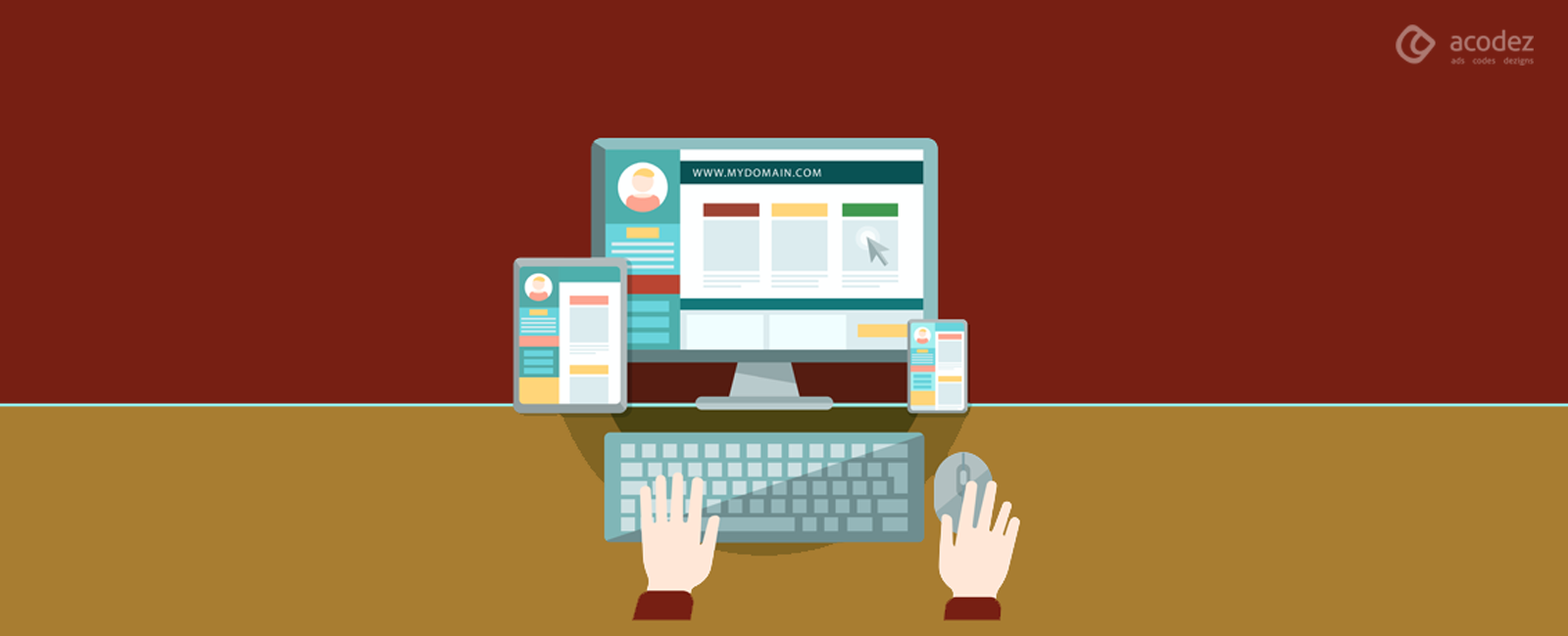
Websites are the key to a customer’s heart. Very recently, it has become an imperative part of businesses. And it has been giving customers with a lot of options when it comes to choosing a product or item. If we take a look at what influences customer decisions when they stop at a website and wait to check further, and then go ahead or return – the homepage of any particular website has a great role to play.
Just as the window of any shop, this is where your people reach you out and find a way to what you have in store for them. The homepage gives them an idea of what lies inside, hence adopting some best and typical homepage design ideas will work out. This is the point where they decide if they want to go deep within or leave. Moreover, it is clear that the appearance of your website will decide whether your customer will move through the buyer’s journey.
So if you have been noticing that your website fails at attracting people, then you should probably be trying to renovate your homepage and check how it works for you. In fact, there are a number of simple tips and tweaks that you can apply (we will be discussing these effortless and cost-effective techniques across this article) on your website.
Let Us Find Out What Are These Best Homepage Design Ideas:
Image Files That Are Lightweight
Images are an imperative part of your website – it should not be just images, but good-looking and high-quality images that you should be making a part of your website. The challenge lies in choosing an appropriate image for your site as big images or high-resolution images take too long to load. And as the loading time shoots up, there are chances that your visitor would get annoyed and leave.
Let us check what experts have got to say about using images. Researches suggest that if a mobile site takes more time than 3 seconds, then around 53% of website visitors might abandon the site.
But, of course, you can always compress your images as this will help in bringing down the page load time. Firstly, you should be able to bridge the gap between the images and ensuring that the page will have a faster loading time. The Page Speed Insights tool (from Google) can always be used to check whether you should be compressing your image. Also, you can use the Tiny PNG tool to get the image compressed further.
Call to Actions That Are Simple, Clean and Important
It is important to ensure that whenever a visitor enters the homepage of your site, everything should be so clear that they should be able to identify what step should be taken next. In such cases a well kept homepage design ideas should be implemented. And here, you can actually fix a call to action within the form and make sure it can be read clearly – this you can achieve with the help of a large button. Once the visitors decide what they need, they can always click on this button – and this would be passed on to the next stage in the funnel – lead creation – and finally, end up reaching sales.
There have been a lot of discussions regarding whether the call to action should appear above the fold or below the fold. But from researches and expert advice, it is recommended that the call to action comes above the fold and not below the fold. In fact, no one would be interested in scrolling toward the bottom within a homepage. There are a number of businesses that benefitted from placing the call to action above the fold. Try it for yourself and see how it works. Also, another important tip is that you need not limit your call to action to just above the fold – but you can always repeat it across the homepage.
Apart from this one call to action, you can always have a call to action button anywhere else on the homepage to help add the product to the cart. It is important that the call to action has been designed in such a way that it catches the eye of the visitor. It is always good to cut all crap across the homepage. Give more importance to the call to action – while you color up your website with a lot of other elements including social media buttons, navigation and others, make sure that these do not cause a distraction to the visitors.
Defining Your Value Proposition
So now you have a clearly defined call to action for your website, but how would you ensure that the visitors would be clear of what action has to be taken. It is important to convey the message clearly – in fact, consumers belonging to all age groups are expecting a clear communication (the content should be free from grammar mistakes and other ambiguities).
It is important to identify what your customers will acquire by clicking on the CTA. Check whether the subheads, headline and the content in the body will be clear and would it solve their concerns. The final aspect is to check whether these visitors would be able to make it clear to others as to what they have acquired from your site.
The Website’s Homepage Content Should be Easy to Skim Through
Regardless of whether your website content is too long or precise, you should ensure that it would be easier for the readers to skim through. All online visitors (including you and me), everyone has this habit of skimming through the text, rather than reading through. Some studies say that not less than 16% of people read the entire text (word by word), but most of the times, people read through the text in an F-pattern. In fact, this kind of a reading might cause them to miss out on important and essential details.
A lot of people tend to lead the website by skimming through – if they don’t find anything useful, they would leave. But, we can give you some simple tips that you can include in order to not lose out on your visitors.
Always include subheads within the content of your homepage. If there are long paragraphs, it is ideal to write down these as bullet points. Ensure that there are no long and complex sentences. You can always use images and videos, if you feel that people prefer to watch these instead of reading through long copies of content. Also, check the size of your font – don’t use small sizes and add captions to images.
You can Always Include Photos of Real People
Of late, photographs of real people are being used on websites and researches say that it is one of the best options to include people across your product promotion photos on the homepage. Human photos have been found to bring about more conversions than using other icons or illustrations on the site. You can include images of your staff and customers rather than using the photos obtained from stock images as people usually tend to ignore these.
In fact, it is found that such photos will not only grab eyeballs but help in building trust and loyalty as visitors have already seen some people in real-life activities. This could be one of the best options for small and medium-sized businesses to attract their customers.
Identify and Minimize the Risk
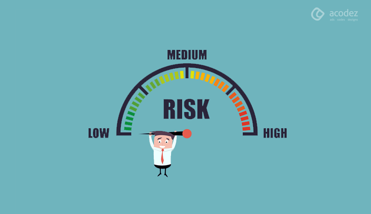
There are possibilities that a customer would not trust your products, while they have been dealing with traditional brands since ages. So if they lack trust, then ultimately, they would not shop with you and this is actually creating a risk for your business. You could provide people with offers such as free delivery, cash on delivery, etc. – and remember all this should appear above the fold.
So to acquire the trust of your customers, it is important that you provide them with a hassle-free service. Convey to your customers that if they don’t like the product, they should be able to return it to the company without any other stress or pain, and the company should accept it without making them pay. When you start offering hassle-free services to your people, they automatically provide you with reviews and testimonials, which will take you closer to others as well. Ensure that all these reviews and social media attention are shared on your homepage with others as well.
Ease of Navigation
Lesser navigation is always good – because it keeps all the trouble away. But, people want to experience the goodness of this navigation to tour the site. Another interesting fact is that when the navigation bars are kept hidden, it is difficult to reach a particular page – in fact, your customers would find it difficult to reach out to the key areas of your site. With combo navigation, there would be a number of pages on your site – and it would be difficult for you to combine all these on to the homepage menu.
Live Chat Could be a Great Option
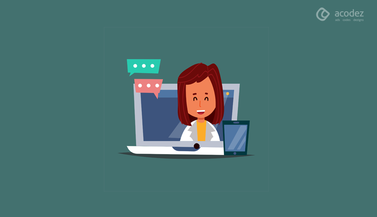
You can always think of including live chats on your website. This feature provides you with an opportunity to interact with website visitors and chat with them in real time. This would help to solve their queries, navigate through the website and also pitch sales to them. This will save them from the effort of having to call or email.
Use Videos
As we had already discussed, videos could be a great option for use on your homepage as these help in bringing about increased conversions. A number of businesses have already benefited from this kind of an option and you can as well. Best to have short videos that don’t last over two minutes.
These are some simple tips that you can apply to your homepage to design them well and find your conversion take a new phase going forward.
Acodez IT Solutions is a web design company in India offering all kinds of web design and web development services to our clients across the globe. We will provide you with flat designs for your websites as per your desire. You just need to tell us what kind of website you need, the rest our web design team will take care of. For more details, you can contact us today.
Looking for a good team
for your next project?
Contact us and we'll give you a preliminary free consultation
on the web & mobile strategy that'd suit your needs best.