People have hailed the internet as a global enabler of information, transactions, and, most importantly, people. However, for the other billions of people residing in low bandwidth environments, the vision of such is still a dream. They delay the time to load a page, and when some functions are not fully developed, plus the high costs of using data, make use of websites frustrating. As the digital economy becomes more and more international, building websites for low bandwidth is no longer a neat option but a necessity. These efforts work to guarantee equal access to Internet-based resources as well as to contribute to the minimization of the digital divide.
Here, you will find useful approaches, devices, and concepts for building Web sites designed for low bandwidth conditions. Within such matters as using a minimalistic approach to enhance design, choosing the right media, and adopting innovative technologies, this article provides practical recommendations for developers and companies to follow.
Designing for Low-Bandwidth Environments – Image source: Open Replay
Low bandwidth areas are regions where Internet connection speed and reliability are not enough to support high call or typical browsing activities. Such difficulties may be traced to the absence of inadequate facilities, geographical locations, or high costs of broadband services. Often, such individuals use old and less efficient devices, expensive and limited data connections, and slow mobile connections, which makes the problems of accessing the internet worse.
Key Statistics on Internet Speeds Globally
The available information shows that there are large differences in internet connection speeds around the world. If in 2024, North America and Western Europe, with average download speeds of over 100 Mbps, are part of developed regions, many developing regions experience less than 10 Mbps. For instance, median speeds as low as 3 Mbps are common in some parts of Sub-Saharan Africa and rural Asia. This connectivity gap is why it is crucial to design new web solutions for the most vulnerable communities as the situation develops.
Below are the top 10 countries with the fastest mobile internet speeds.
Rank
Country
Megabits per second (Mbps)
1
United Arab Emirates
442
2
Qatar
358
3
Kuwait
264
4
Bulgaria
172
5
Denmark
162
6
South Korea
148
7
Netherlands
147
8
Norway
145.74
9
China
139.58
10
Luxembourg
134.14
Source: Speedtest Global Index (as of November 2024)
User Behavior in Low-Bandwidth Areas
Users in low bandwidth areas have specific usage patterns of the site. It is established that any website that takes longer than five seconds to open is likely to be left by the users. People like sites that load quickly and contain only the necessary features not looks. Also, because the internet is expensive to most people, social websites that require a lot of data are rarely revisited.
Core Principles of Designing for Low-Bandwidth Regions
Prioritizing Essential Features
The foundation of a low-bandwidth design strategy can be summarized by the principle of simplicity. The idea proposed is that the featured functionalities are sufficient to make websites useful and not send users to information overload. Determine which of the aspects of a website is most important to your users—be it the speed of access, ease of navigation, or particular tools—and strip out any unnecessary frills.
Optimizing Content Delivery
An efficient delivery of content guarantees that the information gets to the user as soon as possible. Approaches as caching, file compression, and data adapted to the current bandwidth can also improve performance of applications. These measures have the added advantage of enhancing loading speeds, and also, minimizing the data traffic.
Leveraging Minimalist Design Practices
One thing that should be noted is that minimalist design doesn’t mean ignoring the beauty. What he opposes is cluttered interfaces, confusing typography, and complicated layouts. Combining multiple links into a single page and eliminating superfluous components decreases page mass, proving that minimalism is feasible for low connection web sites.
Optimizing Media for Slow Connections
1.Image Compression Techniques
Pictures are usually the greatest in size in terms of the elements used on a webpage. Reducing the size of images can have a relatively massive impact on load times without any quality loss. There are different solutions for this problem: using services like TinyPNG and JPEGmini or using format WebP. Also, image responsiveness makes it possible for the users to download an image based on the size and resolution of the client’s device.
2. Alternatives to Video Content
However, video content as interesting as it is, calls for a lot of resources. Where possible, replace videos with better-optimized GIFs, infographics, or plain text descriptions. When videos are critical, adaptive streaming technologies must provide video quality depending on the connection speed of the end-user with minimal buffering.
3. Leveraging Lightweight Fonts and Graphics
While custom font choices and detailed graphics can alter the load times of a web application. Employing the fonts from the system and utilizing the graphics based on vectors such as SVGs can also contribute to the advantage of keeping the site appealing without bloating the file sizes. Moreover, to save the overhead, stick to the minimum number of font weights and styles, preferable to one.
Technological Strategies for Low-Bandwidth Websites
Utilizing Progressive Web Apps (PWAs)
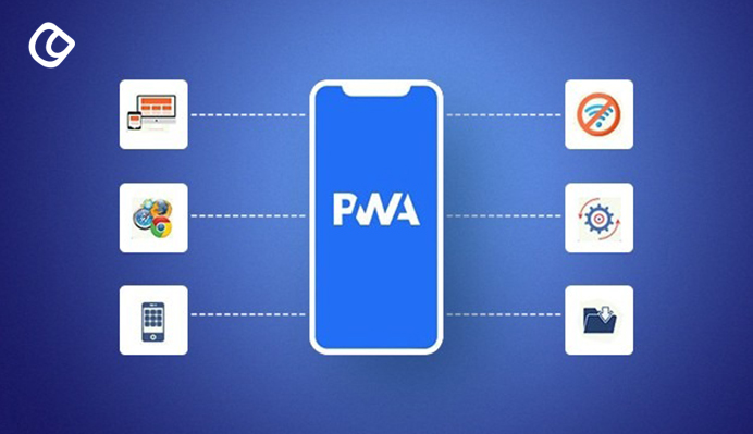
Progressive Web Apps (PWAs) – Image source: HowinCloud, Linkedin
Progressive Web Apps (PWAs) are one of the best solutions in low connectivity situations. PWAs are essentially the perfect blend of websites and apps as they can work offline, load fast, send push notifications, and use very little data. Due to their light-weightiness, they are very suitable for individuals that use them occasionally or in regions with slow connectivity.
Implementing Lazy Loading
Lazy loading is a technique by which the resources that can be loaded in the page such as the images and the videos are loaded when required. This approach serves the purpose of saving bandwidth in that it takes into considerations only the visible content to the user. For instance, images below the fold are usually downloaded only when the user scrolls down the page, and thus, enhancing the rate of first views.
CDN Benefits for Content Delivery
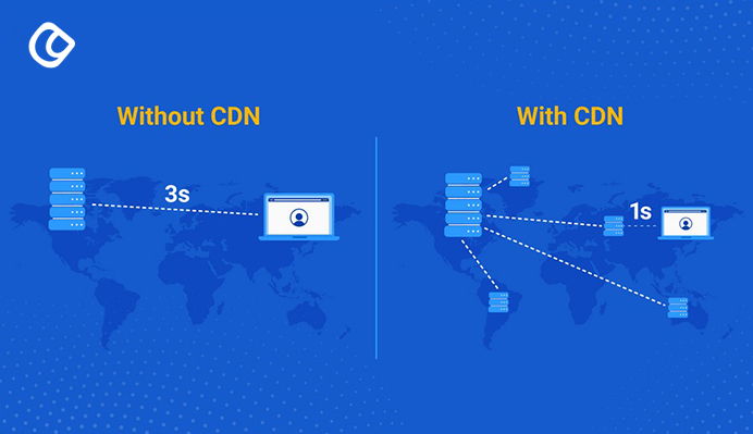
The differences between having CDNs and not having CDNs – Image source: scaleflex
Content Delivery Networks (CDNs) host website assets across a network of servers worldwide hence, lowering the latency level and increasing reliability. CDNs store the content nearer to the user hence guaranteeing faster access throughout the bandwidth-sensitive areas.
Coding Best Practices
1. Clean Code for Faster Rendering
Neat and structured code forms the central part of any good website that a person is planning to create. It is good to minimize nesting, use elements unnecessarily, and inline style tags that can make HTML and CSS bulky. Simplified code not only decreases file size but also makes the site more compatible with old versions of browsers and devices used in places with low bandwidth.
2. Minifying JavaScript and CSS
Minification is the process of stripping off spaces, comments and line breaks from code files. Minified JavaScript and CSS files cause less load time as they occupy less space and add to the user experience.
Here’s how a developer would write a JavaScript file for usage in a website:
   // return random number between 1 and 6
function dieToss() {
  return Math.floor(Math.random() * 6) + 1;
}
// function returns a promise that succeeds if a 6 is tossed
function tossASix() {
  return new RSVP.Promise(function(fulfill, reject) {
    var number = Math.floor(Math.random() * 6) + 1;
    if (number === 6) {
      fulfill(number);
    } else {
      reject(number);
    }
  });
}
// display toss result and launch another toss
function logAndTossAgain(toss) {
  console.log("Tossed a " + toss + ", need to try again.");
  return tossASix();
}

function logSuccess(toss) {
  console.log("Yay, managed to toss a " + toss + ".");
}

function logFailure(toss) {
  console.log("Tossed a " + toss + ". Too bad, couldn't roll a six");
}
// use promise paradigm to try three times to toss a 6
tossASix()
  .then(null, logAndTossAgain)   //Roll first time
  .then(null, logAndTossAgain)   //Roll second time
  .then(logSuccess, logFailure); //Roll third and last time
When minified, the same code looks like this:
function dieToss(){return Math.floor(6*Math.random())+1}function tossASix(){return new RSVP.Promise(function(a,b){var c=Math.floor(6*Math.random())+1;6===c?a(c):b(c)})}function logAndTossAgain(a){return console.log("Tossed a "+a+", need to try again."),tossASix()}function logSuccess(a){console.log("Yay, managed to toss a "+a+".")}function logFailure(a){console.log("Tossed a "+a+". Too bad, couldn't roll a six")}tossASix().then(null,logAndTossAgain).then(null,logAndTossAgain).then(logSuccess,logFailure);
The minified version of this sample code is 48% smaller. In some cases, minification can reduce file size by as much as 60%.
3. Reducing Server Requests
Every server request is another second added to the page loading time. To reduce the number of requests in some ways, applying CSS and JavaScript files, using sprite images, and enabling browser caching are useful for performance.
Accessibility in Low-Bandwidth Regions
Importance of Fast Accessibility
First of all, accessibility is about inclusion and second, speed is key. Websites created for low bandwidth areas need to be fast to load and must work well on older equipment. Overall, ad hoc design is easy to navigate, and clear call-to-action buttons and offline capabilities can improve web accessibility.
Offline-First Approach
It means that even if the user is out of the Internet coverage, he/she can still use basic website functions. By caching crucial assets through service workers, websites can function continuously; thereby, improving reliability to users within areas of inconsistent network connection.
SEO Optimization for Low-Bandwidth Websites
Balancing SEO and Speed
It is possible to achieve both SEO optimization and site speed while working on one. Accessible, focused on the specifics, and easy to implement, true lightweight metadata, optimized keywords, and efficient sitemaps do not hinder discoverability while helping with the performance. Phrases such as ‘Website for low bandwidth regions’ should be used in the headings, content, and meta tags.
Optimizing for Mobile-First Indexing
In the current world, search engines focus on the mobile-first index since most people with low internet bandwidth use mobile phones. First, response design, as well as a fast loading time and mobile layout, are crucial for better rankings.
Creating Lightweight Metadata
Meta descriptions and title tags should form short phrases or keywords. Do not use descriptions that take too long to process, and make sure that the alt text for some images actually describes what the image is.
Challenges and Solutions
Balancing Performance and Aesthetics
Getting the right balance between speed and looks is something that has continued to pose a big challenge in website design, particularly in low-bandwidth areas of the world. It is especially important for designs to be visually appealing to create quality interactions with users, as well as for brand identification and trust. However, if a design is resource-intensive, it takes a very long time to load and can result in annoying users and higher bounce rates.
Developers must not overdo things, meaning that the aesthetic of the site has to be maintained while making the site fast. To achieve this, they can adopt the following strategies:
Optimize Visual Assets: Large pictures and videos must be resized using the methods in modern formats like WebP or AVIF that offer small sizes when compressed. Furthermore, designers are also able to use responsive images that automatically adapt to the defined resolution with regard to the device and connection of the user.
Use Scalable Vector Graphics (SVGs): Unlike raster images SVG images are small in size and can be enlarged to any size, therefore are perfect for icons, logos and simple illustrations. They maintain their quality irrespective of the size and can be loaded even in slow internet connection.
Leverage Aesthetic Minimalism: Sleek and modern designs are quite common, and they also do not require many resources to manufacture and assemble. Simple design, lots of blank space, and avoiding the use of excessive body type customization increase usability without burdening the network.
Asynchronous Loading for Enhanced Interactivity: Another advantage that saves time is that while loading, developers can prioritize bringing in the most important content first and postpone loading other unessential visual content.
Custom Fonts with Caution: Even though use of custom fonts enhances the look of the websites they are used on, they can often increase page size a lot.
Overcoming Connectivity Barriers
Another challenge that users face in a low bandwidth environment is,the issue of connection interruption or inconsistency. Websites must be designed with the network failure of the internet or poor connection as a major consideration. Addressing this issue requires innovative approaches and robust technical solutions, including:
Adaptive Streaming for Media Content: The media content, such as videos, needs adaptive streaming, which means the quality of the streaming can change with the internet speed of the current user. The latter is used on such sites as YouTube to make sure that the videos are viewable even on slow connections.
Preloading Critical Resources: Applying important web objects that are the text content, navigation menus, andlightweight images to be downloaded in advance guarantees the user interaction withthe site as soon as possible regardless of the time spent on loading other elements. This approach enhances the experience of the site by increasing perceived speed and hence decreasing the level of frustration.
Offline Functionality with Service Workers: Including service workers, it is possible to make applications offline-first. Files like CSS, JavaScript, and the basic content are cached, and so users will be able to access some parts of the site should the internet connection disappear. This functionality is useful for news site, education site or e-commerce site target for low bandwidth area.
Progressive Web Apps (PWAs): PWAs are a perfect answer to connectivity issues. These appsimulate native apps, and support offline operation, fast start up, and low resource consumption. They can fully store data locally, with periods of synchronization when connectivity is restored, and give the user experience.
Fallback Content for Unavailable Features: Website design should provide for situations where some of the features cannot be downloaded because of network problems. For example, if it is impossible to play a video, users are offered text in the form of a summary or links to other media content.
Real-Time Bandwidth Detection: The application of real time bandwidth detection enables websites to adapt the content downloaded and the rate at which it is downloaded to the speed available to the user. For instance, the copy that is less accurate can be provided for users who are on slow connections, while the simpler pages can be provided to the lower bandwidth connections.
Error Resilience for Unstable Connections: This means that websites should provide support for messages that are sent in a connectionless fashion and should be able to recover gracefully from broken connections. Options like auto reconnect if the download is left in mid way or session save options are useful for users to continue without getting annoyed.
The Future of Websites in Low-Bandwidth Regions
Emerging Technologies and Trends
5G, satellite internet, and Low-Earth Orbit (LEO) constellations are to revolutionize connectivity in the low bandwidth area. As accessibility increases, more sites will be required to develop and make use of these advancements to boost the speed of websites.
Role of AI and Machine Learning
Today artificial intelligence and machine learning are becoming more and more involved in the management of websites and their effectiveness. These technologies can identify the behavior of the users, forecast the bandwidth conditions or change the delivery of the content in order to deliver a perfect experience to the users under complicated conditions.
Building sites for LBRs is not just a technical endeavor—it is an invitation to narrow the digital divide. Hence, by adopting principles of web development of inclusive design, applying advanced technologies, and achieving higher performance, a website will operate efficiently for all users irrespective of their connection speed. As the world becomes fully connected, the need for the proper design of the web that embraces everyone cannot be overemphasized. If we make the intent of the net simple, efficient, and accessible to all, the internet is not only for the privileged few but for everyone; not only for the elite but for every human being.
Acodez is a leading web design company in India offering all kinds of web development and design solutions at affordable prices. We are also an mobile app development company in india offering Robust & Scalable Mobile App Development to take your business to the next level.
Looking for a good team
for your next project?
Contact us and we'll give you a preliminary free consultation on the web & mobile strategy that'd suit your needs best.
Rithesh Raghavan, Co-Founder, and Director at Acodez IT Solutions, who has a rich experience of 16+ years in IT & Digital Marketing. Between his busy schedule, whenever he finds the time he writes up his thoughts on the latest trends and developments in the world of IT and software development. All thanks to his master brain behind the gleaming success of Acodez.