The ever expanding world of online business has initiated companies towards paying due attention to their websites. Known as the face of an organization on the web world, a website is a source of information for the users and a way to connect with their needs.
They project ideas, products and services to the target audience and evoke them to act favorably. This mandates for designing a good layout that suits the eyes as well as the senses. Indeed, the designs should be attractive enough to spellbind the users and magnetize them to make purchases.
While creating an impressive design, it is necessary to note some of the cautionary steps to make it big on the web world:
Here is how to make a good website layout?
#1. Pen Down Ideas:
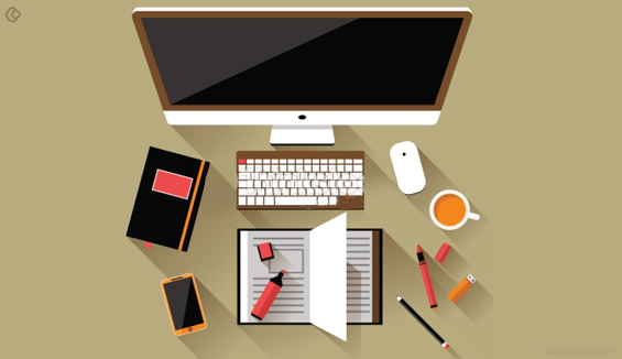
Each time your mind hits with an idea, capture it, because you might not get a second chance or the same idea again. Maintain a diary where you can jot down all the ideas as and when you get them.
Collaborating all these together you can create a masterpiece project.
Also Read: 9 Top Moodboarding tactics that web designers need to implement in the year 2016
#2. Sketching the Layout:
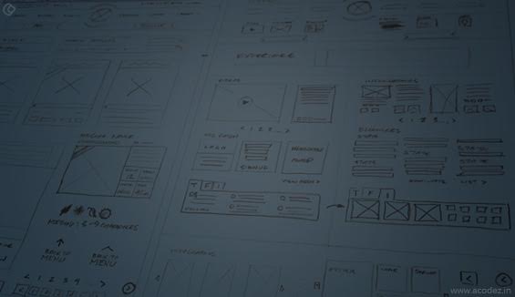
Making a rough sketch of the layout planned will give a fair idea about the positioning of all the elements to be included. Be it the image, content or video, everything needs to be properly placed in a visually appealing layout.
As designers sit down to sketch, they will be able to make alterations as per the notes made earlier till the perfect layout sketch is crafted.
#3. Start with the Grid System:
On the base of the sketch made, access the latest version of the Photoshop with enhanced features. Start by giving a grid to the PSD file as the grid system makes the exact placement of images, content or videos as per the measurements ideated.
It is meant to support the structure of every section in a website. In fact, it is the first step towards achieving perfection in designing the website’s layout.
#4. Font Selection:
Appearance is one of the most important aspects of a website design. Typography just like any other component has a crucial role to play in deciding whether people will love your design or not.
It should be bold enough for an efficient visual appeal and helps the user to understand what is written. Indeed, symmetry is important in the website and it is always better to use one type of Font for the entire website; unless, it is extremely necessary to change it at some points.
#5. Choosing the color theme:
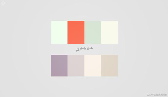
Colors are vital to the health of a website because they tend to add life to a structured layout. With so many colors to choose from the palette available in Photoshop, consider the color as per the idea of the company’s business.
Taking colors from the company’s logo can be an ideal choice; but, sticking just to it is not the suitable thing. Try selecting the matching colors, or maybe the contrast ones for a better choice. In doing so, it is necessary for the designer to think twice that a particular color may not irritate the users or be eye-catching. This will affect the web traffic ratio to the website.
Also read: How to Choose the Perfect Color Scheme for Your Web Design Projects
#6. Selecting apt images:
The images are meant to describe the ideas, which mandates for selecting them cautiously to represent business thoughts.
Along with this, detailed images are always welcome for the products displayed, so as to give a fair idea to the consumer. This will help in building the trust factor of the users for your website.
#7. Analyze the interactive pattern:
Once your layout has been fixed, don’t sit back and relax! You are not yet there.
You have miles to go before the final layout is ready to use.
Designers are at the advantage of deciding the user’s behaviour over the web.
Also, when you design the website, you are at the liberty of choosing how quickly your people find out what they are searching.
There are certain patterns and conventions in web designs that exist because no one has given these a second thought or there was no considerable rethinking on what are the actual requirements.
So, once you finalize the layout, pause a while and rethink whether you are doing this and how well will this benefit your customers.
#8. Hunt for ideas:
Successful designers were not created in a single day. It is years of practice, dedication, innovation and creativity that leads to perfectionism.
Being perfect is the call of a designer’s profession.
When you design a website, let it not be just a part of the existing bandwagon.
Bring out something innovative, take up the challenge. Ensure that you create a design that is unique and ousts all your previous works.
You could do something like adding up an artificial intelligence system or modifying some of the minor components or bring about a change in the selection of colour palettes that you choose to design the web.
#9. Each component is important:
Being a designer myself, there have been several situations wherein I had kept aside certain components to be tended to at the last.
But honestly, I couldn’t offer justice to such components or elements of my design layout.
Sometimes, I would think it’s okay to have shown a little disrespect to these entities when the rest of the design glows and shines.
When I think of those components that were left out, I feel guilty. I should have given time to these and designed them well.
So, when you design, remember each component of your site is important and try to make it unique.
#10. Are your PSD’s sparkling clean?
Though there might be a whole team of designers involved in your project, no matter whether it is a small one or bigger one, you have to ensure that your files are clean.
Advantages:
- Speeds up the design process
- Makes it easier to export different sections
- Also, you can share the files with others, who can collaborate their work.
#11. Is it something that people can relate?
You can start evaluating whether the design is something that people can relate easily.
But, before you think about the people think of whether it is possible for you to relate to these designs?
Often, it is found that what pleases you might not seem to be a pleasant idea to your client.
It would be great if you could request client suggestions at each stage and also try to view your designs from the client’s perspective.
#12. Fancy stuff is good but not always:
We do not need a lot of fancy stuff to ensure that our website looks beautiful.
Minimize the use of images, flashes and javascript in your design.
The worst part of having fancy stuff like a lot of images and flashes is that it will trigger the site’s loading speed and you do not want to lose you valuable people just because your site took a while longer.
Also Read: How to Enhance The Loading Speed Of a Website by Perfect Optimization
#13. Dividing the layout structure:
Every piece in the website layout has to be joined meticulously to create a symmetry. In this regard, it is necessary to divide the structure and check as to what part will take how much space.
As a part of this process, there is a need to give right spacing between the sections to make the layout look extensively attractive.
#14. Attention to details:
Giving high weightage to the detailing is imperative because it directs the way of a website’s appeal.
Be it adding gradient touch to the buttons or adding small popup or changing the color or even an animation, each and everything should be intended to give a collective look and not scattered pieces.
This mandate for the designer to keep re-checking and fine-tuning the website layout for any kind or additions or subtractions to give it proper shaping.
#15. Keeping the resolutions intact:
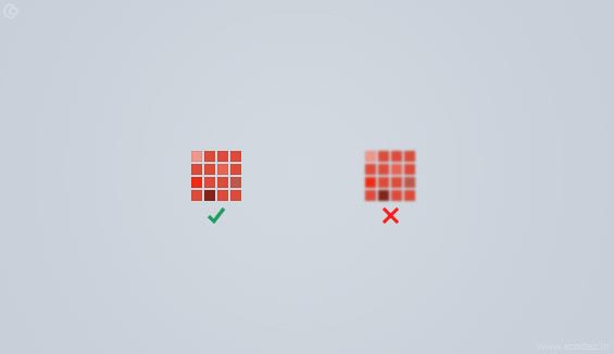
Blurry pixels is one of the most unwelcome things in the web world. The users tend to shun away from the website with blurry images or even the blurry edges of the image.
This accentuates the designer to create the layout with the highest resolution possible so that the pixels of the images do not get blurry on being expanded. Moreover, It will create a bad impression on the users too.
#16. Design for a variety of devices:
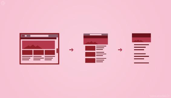
In designing the website layout, the designer should keep in mind the popularity of varied devices in prevalence. With the websites getting designed for different screens,
it is necessary for the expert to see that his website should be compatible with every screen and allow access to varied sections of people in need.
Also Read: Fundamentals Of Responsive Designing That You Must Master
#17. Support the developers:
Developers have an innovative mind and they are expert enough to assist in deciding the concept of the website layout.
So, they should be included in the ideation process from the start and not when their practical task has to be endured. Certainly, sharing the ideas with them will definitely lead to better procedures
#18. Constant check over the website:
As the website enters the development phase, the designer is required to pay attention to his layout because it may not get disturbed by the elements of web development is used. After all, designing layout is an integral part of how a website would look on the web world and slightest of negligence with it will be an obstacle in the way of establishing a brand name.
In the growing world of technology, websites are forming as the base for the organizations to stay in connection with their target audience and persuade them to act favorably.
This necessitates for the designers to keep their mind alert towards selecting the best images, appropriate content, suitable theme and the justifiable colors to make a good looking website layout. Moreover, the first impression is the last and this consideration should drive the designers to do their best.
#19. Choose a template:
Ask your web design company or web designer to illustrate or for a demo of the templates they have been using for their previous clients. If they have been designing across the same ideas then, it is better to drop the idea of getting the layout designed by them!
Someone who is using the same template over and over again cannot give you anything new because they are afraid of failure which is one of the reasons why they stick to the same old template.
All the people are using the same template then, why do you want to join their bandwagon and bore your people?
Think different, act different that should be the policy of the web Design Company you are choosing as it will reflect in the templates and layout designs that they will curate for you.
You need your design to stand out! It is impossible unless they are willing to use a template that is quite different from others. If they can provide you with a number of choices then, things are easier and you can go ahead with the web designer.
#20. Customize the template for your design:
Now that you have got your template, the next step is to blend it with the vision of your brand. Customization is what you have to do!
Bring in some images, content and maybe, a video and combine it all.
The shape, borders, page sequence, fonts, color and much more are all an integral part of your layout that needs to be customized according to your brand and customers your business is seeking out.
You can choose to keep your layout as simple or decorative as you wish. But, before you set out to mixing in a lot of components consider the kind of audiences that you are targeting.
It is always an important factor to design your layout for the audience rather than blending in things that you like.
#21. Tweak the appearance:
Once you add up and adjust the appearance of your layout’s design, it is ready to take the final call. But, there is something that you need to do before you proceed.
Remember there are those aspects of a website that are important beyond choosing the right color and typography for your layout.
You could introduce parallax scrolling to your website or add videos in the background or inject in wide strips to draw your user’s attention to the website.
#22. Navigation flow:
It is not a new factor that we are hearing of! We are all familiar with the importance of navigation flow when it comes to designing layout for a website.
It is important to plan your site flow strategically such that the users are clear with the site structure and know where exactly to look for the main menus, pages, subpages, and the internal links.
#23. Call-to-Action:
It is the place where the user responds and takes the required action.
So, when designing the layout of your site it is important to have a clear picture of what you are going to demand from your visitors.
The position where you are going to place the call-to-actions also matters.
It is where your customers will start doing something for you as per your request.
Subscription forms or contact buttons or sell or buy options are the common things conveyed through call-to-actions. This is where a customer decides what they are going to do on your site.
Also Read: Call-To-Action that works: Above or below the fold?
#24. Content arrangement:
Content is one of the most important things on your website layout.
Before you start you need to decide where you will get your content inserted into.
The hierarchy of your content is another thing that matters a lot.
You need to decide which are the portions that deserve more priority and which are those areas that deserve lesser priority and then, make the arrangements accordingly.
As you know content is the king and the future of your business is determined by the flexibility your content offers to your people in terms of fulfilling their needs.
Do not stuff in a lot and irritate your people. Keep it simple and precise. They will love it!
#25. Readability:
Another most important point to consider when placing your carefully written content on to your website layout is the content’s readability.
Find out the degree to which your content is readable!
If it is not readable and the people have to take an extra strain to read your content then, it is of no use.
They do not need a reason apart from this to leave your website.
Select the fonts carefully. Also, the color, size and the other details of your font do matter when it comes to readability.
#26. Is it ready for the search engines:
This is one of the other most important factors that need to be considered when designing your site.
What use is a website that is not optimized for the search engines?
If you have a website that is invisible because it is not keyword optimized, then you will never reach the top of the search engines and no one will ever know that you have a website and you have got all the answers for their questions.
So, while you fix the layout get your SEO analyst fix the keywords and work on competitor analysis so that you can incorporate it when the website is ready.
The text and the images also need to be SEO optimized before fitting them into the website.
This will ensure that your website is ready for the search engines.
#27. Link Building:
If you get a link from another site then, it is one of the best things to happen to you.
You could make your visitors share your content and also, submit your site to directories to increase your reach and acquire genuine website links.
It helps to drive more traffic from the search engines.
#28. Mobile:
When you are working on your layout design, another most important thing to consider is whether your site is optimized well for the mobile devices and not just the desktop devices.
As you know the likes and interests of our audiences are changing and it is necessary to make our site optimized for all the devices that they are likely to use rather than choosing to optimize it for just a few.
#29. Connect with your audience:
Before your site goes, live this is one another factor that you need to take into consideration.
Your website needs to be liked by your audience. It is necessary that they come to your site frequently.
So, there are a few things that you need to incorporate in your layout design to ensure that your audience will stay connected.
You could include a blog, social feed, and newsletter which will ensure that your audiences will stay connected with you throughout.
So, apart from the points we discussed above,
What are your thoughts about a good web layout?
Acodez IT Solutions is a web designing company offering a wide range of web design and development solutions in india and all over the world.
We implement the most modernized designs in our projects based on the client’s business requirements. Thanks to our team of web developers and designers who work in close-knitted groups to deliver the best of solutions.
We are also a digital marketing service provider helping our clients define a perfect strategy for taking their business to the next level.
For further details, contact us today.
Looking for a good team
for your next project?
Contact us and we'll give you a preliminary free consultation
on the web & mobile strategy that'd suit your needs best.



Great article author! really i appreciate your hard work, thanks for writing such great article.