Currently, every business (regardless of the domain) needs to have an online presence. In fact, this online store is one of the aspects that help potential customers to track further about their brand and reliability. Thanks to the influence of Smartphone and iOS devices – which makes it easier for people to go online, and connect with businesses and individuals that matter to them.
Now, here the challenge is when people come online and search for something that they need – and if your business belongs to the category of their search, then it is imperative that your site reaches them. If not, you are at loss and undoubtedly, you are at a risk of losing potential customers. Here search engine optimization (SEO) is your trump card – so if your site were optimized well for the search engines, then it would reach your people.
Once you ensure that your site has been optimized perfectly (so that it reaches the right kind of audiences at the right time), then a whole lot of work is still required to perfection how people feel about your site and user experience contributes a lot to this. The fact is that unlike in the old days of the web, today, the need is to have a website that offers something more than being dynamic (and is also more than intuitive). Responsive, mobile-friendly, appealing, aesthetic and professional are some of the factors that the modern websites are expected to flaunt (if we were to name a few of those aspects that distinguishes these websites with the traditional static ones).
Ensure that each and every phase of your user journey is seamless and smooth as people move across your business-to-business (B2B) website, enhancing the conversion rates and increasing revenue.
We will take you across some of the best B2B business practices that you should be implementing today:
1. Responsive Designs and Mobile First

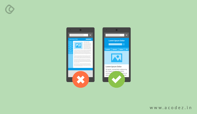
Over time, people using PCs and laptops to access information over the web is declining if sources are to be believed – but as we discussed, it is overridden by the use of mobile devices, as people are using these to access information. In the US, on an average, 71% of the total time spent on a website comes from mobile. So the ease that a mobile device offers – as it can be carried anywhere at any time – is what makes it the people’s potential choice to browse, make purchase decisions and finally shop for a product. So when you are designing your B2B website, it is important that you consider how your site will appear on these devices and accordingly adjust your design and its corresponding elements. This is where responsive design comes into the bigger picture – it will help you to think of a proper screen size – regardless of whether the site would be viewed on mobile or desktop devices – allowing users or visitors to view it across any devices.
2. Do You Still Want to use Flash and Other Complex Elements?
Flash is quite outdated and if you still plan to include it in your B2B Website design, you need to rethink. People assume that t helps in improving user interaction due to the wide number of features that it has got. But take care that it does not prevent you from showing up in the search engine results. Of course, Google crawls Flash videos, but only if the Flash files contain text that can be indexed and snippets that can be displayed within Google searches. But the chances are least as Google does not guarantee the same.
3. Site Hierarchies Have an Important Role

When a visitor reaches your site, it is important that they have the navigation well-designed so that they don’t feel lost anywhere while moving through the site. The structure of your site that helps in directing the user across these pages without effort (from their end) is what matters the most in retaining them.
How do we achieve this?
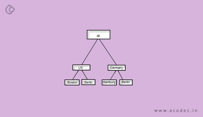
It is important that you strategize the most vital sections of your website that would appear on the home page – map out this hierarchy of your site. Let us not confuse our users with too many of the main categories mapped out here – keep it simple and easy – you can include a few of the important pages, such as about us, services and/or products, blog, contact us, and others. Ensure that each of the main section is appropriately linked to its subsections or sub-categories, where your people can find them without any further hassles.
Understanding your user and their goals is another important aspect of this phase. So when you start designing and arranging your site’s hierarchy, it is important to understand what your user’s intention is. Suppose if your user chooses to check out your ‘Products’ page, what should be the next step – or where would it lead them to? Should it be the landing page or a contacts section or a page where they can cart a product and request it to be shipped after making a successful payment?
Linking pages to one another is again another important phase of building a website, with no flaws, but to attract and convert people. It is also an important on-page SEO tactic – many a time, we end up linking landing pages wherever there is an option to do so – but one of the best ways to do this is by linking only those pages that seem to have an association with pages users tend to visit more often.
With site hierarchy, it is not only the users who will be able to easily navigate across your site but also it would be easier for search engines to crawl across the pages. And ultimately, index pages will be displayed within the search engine results. This also has a great impact on URLs – it affects the URL structure, which contributes to SEO.
4. Images And Videos That Are of High Quality

Of course, we all know that images have an important role to play when it comes to your B2B website design. Alongside, these visuals determine the way your visitors happen to access content or whether they leave your site instantly after landing on it. One of the priorities that people place on when they visit a site, is for good design (which include layouts, along with images). It is important that the visuals you use convey your brand’s intent to your people – visuals can include anything starting from products, services or videos that provide a complete information on what your company does.
It is a good idea to use some unique images rather than going for stock images – which are too boring as most of it is already taken and people are too used to these. A simple tip if you are planning to include videos on your B2B website design is to ensure that it doesn’t take too long to play.
5. Structuring Content and Using Header Tags
We have seen the impact of site hierarchy – so now, you have the site hierarchy defining the structure of each page perfectly, but the point is when your people reach these pages, how would they find the content they are looking for. Organizing your content on each of these pages is very important in deciding whether the users will stick around or leave.
This is where the use of header tags comes into the big picture – for the page title, we recommend using H1 tags, which will make it stand out on the page. For the next most important pages, use H2 tags (for example, subheads and other sections on the page). When you use the appropriate header tags to differentiate content, users would find easier to grab content that matters to them, while also helping search engines to quickly scan through pages that are of utmost importance
6. Reducing Page Load Times – Data Compression Is The Best Way

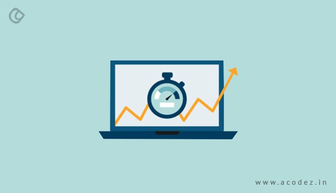
One of the major drawbacks of any website that could annoy a customer is its load time. Think of a scenario where your site appeared within the search engine result pages and they decided to click on it. Now, they have been waiting through for ages before you site decides to finally show up. So it is not only useful information that counts, but also the loading speed of your website that you need to be taking into consideration. Some of the impacts of slower page load times include an increase in bounce rates, the increase in visitors who leave your website. In fact, more than 35% of people are bound to leave a site, if it is too slow to load.
How do you fix this?
You can stop people from leaving your B2B website by ensuring that your page doesn’t take too long to load – compress larger files and images. When the size of your images and files are compressed, the loading time will be reduced. You can find help on sites such as ‘TinyPNG’ to reduce the size of files, while also ensuring that the quality of your image is intact.
7. Display the Most Important Contact Information

A report on B2B website usability revealed that around 45% or more of the users happen to check the products and/or services section first. And this is followed by another 30% of them visiting the Home page, and the remaining people visiting the About us or company information section. But around 64% of people wish to see contact information when they are on a website.
So think of a scenario when a customer comes to your site and likes the products, and wishes to make a purchase. However, before they make a decision, they would like to get in touch with you or contact you for some reason or other – how do you deal with this? It is important that you make sure they can find the contact information with ease.
Where do you push in this kind of information – how about placing it on the footer of the page?
These are some of the best B2B practices that you can implement for your site. If you have any further ideas, comment in the comments box below.
Acodez IT Solutions is a web design company in India offering all kinds of web-related services at affordable prices. We are also an SEO agency with excellent inbound marketing strategies to help take your business to the next level. For more information, contact us today.
Looking for a good team
for your next project?
Contact us and we'll give you a preliminary free consultation
on the web & mobile strategy that'd suit your needs best.


