For any website to be successful, one of the most basic requirements is the design of the website for it is the first thing which attracts the eyes when a visitor opens up the website. And smart-enough people already recognize that design, based upon user experience should be placed on the priority list before making a website and that a website with a bad user experience would definitely fail to live up to the expectations with which it was created.
Most importantly, if you have a website which deals with e-commerce, then you must specifically make a good and effective ux design for computer and mobile device so as to make the customers feel safe before shelling out their hard-earned cash, for no one would risk to pay money if a website is poorly designed and difficult to access and chose options.
Although one cannot predict while designing a website as to what exact problems a user may come to face, but based on research and user experience, the following points can be considered as mantras to get a successfully designed website which can manage with rising standards of user experience designs.
#1. Prioritize the end-user

While designing the website, the ux designers may end up preferring to what he may think is accurate and make designs according to his own needs. But this is wrong and the entire focus should be laid upon what the user might require and what would be best for the user. In other words, all the emphasis must be laid on the requirements of the user because in the end it is only the user that matters.
#2. Results matter, Methods not
Many ux designers follow a stringent set of methods to put up a website. But in the process, they forget that the users are not concerned with the methods they put in to design the website. All they care about is the end product. And in a similar manner, the designers too should focus on that, only without wasting much effort on methods.
#3. Analyze your goals and bridge connectivity between these:
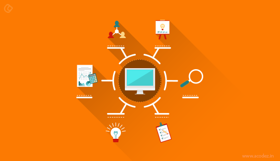
As we have already discussed the end product is your goal! But, often, it is witnessed that no one is clear with the final goals. Most of the time it happens that there is no clear line drawn between the project goals and the business goals and it is the end-user that suffers in the end. Also, it always happens that the user’s goals don’t go well with the goals of your business and what happens?
Your design is incompatible either with the user needs or never matches your business ideologies.
There will be conflicts happening so, to avoid damage it is better to identify the user and business goals before you start your design and tackle down the risk to design what is needed!
Most of the top ux design companies in india conduct interviews with stakeholders and C-level executives to find out what they are expecting and then, design strategies in synch with user goals and business objectives. It is necessary that you include everyone related to the project during the initial stages to avoid last minute disasters after you have completed working on the project.
#4. Simplicity works
For a basically successful design, the most common requirement is to keep everything sweet and simple. The users should be able to find what they want within just a glance. Moreover, time is precious for everyone, and hence everyone would live a simple design which would also help them save lots of time.
#5. Requires Instructions? It may be wrong
If a user ends up checking FAQ’s and reading help and instructions, then its a clear indicator of a fault in the design of the website and hence it should be kept in mind while designing a website that the user should not have to reach for help.
#6. Developing wireframes:
If a user ends up checking FAQ’s and reading help and instructions, then its a clear indicator of a fault in the design of the website and hence it should be kept in mind while designing a website that the user should not have to reach for help.
This is one of the most important steps in your design process. It is necessary that you create wireframes which actually conveys how the real working prototype of the website or the app is going to appear. Get your users test these and examine carefully how they are using it.
Find out whether the app is helpful in resolving their problems. It is necessary that you develop one that will meet their needs. Also, find out whether the instructions or directions are sufficient for them to take them to their goals. This testing of your wireframes will help resolve the issues that might arise when your people start using the real app or the website.
Also, here you will get a better understanding of what your user or customer needs are and work towards achieving that!
#7. Teamwork:

Proper guidelines and directions which may include arrows and other indicators may give the users a fair idea of where to head to get what they are looking for. Hence, clear directions should be provided for assistance.
A design is not the effort of just one or two members but great designs happen when great minds collaborate and contribute equally. Each and every member starting from the project coordinator, the designer, developer, coder, database analyst, content developer, and even your Social Media Manager must be collaborated within a ux design team while being developed.
The ideas contributed by each of them while working on the project is very much necessary for the success of the project. Conducting meetings might kill time. So, let us say ask them to take 15 minutes out each day and analyze the progress of the project and brainstorm on ideas and mail it to you by the End of the day
This will help to identify problems and resolve them early while adding new ideas on a daily basis helping in the further enhancement of the product or the app.
You will get a better picture of things that you never thought or imagined of before!
#8. Directions are helpful
Proper guidelines and directions which may include arrows and other indicators may give the users a fair idea of where to head to get what they are looking for. Hence, clear directions should be provided for assistance.
#9. Paper prototypes
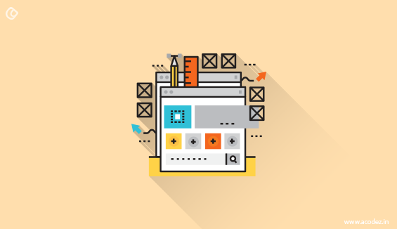
As we had discussed in #7 it is important to collaborate and work as a team when designing. In the UX process whenever teamwork is on, it is impossible to avoid debates and arguments that arise. Some might agree with a design while there are others that want something else included for a smoother navigation. User experience is the main objective of everyone.
Developing prototypes of your real working model is the best way to resolve such issues.
Paper prototypes are very much similar to the interaction model designed on your system.
It will include all those screens, components, buttons, windows, and all that you will be including in the real working model.
Now, all you need to do is get one of your team members’ act as the user or if you could get a real user from your audience list it would be great as you can really get an idea of what they are expecting.
Track down how exactly they are interacting and note it down! Find out what you need to add in and what needs to be removed to provide the users with a smooth flow.
#10. Touch is important:
You are in the year 2017. Responsiveness is the key to Google’s strategy of ranking your website on the top of the Search Engine Pages. So, now what are you planning.
It is not just the mouse or the keyboard that should take your customers through it. There should be more!
Actually, a wide variety of devices needs to be taken into consideration when strategizing your design. Omni-channel should be the key to your design.
Even if the customer starts their interaction with your site or app on one device they must be able to finish the remaining actions as and when they need on other devices starting from the point they left out on the previous device.
Also, don’t forget there are as many as browsers as there are devices too. Your design should be compatible and accessible across any browser that the user decides to access it.
So, take into consideration all these factors and design for all!
#11. Content:

How do you plan to position your content?
As we discussed in #10, you have no idea of the device that your customer would be using to access your site or app. All that they are expecting is a smoother experience and a solution to all their problems.
So, content is the king.
It plays an important role in helping the people resolve their issues.
There are smaller screens for which you need to align your content. Your customers are not going to take the pain if the alignment is not proper.
Consider these factors and get user feedbacks while aligning your content.
#12. Uniqueness matters, but consistency too
Many designers try various different things to make their websites unique as well as different from others, but in this process, they make the websites difficult to be used by users. Despite maintaining uniqueness, they should work on consistency as well. The design should be consistent without missing out on available updates.
#13. Time is money

None of the users have much time to waste and they look for easy and simple options to get their work done swiftly. Hence, the website should be specifically designed so that it works quickly, hence saving the users with not only time, but also the hassle which they otherwise would face.
#14. Users should not be kept in the dark
The website should provide the users with accurate updates and live feedback so that they have the know-how of everything and do not remain in dark over anything.
#15. Make it for humans, not machines
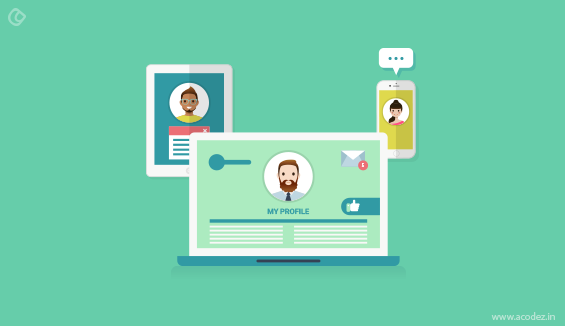
With so many devices being available like the normal computer, tablets and smartphones, it becomes necessary to have specific designs for each device. But one should always remember that it isn’t the device for which they are designing, but it’s for the users. Hence, whatever device, it may be, the design should always cater to the needs of the users.
#16. Get feedback and work on it
Ask the users to leave a feedback on their experience and always listen and work on the suggestions and advice as they would only further improve the website if nothing more.
#17. A Mascot can win hearts:

It is a great idea to have a Mascot for your site. Mascots are a great way to initiate interactions with your people.
Acodez recently released our Mascot, a fluffy blue whale, Acodie, to tell our stories to the world. Another important tip while creating mascots is that don’t create just any static versions of it but real dynamic ones that will guide your users through the site or the app.
Let it evoke fun and start a successful conversation with your people. Trust us! We are speaking from experience that our Acodie has brought us.
Hence, by following these commandments, one can have a solid and a good User Experience Design.
What are the UX best practices that you implement when designing sites?
Share your thoughts, comments and feedback with us.
Acodez IT Solutions is a leading web design company based in India. We are also a multi international award winning company and recently, we have bagged the 2016 VEGA Digital Awards for our work. We know what it takes to ensure a great User Experience while designing sites and apps. We can help you develop great apps and sites. Also, we are a SEO agency based in India helping client businesses to be found on the search engines.
For more details, contact us today.
Looking for a good team
for your next project?
Contact us and we'll give you a preliminary free consultation
on the web & mobile strategy that'd suit your needs best.



Nice information about the user-friendly design. I have gained many new things thanks for sharing the content