Having a great looking website is the dream for all businesses alike. Once you find a great web design company, more than 90% of your job is done.
Design plays an important role at capturing visitor attention. There are a number of web design companies offering website design services and almost all these designs look alike.
So, how do you design a website that stands apart in the crowd and that is full of life and freshness?
It is important that your website displays uniqueness so that it could attract the visitor’s attention and drive traffic.
Let us forget all the tried-and-proven techniques.
Here, we are going to discuss the impact of backgrounds on your design.
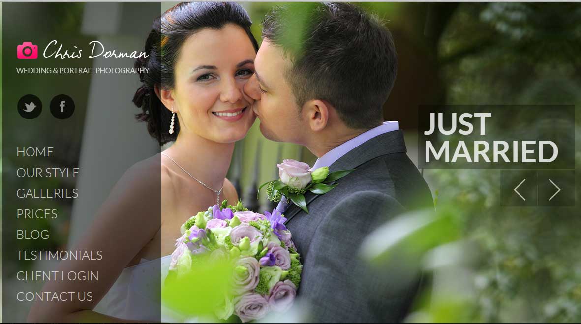
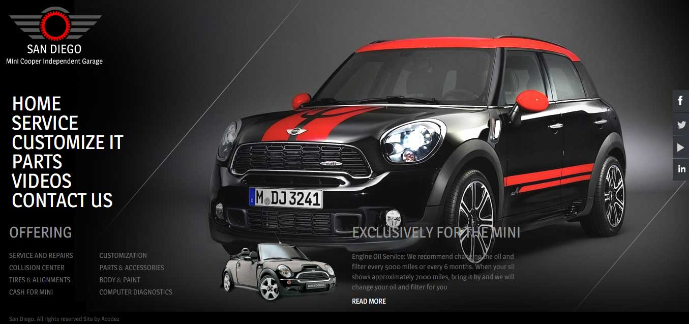
The effect of the full screen backgrounds has already been seen and tested. The artistic beauty that it renders to the website is unmatched; however, it must be created keeping certain factors in mind.
It syncs well with different layouts and has proven to be successful for landing pages as well as the social networking websites. It is quite an effective way to draw the users to the website while creating the brand value of the business.
The background of the website is not confined to the use of images but videos too. There are certain best practices for creating the full screen background for a website which are continuously growing.
These best practices are aimed towards fine tuning the usability, UX and also the appearance of the content.
You are going on the right track if the full screen background of the website adds to the overall appearance of the website and the website works just fine. The image or the video that you use as the full screen background must be in sync with the business and its target audience. If you are able to achieve it, your website is bound to make an impact on the user’s.
Some Of The Factors to Consider While Creating a Full Screen Background
Choosing Between Image And Video:
You can choose between images and videos that you may use with your full screen websites. You must, however keep in mind that using the video will make the website heavier and may take time to load which can leave the users annoyed. It must also be ensured that the full screen background is more of an accessory and all other contents must not be solely dependent on it.
The kind of visuals you use to power the background of your site must be clear and opaque like plain water. And, to ensure the visual perfection of the image or video, implement the best possible version of this file. A simple hack for powering website backgrounds is to implement a file that is large enough to display and fit in across all kinds of screens. Another hack as we have already discussed is to not burden the loading time under the weight of a heavy weight file.
We recommend to follow a resolution of 72dpi while you are also allowed to experiment with a resolution of 96 dpi. You can implement a background image of size 1280*800 or maybe greater than that while working on Wix sites
You can absolutely include videos, but the thing with videos is that it would be difficult to implement if the support from the browser is meek.
Also, remember that your background commodity is not a necessary ingredient, but something that beautifies your site’s design. Enhance the readability of your content such that it has the strength to stand alone in a situation where the background image or video gets eliminated.
The homepage of your website is the place where you need to insert in your background images. When it comes to other pages on your site, the content has an important role to play, but with the Home page when you are trying to create an impression, you need to use appealing images and videos.
The contrast should be glaring:
What does a contrast imply?
The contrast is not just any component but it forms one of the most important properties that reflects the visibility between a foreground and background.
Let me take the example of white text on black background or vice-versa. It provides a lot of impact.
So, now you know how contrast works.
Another thing is that though you have included a background image that looks awesome, remember that it is not the main focus, but there are those components inside your website where you need to grab the visitors attention.
Ensure that the content is clear and visible and in a readable state by introducing in sharp color contrast emphasizing the components such as text and buttons, such that people do not leave the website without noticing these in the background.
Slideshows are also an option:
Full screen slideshows are another option that you can use as background for your website. As the images keep on changing, the website looks more dynamic and the monotony which is created by a single picture is kept at bay. It also gives you an opportunity to showcase images that you wish to.
There are two ways of implementing full screen as part of background design. One of the methods is to create a static background with a fixed image and second method is to create a dynamic background with dynamic images.
People love it when they rotating images on a website as it is more appealing than anything else.
Layouts That Can Be Resized:
If you are into web designing for a considerable period of time, responsive design will be quite a familiar term for you. To ensure that the full screen background works fine on mobile and tablets, the layout must be reusable. It is a challenging task, but not impossible.
Learn To Balance The Components You Are Incorporating:
It is not just a image that is present in your background but there are more number of things. For example, if you have included in the photo of a group of people, products, or maybe landscape, then the content that you have got inside these images and the content outside it for example, the ones present inside the social media links, apps, navigation menus, texts, etc. needs to be in synch with one another.
It would be great if you could add the rest of the components on your website after uploading the background image.
Accessibility:
Are you designing the site for just one visitor who might be using desktop? No! There are millions of visitors from around the world who will be accessing your site via different kind of devices and using different browsers. Your job is to ensure that you offer fluidity to your designs so that it is accessible across all kinds of devices via all browsers.
Test your site for compatibility across a set of browsers that includes – Firefox, IE and Chrome. Also, test it across different kinds of mobile devices and tablet devices too.
While you are busy bombarding your site across these devices do not forget to test it across our traditional desktop.
If it works across all kinds of devices, then you have an appealing and beautiful website that will convert visitors.
How to implement shapes to sync with your content?
This is one of the preferred ways of balancing the content to sync in well with the full screen background. It is recommended that you implement shapes and banners that helps to create an additional layer between the content on your site and the background. For example rather than creating a lot of noise by including a text bubble, you could include shapes and fill it with a color in contrast to the text that will be filled in.
If you are looking how to use blurred background images in web design? You are at right place, Blurred images are a trending web design technique. Any website you see, there are lots of blurred images are showing now a days. Actually making blurred images is a technique in which, photographs will made blurred by Photoshop or with the help of some other software. But this is not the solution to some of your photo problems.
If you are given a blurry photograph and told to make a website out of it, that’s neither trendy nor impressive. That’s a bad photo. But if you have a nice image that you want to use in a new way, the blurred technique is a possibility.
It only works if you have good images to start with. Blur is not a way to “fix” a poor image. There are multiple ways to think about blurring but the first step is to understand how to actually create the blur.
The Crux of Blurred images is that:
- Blurred photos are trendy.
- Blur IA a technique to be used with good images.
- It is the part of image processing technique.
- There are multiple areas where it can be used.
There are various ways of implementing the image blurring technique:
Linear blur Image

Horizontal or vertical averaging of a fixed number of pixels – This is the simplest image blurring technique.The advantage of this method is that it is the simplest of the three. However, it also gives the poorest blurring quality.
Block blur Image

Averaging a small block of pixels by propagating a fixed sized window through the entire image – This method improves upon the quality of the linear blur in that averaging “lines” are no longer visible in the output image. It also helps to retain details that span small horizontal distances in the original image better. However, it still does not overcome the problem of an outer frame in the output image that remains not blurred.
Gaussian blur Image

Convolution of the image with a two-dimensional Gaussian function – This is the best implementation of the image blurring technique, and is used in such commercial software as Adobe Photoshop.
How to Make Blurred Images that Work?
Photoshop has various options to make images blurred. The Best blur photo editor is Photoshop. Adobe has a pretty nice tutorial to get you started in Photoshop.
Blur the whole image:
Designers are putting the techniques together to create a Full screen style, blurred images as the dominant visuals on the landing pages of websites.
It works because:
- A blurred background image can bring focus to layer on top of the image such as text. Just make sure to select an impactful typeface.
- It can create new interest with an image that you use regularly, such as a standard brand photo.
- It can be used with almost any type of content in almost any color scheme for universal appeal.
A Second Application is to Make Layered Images:
Specific parts of an image can be blurred for impact. In this approach designers make foreground blurred with an in-focus background. Actually, it is more common to see blurred backgrounds with a sharp foreground focus.The trick here when you are creating this style of blur is that you can’t tell it was “created” and it should look natural as if the photo were taken in that manner. With photo editing software, you can accomplish this using the Gaussian blur tool with small, incremental adjustments.
It works because:
- Blur creates visual contrast and can tone down the busy feeling of an image.
- It changes the perspective of the image and the user’s view of the visual.
- It adds dimension to an image that might otherwise feel flat for an almost 3D rendering.
Dramatic Blurred For Abstract Art:
When you need a background image for your website but can’t find a pattern or color that does the trick, a photo with a dramatic blur can be the perfect fix. Consider a dramatic blur to be anything that makes the photo content indiscernible at a glance, and it could make the photo completely unrecognizable.
This is a popular option for websites that are launching or promoting a digital project with an abstract blurred photo background behind a phone showing the product.
How it works?
- Brings focus to the featured product
- Creates a custom background rather than using a pattern that might be on other websites
- Gives the designer control over color and feel when it comes to how the abstract blur works from sharpness to soft colors and shapes to the readability of the background image and connect with the brand
Subtle Blur For Any Image:
Designers can add a hint of blur to an image that needs a little foreground focus to help users look at the right parts of an image, to stylize a logo or just to create a more complex visual.
The blur forces you to look at image more closely because of the interesting shape and edging one side of the image has in comparison to the sharpness of the other side. The technique is further emphasized because the website design as a whole uses blur in other places, such as in the background of the dominant image on the landing page.
Why it works?
- Small blurs can create an element of surprise.
- It draws focus on specific parts of a photo, with visual focus.
- It can give you the right amount of contrast to layer other elements on a section of an image, such as text, in the same way a full- screen blur can work with a hero header.
Use Blurred Images for Video Too:
You can use the blur trend with another hot design element such as video. You can use it just like you would with any other image technique. It works in the same way (although the editing tools and process are a little different).
The blur effect is fun and fresh and works with video that is supposed to have an old school feel. The quick video loops are highly readable and attention-grabbing.(2)
Now let us find out what are the things that we should not be doing when creating background images:
Here Are Some Common Mistakes That We All Tend To Make.
It is found that large backgrounds synch well with any kind of screen resolutions. So website developers should be testing their designs with as many resolutions as they please. Some of the factors that should be considered include the screen width – because there are two kinds of users – one set of them do not maximize their tabs to full screen, whereas the others would maximize it.
Do Not Use Scaled, Tiled Or Centered Images
The image’s corner doesn’t fit into the background, which makes the edges unattractive when the users are trying to access it via resolutions that are large. This could be avoided if you can ensure that the image is wide to fit into any of the most popular screens. You can of course implement the CSS into your designs that will inform the browsers to replicate images and create large backgrounds out of these. With this tool, you can repeat the image in any directions – horizontally or vertically.
Optimizing the images
The quality of image and the expected resolution are essential to help with image scaling. With an appropriate image format, the quality of image and page load time is to be set appropriately. Some of the most widely preferred formats include .png, .gif and .jpg. It is always a great choice to use gif to shape lines, circles, etc. And, with images, .jpg is the best format. When you have large images, they should be optimized such that the original format and resolution do not pop out. This can be done by optimizing the CSS and Javascript files of that website. This will help the site to load faster.
Create a smooth and unified background
Only if the pic edges are consistent and in uniformity with the pattern would the background look seamless. Just ensure that you are cutting the image in such a manner that it would fit well into the background without the edges protruding.
Conclusion
These are the reasons why fullscreen backgrounds are widespread and supported by most of the popular browsers that are in use these days. All you need to do is to be as creative as you can and cater to what people are inclined to at that period. The concepts discussed will be of great use when you set out to design your very own website with a full screen background.
Use a lot of blur for high impact and an abstract feeling. Use a minimal blur to create subtle contrast and set focus. As with any design, test it out on a few users before launch and see what they think.
There are many ways to use the blur technique effectively for web design projects. To make it successful is to create a blurred effect that blends into the rest of the design. And you can do that almost by thinking about the blur in extremes.
What kind of factors or practices do you implement when designing for the web?
Is it the color, content, or images or anything else that matters when you design? Share your thoughts, comments and feedback with us.
Acodez is a web designing company in India catering to our clients across the globe offering all kinds of web design and development services. We implement all the latest techniques at developing websites that are unique, professional and stand apart from the crowd.
Looking for a good team
for your next project?
Contact us and we'll give you a preliminary free consultation
on the web & mobile strategy that'd suit your needs best.


First of all, I would like to appreciate the effort that you have put in making such an informative blog. I enjoyed this post of yours and I must say that every time Icome back to your blog, I always have something new and informative to read. Thanks for keeping me updated.
Thank you very much for your valuable comments Shawn Robles